Create a dataset of Irish parliament members

library(rvest)
library(tidyverse)
library(toOrdinal)
library(magrittr)
library(genderizeR)
library(stringi)

This blogpost will walk through how to scrape and clean up data for all the members of parliament in Ireland.

Or we call them in Irish, TDs (or Teachtaí Dála) of the Dáil.

We will start by scraping the Wikipedia pages with all the tables. These tables have information about the name, party and constituency of each TD.

On Wikipedia, these datasets are on different webpages.

This is a pain.

However, we can get around this by creating a list of strings for each number in ordinal form – from1st to 33rd. (because there have been 33 Dáil sessions as of January 2023)

We don’t need to write them all out manually: “1st”, “2nd”, “3rd” … etc.

Instead, we can do this with the toOrdinal() function from the package of the same name.

dail_sessions <- sapply(1:33,toOrdinal)

Next we can feed this vector of strings with the beginning of the HTML web address for Wikipedia as a string.

We paste the HTML string and the ordinal number strings together with the stri_paste() function from the stringi package.

This iterates over the length of the dail_sessions vector (in this case a length of 33) and creates a vector of each Wikipedia page URL.

dail_wikipages <- stri_paste("https://en.wikipedia.org/wiki/Members_of_the_",
           dail_sessions, "_D%C3%A1il")

Now, we can take the most recent Dáil session Wikipedia page and take the fifth table on the webpage using `[[`(5)

We rename the column names with select().

And the last two mutate() lines reomve the footnote numbers in ( ) [ ] brackets from the party and name variables.

dail_wikipages[33] %>%  
  read_html() %>%
  html_table(header = TRUE, fill = TRUE) %>% 
  `[[`(5) %>% 
  rename("ble" = 1, "party" = 2, "name" = 3, "constituency" = 4) %>% 
  select(-ble) %>% 
  mutate(party = gsub(r"{\s*\([^\)]+\)}","",as.character(party))) %>% 
  mutate(name = sub("\\[.*", "", name)) -> dail_33

Last we delete the first row. That just contais a duplicate of the variable names.

dail_33 <- dail_33[-1,]

We want to delete the fadas (long accents on Irish words). We can do this across all the character variables with the across() function.

The stri_trans_general() converts all strings to LATIN ASCII, which turns string to contain only the letters in the English language alphabet.

dail_33 %<>% 
  mutate(across(where(is.character), ~ stri_trans_general(., id = "Latin-ASCII"))) 

We can also separate the first name from the second names of all the TDs and create two variables with mutate() and separate()

dail_33 %<>% 
  mutate(name = str_replace(name, "\\s", "|")) %>% 
  separate(name, into = c("first_name", "last_name"), sep = "\\|") 

With the first_name variable, we can use the new pacakge by Kalimu. This guesses the gender of the name. Later, we can track the number of women have been voted into the Dail over the years.

Of course, this will not be CLOSE to 100% correct … so later we will have to check each person manually and make sure they are accurate.

devtools::install_github("kalimu/genderizeR")

gender = findGivenNames(dail_33$name, progress = TRUE)

gender %>% 
  select(probability, gender)  -> gen_variable

gen_variable %<>% 
  select(name, gender) %>% 
  mutate(name = str_to_sentence(name))

dail_33 %<>% 
  left_join(gen_variable, by = "name") 

Create date variables and decade variables that we can play around with.

dail_df$date_2 <- as.Date(dail_df$date, "%Y-%m-%d")

dail_df$year <- format(dail_df$date_2, "%Y")

dail_df$month <- format(dail_df$date_2, "%b")

dail_df %>% 
  mutate(decade = substr(year, 1, 3)) %>% 
  mutate(decade = paste0(decade, "0s"))

In the next blog, we will graph out the various images to explore these data in more depth. For example, we can make a circle plot with the composition of the current Dail with the ggparliament package.

We can go into more depth with it in the next blog… Stay tuned.

Advertisement

Create a correlation matrix with GGally package in R

We can create very informative correlation matrix graphs with one function.

Packages we will need:

library(GGally)
library(bbplot) #for pretty themes

First, choose some nice hex colors.

my_palette <- c("#005D8F", "#F2A202")
Happy Friends GIF by netflixlat - Find & Share on GIPHY

Next, we can go create a dichotomous factor variable and divide the continuous “freedom from torture scale” variable into either above the median or below the median score. It’s a crude measurement but it serves to highlight trends.

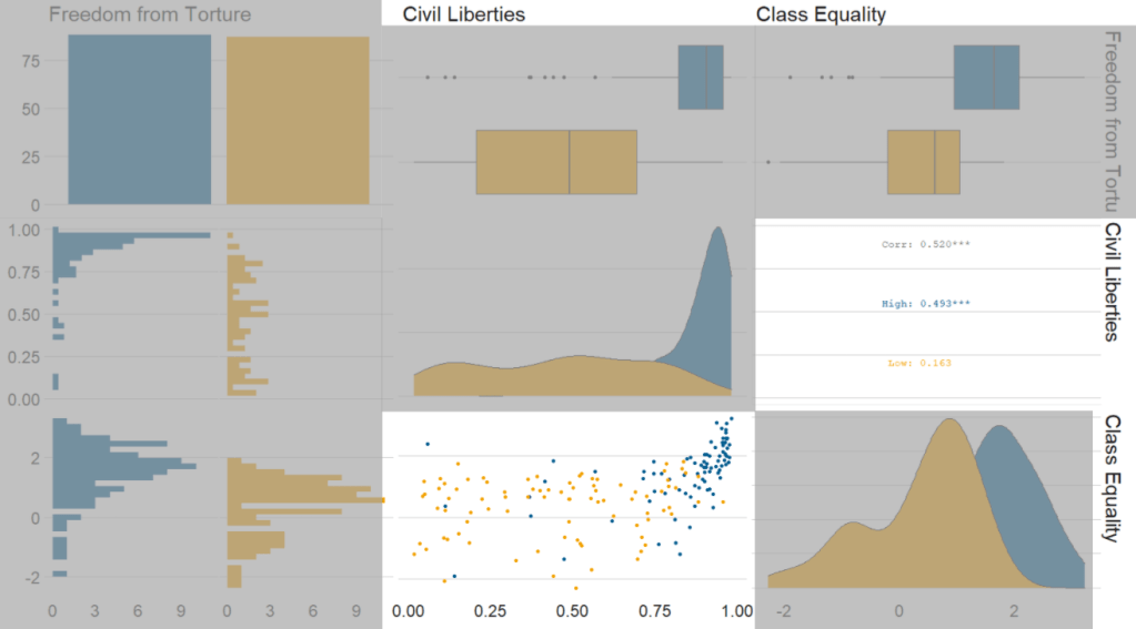
Blue means the country enjoys high freedom from torture. Yellow means the county suffers from low freedom from torture and people are more likely to be tortured by their government.

Then we feed our variables into the ggpairs() function from the GGally package.

I use the columnLabels to label the graphs with their full names and the mapping argument to choose my own color palette.

I add the bbc_style() format to the corr_matrix object because I like the font and size of this theme. And voila, we have our basic correlation matrix (Figure 1).

corr_matrix <- vdem90 %>% 
  dplyr::mutate(
    freedom_torture = ifelse(torture >= 0.65, "High", "Low"),
    freedom_torture = as.factor(freedom_t))
  dplyr::select(freedom_torture, civil_lib, class_eq) %>% 
  ggpairs(columnLabels = c('Freedom from Torture', 'Civil Liberties', 'Class Equality'), 
    mapping = ggplot2::aes(colour = freedom_torture)) +
  scale_fill_manual(values = my_palette) +
  scale_color_manual(values = my_palette)

corr_matrix + bbplot::bbc_style()
Figure 1.
Excited Season 4 GIF by Friends - Find & Share on GIPHY

First off, in Figure 2 we can see the centre plots in the diagonal are the distribution plots of each variable in the matrix

Figure 2.

In Figure 3, we can look at the box plot for the ‘civil liberties index’ score for both high (blue) and low (yellow) ‘freedom from torture’ categories.

The median civil liberties score for countries in the high ‘freedom from torture’ countries is far higher than in countries with low ‘freedom from torture’ (i.e. citizens in these countries are more likely to suffer from state torture). The spread / variance is also far great in states with more torture.

Figure 3.

In Figur 4, we can focus below the diagonal and see the scatterplot between the two continuous variables – civil liberties index score and class equality index scores.

We see that there is a positive relationship between civil liberties and class equality. It looks like a slightly U shaped, quadratic relationship but a clear relationship trend is not very clear with the countries with higher torture prevalence (yellow) showing more randomness than the countries with high freedom from torture scores (blue).

Saying that, however, there are a few errant blue points as outliers to the trend in the plot.

The correlation score is also provided between the two categorical variables and the correlation score between civil liberties and class equality scores is 0.52.

Examining at the scatterplot, if we looked only at countries with high freedom from torture, this correlation score could be higher!

Figure 4.

Excited Season 4 GIF by Friends - Find & Share on GIPHY