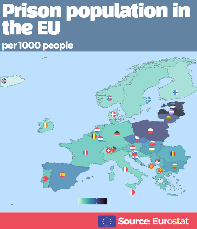
In this post, we will map prison populations as a percentage of total populations in Europe with Eurostat data.
library(eurostat)
library(tidyverse)
library(sf)
library(rnaturalearth)
library(ggthemes)
library(countrycode)
library(ggflags)
library(viridis)
library(rvest)
Click here to read Part 1 about downloading Eurostat data.
prison_pop <- get_eurostat("crim_pris_pop", type = "label")

prison_pop$iso3 <- countrycode::countrycode(prison_pop$geo, "country.name", "iso3c")

prison_pop$year <- as.numeric(format(prison_pop$time, format = "%Y"))
Next we will download map data with the rnaturalearth package. Click here to read more about using this package.
We only want to zoom in on continental EU (and not include islands and territories that EU countries have around the world) so I use the coordinates for a cropped European map from this R-Bloggers post.
map <- rnaturalearth::ne_countries(scale = "medium", returnclass = "sf")

europe_map <- sf::st_crop(map, xmin = -20, xmax = 45,
                          ymin = 30, ymax = 73)

prison_map <- merge(prison_pop, europe_map, by.x = "iso3", by.y = "adm0_a3", all.x = TRUE)
We will look at data from 2000.
prison_map %>%
  filter(year == 2000) -> map_2000
To add flags to our map, we will need ISO codes in lower case and longitude / latitude.
prison_map$iso2c <- tolower(countrycode(prison_map$geo, "country.name", "iso2c"))

coord <- read_html("https://developers.google.com/public-data/docs/canonical/countries_csv")

coord_tables <- coord %>% html_table(header = TRUE, fill = TRUE)

coord <- coord_tables[[1]]

prison_map <- merge(prison_map, coord, by.x= "iso_a2", by.y = "country", all.y = TRUE)
Nex we will plot it out!
We will focus only on European countries and we will change the variable from total prison populations to prison pop as a percentage of total population. Finally we multiply by 1000 to change the variable to per 1000 people and not have the figures come out with many demical places.
prison_map %>%
  filter(continent == "Europe") %>%
  mutate(prison_pc = (values / pop_est)*1000) %>%
  ggplot() +
  geom_sf(aes(fill = prison_pc, geometry = geometry),
          position = "identity") +
  labs(fill='Prison population')  +
  ggflags::geom_flag(aes(x = longitude,
                         y = latitude+0.5,
                         country = iso2_lower),
                     size = 9) +
  scale_fill_viridis_c(option = "mako", direction = -1) +
  ggthemes::theme_map() -> prison_map
Next we change how it looks, including changing the background of the map to a light blue colour and the legend.
prison_map +
  theme(legend.title = element_text(size = 20),
        legend.text = element_text(size = 14),
         legend.position = "bottom",
        legend.background = element_rect(fill = "lightblue",
                                         colour = "lightblue"),
        panel.background = element_rect(fill = "lightblue",
                                        colour = "lightblue"))
I will admit that I did not create the full map in ggplot. I added the final titles and block colours with canva.com because it was just easier! I always find fonts very tricky in R so it is nice to have dozens of different fonts in Canva and I can play around with colours and font sizes without needing to reload the plot each time.