
Packages we will need:
library(eurostat)
library(tidyverse)
library(maggritr)
library(ggthemes)
library(forcats)
In this blog, we will try to replicate this graph from Eurostat!
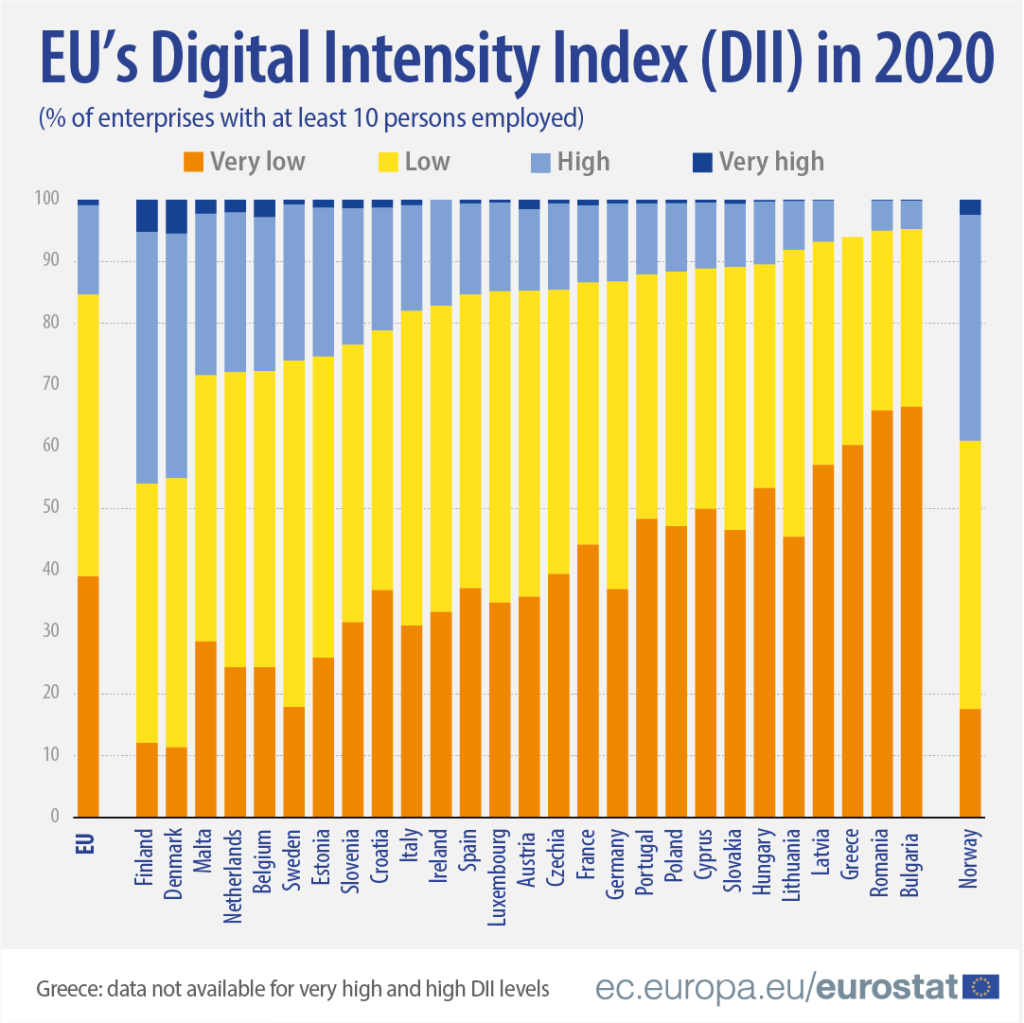
It compares all European countries on their Digitical Intensity Index scores in 2020. This measures the use of different digital technologies by enterprises.
The higher the score, the higher the digital intensity of the enterprise, ranging from very low to very high.
For more information on the index, I took the above information from this site: https://ec.europa.eu/eurostat/web/products-eurostat-news/-/ddn-20211029-1
First, we will download the digital index from Eurostat with the get_eurostat() function.
Click here to learn more about downloading data on EU from the Eurostat package.
Next some data cleaning. To copy the graph, we will aggregate the different levels into very low, low, high and very high categories with the grepl() function in some ifelse() statements.
The variable names look a bit odd with lots of blank space because I wanted to space out the legend in the graph to replicate the Eurostat graph above.
dig <- get_eurostat("isoc_e_dii", type = "label")

dig %<>%
   mutate(dii_level = ifelse(grepl("very low", indic_is), "Very low        " , ifelse(grepl("with low", indic_is), "Low        ", ifelse(grepl("with high", indic_is), "High        ", ifelse(grepl("very high", indic_is), "Very high        ", indic_is)))))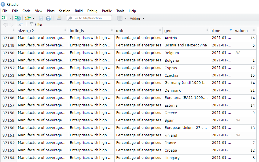
Next I fliter out the year I want and aggregate all industry groups (from the sizen_r2 variable) in each country to calculate a single DII score for each country.
dig %>%
  select(sizen_r2, geo, values, dii_level, year) %>%
  filter(year == 2020) %>%
  group_by(dii_level, geo) %>%
  summarise(total_values = sum(values, na.rm = TRUE)) %>%
  ungroup() -> my_dig
I use a hex finder website imagecolorpicker.com to find the same hex colors from the Eurostat graph and assign them to our version.
dii_pal <- c("Very low        " = "#f0aa4f",
             "Low        " = "#fee229",
             "Very high        " = "#154293",
             "High        " = "#7fa1d4")
We can make sure the factors are in the very low to very high order (rather than alphabetically) with the ordered() function
my_dig$dii_level <- ordered(my_dig$dii_level, levels = c("Very Low ", "Low ", "High ","Very high "))Next we filter out the geo rows we don’t want to add to the the graph.
Also we can change the name of Germany to remove its longer title.
my_dig %>%
  filter(geo != "Euro area (EA11-1999, EA12-2001, EA13-2007, EA15-2008, EA16-2009, EA17-2011, EA18-2014, EA19-2015)") %>%
  filter(geo != "United Kingdom") %>%
  filter(geo != "European Union - 27 countries (from 2020)") %>%
  filter(geo != "European Union - 28 countries (2013-2020)") %>%
  mutate(geo = ifelse(geo == "Germany (until 1990 former territory of the FRG)", "Germany", geo)) -> my_dig
And also, to have the same order of countries that are in the graph, we can add them as ordered factors.
my_dig$country <- factor(my_dig$geo, levels = c("Finland", "Denmark", "Malta", "Netherlands", "Belgium", "Sweden", "Estonia", "Slovenia", "Croatia", "Italy", "Ireland","Spain", "Luxembourg", "Austria", "Czechia", "France", "Germany", "Portugal", "Poland", "Cyprus", "Slovakia", "Hungary", "Lithuania", "Latvia", "Greece", "Romania", "Bulgaria", "Norway"), ordered = FALSE)Now to plot the graph:
my_dig %>%
  filter(!is.na(country)) %>%
  group_by(country, dii_level) %>%
  ggplot(aes(y = country,
             x = total_values,
             fill = forcats::fct_rev(dii_level))) +
  geom_col(position = "fill", width = 0.7) +
  scale_fill_manual(values = dii_pal) +
  ggthemes::theme_pander() +
  coord_flip() +
  labs(title = "EU's Digital Intensity Index (DII) in 2020",
       subtitle = ("(% of enterprises with at least 10 persons employed)"),
       caption = "ec.europa/eurostat") +
  xlab("") +
  ylab("") +
  theme(text = element_text(family = "Verdana", color = "#154293"),
        axis.line.x = element_line(color = "black", size = 1.5),
        axis.text.x = element_text(angle = 90, size = 20, color = "#154293", hjust = 1),
        axis.text.y = element_text(color = "#808080", size = 13, face = "bold"),
        legend.position = "top",
        legend.title = element_blank(),
        legend.text = element_text(color = "#808080", size = 20, face = "bold"),
        plot.title = element_text(size = 42, color = "#154293"),
        plot.subtitle = element_text(size = 25, color = "#154293"),
        plot.caption = element_text(size = 20, color = "#154293"),
        panel.background = element_rect(color = "#f2f2f2"))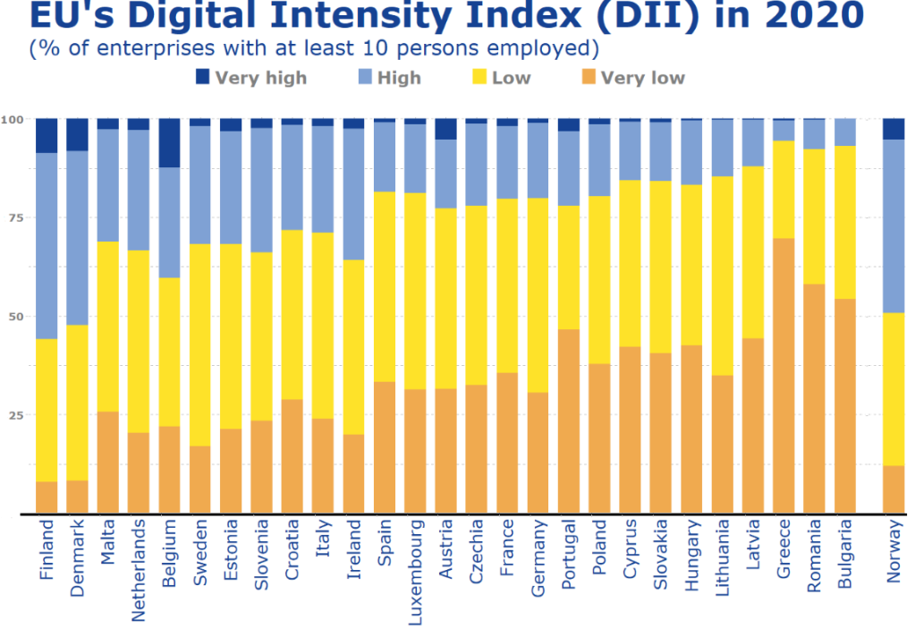
It is not identical and I had to move the black line up and the Norway model more to the right with Paint on my computer! So a bit of cheating!
Click to read Part 1, Part 2 and Part 3 of the blog series on visualising Eurostat data
For information on the index discussed in this blog post: https://ec.europa.eu/eurostat/web/products-eurostat-news/-/ddn-20211029-1
