Lollipop plots with ggplot2 in R

Packages we will need:

library(tidyverse)
library(rvest)
library(ggflags)
library(countrycode)
library(ggpubr)

We will plot out a lollipop plot to compare EU countries on their level of income inequality, measured by the Gini coefficient.

A Gini coefficient of zero expresses perfect equality, where all values are the same (e.g. where everyone has the same income). A Gini coefficient of one (or 100%) expresses maximal inequality among values (e.g. for a large number of people where only one person has all the income or consumption and all others have none, the Gini coefficient will be nearly one).

To start, we will take data on the EU from Wikipedia. With rvest package, scrape the table about the EU countries from this Wikipedia page.

Click here to read more about the rvest pacakge

With the gsub() function, we can clean up the different variables with some regex. Namely delete the footnotes / square brackets and change the variable classes.

eu_site <- read_html("https://en.wikipedia.org/wiki/Member_state_of_the_European_Union")

eu_tables <- eu_site %>% html_table(header = TRUE, fill = TRUE)

eu_members <- eu_tables[[3]]

eu_members %<>% janitor::clean_names()  %>% 
  filter(!is.na(accession))

eu_members$iso3 <- countrycode::countrycode(eu_members$geo, "country.name", "iso3c")

eu_members$accession <- as.numeric(gsub("([0-9]+).*$", "\\1",eu_members$accession))

eu_members$name_clean <- gsub("\\[.*?\\]", "", eu_members$name)

eu_members$gini_clean <- gsub("\\[.*?\\]", "", eu_members$gini)

Next some data cleaning and grouping the year member groups into different decades. This indicates what year each country joined the EU. If we see clustering of colours on any particular end of the Gini scale, this may indicate that there is a relationship between the length of time that a country was part of the EU and their domestic income inequality level. Are the founding members of the EU more equal than the new countries? Or conversely are the newer countries that joined from former Soviet countries in the 2000s more equal. We can visualise this with the following mutations:

eu_members %>%
  filter(name_clean != "Totals/Averages") %>% 
  mutate(gini_numeric = as.numeric(gini_clean)) %>% 
  mutate(accession_decades = ifelse(accession < 1960, "1957", ifelse(accession > 1960 & accession < 1990, "1960s-1980s", ifelse(accession == 1995, "1990s", ifelse(accession > 2003, "2000s", accession))))) -> eu_clean 

To create the lollipop plot, we will use the geom_segment() functions. This requires an x and xend argument as the country names (with the fct_reorder() function to make sure the countries print out in descending order) and a y and yend argument with the gini number.

All the countries in the EU have a gini score between mid 20s to mid 30s, so I will start the y axis at 20.

We can add the flag for each country when we turn the ISO2 character code to lower case and give it to the country argument.

Click here to read more about the ggflags package

eu_clean %>% 
ggplot(aes(x= name_clean, y= gini_numeric, color = accession_decades)) +
  geom_segment(aes(x = forcats::fct_reorder(name_clean, -gini_numeric), 
                   xend = name_clean, y = 20, yend = gini_numeric, color = accession_decades), size = 4, alpha = 0.8) +
  geom_point(aes(color = accession_decades), size= 10) +
  geom_flag(aes(y = 20, x = name_clean, country = tolower(iso_3166_1_alpha_2)), size = 10) +
  ggtitle("Gini Coefficients of the EU countries") -> eu_plot

Last we add various theme changes to alter the appearance of the graph

eu_plot + 
coord_flip() +
ylim(20, 40) +
  theme(panel.border = element_blank(),
        legend.title = element_blank(),
        axis.title = element_blank(),
        axis.text = element_text(color = "white"),
        text= element_text(size = 35, color = "white"),
        legend.text = element_text(size = 20),
        legend.key = element_rect(colour = "#001219", fill = "#001219"),
        legend.key.width = unit(3, 'cm'),
        legend.position = "bottom",
        panel.grid.major.y = element_line(linetype="dashed"),
        plot.background = element_rect(fill = "#001219"),
        panel.background = element_rect(fill = "#001219"),
        legend.background = element_rect(fill = "#001219") )

We can see there does not seem to be a clear pattern between the year a country joins the EU and their level of domestic income inequality, according to the Gini score.

Of course, the Gini coefficient is not a perfect measurement, so take it with a grain of salt.

Another option for the lolliplot plot comes from the ggpubr package. It does not take the familiar aesthetic arguments like you can do with ggplot2 but it is very quick and the defaults look good!

eu_clean %>% 
  ggdotchart( x = "name_clean", y = "gini_numeric",
              color = "accession_decades",
              sorting = "descending",                      
              rotate = TRUE,                                
              dot.size = 10,   
              y.text.col = TRUE,
              ggtheme = theme_pubr()) + 
  ggtitle("Gini Coefficients of the EU countries") + 
  theme(panel.border = element_blank(),
        legend.title = element_blank(),
        axis.title = element_blank(),
        axis.text = element_text(color = "white"),
        text= element_text(size = 35, color = "white"),
        legend.text = element_text(size = 20),
        legend.key = element_rect(colour = "#001219", fill = "#001219"),
        legend.key.width = unit(3, 'cm'),
        legend.position = "bottom",
        panel.grid.major.y = element_line(linetype="dashed"),
        plot.background = element_rect(fill = "#001219"),
        panel.background = element_rect(fill = "#001219"),
        legend.background = element_rect(fill = "#001219") )

Advertisement

Replicating Eurostat graphs in R

Packages we will need:

library(eurostat)
library(tidyverse)
library(maggritr)
library(ggthemes)
library(forcats)

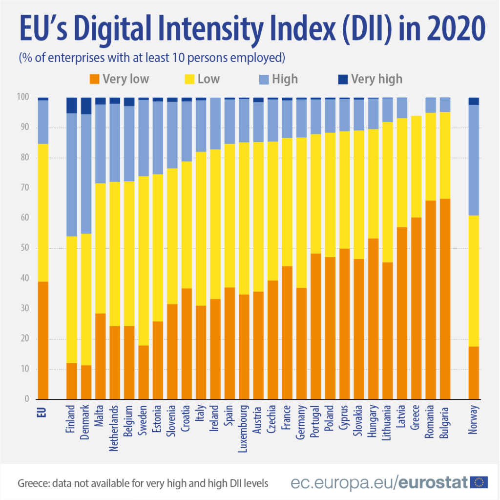
In this blog, we will try to replicate this graph from Eurostat!

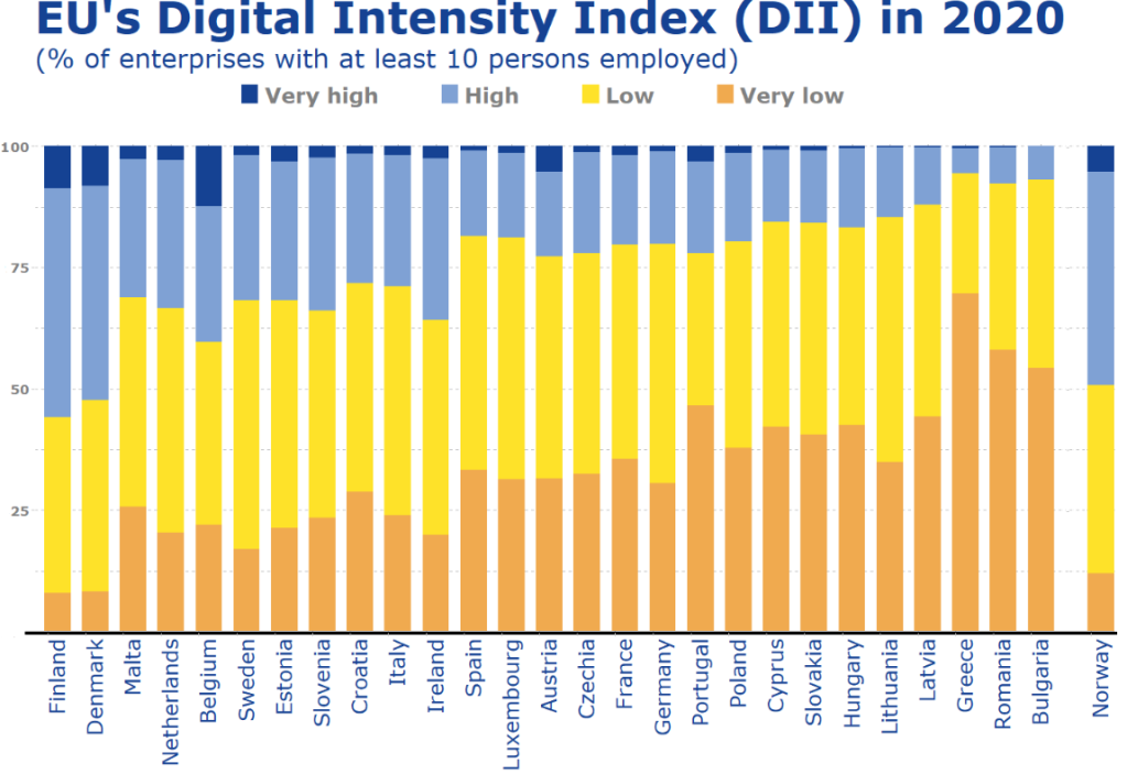
It compares all European countries on their Digitical Intensity Index scores in 2020. This measures the use of different digital technologies by enterprises.

The higher the score, the higher the digital intensity of the enterprise, ranging from very low to very high. 

For more information on the index, I took the above information from this site: https://ec.europa.eu/eurostat/web/products-eurostat-news/-/ddn-20211029-1

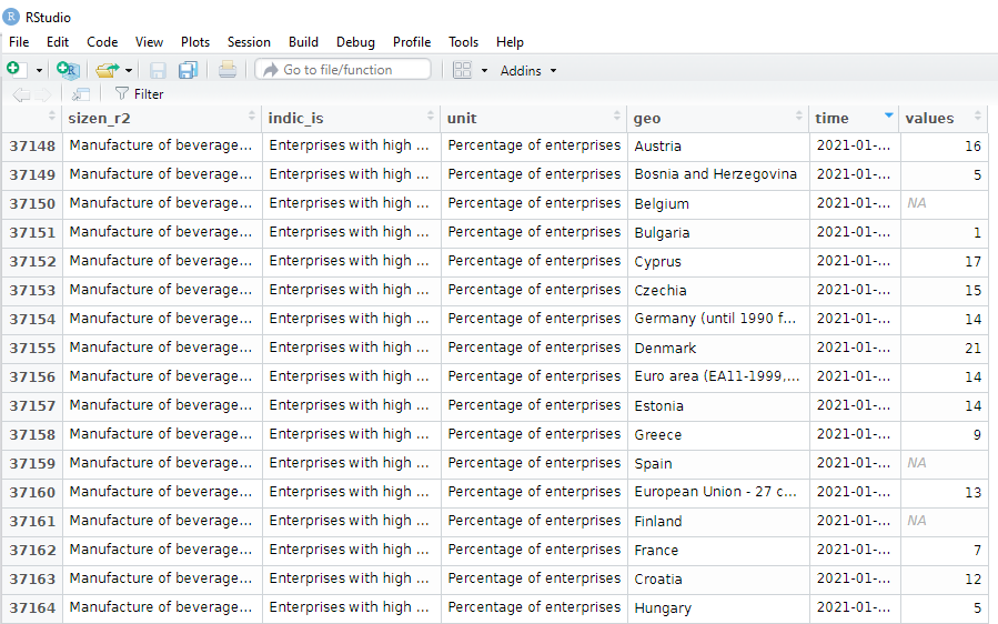
First, we will download the digital index from Eurostat with the get_eurostat() function.

Click here to learn more about downloading data on EU from the Eurostat package.

Next some data cleaning. To copy the graph, we will aggregate the different levels into very low, low, high and very high categories with the grepl() function in some ifelse() statements.

The variable names look a bit odd with lots of blank space because I wanted to space out the legend in the graph to replicate the Eurostat graph above.

dig <- get_eurostat("isoc_e_dii", type = "label")

dig %<>% 
   mutate(dii_level = ifelse(grepl("very low", indic_is), "Very low        " , ifelse(grepl("with low", indic_is), "Low        ", ifelse(grepl("with high", indic_is), "High        ", ifelse(grepl("very high", indic_is), "Very high        ", indic_is)))))

Next I fliter out the year I want and aggregate all industry groups (from the sizen_r2 variable) in each country to calculate a single DII score for each country.

dig %>% 
  select(sizen_r2, geo, values, dii_level, year) %>%  
  filter(year == 2020) %>% 
  group_by(dii_level, geo) %>% 
  summarise(total_values = sum(values, na.rm = TRUE)) %>% 
  ungroup() -> my_dig

I use a hex finder website imagecolorpicker.com to find the same hex colors from the Eurostat graph and assign them to our version.

dii_pal <- c("Very low        " = "#f0aa4f",
             "Low        " = "#fee229",
             "Very high        " = "#154293", 
             "High        " = "#7fa1d4")

We can make sure the factors are in the very low to very high order (rather than alphabetically) with the ordered() function

my_dig$dii_level <- ordered(my_dig$dii_level, levels = c("Very Low        ", "Low        ", "High        ","Very high        "))

Next we filter out the geo rows we don’t want to add to the the graph.

Also we can change the name of Germany to remove its longer title.

my_dig %>% 
  filter(geo != "Euro area (EA11-1999, EA12-2001, EA13-2007, EA15-2008, EA16-2009, EA17-2011, EA18-2014, EA19-2015)") %>% 
  filter(geo != "United Kingdom") %>% 
  filter(geo != "European Union - 27 countries (from 2020)") %>% 
  filter(geo != "European Union - 28 countries (2013-2020)") %>% 
  mutate(geo = ifelse(geo == "Germany (until 1990 former territory of the FRG)", "Germany", geo)) -> my_dig 

And also, to have the same order of countries that are in the graph, we can add them as ordered factors.

my_dig$country <- factor(my_dig$geo, levels = c("Finland", "Denmark", "Malta", "Netherlands", "Belgium", "Sweden", "Estonia", "Slovenia", "Croatia", "Italy", "Ireland","Spain", "Luxembourg", "Austria", "Czechia", "France", "Germany", "Portugal", "Poland", "Cyprus", "Slovakia", "Hungary", "Lithuania", "Latvia", "Greece", "Romania", "Bulgaria", "Norway"), ordered = FALSE)

Now to plot the graph:

my_dig %>% 
  filter(!is.na(country)) %>% 
  group_by(country, dii_level) %>% 
  ggplot(aes(y = country, 
             x = total_values,
             fill = forcats::fct_rev(dii_level))) +
  geom_col(position = "fill", width = 0.7) + 
  scale_fill_manual(values = dii_pal) + 
  ggthemes::theme_pander() +
  coord_flip() +
  labs(title = "EU's Digital Intensity Index (DII) in 2020",
       subtitle = ("(% of enterprises with at least 10 persons employed)"),
       caption = "ec.europa/eurostat") +
  xlab("") + 
  ylab("") + 
  theme(text = element_text(family = "Verdana", color = "#154293"),
        axis.line.x = element_line(color = "black", size = 1.5),
        axis.text.x = element_text(angle = 90, size = 20, color = "#154293", hjust = 1),
        axis.text.y = element_text(color = "#808080", size = 13, face = "bold"),
        legend.position = "top", 
        legend.title = element_blank(),
        legend.text = element_text(color = "#808080", size = 20, face = "bold"),
        plot.title = element_text(size = 42, color = "#154293"),
        plot.subtitle = element_text(size = 25, color = "#154293"),
        plot.caption = element_text(size = 20, color = "#154293"),
        panel.background = element_rect(color = "#f2f2f2"))

It is not identical and I had to move the black line up and the Norway model more to the right with Paint on my computer! So a bit of cheating!

Click to read Part 1, Part 2 and Part 3 of the blog series on visualising Eurostat data

For information on the index discussed in this blog post: https://ec.europa.eu/eurostat/web/products-eurostat-news/-/ddn-20211029-1

Bump charts for ranking with ggbump package in R

library(eurostat)
library(tidyverse)
library(magrittr)
library(ggthemes)
library(ggpbump)
library(ggflags)
library(countrycode)

Click here for Part 1 and here for Part 2 of the series on Eurostat data – explains how to download and visualise the Eurostat data

In this blog, we will look at government expenditure of the European Union!

Part 1 will go into detail about downloading Eurostat data with their package.

govt <- get_eurostat("gov_10a_main", fix_duplicated = TRUE)

Some quick data cleaning and then we can look at the variables in the dataset.

govt$year <- as.numeric(format(govt$time, format = "%Y"))
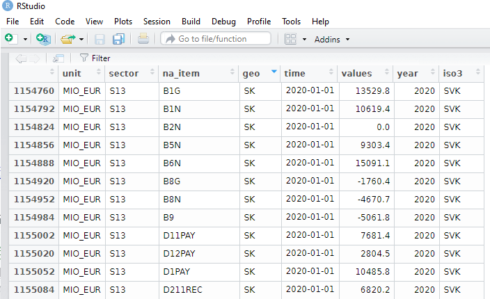
View(govt)

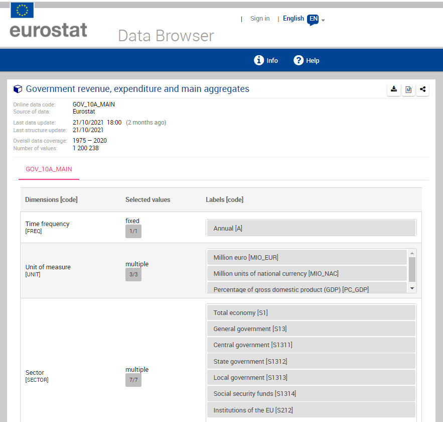
The numbers and letters are a bit incomprehensible. We can go to the Eurostat data browser site. It ascts as a codebook for all the variables we downloaded:

https://ec.europa.eu/eurostat/databrowser/product/page/GOV_10A_MAIN

I want to take the EU accession data from Wikipedia. Check out the Part 1 blog post to scrape the data.

govt$iso3 <- countrycode(govt$geo, "iso2c", "iso3c")

govt_df <- merge(govt, eu_members, by.x = "iso3", by.y = "iso_3166_1_alpha_3", all.x = TRUE)

We will look at general government spending of the countries from the 2004 accession.

Also we will choose data is government expenditure as a percentage of GDP.

govt_df %<>%
  filter(sector == "S13") %>%      # General government spending
  filter(accession == 2004) %>%    # For countries that joined 2004
  filter(unit == "PC_GDP") %>%     # Spending as percentage of GDP
  filter(na_item == "TE")          # Total expenditure

A little more data cleaning! To use the ggflags package, the ISO 2 character code needs to be in lower case.

Also we will use some regex to remove the strings in the square brackets from the dataset.

govt_df$iso2_lower <- tolower(govt_df$iso_3166_1_alpha_2)

govt_df$name_clean <- gsub("\\[.*?\\]", "", govt_df$name)

To put the flags at the start of the graph and names of the countries at the end of the lines, create mini dataframes with only information for the last year and first year:

last_time <- govt_df %>%
  group_by(geo) %>% 
  slice(which.max(year)) %>% 
  ungroup()

first_time <- govt_df %>%
  group_by(geo) %>% 
  slice(which.min(year)) %>% 
  ungroup()

I choose some nice hex colours from the coolors website. They need # in the strings to be acknowledged as hex colours by ggplot

add_hashtag <- function(my_vec){
  hash_vec <-  paste0('#', my_vec)
  return(hash_vec)
}

pal <- c("0affc2","ffb8d1","05e6dc","00ccf5","ff7700",
         "fa3c3b","f50076","b766b4","fd9c1e","ffcf00")

pal_hash <- add_hashtag(pal)

Now we can plot:

govt_df %>% 
  filter(geo != "CY" | geo != "MT") %>% 
  filter( year < 2020) %>% 
  ggplot(aes(x = year,
             y = values, group = name)) + 
  geom_text_repel(data = last_time, aes(label = name_clean, 
                                        color = name), 
                  size = 6, hjust = -3) +
  geom_point(aes(color = name)) + 
  geom_line(aes(color = name), size = 3, alpha = 0.8) +
  ggflags::geom_flag(data = first_time,
                     aes(x = year,
                         y = values,
                         country = iso2_lower),
                     size = 8) +
   scale_color_manual(values = pal_hash) +
  xlim(1994, 2021) + 
   ggthemes::theme_fivethirtyeight() +
  theme(panel.background = element_rect(fill = "#284b63"),
        legend.position = "none",
        axis.text.x = element_text(size = 20),
        axis.text.y = element_text(size = 20),
        
        panel.grid.major.y = element_line(color = "#495057",
                                          size = 0.5,
                                          linetype = 2),
        panel.grid.minor.y = element_line(color = "#495057",
                                          size = 0.5,
                                          linetype = 2)) +
  guides(colour = guide_legend(override.aes = list(size=10)))

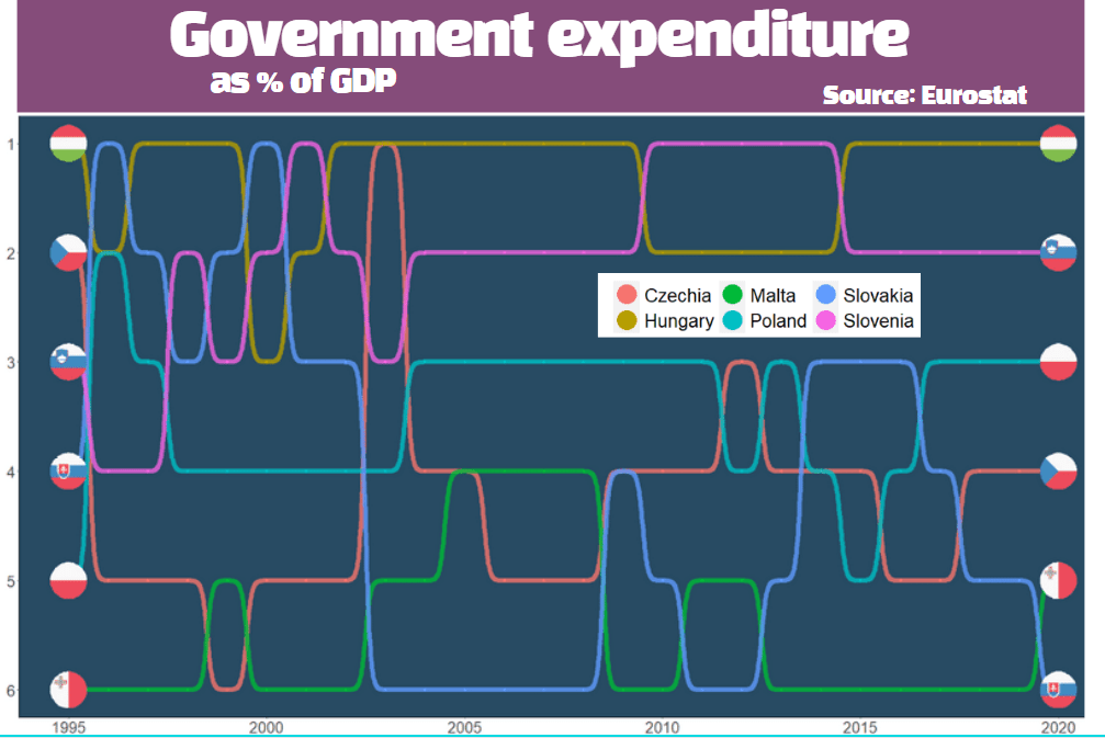
Sometimes a simple line graph doesn’t easily show us the ranking of the countries over time.

The last graph was a bit cluttered, so we can choose the top average highest government expenditures to compare

govt_rank %>% 
  distinct(geo, mean_rank) %>% 
  top_n(6, mean_rank) %>%
  pull(geo) -> top_rank

We can look at a bump chart that ranks the different positions over time

govt_df %>% 
  filter(geo %in%  top_rank) %>% 
  group_by(year) %>%
  mutate(rank_budget = rank(-values, ties.method = "min")) %>%
  ungroup() %>% 
  group_by(geo) %>% 
  mutate(mean_rank = mean(values)) %>% 
  ungroup()  %>% 
  select(geo, iso2_lower, year, fifth_year, rank_budget, mean_rank) -> govt_rank

We recreate the last and first dataframes for the flags with the new govt_rank dataset.

last_time <- govt_rank %>%
  filter(geo %in% top_rank ) %>% 
  group_by(geo) %>% 
  slice(which.max(year)) %>% 
  ungroup()

first_time <- govt_rank %>%
  filter(geo %in% top_rank ) %>% 
  group_by(geo) %>% 
  slice(which.min(year)) %>% 
  ungroup()

All left to do is code the bump plot to compare the ranking of highest government expenditure as a percentage of GDP

govt_rank %>% 
  ggplot(aes(x = year, y = rank_budget, 
             group = country,
             color = country, fill = country)) +
  geom_point() +
  geom_bump(aes(), 
            size = 3, alpha = 0.8,
            lineend = "round") + 
  geom_flag(data = last_time %>%
              filter(year == max(year)),
            aes(country = iso2_lower ),
            size = 20,
            color = "black") +
  geom_flag(data = first_time %>%
              filter(year == max(year)),
            aes(country = iso2_lower),
            size = 20,
            color = "black") -> govt_bump

Last we change the theme aesthetics of the bump plot

govt_bump + theme(panel.background = element_rect(fill = "#284b63"),
      legend.position = "bottom",
      axis.text.x = element_text(size = 20),
      axis.text.y = element_text(size = 20),
      axis.line = element_line(color='black'),
      axis.title.x = element_blank(), 
      axis.title.y = element_blank(), 
      legend.title = element_blank(),
      legend.text = element_text(size = 20),
      panel.grid.major = element_blank(),
      panel.grid.minor = element_blank()) + 
  guides(colour = guide_legend(override.aes = list(size=10))) + 
  scale_y_reverse(breaks = 1:100)

I added the title and moved the legend with canva.com, rather than attempt it with ggplots! I feel bad for cheating a bit.

Visualize EU data with Eurostat package in R: Part 2 (with maps)

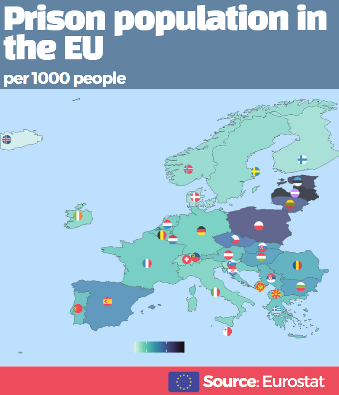
In this post, we will map prison populations as a percentage of total populations in Europe with Eurostat data.

library(eurostat)
library(tidyverse)
library(sf)
library(rnaturalearth)
library(ggthemes)
library(countrycode)
library(ggflags)
library(viridis)
library(rvest)

Click here to read Part 1 about downloading Eurostat data.


prison_pop <- get_eurostat("crim_pris_pop", type = "label")

prison_pop$iso3 <- countrycode::countrycode(prison_pop$geo, "country.name", "iso3c")

prison_pop$year <- as.numeric(format(prison_pop$time, format = "%Y"))

Next we will download map data with the rnaturalearth package. Click here to read more about using this package.

We only want to zoom in on continental EU (and not include islands and territories that EU countries have around the world) so I use the coordinates for a cropped European map from this R-Bloggers post.

map <- rnaturalearth::ne_countries(scale = "medium", returnclass = "sf")

europe_map <- sf::st_crop(map, xmin = -20, xmax = 45,
                          ymin = 30, ymax = 73)

prison_map <- merge(prison_pop, europe_map, by.x = "iso3", by.y = "adm0_a3", all.x = TRUE)

We will look at data from 2000.

prison_map %>% 
  filter(year == 2000) -> map_2000

To add flags to our map, we will need ISO codes in lower case and longitude / latitude.

prison_map$iso2c <- tolower(countrycode(prison_map$geo, "country.name", "iso2c"))

coord <- read_html("https://developers.google.com/public-data/docs/canonical/countries_csv")

coord_tables <- coord %>% html_table(header = TRUE, fill = TRUE)

coord <- coord_tables[[1]]

prison_map <- merge(prison_map, coord, by.x= "iso_a2", by.y = "country", all.y = TRUE)

Nex we will plot it out!

We will focus only on European countries and we will change the variable from total prison populations to prison pop as a percentage of total population. Finally we multiply by 1000 to change the variable to per 1000 people and not have the figures come out with many demical places.

prison_map %>% 
  filter(continent == "Europe") %>% 
  mutate(prison_pc = (values / pop_est)*1000) %>% 
  ggplot() +
  geom_sf(aes(fill = prison_pc, geometry = geometry), 
          position = "identity") + 
  labs(fill='Prison population')  +
  ggflags::geom_flag(aes(x = longitude, 
                         y = latitude+0.5, 
                         country = iso2_lower), 
                     size = 9) +  
  scale_fill_viridis_c(option = "mako", direction = -1) +
  ggthemes::theme_map() -> prison_map

Next we change how it looks, including changing the background of the map to a light blue colour and the legend.

prison_map + 
  theme(legend.title = element_text(size = 20),
        legend.text = element_text(size = 14), 
         legend.position = "bottom",
        legend.background = element_rect(fill = "lightblue",
                                         colour = "lightblue"),
        panel.background = element_rect(fill = "lightblue",
                                        colour = "lightblue"))

I will admit that I did not create the full map in ggplot. I added the final titles and block colours with canva.com because it was just easier! I always find fonts very tricky in R so it is nice to have dozens of different fonts in Canva and I can play around with colours and font sizes without needing to reload the plot each time.

How to download EU data with Eurostat package in R: Part 1 (with pyramid graphs)

library(eurostat)
library(tidyverse)
library(janitor)
library(ggcharts)
library(ggflags)
library(rvest)
library(countrycode)
library(magrittr)

Eurostat is the statistical office of the EU. It publishes statistics and indicators that enable comparisons between countries and regions.

With the eurostat package, we can visualise some data from the EU and compare countries. In this blog, we will create a pyramid graph and a Statista-style bar chart.

First, we use the get_eurostat_toc() function to see what data we can download. We only want to look at datasets.

available_data <- get_eurostat_toc()

available_datasets <- available_data %>% 
  filter(type == "dataset")

A simple dataset that we can download looks at populations. We can browse through the available datasets and choose the code id. We feed this into the get_eurostat() dataset.

demo <- get_eurostat(id = "demo_pjan", 
                     type = "label")

View(demo)

Some quick data cleaning. First changing the date to a numeric variable. Next, extracting the number from the age variable to create a numeric variable.

demo$year <- as.numeric(format(demo$time, format = "%Y"))

demo$age_number <- as.numeric(gsub("([0-9]+).*$", "\\1", demo$age))

Next we filter out the data we don’t need. For this graph, we only want the total columns and two years to compare.


demo %>%
  filter(age != "Total") %>%
  filter(age != "Unknown") %>% 
  filter(sex == "Total") %>% 
  filter(year == 1960 | year == 2019 ) %>% 
  select(geo, iso3, values, age_number) -> demo_two_years

I want to compare the populations of the founding EU countries (in 1957) and those that joined in 2004. I’ll take the data from Wikipedia, using the rvest package. Click here to learn how to scrape data from the Internet.

eu_site <- read_html("https://en.wikipedia.org/wiki/Member_state_of_the_European_Union")

eu_tables <- eu_site %>% html_table(header = TRUE, fill = TRUE)

eu_members <- eu_tables[[3]]

eu_members %<>% janitor::clean_names()  %>% 
filter(!is.na(accession))

Some quick data cleaning to get rid of the square bracket footnotes from the Wikipedia table data.

eu_members$accession <- as.numeric(gsub("([0-9]+).*$", "\\1",eu_members$accession))

eu_members$name_clean <- gsub("\\[.*?\\]", "", eu_members$name)

We merge the two datasets, on the same variable. In this case, I will use the ISO3C country codes (from the countrycode package). Using the names of each country is always tricky (I’m looking at you, Czechia / Czech Republic).

demo_two_years$iso3 <- countrycode::countrycode(demo_two_years$geo, "country.name, "iso3c")

my_pyramid <- merge(demo_two_years, eu_members, by.x = "iso3", by.y = "iso_3166_1_alpha_3", all.x = TRUE)

We will use the pyramid_chart() function from the ggcharts package. Click to read more about this function.

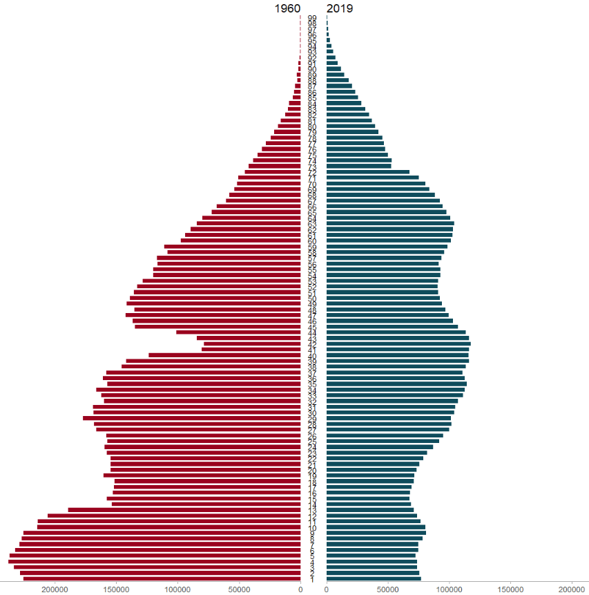
The function takes the age group (we go from 1 to 99 years of age), the number of people in that age group and we add year to compare the ages in 1960 versus in 2019.

The first graph looks at the countries that founded the EU in 1957.

my_pyramid %>%  
  filter(!is.na(age_number)) %>%  
  filter(accession == 1957 ) %>% 
  arrange(age_number) %>% 
  group_by(year, age_number) %>% 
  summarise(mean_age = mean(values, na.rm = TRUE)) %>% 
  ungroup() %>% 
  pyramid_chart(age_number, mean_age, year,
                bar_colors = c("#9a031e", "#0f4c5c")) 
Source: Eurostat

The second graph is the same, but only looks at the those which joined in 2004.

my_pyramid %>%  
  filter(!is.na(age_number)) %>%  
  filter(accession == 2004 ) %>% 
  arrange(age_number) %>% 
  group_by(year, age_number) %>% 
  summarise(mean_age = mean(values, na.rm = TRUE)) %>% 
  ungroup() %>% 
  pyramid_chart(age_number, mean_age, year,
                bar_colors = c("#9a031e", "#0f4c5c")) 

Next we will use the Eurostat data on languages in the EU and compare countries in a bar chart.

I want to try and make this graph approximate the style of Statista graphs. It is far from identical but I like the clean layout that the Statista website uses.

Similar to above, we add the code to the get_eurostat() function and claen the data like above.

lang <- get_eurostat(id = "edat_aes_l22", 
                     type = "label")

lang$year <- as.numeric(format(lang$time, format = "%Y"))

lang$iso2 <- tolower(countrycode(lang$geo, "country.name", "iso2c"))

lang %>% 
  mutate(geo = ifelse(geo == "Germany (until 1990 former territory of the FRG)", "Germany", 
                      ifelse(geo == "European Union - 28 countries (2013-2020)", "EU", geo))) %>% 
  filter(n_lang == "3 languages or more") %>% 
  filter(year == 2016) %>% 
  filter(age == "From 25 to 34 years") %>% 
  filter(!is.na(iso2)) %>% 
  group_by(geo, year) %>% 
  mutate(mean_age = mean(values, na.rm = TRUE)) %>% 
  arrange(mean_age) -> lang_clean

Next we will create bar chart with the stat = "identity" argument.

We need to make sure our ISO2 country code variable is in lower case so that we can add flags to our graph with the ggflags package. Click here to read more about this package

lang_clean %>%
  ggplot(aes(x = reorder(geo, mean_age), y = mean_age)) + 
  geom_bar(stat = "identity", width = 0.7, color = "#0a85e5", fill = "#0a85e5") + 
  ggflags::geom_flag(aes(x = geo, y = -1, country = iso2), size = 8) +
  geom_text(aes(label= values), position = position_dodge(width = 0.9), hjust = -0.5, size = 5, color = "#000500") + 
  labs(title = "Percentage of people that speak 3 or more languages",
       subtitle = ("(% of overall population)"),
       caption = "         Source: Eurostat ") +
  xlab("") + 
  ylab("") -> lang_plot 
  

To try approximate the Statista graphs, we add many arguments to the theme() function for the ggplot graph!

lang_plot + coord_flip() + 
  expand_limits(y = 65) + 
  ggthemes::theme_pander() + 
  theme(plot.background = element_rect(color = "#f5f9fc"),
        panel.grid = element_line(colour = "#f5f9fc"),
        # axis.title.x = element_blank(),
        axis.text.x = element_blank(),
        axis.text.y = element_text(color = "#000500", size = 16),
        # axis.title.y = element_blank(),
        axis.ticks.x = element_blank(),
        text = element_text(family = "Gadugi"),
        plot.title = element_text(size = 28, color = "#000500"),
        plot.subtitle = element_text(size = 20, color = "#484e4c"),
        plot.caption = element_text(size = 20, color = "#484e4c") )

Next, click here to read Part 2 about visualizing Eurostat data with maps