Check out part 1 of this blog where you can follow along how to scrape the data that we will use in this blog. It will create a dataset of the current MPs in the Irish Dail.
In this blog, we will use the ggparliament package, created by Zoe Meers.
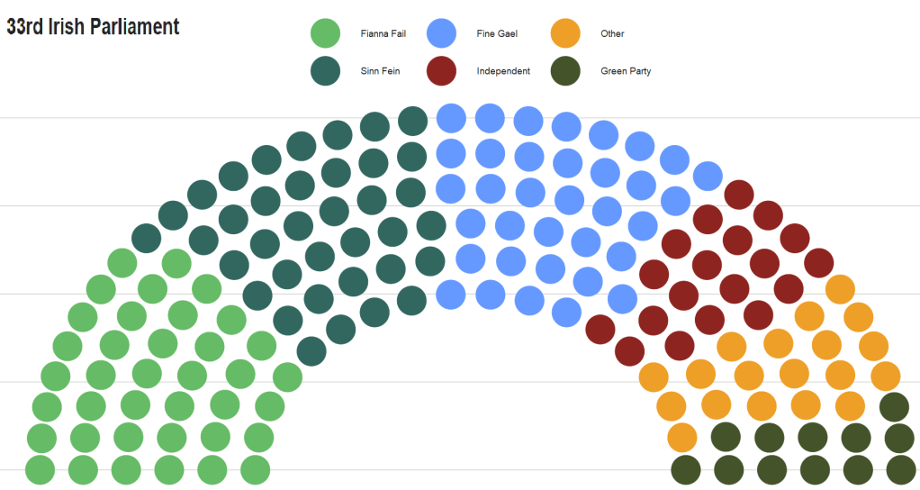
With this dataset of the 33rd Dail, we will reduce it down to get the number of seats that each party holds.
If we don’t want to graph every party, we can lump most of the smaller parties into an “other” category. We can do this with the fct_lump_n() function from the forcats package. I want the top five biggest parties only in the graph. The rest will be colored as “Other”.
  <fct>        <int>
1 Fianna Fail     38
2 Sinn Fein       37
3 Fine Gael       35
4 Independent     19
5 Other           19
6 Green Party     12
Before we graph, I found the hex colors that represent each of the biggest Irish political party. We can create a new party color variables with the case_when() function and add each color.
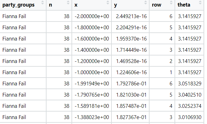
If we view the dail_33_coord data.frame we can see that the parliament_data() function calculated new x and y coordinate variables for the semi-circle graph.
I don’t know what the theta variables is for… But there it is also … maybe to make circular shapes?
We feed the x and y coordinates into the ggplot() function and then add the geom_parliament_seat() layer to produce our graph!
Click here to check out the PDF for the ggparliament package
dail_33_coord %>%
  ggplot(aes(x = x,
             y = y,
             colour = party_groups)) +
  geom_parliament_seats(size = 20) -> dail_33_plot
And we can make it look more pretty with bbc_style() plot and colors.
This blogpost will walk through how to scrape and clean up data for all the members of parliament in Ireland.
Or we call them in Irish, TDs (or Teachtaí Dála) of the Dáil.
We will start by scraping the Wikipedia pages with all the tables. These tables have information about the name, party and constituency of each TD.
On Wikipedia, these datasets are on different webpages.
This is a pain.
However, we can get around this by creating a list of strings for each number in ordinal form – from1st to 33rd. (because there have been 33 Dáil sessions as of January 2023)
We don’t need to write them all out manually: “1st”, “2nd”, “3rd” … etc.
Instead, we can do this with the toOrdinal() function from the package of the same name.
dail_sessions <- sapply(1:33,toOrdinal)
Next we can feed this vector of strings with the beginning of the HTML web address for Wikipedia as a string.
We paste the HTML string and the ordinal number strings together with the stri_paste() function from the stringi package.
This iterates over the length of the dail_sessions vector (in this case a length of 33) and creates a vector of each Wikipedia page URL.
With the first_name variable, we can use the new pacakge by Kalimu. This guesses the gender of the name. Later, we can track the number of women have been voted into the Dail over the years.
Of course, this will not be CLOSE to 100% correct … so later we will have to check each person manually and make sure they are accurate.
In the next blog, we will graph out the various images to explore these data in more depth. For example, we can make a circle plot with the composition of the current Dail with the ggparliament package.
We can go into more depth with it in the next blog… Stay tuned.
For this blog post, we will look at UN peacekeeping missions and compare across regions.
Despite the criticisms about some operations, the empirical record for UN peacekeeping records has been robust in the academic literature
“In short, peacekeeping intervenes in the most difficult cases, dramatically increases the chances that peace will last, and does so by altering the incentives of the peacekept, by alleviating their fear and mistrust of each other, by preventing and controlling accidents and misbehavior by hard-line factions, and by encouraging political inclusion” (Goldstone, 2008: 178).
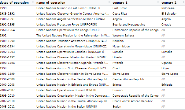
The data on the current and previous PKOs (peacekeeping operations) will come from the Wikipedia page. But the variables do not really lend themselves to analysis as they are.
Once we have the url, we scrape all the tables on the Wikipedia page in a few lines
We then bind the completed and current mission data.frames
rbind(pko_complete, pko_current) -> pko
Then we clean the variable names with the function from the janitor package.
pko_df <-  pko %>%
  janitor::clean_names()
Next we’ll want to create some new variables.
We can make a new row for each country that is receiving a peacekeeping mission. We can paste all the countries together and then use the separate function from the tidyr package to create new variables.
pko_countries %>%
  ggplot(mapping = aes(x = decade,
                       y = duration,
                       fill = decade)) +
  geom_boxplot(alpha = 0.4) +
  geom_jitter(aes(color = decade),
              size = 6, alpha = 0.8, width = 0.15) +
   coord_flip() +
  geom_curve(aes(x = "1950s", y = 60, xend = "1940s", yend = 72),
  arrow = arrow(length = unit(0.1, "inch")), size = 0.8, color = "black",
   curvature = -0.4) +
  annotate("text", label = "First Mission to Kashmir",
           x = "1950s", y = 49, size = 8, color = "black") +
  geom_curve(aes(x = "1990s", y = 46, xend = "1990s", yend = 32),
             arrow = arrow(length = unit(0.1, "inch")), size = 0.8, color = "black",curvature = 0.3) +
  annotate("text", label = "Most Missions after the Cold War",
           x = "1990s", y = 60, size = 8, color = "black") +

  bbplot::bbc_style() + ggtitle("Duration of Peacekeeping Missions")
Years
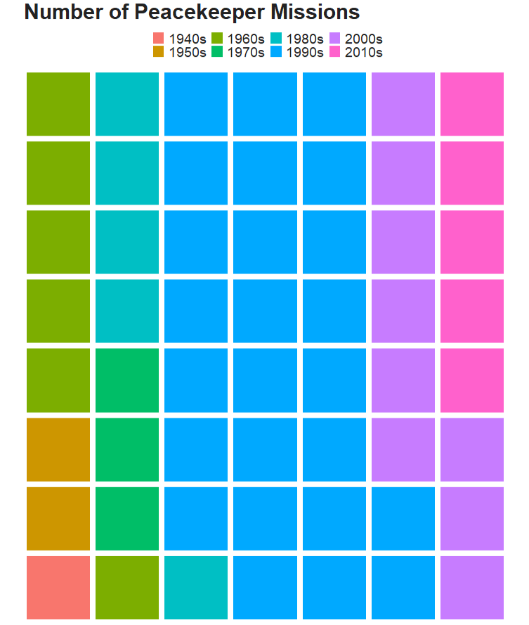
Following the end of the Cold War, there were renewed calls for the UN to become the agency for achieving world peace, and the agency’s peacekeeping dramatically increased, authorizing more missions between 1991 and 1994 than in the previous 45 years combined.
We can use a waffle plot to see which decade had the most operation missions. Waffle plots are often seen as more clear than pie charts.
To get the data ready for a waffle chart, we just need to count the number of peacekeeping missions (i.e. the number of rows) in each decade. Then we fill the groups (i.e. decade) and enter the n variable we created as the value.
For this blog, we are going to look at the titles of all countries’ heads of state, such as Kings, Presidents, Emirs, Chairman … understandably, there are many many many ways to title the leader of a country.
First, we will download the PACL dataset from the democracyData package.
Click here to read more about this super handy package:
We are going to look at the npost variable; this captures the political title of the nominal head of stage. This can be King, President, Sultan et cetera!
pacl %>%
  count(npost) %>%
  arrange(desc(n))
If we count the occurence of each title, we can see there are many ways to be called the head of a country!
"president"                         3693
"prime minister"                    2914
"king"                               470
"Chairman of Council of Ministers"   229
"premier"                            169
"chancellor"                         123
"emir"                               117
"chair of Council of Ministers"      111
"head of state"                       90
"sultan"                              67
"chief of government"                 63
"president of the confederation"      63
""                                    44
"chairman of Council of Ministers"    44
"shah"                                33

# ... with 145 more rows
155 groups is a bit difficult to meaningfully compare.
So we can collapse some of the groups together and lump all the titles that occur relatively seldomly – sometimes only once or twice – into an “other” category.
First, we use grepl() function to take the word president and chair (chairman, chairwoman, chairperson et cetera) and add them into broader categories.
Also, we use the tolower() function to make all lower case words and there is no confusion over the random capitalisation.
Now, instead of 155 types of leader titles, we have 10 types and the rest are all bundled into the Other Leader Type category
President            4370
Prime Minister       2945
Chairperson           520
King                  470
Other Leader Type     225
Premier               169
Chancellor            123
Emir                  117
Head Of State          90
Sultan                 67
Chief Of Government    63
The forcast package has three other ways to lump the variables together.
First, we can quickly look at fct_lump_min().
We can set the min argument to 100 and look at how it condenses the groups together:
President       4370
Prime Minister  2945
Chairperson      520
King             470
Other Type       445
Premier          169
Chancellor       123
Emir             117
We can see that if the post appears fewer than 100 times, it is now in the Other Type category. In the previous example, Head Of State only appeared 90 times so it didn’t make it.
Next we look at fct_lump_lowfreq().
This function lumps together the least frequent levels. This one makes sure that “other” category remains as the smallest group. We don’t add another numeric argument.
President       4370
Prime Minister  2945
Other Type      1844
This one only has three categories and all but president and prime minister are chucked into the Other type category.
Last, we can look at the fct_lump_n() to make sure we have a certain number of groups. We add n = 5 and we create five groups and the rest go to the Other type category.
President       4370
Prime Minister  2945
Other Type       685
Chairperson      520
King             470
Premier          169
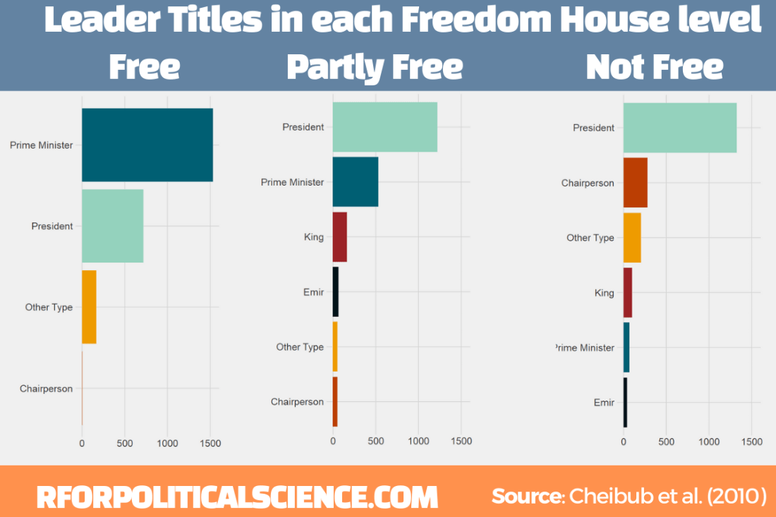
Next we can make a simple graph counting the different leader titles in free, partly free and not free Freedom House countries. We will use the download_fh() from DemocracyData package again
fh <- download_fh()
We will use the reorder_within() function from tidytext package.
Click here to read the full blog post explaining the function from Julia Silge’s blog.
First we add Freedom House data with the inner_join() function
Then we use the fct_lump_n() and choose the top five categories (plus the Other Type category we make)
Using reorder_within(), we order the titles from most to fewest occurences WITHIN each status group:
pacl %<>%
  mutate(npost = reorder_within(npost, n, status))
To plot the columns, we use geom_col() and separate them into each Freedom House group, using facet_wrap(). We add scales = "free y" so that we don’t add every title to each group. Without this we would have empty spaces in the Free group for Emir and King. So this step removes a lot of clutter.
Last, I manually added the colors to each group (which now have longer names to reorder them) so that they are consistent across each group. I am sure there is an easier and less messy way to do this but sometimes finding the easier way takes more effort!
We add the scale_x_reordered() function to clean up the names and remove everything from the underscore in the title label.