Packages we will need:
library(tidyverse)
library(rvest)
library(magrittr)
library(tidyr)
library(countrycode)
library(democracyData)
library(janitor)
library(waffle)
For this blog post, we will look at UN peacekeeping missions and compare across regions.
Despite the criticisms about some operations, the empirical record for UN peacekeeping records has been robust in the academic literature
“In short, peacekeeping intervenes in the most difficult
cases, dramatically increases the chances that peace will
last, and does so by altering the incentives of the peacekept,
by alleviating their fear and mistrust of each other, by
preventing and controlling accidents and misbehavior by
hard-line factions, and by encouraging political inclusion”
(Goldstone, 2008: 178).
The data on the current and previous PKOs (peacekeeping operations) will come from the Wikipedia page. But the variables do not really lend themselves to analysis as they are.


Once we have the url, we scrape all the tables on the Wikipedia page in a few lines
pko_members <- read_html("https://en.wikipedia.org/wiki/List_of_United_Nations_peacekeeping_missions")
pko_tables <- pko_members %>% html_table(header = TRUE, fill = TRUE)
Click here to read more about the rvest package for scraping data from websites.
pko_complete_africa <- pko_tables[[1]]
pko_complete_americas <- pko_tables[[2]]
pko_complete_asia <- pko_tables[[3]]
pko_complete_europe <- pko_tables[[4]]
pko_complete_mena <- pko_tables[[5]]
And then we bind them together! It’s very handy that they all have the same variable names in each table.
rbind(pko_complete_africa, pko_complete_americas, pko_complete_asia, pko_complete_europe, pko_complete_mena) -> pko_completeNext, we will add a variable to indicate that all the tables of these missions are completed.
pko_complete %<>%
  mutate(complete = ifelse(!is.na(pko_complete$Location), "Complete", "Current"))
We do the same with the current missions that are ongoing:
pko_current_africa <- pko_tables[[6]]
pko_current_asia <- pko_tables[[7]]
pko_current_europe <- pko_tables[[8]]
pko_current_mena <- pko_tables[[9]]

rbind(pko_current_europe, pko_current_mena, pko_current_asia, pko_current_africa) -> pko_current

pko_current %<>%
  mutate(complete = ifelse(!is.na(pko_current$Location), "Current", "Complete"))
We then bind the completed and current mission data.frames
rbind(pko_complete, pko_current) -> pko
Then we clean the variable names with the function from the janitor package.
pko_df <-  pko %>%
  janitor::clean_names()
Next we’ll want to create some new variables.
We can make a new row for each country that is receiving a peacekeeping mission. We can paste all the countries together and then use the separate function from the tidyr package to create new variables.
 pko_df %>%
  group_by(conflict) %>%
  mutate(location = paste(location, collapse = ', ')) %>%
  separate(location,  into = c("country_1", "country_2", "country_3", "country_4", "country_5"), sep = ", ")  %>%
  ungroup() %>%
distinct(conflict, .keep_all = TRUE) %>% 
Next we can create a new variable that only keeps the acroynm for the operation name. I took these regex codes from the following stack overflow link
pko_df %<>%
  mutate(acronym = str_extract_all(name_of_operation, "\\([^()]+\\)")) %>%
  mutate(acronym = substring(acronym, 2, nchar(acronym)-1)) %>%
  separate(dates_of_operation, c("start_date", "end_date"), "–")
I will fill in the end data for the current missions that are still ongoing in 2022
pko_df %<>%
  mutate(end_date = ifelse(complete == "Current", 2022, end_date))
And next we can calculate the duration for each operation
pko_df %<>%
  mutate(end_date = as.integer(end_date)) %>%
  mutate(start_date = as.integer(start_date)) %>%
  mutate(duration = ifelse(!is.na(end_date), end_date - start_date, 1))
I want to compare regions and graph out the different operations around the world.
We can download region data with democracyData package (best package ever!)

pacl <- redownload_pacl()

pacl %>%
  select(cown = pacl_cowcode,
        un_region_name, un_continent_name) %>%
  distinct(cown, .keep_all = TRUE) -> pacl_region
We join the datasets together with the inner_join() and add Correlates of War country codes.
pko_df %<>%
  mutate(cown = countrycode(country_1, "country.name", "cown")) %>%   mutate(cown = ifelse(country_1 == "Western Sahara", 605,
                       ifelse(country_1 == "Serbia", 345, cown))) %>%
  inner_join(pacl_region, by = "cown")
Now we can start graphing our duration data:
pko_df %>%
  ggplot(mapping = aes(x = forcats::fct_reorder(un_region_name, duration),
                       y = duration,
                       fill = un_region_name)) +
  geom_boxplot(alpha = 0.4) +
  geom_jitter(aes(color = un_region_name),
              size = 6, alpha = 0.8, width = 0.15) +
  coord_flip() +
  bbplot::bbc_style() + ggtitle("Duration of Peacekeeping Missions")

We can see that Asian and “Western Asian” – i.e. Middle East – countries have the longest peacekeeping missions in terns of years.
pko_countries %>%
  filter(un_continent_name == "Asia") %>%
  unite("country_names", country_1:country_5, remove = TRUE,  na.rm = TRUE, sep = ", ") %>%
  arrange(desc(duration)) %>%
knitr::kable("html")| Start | End | Duration | Region | Country |
|---|---|---|---|---|
| 1949 | 2022 | 73 | Southern Asia | India, Pakistan |
| 1964 | 2022 | 58 | Western Asia | Cyprus, Northern Cyprus |
| 1974 | 2022 | 48 | Western Asia | Israel, Syria, Lebanon |
| 1978 | 2022 | 44 | Western Asia | Lebanon |
| 1993 | 2009 | 16 | Western Asia | Georgia |
| 1991 | 2003 | 12 | Western Asia | Iraq, Kuwait |
| 1994 | 2000 | 6 | Central Asia | Tajikistan |
| 2006 | 2012 | 6 | South-Eastern Asia | East Timor |
| 1988 | 1991 | 3 | Southern Asia | Iran, Iraq |
| 1988 | 1990 | 2 | Southern Asia | Afghanistan, Pakistan |
| 1965 | 1966 | 1 | Southern Asia | Pakistan, India |
| 1991 | 1992 | 1 | South-Eastern Asia | Cambodia, Cambodia |
| 1999 | NA | 1 | South-Eastern Asia | East Timor, Indonesia, East Timor, Indonesia, East Timor |
| 1958 | NA | 1 | Western Asia | Lebanon |
| 1963 | 1964 | 1 | Western Asia | North Yemen |
| 2012 | NA | 1 | Western Asia | Syria |
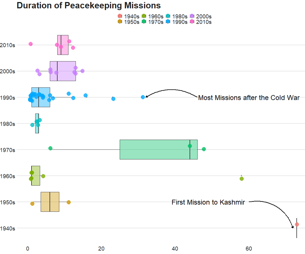
Next we can compare the decades
pko_countries %<>%
  mutate(decade = substr(start_date, 1, 3)) %>%
  mutate(decade = paste0(decade, "0s"))
And graph it out:
pko_countries %>%
  ggplot(mapping = aes(x = decade,
                       y = duration,
                       fill = decade)) +
  geom_boxplot(alpha = 0.4) +
  geom_jitter(aes(color = decade),
              size = 6, alpha = 0.8, width = 0.15) +
   coord_flip() +
  geom_curve(aes(x = "1950s", y = 60, xend = "1940s", yend = 72),
  arrow = arrow(length = unit(0.1, "inch")), size = 0.8, color = "black",
   curvature = -0.4) +
  annotate("text", label = "First Mission to Kashmir",
           x = "1950s", y = 49, size = 8, color = "black") +
  geom_curve(aes(x = "1990s", y = 46, xend = "1990s", yend = 32),
             arrow = arrow(length = unit(0.1, "inch")), size = 0.8, color = "black",curvature = 0.3) +
  annotate("text", label = "Most Missions after the Cold War",
           x = "1990s", y = 60, size = 8, color = "black") +

  bbplot::bbc_style() + ggtitle("Duration of Peacekeeping Missions")
Following the end of the Cold War, there were renewed calls for the UN to become the agency for achieving world peace, and the agency’s peacekeeping dramatically increased, authorizing more missions between 1991 and 1994 than in the previous 45 years combined.
We can use a waffle plot to see which decade had the most operation missions. Waffle plots are often seen as more clear than pie charts.
Click here to read more about waffle charts in R
To get the data ready for a waffle chart, we just need to count the number of peacekeeping missions (i.e. the number of rows) in each decade. Then we fill the groups (i.e. decade) and enter the n variable we created as the value.
pko_countries %>%
  group_by(decade) %>%
  count() %>%
  ggplot(aes(fill = decade, values = n)) +
  waffle::geom_waffle(color = "white", size= 3, n_rows = 8) +
  scale_x_discrete(expand=c(0,0)) +
  scale_y_discrete(expand=c(0,0)) +
  coord_equal() +
labs(title = "Number of Peacekeeper Missions") + bbplot::bbc_style() 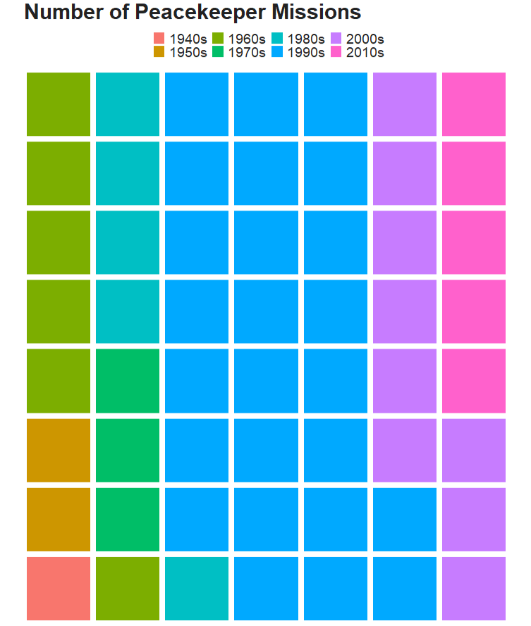

If we want to add more information, we can go to the UN Peacekeeping website and download more data on peacekeeping troops and operations.
We can graph the number of peacekeepers per country
Click here to learn more about adding flags to graphs!
le_palette <- c("#5f0f40", "#9a031e", "#94d2bd", "#e36414", "#0f4c5c")

pkt %>%
  mutate(contributing_country = ifelse(contributing_country == "United Republic of Tanzania", "Tanzania",ifelse(contributing_country == "Côte d’Ivoire", "Cote d'Ivoire", contributing_country))) %>%
  mutate(iso2 = tolower(countrycode::countrycode(contributing_country, "country.name", "iso2c"))) %>%
  mutate(cown = countrycode::countrycode(contributing_country, "country.name", "cown")) %>%
  inner_join(pacl_region, by = "cown") %>%
  mutate(un_region_name = case_when(grepl("Africa", un_region_name) ~ "Africa",grepl("Eastern Asia", un_region_name) ~ "South-East Asia",
 un_region_name == "Western Africa" ~ "Middle East",TRUE ~ as.character(un_region_name))) %>%
  filter(total_uniformed_personnel > 700) %>%
  ggplot(aes(x = reorder(contributing_country, total_uniformed_personnel),
             y = total_uniformed_personnel)) +
  geom_bar(stat = "identity", width = 0.7, aes(fill = un_region_name), color = "white") +
  coord_flip() +
  ggflags::geom_flag(aes(x = contributing_country, y = -1, country = iso2), size = 8) +
  # geom_text(aes(label= values), position = position_dodge(width = 0.9), hjust = -0.5, size = 5, color = "#000500") +
  scale_fill_manual(values = le_palette) +
  labs(title = "Total troops serving as peacekeepers",
       subtitle = ("Across countries"),
       caption = "         Source: UN ") +
  xlab("") +
  ylab("") + bbplot::bbc_style()
We can see that Bangladesh, Nepal and India have the most peacekeeper troops!
