Download WorldBank data with WDI package in R

Packages we will need:

library(WDI)
library(tidyverse)
library(magrittr) # for pipes
library(ggthemes)
library(rnaturalearth)
 # to create maps
library(viridis) # for pretty colors

We will use this package to really quickly access all the indicators from the World Bank website.

Below is a screenshot of the World Bank’s data page where you can search through all the data with nice maps and information about their sources, their available years and the unit of measurement et cetera.

You can look at the World Bank website and browse all the indicators available.

In R when we download the WDI package, we can download the datasets directly into our environment.

With the WDIsearch() function we can look for the World Bank indicator.

For this blog, we want to map out how dependent countries are on oil. We will download the dataset that measures oil rents as a percentage of a country’s GDP.

WDIsearch('oil rent')

The output is:

indicator             name 
"NY.GDP.PETR.RT.ZS"   "Oil rents (% of GDP)"

Copy the indicator string and paste it into the WDI() function. The country codes are the iso2 codes, which you can input as many as you want in the c().

If you want all countries that the World Bank has, do not add country argument.

We can compare Iran and Saudi Arabian oil rents from 1970 until the most recent value.

data = WDI(indicator='NY.GDP.PETR.RT.ZS', country=c('IR', 'SA'), start=1970, end=2019)

And graph out the output. All only takes a few steps.

my_palette = c("#DA0000", "#239f40")
 #both the hex colors are from the maps of the countries

oil_graph <- ggplot(oil_data, aes(year, NY.GDP.PETR.RT.ZS, color =  country)) + 
  geom_line(size = 1.4) +
  labs(title = "Oil rents as a percentage of GDP",
       subtitle = "In Iran and Saudi Arabia from 1970 to 2019",
       x = "Year",
       y = "Average oil rent as percentage of GDP",
       color = " ") +
  scale_color_manual(values = my_palette)

oil_graph + 
ggthemes::theme_fivethirtyeight() + 
theme(
plot.title = element_text(size = 30), 
      axis.title.y = element_text(size = 20),
      axis.title.x = element_text(size = 20))

For some reason the World Bank does not have data for Iran for most of the early 1990s. But I would imagine that they broadly follow the trends in Saudi Arabia.

I added the flags myself manually after I got frustrated with geom_flag() . It is something I will need to figure out for a future blog post!

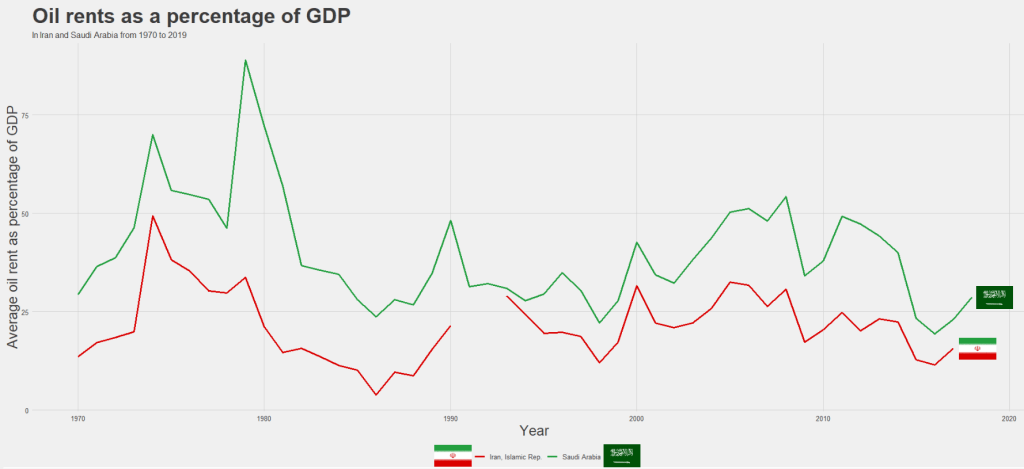
It is really something that in the late 1970s, oil accounted for over 80% of all Saudi Arabia’s Gross Domestic Product.

Now we see both countries rely on a far smaller percentage. Due both to the fact that oil prices are volatile, climate change is a new constant threat and resource exhaustion is on the horizon, both countries have adjusted policies in attempts to diversify their sources of income.

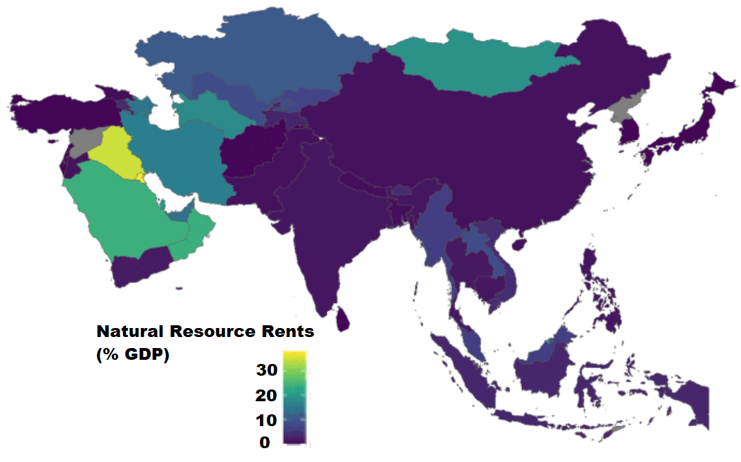
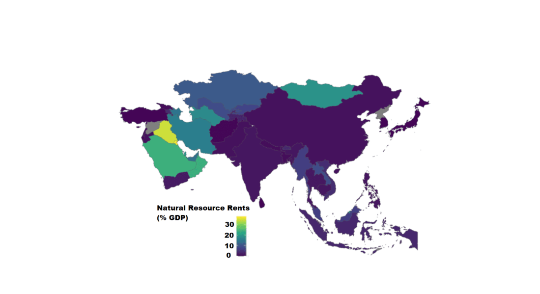
Next we can use the World Bank data to create maps and compare regions on any World Bank scores.

We will compare all Asian and Middle Eastern countries with regard to all natural rents (not just oil) as a percentage of their GDP.

So, first we create a map with the rnaturalearth package. Click here to read a previous tutorial about all the features of this package.

I will choose only the geographical continent of Asia, which covers the majority of Middle East also.

asia_map <- ne_countries(scale = "medium", continent = 'Asia', returnclass = "sf")

Then, once again we use the WDI() function to download our World Bank data.

nat_rents = WDI(indicator='NY.GDP.TOTL.RT.ZS', start=2016, end=2018)

Next I’ll merge the with the asia_map object I created.

asia_rents <- merge(asia_map, nat_rents, by.x = "iso_a2", by.y = "iso2c", all = TRUE)

We only want the value from one year, so we can subset the dataset

map_2017 <- asia_rents [which(asia_rents$year == 2017),]

And finally, graph out the data:

nat_rent_graph <- ggplot(data = map_2017) +
  geom_sf(aes(fill = NY.GDP.TOTL.RT.ZS), 
          position = "identity") + 
  labs(fill ='Natural Resource Rents as % GDP') +
  scale_fill_viridis_c(option = "viridis")

nat_rent_graph + theme_map()

Download economic and financial time series data with Quandl package in R

Packages we will need:

library(Quandl)
library(forecast) #for time series analysis and graphing

The website Quandl.com is a great resource I came across a while ago, where you can download heaps of datasets for variables such as energy prices, stock prices, World Bank indicators, OECD data other random data.

In order to download the data from the site, you need to first set up an account on the website, and indicate your intended use for the data.

Then you can access your API key, when you go to your “Account Setting” page.

Back on R, you call the API key with Quandl.api_key() function and now you can directly download data!

Quandl.api_key("StRiNgOfNuMbErSaNdLeTtErs")

Now, I click to search only through the free datasets. I have no idea how much a subscription costs but I imagine it is not cheap.

You can browse through the database and when you find the dataset you want, you copy and paste the string code into Quandl() function.

We can choose the class of the time series object we will download with the type = argument.

We also toggle the start_date and end_data of the time series.

So I will download employment data for Ireland from 1980 until 2019 as a zoo object. We can check the Quandl page for the Irish employment data to learn about the data source and the unit of measurement

emp <- Quandl('ODA/IRL_LE', start_date='1980-01-01', end_date='2020-01-01',type="zoo")

Click here to check out the Quandl CRAN pdf documentation and learn more about the differen arguments you can use with this function. Here is the generic arguments you can play with when downloading your dataset:

 Quandl(code, type = c("raw", "ts", "zoo", "xts", "timeSeries"),
 transform = c("", "diff", "rdiff", "normalize", "cumul", "rdiff_from"),
 collapse = c("", "daily", "weekly", "monthly", "quarterly", "annual")

Now we can graph the emp data:

autoplot(emp[,"V1"]) +
   ggtitle("Employment level in Ireland") +
   labs("Source: International Monetary Fund data") + 
   xlab("Year") +
   ylab("Employed people (in millions)")

The 1980s were a rough time for unemployment in Ireland. Also the 2008 recession had a sizeable impact on unemployment too. I am afraid how this graph will look with 2020 data.

Next, we can visually examine the autocorrelation plot.

With time series data, it is natural to assume that the value at the current time period is highly related (i.e. serially correlated) to its value in the previous period. This is autocorrelation, and it can be problematic when we want to forecast or run statistics. This is because it violates the assumption that values are independent of each other.

emp_ts <- ts(emp)
forecast::ggAcf(emp_ts)

There is very high autocorrelation in employment level in Ireland over the years.

In next blog, we will look at how to correct for autocorrelation in time series data.

Visualise panel data regression with ExPanDaR package in R

The ExPand package is an example of a shiny app.

What is a shiny app, you ask? Click to look at a quick Youtube explainer. It’s basically a handy GUI for R.

When we feed a panel data.frame into the ExPanD() function, a new screen pops up from R IDE (in my case, RStudio) and we can interactively toggle with various options and settings to run a bunch of statistical and visualisation analyses.

Click here to see how to convert your data.frame to pdata.frame object with the plm package.

Be careful your pdata.frame is not too large with too many variables in the mix. This will make ExPanD upset enough to crash. Which, of course, I learned the hard way.

Also I don’t know why there are random capitalizations in the PaCkaGe name. Whenever I read it, I think of that Sponge Bob meme.

If anyone knows why they capitalised the package this way. please let me know!

So to open up the new window, we just need to feed the pdata.frame into the function:

ExPanD(mil_pdf)

For my computer, I got error messages for the graphing sections, because I had an old version of Cairo package. So to rectify this, I had to first install a source version of Cairo and restart my R session. Then, the error message gods were placated and they went away.

install.packages("Cairo", type="source")

Then press command + shift + F10 to restart R session

library(Cairo)

You may not have this problem, so just ignore if you have an up-to-date version of the necessary packages.

When the new window opens up, the first section allows you to filter subsections of the panel data.frame. Similar to the filter() argument in the dplyr package.

For example, I can look at just the year 1989:

But let’s look at the full sample

We can toggle with variables to look at mean scores for certain variables across different groups. For example, I look at physical integrity scores across regime types.

  • Purple plot: closed autocracy
  • Turquoise plot: electoral autocracy
  • Khaki plot: electoral democracy:
  • Peach plot: liberal democracy

The plots show that there is a high mean score for physical integrity scores for liberal democracies and less variance. However with the closed and electoral autocracies, the variance is greater.

We can look at a visualisation of the correlation matrix between the variables in the dataset.

Next we can look at a scatter plot, with option for loess smoother line, to graph the relationship between democracy score and physical integrity scores. Bigger dots indicate larger GDP level.

Last we can run regression analysis, and add different independent variables to the model.

We can add fixed effects.

And we can subset the model by groups.

The first column, the full sample is for all regions in the dataset.

The second column, column 1 is

Column 2 Post Soviet countries

Column 3: Latin America

Column 4: AFRICA

Column 5: Europe, North America

Column 6: Asia

Create network graphs with igraph package in R

Packages we will use:

install.packages("igraph")
library(igraph)

First create a dataframe with the two actors in the dyad.

countries_df <- data.frame(stateA = ww1_df$statea, stateB = ww1_df$stateb, stringsAsFactors = TRUE)

Next, convert to matrix so it is suitable for the next function

countries_matrix <- as.matrix(countries_df)

Feed the matrix into the graph.edgelist() function. We can see that it returns an igraph object:

countries_ig <- graph.edgelist(countries_matrix , directed=TRUE)

“Nodes” designate the vertices of a network, and “edges”  designate its ties. Vertices are accessed using the V() function while edges are accessed with the E(). This igraph object has 232 edges and 16 vertices over the four years.

Furthermore, the igraph object has a name attribute as one of its vertices properties. To access, type:

V(countries_ig)$name

Which prints off all the countries in the ww1 dataset; this is all the countries that engaged in militarized interstate disputes between the years 1914 to 1918.

 [1] "United Kingdom" "Austria-Hungary" "France" "United States" "Russia" "Romania" "Germany" "Greece" "Yugoslavia"
[10] "Italy" "Belgium" "Turkey" "Bulgaria" "Portugal" "Estonia" "Latvia"

Next we can fit an algorithm to modify the graph distances. According to our pal Wikipedia, force-directed graph drawing algorithms are a class of algorithms for drawing graphs in an aesthetically-pleasing way. Their purpose is to position the nodes of a graph in two-dimensional or three-dimensional space so that all the edges are of more or less equal length and there are as few crossing edges as possible, by assigning forces among the set of edges and the set of nodes, based on their relative positions!

We can do this in one simple step by feeding the igraph into the algorithm function.

Check out this blog post to see the differences between these distance algorithms.

I will choose the Kamada-Kawai algorithm.

kamada_layout <- layout.kamada.kawai(countries_ig)

Now to plot the WW1 countries and their war dispute networks

plot(countries_ig, 
layout = kamada_layout,
vertex.size = 14,
vertex.color = "red",
vertex.frame.color = NA,
vertex.label.cex = 1.2,
edge.curved = .2,
edge.arrow.size = .3,
edge.width = 1)

Plot variables on a map with rnaturalearth package in R

All the packages I will be using:

library(rnaturalearth)
library(countrycode)
library(tidyverse)
library(ggplot2)
library(ggthemes)
library(viridis)

First, we access and store a map object from the rnaturalearth package, with all the spatial information in contains. We specify returnclass = "sf", which will return a dataframe with simple features information.

Simple features or simple feature access refers to a formal standard (ISO 19125-1:2004) that describes how objects in the real world can be represented in computers, with emphasis on the spatial geometry of these objects. Our map has these attributes stored in the object.

With the ne_countries() function, we get the borders of all countries.

map <- ne_countries(scale = "medium", returnclass = "sf")
View(map)

This map object comes with lots of information about 241 countries and territories around the world.

In total, it has 65 columns, mostly with different variants of the names / locations of each country / territory. For example, ISO codes for each country. Further in the dataset, there are a few other variables such as GDP and population estimates for each country. So a handy source of data.

However, I want to use values from a different source; I have a freedom_df dataframe with a freedom of association variable.

The freedom of association index broadly captures to what extent are parties, including opposition parties, allowed to form and to participate in elections, and to what extent are civil society organizations able to form and to operate freely in each country.

So, we can merge them into one dataset.

Before that, I want to only use the scores from the most recent year to map out. So, take out only those values in the year 2019 (don’t forget the comma sandwiched between the round bracket and the square bracket):

freedom19 <- freedom_df[which(freedom_df$year == 2019),]

My freedom19 dataset uses the Correlates of War codes but no ISO country codes. So let’s add these COW codes to the map dataframe for ease of merging.

I will convert the ISO codes to COW codes with the countrycodes() function:

map$COWcode <- countrycode(map$adm0_a3, "iso3c", "cown") 

Click here to read more about the countrycode() function in R.

Now, with a universal variable common to both datasets, I can merge the two datasets with the common COW codes:

map19 <- merge(map, freedom19, by.x = "COWcode", by.y = "ccode", all = TRUE)

Click here to read more about the merge() function in R.

We’re all ready to graph the map. We can add the freedom of association variable into the aes() argument of the geom_sf() function. Again, the sf refers to simple features with geospatial information we will map out.

assoc_graph <- ggplot(data = map19) +
  geom_sf(aes(fill = freedom_association_index), 
          position = "identity") + 
  labs(fill='Freedom of Association Index')  +
  scale_fill_viridis_c(option = "viridis")

The scale_fill_viridis_c(option = "viridis") changes the color spectrum of the main variable.

Other options include:

"viridis"

"magma"

"plasma

And various others. Click here to learn more about this palette package.

Finally we call the new graph stored in the assoc_graph object.

I use the theme_map() function from the ggtheme package to make the background very clean and to move the legend down to the bottom left of the screen where it takes up the otherwise very empty Pacific ocean / Antarctic expanse.

Click here for more information on the ggtheme package.

assoc_graph + theme_map()

And there we have it, a map of countries showing the Freedom of Association index across countries.

The index broadly captures to what extent are parties, including opposition parties, allowed to form and to participate in elections, and to what extent are civil society organizations able to form and to operate freely.

Yellow colors indicate more freedom, green colors indicate middle scores and blue colors indicate low levels of freedom.

Some of the countries have missing data, such as Germany and Yemen, for various reasons. A true perfectionist would go and find and fill in the data manually.

Graph political party manifestos on ideological spectrum with manifestoR package in R

The Manifesto Project maintains a database of political party manifestos for around 50 countries. It covers free and democratic elections since 1945 in various countries.

To access the manifestos, we install and load the manifestoR package, which provides an API between R and The Manifesto Project site.

(What’s an API?)

On the website, we can navigate the Manifesto Project database and search for any country for a given time period in the Data Dashboard section on the site. For example, I search for Ireland from 2012 until the present day and I can see the most recent manifestos put forward by the parties.

We can see the number code for each party. (We will need to use these when downloading the texts into R via the API).

Click here for the full CRAN PDF which gives more information for the manifestoR package.

So first, install the packages.

install.packages("manifestoR")
library(manifestoR)

But we cannot just access the data right away.

In order to download any manifesto text from the database, we need to first set up an account on the website and download an API key. So first step to do is go on the website and sign up.

Then you go to your website profile and click download API Key file (txt).

Then we go back on R and write in:

mp_key <- mp_setapikey(file.choose())

Choose the txt file downloaded from the website … and hopefully you should be all set up to access all the manifesto text data.

Now, we can choose the manifestos we want to download.

Using the mp_corpus() function, we can choose the country and date that we want and download lists of all the texts.

manifestos_2016 <- mp_corpus(countryname == "Ireland" & edate > as.Date("2016-02-01"))

Note that the date I enter into the mp_corpus() function corresponds with the date from the Manifesto Project website. If there is a way to look this up directly through R, please let me know!

If we look at the manifestos_2016 object we just downloaded:

View(manifestos_2016)

We see we have ten lists. Say, for example, the party I want to look at is Fine Gael, I need the party ID code assigned by the Manifesto Project.

Similar to how I got the date, I can look up the Data Dashboard to find the party code for Fine Gael. Or I can search for the ID via this site.

It was funny to see that all the names of the Irish parties are in English, which I never hear! Fine Gael is Irish for Tribes of Ireland and I guess Family is another way to translate that.

The ID code for the party is 53520, which is the seventh list. So index this list and create a new tibble structure for the manifesto text.

fg_2016 <- as_tibble(manifestos_2016[7])
View(fg_2016)

The cmp_code refers to the value that coders from the Manifesto Project have assigned to each topic or policy position that the party puts forward in their text.

For example 104 means that the party speaks positively of the military, whereas 105 means that the party speaks of the military in a negative way.

I don’t know what the eu_code is in reference to, but it is all blank in the 2016 coding…

In another post, I hope to write about text mining and sentiment analysis with manifestos. But I’ll leave that to another day.

An alternative way to download and store the manifestos is to download everything from the database:

all_manifestos <- mp_maindataset()

And I want to subset all Irish parties only:

ireland_manifestos <- all_manifestos[which(all_manifestos$countryname == "Ireland"),]

With these all ready, there are some really interesting functions we can run with the data and the coding of the texts by the Manifesto Project.

For example, the rile() function. This calculates the Right Left Score.

Essentially, higher RILE scores indicate that the party leans more right on the ideological spectrum, with a maximum score of +100 if the whole manifesto is devoted to ‘right’ categories. Conversely, lower RILE scores indicate that the party leans more left (and a score of -100 would mean the entire manifesto puts forward exclusively ‘left’ categories)

Of course, it is a crude instrument to compress such a variety of social, political and economic positions onto a single dimension. But as long as we keep that caveat in mind, it is a handy shorthanded approach to categorising the different parties.

Additionally, Molder (2016) in his paper, “The validity of the RILE left–right index as a measure of party policy” argues that the index is not very valid. Additional researchers have also found that RILE index inaccurately places political parties in policy space as manifestos are not actual binding policies but rather directional signals and aspriations (see Pelizzo’s (2003) paper, “Party positions or party direction? An analysis of Party Manifesto Data” for more on this)

So take these figures with a grain of salt. But it is interesting to visualise the trends.

I continue subsetting until I have only the largest parties in Ireland and put them into big_parties object. The graph gets a bit hectic when including all the smaller parties in the country since 1949. Like in most other countries, party politics is rarely simple.

Next I can simply create a new rile_index variable and graph it across time.

big_parties$rile_index <- rile(big_parties)

The large chuck in the geom_text() command is to only show the name of the party at the end of the line. Otherwise, the graph is far more busy and far more unreadable.

graph_rile <- big_parties %>%
group_by(partyname) %>%
ggplot(aes(x= as.Date(edate), y = rile_index, color=partyname)) +
geom_point() + geom_line() +
geom_text(data=. %>%
arrange(desc(edate)) %>%
group_by(partyname) %>%
slice(1),
aes(label=partyname), position=position_jitter(height=2), hjust = 0, size = 5, angle=40) +
ggtitle("Relative Left Right Ideological Position of Major Irish Parties 1949 - 2016") +
xlab("Year") + ylab("Right Left (RILE) Index")

While the graph is a bit on the small size, what jumps out immediately is that there has been a convergence of the main political parties toward the ideological centre. In fact, they are all nearing left of centre. The most right-wing a party has ever been in Ireland was Fine Gael in the 1950s, with a RILE score nearing 80. Given their history of its predecessor “Blueshirts” group, this checks out.

The Labour Party has consistently been very left wing, with its most left-leaning RILE score of -40 something in the early 1950s and again in early 1980s.

Ireland joined the European Union in 1978, granted free third level education for all its citizens since the 1990s and in genenral, has seen a consistent trend of secularisation in society, these factors all could account for the constricting lines converging in the graph for various socio-economic reasons.

In recent years Ireland has become more socially liberal (as exemplified by legalisation of abortion, legalisation of same sex marriage) so these lines do not surprise. Additionally, we do not have full control over monetary policy since joining the euro, so again, this mitigates the trends of extreme economic positions laid out in manifestos.

References

Mölder, M. (2016). The validity of the RILE left–right index as a measure of party policy. Party Politics22(1), 37-48.

Pelizzo, R. (2003). Party positions or party direction? An analysis of party manifesto data. West European Politics26(2), 67-89.

Make word clouds with tidytext and gutenbergr in R

This blog will run through how to make a word cloud with Mill’s “On Liberty”, a treatise which argues that the state should never restrict people’s individual pursuits or choices (unless such choices harm others in society).

First, we install and load the gutenbergr package to access the catalogue of books from Project Gutenburg . This gutenberg_metadata function provides access to the website and its collection of around 60,000 digitised books in the public domain, for which their U.S. copyright has expired. This website is an amazing resource in its own right.

install.packages("gutenbergr")
library(gutenbergr)

Next we choose a book we want to download. We can search through the Gutenberg Project catalogue (with the help of the dplyr package). In the filter( ) function, we can search for a book in the library by supplying a string search term in “quotations”. Click here to see the CRAN package PDF. For example, we can look for all the books written by John Stuart Mill (search second name, first name) on the website:

mill_all <- gutenberg_metadata %>%
  filter(author = "Mill, John Stuart")

Or we can search for the title of the book:

mill_liberty <- gutenberg_metadata %>%
  filter(title = "On Liberty")

We now have a tibble of all the sentences in the book!

View(mill_liberty)

We see there are two variables in this new datafram and 4,703 string rows.

To extract every word as a unit, we need the unnest_tokens( ) function from the tidytext package:

install.packages("tidytext")
library(tidytext)

We take our mill_liberty object from above and indicate we want the unit to be words from the text. And we create a new mill_liberty_words object to hold the book in this format.

mill_liberty_words <- mill_liberty %>%
    unnest_tokens(word, text) %>%
    anti_join(stop_words)

We now have a row for each word, totalling to 17,576 words! This excludes words such as “the”, “of”, “to” and all those small sentence builder words.

Now we have every word from “On Liberty”, we can see what words appear most frequently! We can either create a list with the count( ) function:

count_word <- mill_liberty_words %>%
   count(word, sort = TRUE)

The default for a tibble object is printing off the first ten observations. If we want to see more, we can increase the n in our print argument.

print(liberty_words, n=30)

An alternative to this is making a word cloud to visualise the relative frequencies of these terms in the text.

For this, we need to install the wordcloud package.

install.packages("wordcloud")
library(wordcloud)

To get some nice colour palettes, we can also install the RColorBrewer package also:

install.packages("RColorBrewer")
library(RColorBrewer)

Check out the CRAN PDF on the wordcloud package to tailor your specifications.

For example, the rot.per argument indicates proportion words we want with 90 degree rotation. In my example, I have 30% of the words being vertical. I reran the code until the main one was horizontal, just so it pops out more.

With the scale option, we can indicate the range of the size of the words (for example from size 4 to size 0.5) in the example below

We can choose how many words we want to include in the wordcloud with the max.words argument

color_number <- 20
color_palette <- colorRampPalette(brewer.pal(8, "Paired"))(color_number)

wordcloud(words = mill_liberty_words$word, min.freq = 2,
 scale = c(4, 0.5)
          max.words=200, random.order=FALSE, rot.per=0.3, 
          colors=color_palette)

We can see straightaway the most frequent word in the book is opinion. Given that this book forms one of the most rigorous defenses of the idea of freedom of speech, a free press and therefore against the a priori censorship of dissent in society, these words check out.

If we run the code with random.order=TRUE option, the cloud would look like this:

And you can play with proportions, colours, sizes and word placement until you find one you like!

This word cloud highlights the most frequently used words in John Stuart Mill’s “Utilitarianism”:

How to graph Google search trends with gtrendsR package in R

Google Trends is a search trends feature. It shows how frequently a given search term is entered into Google’s search engine, relative to the site’s total search volume over a given period of time.

( So note: because the results are all relative to the other search terms in the time period, the dates you provide to the gtrendsR function will change the shape of your graph and the relative percentage frequencies on the y axis of your plot).

To scrape data from Google Trends, we use the gtrends() function from the gtrendsR package and the get_interest() function from the trendyy package (a handy wrapper package for gtrendsR).

If necessary, also load the tidyverse and ggplot packages.

library(tidyverse)
library(gtrendsR)
library(trendyy)

To scrape the Google trend data, call the trendy() function and write in the search terms.

We can look at relative search hits for Yevgeny Prigozhin, leader of Russian mercenary army, Wagner Group.

prig <- trendy("Prigozhin", "2022-08-25", "2023-08-26") %>% 
  get_interest()

ggplot(data = prig, aes(x = as.Date(date), 
                          y = hits)) +
  geom_line(colour = "#005f73", 
            size = 6.5, alpha = 0.1)  +
  geom_line(colour = "#005f73", 
            size = 4, alpha = 0.3) +
  geom_line(colour = "#005f73", 
            size = 3, alpha = 0.5) +
  geom_line(colour = "#005f73", 
            size = 2) +
  ylab(label = 'Relative Hits %') +
  bbplot::bbc_style() +
  xlab(label = "Search Dates") + 
  ylab(label = 'Relative Hits %') +
  labs(title = "Relative hits for `Prigozhin` on Google",
       subtitle = "Data from Google search hits") +
  geom_curve(aes(x = as.Date("2021-10-01"), 
                   y = 45, 
                   xend = as.Date("2022-02-01"), 
                   yend = 30),
             size = 2, alpha = 0.8,
               color = "#001219",
               arrow = arrow(type = "closed")) 

For the next example, here we search for the term “Kamala Harris” during the period from 1st of January 2019 until today.

If you want to check out more specifications, for the package, you can check out the package PDF here. For example, we can change the geographical region (US state or country for example) with the geo specification.

We can also change the parameters of the time argument, we can specify the time span of the query with any one of the following strings:

  • “now 1-H” (previous hour)
  • “now 4-H” (previous four hours)
  • “today+5-y” last five years (default)
  • “all” (since the beginning of Google Trends (2004))

If don’t supply a string, the default is five year search data.

kamala <- trendy("Kamala Harris", "2019-01-01", "2020-08-13") %>% get_interest()

We call the get_interest() function to save this data from Google Trends into a data.frame version of the kamala object. If we didn’t execute this last step, the data would be in a form that we cannot use with ggplot().

View(kamala)

In this data.frame, there is a date variable for each week and a hits variable that shows the interest during that week. Remember,  this hits figure shows how frequently a given search term is entered into Google’s search engine relative to the site’s total search volume over a given period of time.

We will use these two variables to plot the y and x axis.

To look at the search trends in relation to the events during the Kamala Presidential campaign over 2019, we can add vertical lines along the date axis, with a data.frame, we can call kamala_events.

kamala_events = data.frame(date=as.Date(c("2019-01-21", "2019-06-25", "2019-12-03", "2020-08-12")), 
event=c("Launch Presidential Campaign", "First Primary Debate", "Drops Out Presidential Race", "Chosen as Biden's VP"))

Note the very specific order the as.Date() function requires.

Next, we can graph the trends, using the above date and hits variables:

ggplot(kamala, aes(x = as.Date(date), y = hits)) +
  geom_line(colour = "steelblue", size = 2.5) +
  geom_vline(data=kamala_events, mapping=aes(xintercept=date), color="red") +
    geom_text(data=kamala_events, mapping=aes(x=date, y=0, label=event), size=4, angle=40, vjust=-0.5, hjust=0) + 
    xlab(label = "Search Dates") + 
    ylab(label = 'Relative Hits %')

Which produces:

I can update the graph

Cairo::CairoWin()

ggplot(data = kamala, aes(x = as.Date(date), 
                          y = hits)) +
  geom_vline(data = kamala_events, 
             mapping = aes(xintercept = date),
             size = 11, 
             alpha = 0.1,
             color = "#9b2226") +
  geom_vline(data = kamala_events, 
             mapping = aes(xintercept = date),
             size = 8, 
             alpha = 0.2,
             color = "#9b2226") +
  geom_vline(data = kamala_events, 
             mapping = aes(xintercept = date),
             size = 7, 
             alpha = 0.3,
             color = "#9b2226") +
  geom_vline(data = kamala_events, 
             mapping = aes(xintercept = date),
             size = 4, 
             alpha = 0.4,
             color = "#9b2226") +
  geom_line(colour = "#005f73", 
            size = 5.5, alpha = 0.4)  +
  geom_line(colour = "#005f73", 
            size = 5, alpha = 0.5) +
  geom_line(colour = "#005f73", 
            size = 4, alpha = 0.6) +
  geom_line(colour = "#005f73", 
            size = 3) +
  geom_text(data = kamala_events, 
            mapping = aes(x = date, 
                          y = 0,
                          label = event), 
                    size = 9,
                    angle = 10, 
                    vjust = -4.6, 
                    hjust = 0.7) + 
  bbplot::bbc_style() +
  xlab(label = "Search Dates") + 
  ylab(label = 'Relative Hits %') +
  labs(title = "Relative hits for `Kamala Harris` on Google",
       subtitle = "Data from Google search hits") +
  theme(plot.title = element_text(size = 40), 
        plot.subtitle = element_text(size = 20)) +
  geom_curve(aes(x = as.Date("2018-12-01"), 
                  y = 88, 
                  xend = as.Date("2019-01-15"), 
                  yend = 99),
             size = 2, alpha = 0.8,
             color = "#001219",
             curvature = -0.4,
             angle = 90,
             arrow = arrow(type = "closed")) +
  geom_curve(aes(x = as.Date("2019-05-01"), 
                 y = 69, 
                 xend = as.Date("2019-06-15"), 
                 yend = 70),
             size = 2, 
             alpha = 0.8,
             color = "#001219",
             curvature = 0.7,
             angle = 90,
             arrow = arrow(type = "closed")) +
  geom_curve(aes(x = as.Date("2019-10-15"), 
                 y = 69, 
                 xend = as.Date("2019-11-20"), 
                 yend = 46),
             size = 2, 
             alpha = 0.8,
             color = "#001219",
             curvature = 0.3,
             angle = 90,
             arrow = arrow(type = "closed")) 

Super easy and a quick way to visualise the ups and downs of Kamala Harris’ political career over the past few months, operationalised as the relative frequency with which people Googled her name.

If I had chosen different dates, the relative hits as shown on the y axis would be different! So play around with it and see how the trends change when you increase or decrease the time period.

Plot marginal effects with sjPlot package in R

Without examining interaction effects in your model, sometimes we are incorrect about the real relationship between variables.

This is particularly evident in political science when we consider, for example, the impact of regime type on the relationship between our dependent and independent variables. The nature of the government can really impact our analysis.

For example, I were to look at the relationship between anti-government protests and executive bribery.

I would expect to see that the higher the bribery score in a country’s government, the higher prevalence of people protesting against this corrupt authority. Basically, people are angry when their government is corrupt. And they make sure they make this very clear to them by protesting on the streets.

First, I will describe the variables I use and their data type.

With the dependent variable democracy_protest being an interval score, based upon the question: In this year, how frequent and large have events of mass mobilization for pro-democratic aims been?

The main independent variable is another interval score on executive_bribery scale and is based upon the question: How clean is the executive (the head of government, and cabinet ministers), and their agents from bribery (granting favors in exchange for bribes, kickbacks, or other material inducements?)

Higher scores indicate cleaner governing executives.

So, let’s run a quick regression to examine this relationship:

summary(protest_model <- lm(democracy_protest ~ executive_bribery, data = data_2010))

Examining the results of the regression model:

We see that there is indeed a negative relationship. The cleaner the government, the less likely people in the country will protest in the year under examination. This confirms our above mentioned hypothesis.

However, examining the R2, we see that less than 1% of the variance in protest prevalence is explained by executive bribery scores.

Not very promising.

Is there an interaction effect with regime type? We can look at a scatterplot and see if the different regime type categories cluster in distinct patterns.

The four regime type categories are

  • purple: liberal democracy (such as Sweden or Canada)
  • teal: electoral democracy (such as Turkey or Mongolia)
  • khaki green: electoral autocracy (such as Georgia or Ethiopia)
  • red: closed autocracy (such as Cuba or China)

The color clusters indicate regime type categories do cluster.

  • Liberal democracies (purple) cluster at the top left hand corner. Higher scores in clean executive index and lower prevalence in pro-democracy protesting.
  • Electoral autocracies (teal) cluster in the middle.
  • Electoral democracies (khaki green) cluster at the bottom of the graph.
  • The closed autocracy countries (red) seem to have a upward trend, opposite to the overall best fitted line.

So let’s examine the interaction effect between regime types and executive corruption with mass pro-democracy protests.

Plot the model and add the * interaction effect:

summary(protest_model_2 <-lm(democracy_protest ~ executive_bribery*regime_type, data = data_2010))

Adding the regime type variable, the R2 shoots up to 27%.

The interaction effect appears to only be significant between clean executive scores and liberal democracies. The cleaner the country’s executive, the prevalence of mass mobilization and protests decreases by -0.98 and this is a statistically significant relationship.

The initial relationship we saw in the first model, the simple relationship between clean executive scores and protests, has disappeared. There appears to be no relationship between bribery and protests in the semi-autocratic countries; (those countries that are not quite democratic but not quite fully despotic).

Let’s graph out these interactions.

In the plot_model() function, first type the name of the model we fitted above, protest_model.

Next, choose the type . For different type arguments, scroll to the bottom of this blog post. We use the type = "pred" argument, which plots the marginal effects.

Marginal effects tells us how a dependent variable changes when a specific independent variable changes, if other covariates are held constant. The two terms typed here are the two variables we added to the model with the * interaction term.

install.packages("sjPlot")
library(sjPlot)

plot_model(protest_model, type = "pred", terms = c("executive_bribery", "regime_type"), title = 'Predicted values of Mass Mobilization Index',

 legend.title = "Regime type")

Looking at the graph, we can see that the relationship changes across regime type. For liberal democracies (purple), there is a negative relationship. Low scores on the clean executive index are related to high prevalence of protests. So, we could say that when people in democracies see corrupt actions, they are more likely to protest against them.

However with closed autocracies (red) there is the opposite trend. Very corrupt countries in closed autocracies appear to not have high levels of protests.

This would make sense from a theoretical perspective: even if you want to protest in a very corrupt country, the risk to your safety or livelihood is often too high and you don’t bother. Also the media is probably not free so you may not even be aware of the extent of government corruption.

It seems that when there are no democratic features available to the people (free media, freedom of assembly, active civil societies, or strong civil rights protections, freedom of expression et cetera) the barriers to protesting are too high. However, as the corruption index improves and executives are seen as “cleaner”, these democratic features may be more accessible to them.

If we only looked at the relationship between the two variables and ignore this important interaction effects, we would incorrectly say that as

Of course, panel data would be better to help separate any potential causation from the correlations we can see in the above graphs.

The blue line is almost vertical. This matches with the regression model which found the coefficient in electoral autocracy is 0.001. Virtually non-existent.

Different Plot Types

type = "std" – Plots standardized estimates.

type = "std2" – Plots standardized estimates, however, standardization follows Gelman’s (2008) suggestion, rescaling the estimates by dividing them by two standard deviations instead of just one. Resulting coefficients are then directly comparable for untransformed binary predictors.

type = "pred" – Plots estimated marginal means (or marginal effects). Simply wraps ggpredict.

type = "eff"– Plots estimated marginal means (or marginal effects). Simply wraps ggeffect.

type = "slope" and type = "resid" – Simple diagnostic-plots, where a linear model for each single predictor is plotted against the response variable, or the model’s residuals. Additionally, a loess-smoothed line is added to the plot. The main purpose of these plots is to check whether the relationship between outcome (or residuals) and a predictor is roughly linear or not. Since the plots are based on a simple linear regression with only one model predictor at the moment, the slopes (i.e. coefficients) may differ from the coefficients of the complete model.

type = "diag" – For Stan-models, plots the prior versus posterior samples. For linear (mixed) models, plots for multicollinearity-check (Variance Inflation Factors), QQ-plots, checks for normal distribution of residuals and homoscedasticity (constant variance of residuals) are shown. For generalized linear mixed models, returns the QQ-plot for random effects.