Packages you will need:
library(tidyverse)
library(magrittr)     # for pipes

library(broom)        # add model variables
library(easystats)    # diagnostic graphs

library(WDI)           # World Bank data
library(democracyData) # Freedom House data

library(countrycode)   # add ISO codes
library(bbplot)        # pretty themes
library(ggthemes)      # pretty colours
library(knitr)         # pretty tables
library(kableExtra)    # make pretty tables prettier
This blog will look at the augment() function from the broom package.
After we run a liner model, the augment() function gives us more information about how well our model can accurately preduct the model’s dependent variable.
It also gives us lots of information about how does each observation impact the model. With the augment() function, we can easily find observations with high leverage on the model and outlier observations.
For our model, we are going to use the “women in business and law” index as the dependent variable.
According to the World Bank, this index measures how laws and regulations affect women’s economic opportunity.
Overall scores are calculated by taking the average score of each index (Mobility, Workplace, Pay, Marriage, Parenthood, Entrepreneurship, Assets and Pension), with 100 representing the highest possible score.
Into the right-hand side of the model, our independent variables will be child mortality, military spending by the government as a percentage of GDP and Freedom House (democracy) Scores.
First we download the World Bank data and summarise the variables across the years.
Click here to read more about the WDI package and downloading variables from the World Bank website.
women_business = WDI(indicator = "SG.LAW.INDX")
mortality = WDI(indicator = "SP.DYN.IMRT.IN")
military_spend_gdp <- WDI(indicator = "MS.MIL.XPND.ZS")
We get the average across 60 ish years for three variables. I don’t want to run panel data regression, so I get a single score for each country. In total, there are 160 countries that have all observations. I use the countrycode() function to add Correlates of War codes. This helps us to filter out non-countries and regions that the World Bank provides. And later, we will use COW codes to merge the Freedom House scores.
women_business %>%
  filter(year > 1999) %>%
  inner_join(mortality) %>%
  inner_join(military_spend_gdp) %>%
  select(country, year, iso2c,
         fem_bus = SG.LAW.INDX,
         mortality = SP.DYN.IMRT.IN,
         mil_gdp = MS.MIL.XPND.ZS)  %>%
  mutate_all(~ifelse(is.nan(.), NA, .)) %>%
  select(-year) %>%
  group_by(country, iso2c) %>%
  summarize(across(where(is.numeric), mean,
   na.rm = TRUE, .names = "mean_{col}")) %>%
  ungroup() %>%
  mutate(cown = countrycode::countrycode(iso2c, "iso2c", "cown")) %>%
  filter(!is.na(cown)) -> wdi_summary
Next we download the Freedom House data with the democracyData package.
Click here to read more about this package.
fh <- download_fh()

fh %>%
  group_by(fh_country) %>%
  filter(year > 1999) %>%
  summarise(mean_fh = mean(fh_total, na.rm = TRUE)) %>%
  mutate(cown = countrycode::countrycode(fh_country, "country.name", "cown")) %>%
  mutate_all(~ifelse(is.nan(.), NA, .)) %>%
  filter(!is.na(cown))  -> fh_summary
We join both the datasets together with the inner_join() functions:
fh_summary %>%
  inner_join(wdi_summary, by = "cown") %>%
  select (-c(cown, iso2c, fh_country)) -> wdi_fh
Before we model the data, we can look at the correlation matrix with the corrplot package:
wdi_fh %>%
  drop_na() %>%
  select(-country)  %>%
  select(`Females in business` = mean_fem_bus,
        `Mortality rate` = mean_mortality,
        `Freedom House` = mean_fh,
        `Military spending GDP` = mean_mil_gdp)  %>%
  cor() %>%
  corrplot(method = 'number',
           type = 'lower',
           number.cex = 2,
           tl.col = 'black',
           tl.srt = 30,
           diag = FALSE)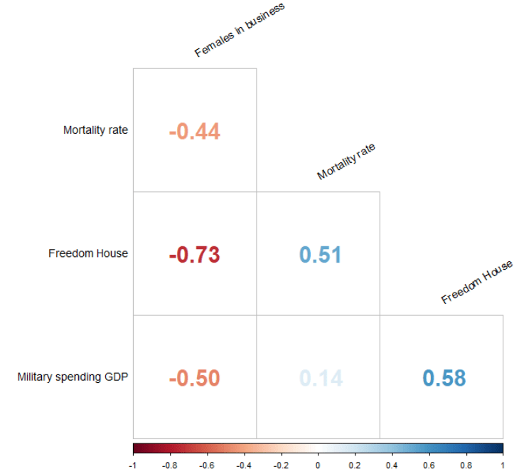
Next, we run a simple OLS linear regression. We don’t want the country variables so omit it from the list of independent variables.
fem_bus_lm <- lm(mean_fem_bus ~ . - country, data = wdi_fh)| Dependent variable: | |
| mean_fem_bus | |
| mean_fh | -2.807*** |
| (0.362) | |
| mean_mortality | -0.078* |
| (0.044) | |
| mean_mil_gdp | -0.416** |
| (0.205) | |
| Constant | 94.684*** |
| (2.024) | |
| Observations | 160 |
| R2 | 0.557 |
| Adjusted R2 | 0.549 |
| Residual Std. Error | 11.964 (df = 156) |
| F Statistic | 65.408*** (df = 3; 156) |
| Note: | *p<0.1; **p<0.05; ***p<0.01 |
We can look at some preliminary diagnostic plots.
Click here to read more about the easystat package. I found it a bit tricky to download the first time.
performance::check_model(fem_bus_lm)
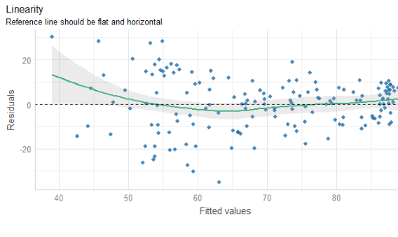

The line is not flat at the beginning so that is not ideal..
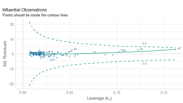
We will look more into this later with the variables we create with augment() a bit further down this blog post.

None of our variables have a VIF score above 5, so that is always nice to see!

From the broom package, we can use the augment() function to create a whole heap of new columns about the variables in the model.
fem_bus_pred <- broom::augment(fem_bus_lm)
.fitted= this is the model prediction value for each country’s dependent variable score. Ideally we want them to be as close to the actual scores as possible. If they are totally different, this means that our independent variables do not do a good job explaining the variance in our “women in business” index.
.resid= this is actual dependent variable value minus the .fitted value.
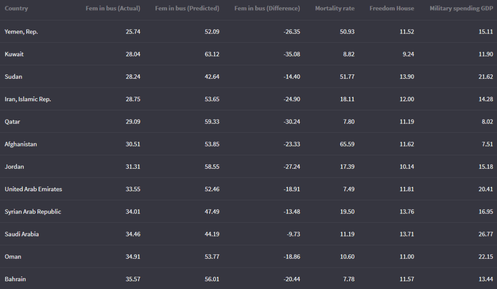
We can look at the fitted values that the model uses to predict the dependent variable – level of women in business – and compare them to the actual values.
The third column in the table is the difference between the predicted and actual values.
fem_bus_pred %>%
  mutate(across(where(is.numeric), ~round(., 2))) %>%
  arrange(mean_fem_bus) %>%
  select(Country = country,
    `Fem in bus (Actual)` = mean_fem_bus,
    `Fem in bus (Predicted)` = .fitted,
    `Fem in bus (Difference)` = .resid,
                  `Mortality rate` = mean_mortality,
                  `Freedom House` = mean_fh,
                  `Military spending GDP` = mean_mil_gdp)  %>%
kbl(full_width = F) | Country | Leverage of country | Fem in bus (Actual) | Fem in bus (Predicted) |
|---|---|---|---|
| Austria | 0.02 | 88.92 | 88.13 |
| Belgium | 0.02 | 92.13 | 87.65 |
| Costa Rica | 0.02 | 79.80 | 87.84 |
| Denmark | 0.02 | 96.36 | 87.74 |
| Finland | 0.02 | 94.23 | 87.74 |
| Iceland | 0.02 | 96.36 | 88.90 |
| Ireland | 0.02 | 95.80 | 88.18 |
| Luxembourg | 0.02 | 94.32 | 88.33 |
| Sweden | 0.02 | 96.45 | 87.81 |
| Switzerland | 0.02 | 83.81 | 87.78 |
And we can graph them out:
fem_bus_pred %>%
  mutate(fh_category = cut(mean_fh, breaks =  5,
  labels = c("full demo ", "high", "middle", "low", "no demo"))) %>%         ggplot(aes(x = .fitted, y = mean_fem_bus)) +
  geom_point(aes(color = fh_category), size = 4, alpha = 0.6) +
  geom_smooth(method = "loess", alpha = 0.2, color = "#20948b") +
  bbplot::bbc_style() +
  labs(x = '', y = '', title = "Fitted values versus actual values")
In addition to the predicted values generated by the model, other new columns that the augment function adds include:
.hat= this is a measure of the leverage of each variable.
.cooksd= this is the Cook’s Distance. It shows how much actual influence the observation had on the model. Combines information from .residual and .hat.
.sigma= this is the estimate of residual standard deviation if that observation is dropped from model
.std.resid= standardised residuals
If we look at the .hat observations, we can examine the amount of leverage that each country has on the model.
fem_bus_pred %>%
  mutate(dplyr::across(where(is.numeric), ~round(., 2))) %>%
  arrange(desc(.hat)) %>%
  select(Country = country,
         `Leverage of country` = .hat,
         `Fem in bus (Actual)` = mean_fem_bus,
         `Fem in bus (Predicted)` = .fitted)  %>%
  kbl(full_width = F) %>%
  kable_material_dark()
Next, we can look at Cook’s Distance. This is an estimate of the influence of a data point. According to statisticshowto website, Cook’s D is a combination of each observation’s leverage and residual values; the higher the leverage and residuals, the higher the Cook’s distance.
- If a data point has a Cook’s distance of more than three times the mean, it is a possible outlier
- Any point over 4/n, where n is the number of observations, should be examined
- To find the potential outlier’s percentile value using the F-distribution. A percentile of over 50 indicates a highly influential point
fem_bus_pred %>%
  mutate(fh_category = cut(mean_fh,
breaks =  5,
  labels = c("full demo ", "high", "middle", "low", "no demo"))) %>%
  mutate(outlier = ifelse(.cooksd > 4/length(fem_bus_pred), 1, 0)) %>%
  ggplot(aes(x = .fitted, y = .resid)) +
  geom_point(aes(color = fh_category), size = 4, alpha = 0.6) +
  ggrepel::geom_text_repel(aes(label = ifelse(outlier == 1, country, NA))) +
  labs(x ='', y = '', title = 'Influential Outliers') +
bbplot::bbc_style() 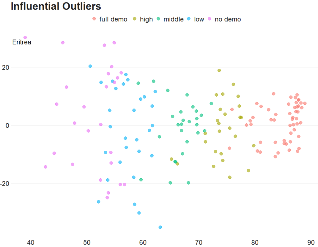
We can decrease from 4 to 0.5 to look at more outliers that are not as influential.
Also we can add a horizontal line at zero to see how the spread is.
fem_bus_pred %>%
  mutate(fh_category = cut(mean_fh, breaks =  5,
labels = c("full demo ", "high", "middle", "low", "no demo"))) %>%
  mutate(outlier = ifelse(.cooksd > 0.5/length(fem_bus_pred), 1, 0)) %>%
  ggplot(aes(x = .fitted, y = .resid)) +
  geom_point(aes(color = fh_category), size = 4, alpha = 0.6) +
  geom_hline(yintercept = 0, color = "#20948b", size = 2, alpha = 0.5) +
  ggrepel::geom_text_repel(aes(label = ifelse(outlier == 1, country, NA)), size = 6) +
  labs(x ='', y = '', title = 'Influential Outliers') +
bbplot::bbc_style() 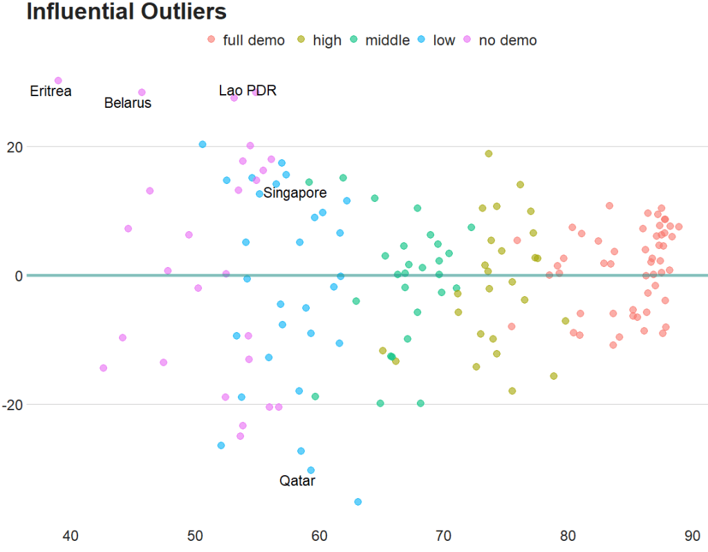
To look at the model-level data, we can use the tidy()function
fem_bus_tidy <- broom::tidy(fem_bus_lm)
And glance() to examine things such as the R-Squared value, the overall resudial standard deviation of the model (sigma) and the AIC scores.
broom::glance(fem_bus_lm)
An R squared of 0.55 is not that hot ~ so this model needs a fair bit more work.
We can also use the broom packge to graph out the assumptions of the linear model. First, we can check that the residuals are normally distributed!
fem_bus_pred %>%
  ggplot(aes(x = .resid)) +
  geom_histogram(bins = 15, fill = "#20948b") +
  labs(x = '', y = '', title = 'Distribution of Residuals') +
  bbplot::bbc_style()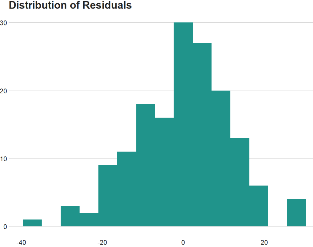
Next we can plot the predicted versus actual values from the model with and without the outliers.
First, all countries, like we did above:
fem_bus_pred %>%
  mutate(fh_category = cut(mean_fh, breaks =  5,
  labels = c("full demo ", "high", "middle", "low", "no demo"))) %>%         ggplot(aes(x = .fitted, y = mean_fem_bus)) +
  geom_point(aes(color = fh_category), size = 4, alpha = 0.6) +
  geom_smooth(method = "loess", alpha = 0.2, color = "#20948b") +
  bbplot::bbc_style() +
  labs(x = '', y = '', title = "Fitted values versus actual values")
And how to plot looks like if we drop the outliers that we spotted earlier,
fem_bus_pred %>%
  filter(country != "Eritrea") %>%
   filter(country != "Belarus") %>%
  mutate(fh_category = cut(mean_fh, breaks =  5,
                           labels = c("full demo ", "high", "middle", "low", "no demo"))) %>%         ggplot(aes(x = .fitted, y = mean_fem_bus)) +
  geom_point(aes(color = fh_category), size = 4, alpha = 0.6) +
  geom_smooth(method = "loess", alpha = 0.2, color = "#20948b") +
  bbplot::bbc_style() +
  labs(x = '', y = '', title = "Fitted values versus actual values")
