Tips and code snippets to improve ggplot graphs and plots in R

Some code snippets to improve graph appearance and readability!

Compare the first basic graph with the second more informative graph.

Happy Birthday Reaction GIF - Find & Share on GIPHY
pko %>% 
  group_by(year) %>% 
  count() -> ya

ya %>% 
  ggplot(aes(x = year,
             y = n)) +
  geom_point() + geom_line()

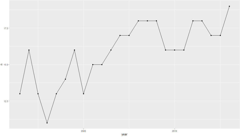
Dealing with the z and y axes can be a pain.

yo %>% 
  ggplot(aes(x = year, y = n)) + 
  geom_point() + 
  geom_line() +
  scale_x_continuous(breaks = seq(min(yo$year, na.rm = TRUE), 
                                  max(yo$year, na.rm = TRUE), 
                                  by = 1)) + 
  scale_y_continuous(limits = c(0, max(yo$n, na.rm = TRUE)),
                     breaks = function(limits) seq(floor(limits[1]), ceiling(limits[2]), by = 1)
  )

In this code:

The breaks argument of scale_y_continuous() is set using a custom function that takes limits as input (which represents the range of the y-axis determined by ggplot2 based on your data).

seq() generates a sequence from the floor (rounded down) of the minimum limit to the ceiling (rounded up) of the maximum limit, with a step size of 1.

This ensures that the sequence includes only whole integers.

Using floor() for the start of the sequence ensures you start at a whole number not greater than the smallest data point, and ceiling() for the end of the sequence ensures you end at a whole number not less than the largest data point.

This approach allows the y-axis to dynamically adapt to your data’s range while ensuring that only whole integers are used as ticks, suitable for counts or other integer-valued data.

pko %>% 
  pivot_longer(!c(cown, year),
               names_to = "organization",
               values_to = "troops") %>% 
  group_by(year, organization) %>% 
  summarise(sum_troops = sum(troops, na.rm = TRUE)) %>% 
  ungroup() -> yo


pal <- c("totals_intl" = "#DE2910",
         "totals_reg" = "#3C3B6E", 
         "totals_un" = "#FFD900")

yo %>% 
  ggplot(aes(x = year, y = sum_troops,
             group = organization,
             color = organization)) + 
  geom_point(size = 3) +
  geom_line(size = 2, alpha = 0.7)  + 
  scale_y_continuous(labels = scales::label_comma()) + 
  # scale_y_continuous(limits = c(0, max(yo$n, na.rm = TRUE))) +
  scale_x_continuous(breaks = seq(min(yo$year, na.rm = TRUE), 
                                  max(yo$year, na.rm = TRUE), 
                                  by = 2)) +
  ggthemes::theme_fivethirtyeight() +
  scale_color_manual(values =  pal,
                     name = "Organization Type",  
                     labels = c("International",
                                "Regional",
                                "United Nations")) +
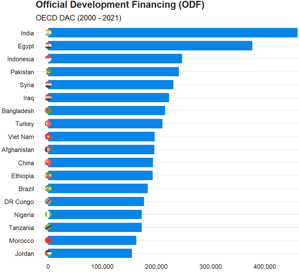
  labs(title = "Peacekeeping Operations",
       subtitle = "Number of troops per organization type",
       caption = "Source: Bara 2020",
       x = "Year",
       y = "Number of troops") +
  
  guides(color = guide_legend(override.aes = list(size = 8))) + 
  theme(text = element_text(size = 12),  # Default text size for all text elements
        plot.title = element_text(size = 20, face="bold"),  # Plot title
        axis.title = element_text(size = 16),  # Axis titles (both x and y)
        axis.text = element_text(size = 14),  # Axis text (both x and y)
        legend.title = element_text(size = 14),  # Legend title
        legend.text = element_text(size = 12))  # Legend items

Cairo::CairoWin()    
Happy Season 5 GIF by The Office - Find & Share on GIPHY

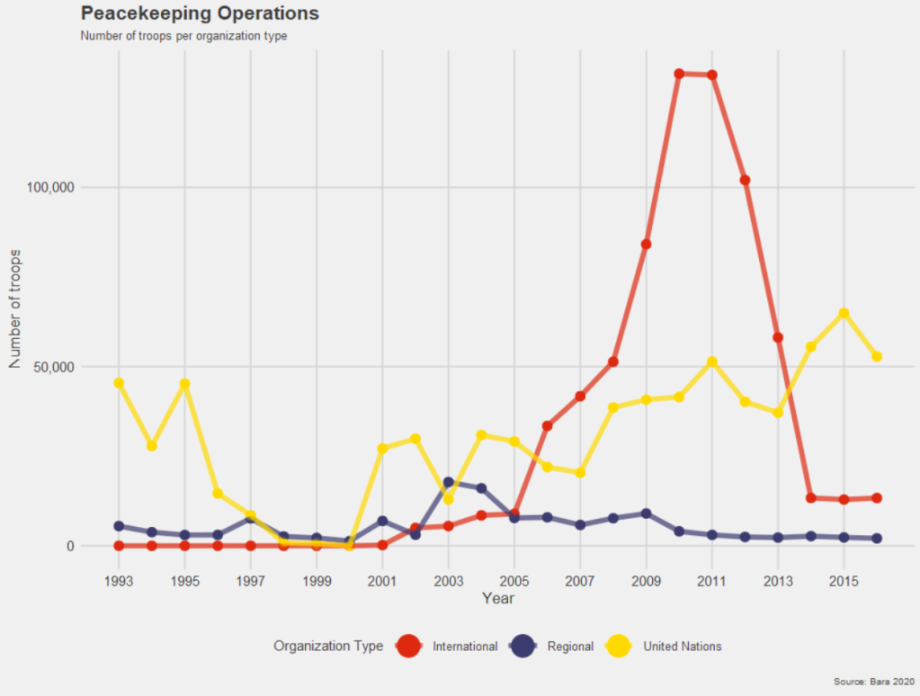
Next, we will look at changing colors in our maps.

We have a map and we want to make the colors pop more.

Click here to read about downloading the V-DEM and map data:

   geom_tile(data = data.frame(value = seq(0, 1, length.out = length(colors))), 
             aes(x = 1, y = value, fill = value), 
             show.legend = FALSE) +
   scale_fill_gradientn(colors = colors, 
                        breaks = scales::pretty_breaks(n = length(colors)),
                        labels = scales::number_format(accuracy = 1)) +

Creation of data for geom_tile():

data = data.frame(value = seq(0, 1, length.out = length(colors))) 

This line creates a data.frame with a single column named value. The column contains a sequence of values from 0 to 1. The length.out parameter is set to the length of the colors vector, meaning the sequence will be of the same length as the number of colors you have defined. This ensures that the gradient will have the same number of distinct colors as are in your colors vector.

geom_tile()

geom_tile(aes(x = 1, y = value, fill = value), show.legend = FALSE)

geom_tile() is used here to create a series of rectangles (tiles). Each tile will have its y position set to the corresponding value from the sequence created earlier. The x position is fixed at 1, so all tiles will be in a straight line. The fill aesthetic is mapped to the value, so each tile’s fill color will be determined by its y value. The show.legend = FALSE parameter hides the legend for this layer, which is typically used when you want to create a custom legend.

scale_fill_gradientn()

scale_fill_gradientn(colors = colors, breaks = scales::pretty_breaks(n = length(colors)), labels = scales::number_format(accuracy = 1)) 

scale_fill_gradientn() creates a color scale for the fill aesthetic based on the colors vector that we supplied.

The breaks argument is set with scales::pretty_breaks(n = length(colors)), which calculates ‘pretty’ breaks for the scale, basically nice round numbers within the range of your data, and it is set to create as many breaks as there are colors.

The labels argument is set with scales::number_format(accuracy = 2), which specifies how the labels on the legend should be formatted. The accuracy = 2 parameter means that the labels will be formatted to one decimal place

How to download OECD datasets in R

Packages we will need:

library(OECD)
library(tidyverse)
library(magrittr)
library(janitor)
library(devtools)
library(readxl)
library(countrycode)
library(scales)
library(ggflags)
library(bbplot)

In this blog post, we are going to look at downloading data from the OECD statsitics and data website.

The Organisation for Economic Co-operation and Development (OECD) provides analysis, and policy recommendations for 38 industrialised countries.

Angry Work GIF by Jess - Find & Share on GIPHY

The 38 countries in the OECD are:

  • Australia
  • Austria
  • Belgium
  • Canada
  • Chile
  • Colombia
  • Czech Republic
  • Denmark
  • Estonia
  • Finland
  • France
  • Germany
  • Hungary
  • Iceland
  • Ireland
  • Israel
  • Italy
  • Japan
  • South Korea
  • Latvia
  • Lithuania
  • Luxembourg
  • Mexico
  • Netherland
  • New Zealand
  • Norway
  • Poland
  • Portugal
  • Slovakia
  • Slovenia
  • Spain
  • Sweden
  • Switzerland
  • Turkey
  • United Kingdom
  • United States
  • European Union

We can download the OCED data package directly from the github repository with install_github()

install_github("expersso/OECD")
library(OECD)

The most comprehensive tutorial for the package comes from this github page. Mostly, it gives a fair bit more information about filtering data

We can look at the all the datasets that we can download from the website via the package with the following get_datasets() function:

titles <- OECD::get_datasets()

This gives us a data.frame with the ID and title for all the OECD datasets we can download into the R console, as we can see below.

In total there are 1662 datasets that we can download.

These datasets all have different variable types, countries, year spans and measurement values. So it is important to check each dataset carefully when we download them.

We can filter key phrases to subset datasets:

 titles %>%  
         filter(grepl("oda", title, ignore.case = TRUE)) %>% View

In this blog, we will graph out the Official Development Financing (ODF) for each country.

Official Development Financing measures the sum of RECEIVED (NOT DONATED) aid such as:

  • bilateral ODA aid
  • concessional and non-concessional resources from multilateral sources
  • bilateral other official flows made available for reasons unrelated to trade

Before we can charge into downloading any dataset, it is best to check out the variables it has. We can do that with the get_data_structure() function:

get_data_structure("REF_TOTAL_ODF") %>% 
       str(., max.level = 2)
 $ VAR_DESC       :'data.frame':	10 obs. of  2 variables:
  ..$ id         : chr [1:10] "RECIPIENT" "PART" "AMOUNTTYPE" "TIME" ...
  ..$ description: chr [1:10] "Recipient" "Part" "Amount type" "Year" ...

 $ RECIPIENT      :'data.frame':	301 obs. of  2 variables:
  ..$ id   : chr [1:301] "10200" "10100" "10010" "71" ...
  ..$ label: chr [1:301] "All Recipients, Total" "Developing Countries, Total" "Europe, Total" "Albania" ...

 $ PART           :'data.frame':	2 obs. of  2 variables:
  ..$ id   : chr [1:2] "1" "2"
  ..$ label: chr [1:2] "1 : Part I - Developing Countries" "2 : Part II - Countries in Transition"

 $ AMOUNTTYPE     :'data.frame':	2 obs. of  2 variables:
  ..$ id   : chr [1:2] "A" "D"
  ..$ label: chr [1:2] "Current Prices" "Constant Prices"

 $ TIME           :'data.frame':	62 obs. of  2 variables:
  ..$ id   : chr [1:62] "1960" "1961" "1962" "1963" ...
  ..$ label: chr [1:62] "1960" "1961" "1962" "1963" ...

We will clean up the ODF dataset with the clean_names() function from janitor package.

aid <- get_dataset("REF_TOTAL_ODF")  %>% 
  janitor::clean_names()  %>%
  select(recipient, aid = obs_value, time)

One problem with this dataset is that we only have the DAC country codes in this dataset.

We will need to read in and merge the country code variables into the aid dataset.

dac_code <- readxl::read_excel(file.choose())

We can then clean up the DAC codes to merge with the aid data.

dac_code %<>%
    janitor::clean_names()  %>% 
    mutate(cown = countrycode(recipient_name_e, "country.name", "cown")) %>% 
    select(recipient_code,
         year, 
         cown,
         country = recipient_name_e,
         group_id, 
         dev_group = group_name_e,
         p_group = group_name_f,
         wb_group)

And merge with left_join()

aid %<>% 
  mutate(recipient_code = parse_number(recipient)) %>%  
  left_join(dac_code, by = c("recipient_code" = "recipient_code")) 

Next we can sum up the aid that each country received since 2000.

aid %>% 
  filter(year > 1999) %>%  
  filter(!is.na(country)) %>% 
  mutate(aid = parse_number(aid)) %>% 
  mutate(country = case_when(country == "Syrian Arab Republic" ~ "Syria", 
                             country == "T?rkiye" ~ "Turkey",
                             country == "China (People's Republic of)" ~ "China",
                             country == "Democratic Republic of the Congo" ~ "DR Congo",
                             TRUE ~ as.character(country))) %>% 
  group_by(country) %>% 
  summarise(total_aid = sum(aid, na.rm = TRUE)) %>% 
  ungroup() %>% 
  mutate(iso2 = tolower(countrycode(country, "country.name", "iso2c"))) %>% 
  filter(total_aid > 150000) %>% 
  ggplot(aes(x = reorder(country, total_aid),
             y = total_aid)) + 
  geom_bar(stat = "identity", 
           width = 0.7, 
           color = "#0a85e5", 
           fill = "#0a85e5") +
  ggflags::geom_flag(aes(x = country, y = -1, country = iso2), size = 8) +
  bbplot::bbc_style() + 
  scale_y_continuous(labels = scales::comma_format()) +
  coord_flip() + 
  labs(x = "ODA received", y = "", title = "Official Development Financing (ODF)", subtitle = "OECD DAC (2000 - 2021)")

The TIME_FORMAT can be any of the following types:

  • ‘P1Y’ for annual
  • ‘P6M’ for bi-annual
  • ‘P3M’ for quarterly
  • ‘P1M’ for monthly data.

To access each countries in the datasets, we can use the following codes

oecd_ios3 <- c("AUS", "AUT", "BEL", "CAN", "CHL", "COL", "CZE",
               "DNK", "EST", "FIN", "FRA", "DEU", "GRC", "HUN",
               "ISL", "IRL", "ISR", "ITA", "JPN", "KOR", "LVA", 
               "LTU", "LUX", "MEX", "NLD", "NZL", "NOR", "POL",
               "PRT", "SVK", "SVN", "ESP", "SWE", "CHE", "TUR",
               "GBR", "USA")

Alternatively, we can use only the EU countries that are in the OECD.

eu_oecd_iso3 <- c("AUT", "BEL", "CZE", "DNK", "EST", "FIN", 
                  "FRA", "DEU", "GRC", "HUN", "IRL", "ITA",
                  "LVA", "LTU", "LUX", "NLD", "POL", "PRT",
                  "SVK", "SVN", "ESP", "SWE")
sal_raw %>% 
  janitor::clean_names() %>% 
  filter(age == "Y25T64") %>% 
  filter(grade == "TE") %>% 
  filter(indicator == "NAT_ACTL_YR") %>% 
  filter(isc11 == "L1") %>% 
  filter(sex == "T") %>% 
  select(country, year = time, obs_value) -> sal

Cleaning up messy World Bank data

Packages we will need:

library(tidyverse)
library(tidyr)
library(janitor)
library(magrittr)
library(democracyData)
library(countrycode)
library(ggimage)

When you come across data from the World Bank, often it is messy.

So this blog will go through how to make it more tidy and more manageable in R

For this blog, we will look at World Bank data on financial aid. Specifically, we will be using values for net ODA received as percentage of each country’s GNI. These figures come from the Development Assistance Committee of the Organisation for Economic Co-operation and Development (DAC OECD).

If we look at the World Bank data downloaded from the website, we have a column for each year and the names are quite messy.

This data is wide form.

Unacceptable.

So we will change the data from wide to long data.

Instead of a column for each year, we will have a row for each country-year.

Before doing that, we can clean up the variable names with the janitor package function: clean_names().

sdg %<>% 
  clean_names() 

ALSO, before we pivot the dataset to longer format, we choose the variables we want to keep (i.e. only country, year and ODA value)

sdg %<>% 
  select(country_name, x1990_yr1990:x2015_yr2015) 

Now we are ready to turn the data from wide to long.

We can use the pivot_longer() function from the tidyr package.

Instead of 286 rows and 27 columns, we will ultimately end up with 6968 rows and only 3 columns.

Source: Garrick Aden-Buie’s (@grrrckTidy Animated Verbs

Thank you to Mr. Aden-Buie for your page visualising all the different ways to transform datasets with dplyr. Click the link to check out more.

Back to the pivoting, we want to create a row for each year, 1990, 1991, 1992 …. up to 2015

And we will have a separate cell for each value of the ODA variable for each country-year value.

In the pivot_longer() function we exclude the country names,

We want a new row for each year, so we make a “year” variable with the names_to() argument.

And we create a separate value for each ODA as a percentage of GNI with the values_to() argument.

sdg %>% 
  pivot_longer(!country_name, names_to = "year", 
               values_to = "oda_gni") -> oda

The year values are character strings, not numbers. So we will convert with parse_number(). This parses the first number it finds, dropping any non-numeric characters before the first number and all characters after the first number.

oda %>% 
     mutate(year = parse_number(year)) -> oda 

Next we will move from the year variable to ODA variable. There are many ODA values that are empty. We can see that there are 145 instances of empty character strings.

oda %>% 
  count(oda_gni) %>% 
  arrange(oda_gni)

So we can replace the empty character strings with NA values using the na_if() function. Then we can use the parse_number() function to turn the character into a string.

oda %>%
  mutate(oda_gni = na_if(oda_gni, "")) %>% 
  mutate(oda_gni = parse_number(oda_gni)) -> oda

Now we need to delete the year variables that have no values.

oda %<>% 
  filter(!is.na(year))

Also we need to delete non-countries.

The dataset has lots of values for regions that are not actual countries. If you only want to look at politically sovereign countries, we can filter out countries that do not have a Correlates of War value.

oda %<>%
  mutate(cow = countrycode(oda$country_name, "country.name", 'cown')) %>% 
  filter(!is.na(cow))

We can also make a variable for each decade (1990s, 2000s etc).

oda %>% 
  mutate(decade = substr(year, 1, 3)) %>% 
  mutate(decade = paste0(decade, "0s"))

And download data for countries’ region, continent and govenment regime. To do this we use the democracyData package and download the PACL dataset.

Click here to read more about this package.

pacl <- democracyData::redownload_pacl()

pacl %>% 
  select(cow = pacl_cowcode,
         year,
         region = un_region_name,
         continent = un_continent_name,
         demo_dummy = democracy,
         regime = regime
         ) -> pacl_subset

We use the left_join() function to join both datasets together with Correlates of War code and year variables.

oda %>% 
  left_join(pacl_subset, by = c("cow", "year")) -> oda_pacl

Now if we look at the dataset, we can see that it is much tidier and we can start analysing.

Below we can create a bar chart of the top ten countries that received the most aid as a percentage of their economic income (gross national income)

First we need to get the average oda per country with the group_by() and summarise() functions

oda_pacl %>%
  mutate(oda_gni = ifelse(is.na(oda_gni), 0, oda_gni)) %>%  
  group_by(country_name,region, continent) %>% 
  summarise(avg_oda = mean(oda_gni, na.rm = TRUE)) -> oda_mean

We use the slice() function to only have the top ten countries

oda_mean %>% 
  arrange(desc(avg_oda)) %>%
  ungroup() %>% 
  slice(1:10) -> oda_slice

We add an ISO code for each country for the flags

Click here to read more about the ggimage package

oda_slice %<>% 
  mutate(iso2 = countrycode(country_name, "country.name", "iso2c"))

And some nice hex colours

my_palette <- c( "#44bec7", "#ffc300", "#fa3c4c")

And finally, plot it out with ggplot()

oda_slice %>%
  ggplot(aes(x = reorder(country_name, avg_oda),
             y = avg_oda, fill = continent)) + 
  geom_bar(stat = "identity") + 
  ggimage::geom_flag(aes(image = iso2), size = 0.1)  +
  coord_flip() +
  scale_fill_manual(values = my_palette) + 
  labs(title = "ODA aid as % GNI ",
       subtitle = "Source: OECD DAC via World Bank",
       x = "Donor Country",
       y = "ODA per capita") + bbplot::bbc_style()

Download and graph UN votes data with the unvotes package in R

Packages we will need:

library(unvotes)
library(lubridate)
library(tidyverse)
library(magrittr)
library(bbplot)
library(waffle)

How to download UN votes to R.

This package was created by David Robinson. Click here to read the CRAN PDF.

Pop Tv Congrats GIF by Schitt's Creek - Find & Share on GIPHY

We will download both the votes roll calls and the issues. Then we can use the inner_join() variable to add them together by the ID.

un_votes <- unvotes::un_roll_calls

un_votes_issues <- unvotes::un_roll_call_issues

un_votes %<>% 
  inner_join(un_votes_issues, by = "rcid")

We can create a year variable with the format() function and extract the year with “%Y”

un_votes %<>% 
  mutate(year = format(date, format = "%Y")) 

And graph out the count of each type of UN vote issue

un_votes %>% 
  group_by(year) %>% 
  count(issue) %>% 
  ggplot(aes(x = year, y = n, group = issue, color = issue)) + 
  geom_line(size = 2) + 
  geom_point(aes(color = issue), fill = "white", 
             shape = 21, size = 2, stroke = 1) +
  scale_x_discrete(breaks = round(seq(min(un_votes$year), max(un_votes$year), by = 10),1)) +
  bbplot::bbc_style() + facet_wrap(~issue)

Next we can look at which decade had the most votes across the issues with the waffle package

Click here to read more about the waffle package

un_votes %>% 
  mutate(decade = substr(year, 1, 3)) %>% 
  mutate(decade = paste0(decade, "0s")) %>% 
  
  group_by(decade) %>% 
  count(issue) %>% 
  
  ggplot(aes(fill = issue, values = n)) +
  geom_waffle(color = "white",
              size = 0.3,
              n_rows = 10, 
              flip = TRUE) +
  facet_wrap(~decade, nrow = 1, strip.position = "bottom") + 
  bbplot::bbc_style()  +
  scale_x_discrete(breaks = round(seq(0, 1, by = 0.2),3)) 

The 1980s were a prolific time for the UNGA with voting, with arms control being the largest share of votes. And it has stablised in the decades since.

Well Done Applause GIF by CBC - Find & Share on GIPHY

Next we can look at votes in total

un_votes %>% 
  mutate(issue = case_when(issue == "Nuclear weapons and nuclear material" ~ "Nukes",
                           issue == "Arms control and disarmament" ~ "Arms",
                           issue == "Palestinian conflict" ~ "Palestine",
                           TRUE ~ as.character(issue))) %>% 
  count(issue) %>%  
  ggplot(aes(x = reorder(issue, n), y = n, fill = as.factor(issue))) + 
  geom_bar(stat = "identity") + 
  coord_polar("x", start = 0, direction = -1)  + 
  ggthemes::theme_pander()  +
  bbplot::bbc_style() + 
    theme(axis.text = element_blank(),
          axis.title.x = element_blank(),
          axis.title.y = element_blank(),
          axis.ticks = element_blank(),
          text = element_text(size = 25),
          panel.grid = element_blank()) + 
    ggtitle(label = "UN Votes by issue ", 
            subtitle = "Source: unvotes package")