How to create a Regional Economic Communities dataset. PART ONE: Scraping data with rvest in R

Click here for part two on the REC dataset.

Packages we will need:

library(tidyverse)
library(rvest)
library(janitor)
library(ggflags)
library(countrycode)

The Economic Community of West African States (ECOWAS) has been in the news recently. The regional bloc is openly discussing military options in response to the coup unfolding in the capital of Niger.

This made me realise that I know VERY VERY LITTLE about the regional economic communities (REC) in Africa.

Ernest Aniche (2015: 41) argues, “the ghost of [the 1884] Berlin Conference” led to a quasi-balkanisation of African economies into spheres of colonial influence. He argues that this ghost “continues to haunt Africa […] via “neo-colonial ties” today.

To combat this balkanisation and forge a new pan-Africanist approach to the continent’s development, the African Union (AU) has focused on regional integration.

This integration was more concretely codified with 1991’s Abuja Treaty.

One core pillar on this agreement highlights a need for increasing flows of intra-African trade and decreasing the reliance on commodity exports to foreign markets (Songwe, 2019: 97)

Broadly they aim mirror the integration steps of the EU. That translates into a roadmap towards the development of:

Free Trade Areas:

  • AU : The African Continental Free Trade Area (AfCFTA) aims to create a single market for goods and services across the African continent, with the goal of boosting intra-African trade.
  • EU : The European Free Trade Association (EFTA) is a free trade area consisting of four European countries (Iceland, Liechtenstein, Norway, and Switzerland) that have agreed to remove barriers to trade among themselves.

Customs Union:

  • AU: The East African Community (EAC) is an REC a customs union where member states (Burundi, Kenya, Rwanda, South Sudan, Tanzania, and Uganda) have eliminated customs duties and adopted a common external tariff for trade with non-member countries.
  • EU: The EU’s Single Market is a customs union where goods can move freely without customs duties or other barriers across member states.

Common Market:

  • AU: Many RECs such the Southern African Development Community (SADC) is working towards establishing a common market that allows for the free movement of goods, services, capital, and labor among its member states.
  • EU: The EU is a prime example of a common market, where not only goods and services, but also people and capital, can move freely across member countries.

Economic Union:

  • AU: The West African Economic and Monetary Union (WAEMU) is moving towards an economic union with shared economic policies, a common currency (West African CFA franc), and coordination of monetary and fiscal policies.
  • EU: Has coordinated economic policies and a single currency (Euro) used by several member states.

The achievement of a political union on the continent is seen as the ultimate objective in many African countries (Hartzenberg, 2011: 2), such as the EU with its EU Parliament, Council, Commission and common foreign policy.

According to a 2012 UNCTAD report, “progress towards regional integration has, to date, been uneven, with some countries integrating better at the regional and/or subregional level and others less so”.

So over this blog, series, we will look at the RECs and see how they are contributing to African integration.

We can use the rvest package to scrape the countries and information from each Wiki page. Click here to read more about the rvest package and web scraping:

First we will look at the Arab Maghreb Union (AMU). We feed the AMU wikipedia page into the read_html() function.

With `[[`(3) we can choose the third table on the Wikipedia page.

With the janitor package, we can can clean the names (such as remove capital letters and awkward spaces) and ensure more uniform variable names.

We pull() the country variable and it becomes a vector, then turn it into a data frame with as.data.frame() . Alternatively we can just select this variable with the select() function.

We create some more variables for each REC group when we merge them all together later.

We will use the str_detect() function from the stringr package to filter out the total AMU column row as it is non-country.

read_html("https://en.wikipedia.org/wiki/Arab_Maghreb_Union") %>% 
  html_table(header = TRUE, fill = TRUE) %>% 
  `[[`(3) %>%  
  clean_names()  %>% 
  pull(country) %>% 
  as.data.frame() %>% 
  mutate(rec = "Arab Meghreb Union",
         geo = "Maghreb", 
         rec_abbrev = "AMU") %>% 
  select(country = '.', everything()) %>% 
  filter(!str_detect(country, fixed("Arab Maghreb", ignore_case = TRUE))) -> amu

We can see in the table on the Wikipedia page, that it contains a row for all the Arab Maghreb Union countries at the end. But we do not want this.

We use the str_detect() function to check if the “country” variable contains the string pattern we feed in. The ignore_case = TRUE makes the pattern matching case-insensitive.

The ! before str_detect() means that we remove this row that matches our string pattern.

We can use the fixed() function to make sure that we match a string as a literal pattern rather than a regular expression pattern / special regex symbols. This is not necessary in this situation, but it is always good to know.

For this example, I will paste the code to make a map of the countries with country flags.

Click here to read more about adding flags to maps in R

First we download a map object from the rnaturalearth package

world_map <- ne_countries(scale = "medium", returnclass = "sf")

To add the flags on the map, we need longitude and latitude coordinates to feed into the x and y arguments in the geom_flag(). We can scrape these from the web too.

We add iso2 character codes in all lower case (very important for the geom_flag() step)) with the countrycode() function.

Click here to read more about the countrycode package.

read_html("https://developers.google.com/public-data/docs/canonical/countries_csv") %>%
  html_table(header = TRUE, fill = TRUE) %>% 
  `[[`(1) %>% 
  select(latitude, 
         longitude, 
         iso_a2 = country) %>% 
  right_join(world_map, by = c("iso_a2" = "iso_a2")) %>% 
  left_join(amu, by = c("admin" = "country")) %>% 
  select(latitude, longitude, iso_a2, geometry, admin, region_un, rec, rec_abbrev) %>% 
  mutate(amu_map = ifelse(!is.na(rec), 1, 0),
         iso_a2 = tolower(iso_a2)) %>%
  filter(region_un == "Africa") -> amu_map

Set a consistent theme for the maps.

theme_set(bbplot::bbc_style() +   theme(legend.position = "none",
                                        axis.text.x = element_blank(),
                                        axis.text.y = element_blank(),
                                        axis.title.x = element_blank(),
                                        axis.title.y = element_blank()))

And we can create the map of AMU countries with the following code:

amu_map %>% 
  ggplot() + 
  geom_sf(aes(geometry = geometry,
              fill = as.factor(amu_map), 
              alpha = 0.9),
          position = "identity",
          color = "black") + 
  ggflags::geom_flag(data = . %>% filter(rec_abbrev == "AMU"), 
                     aes(x = longitude,
                         y = latitude + 0.5,
                         country = iso_a2), 
                     size = 6) +
  scale_fill_manual(values = c("#FFFFFF", "#b766b4")) 

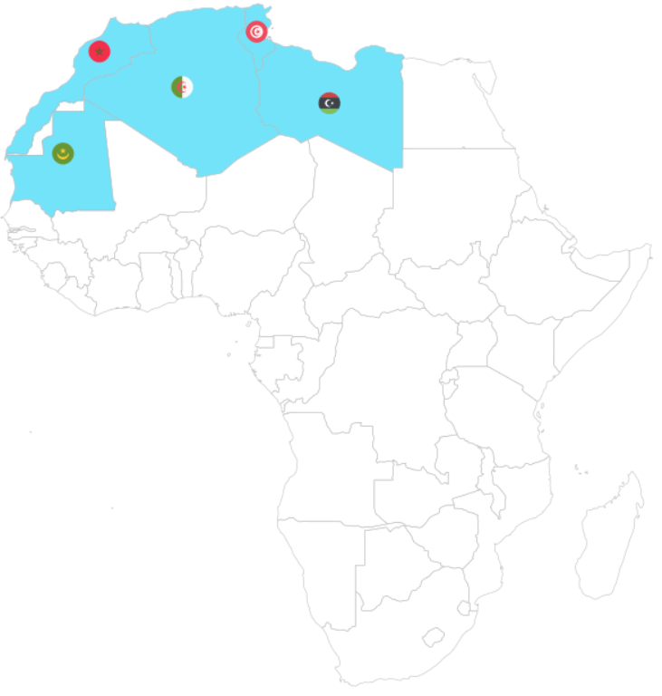
Next we will look at the Common Market for Eastern and Southern Africa.

If we don’t want to scrape the data from the Wikipedia article, we can feed in the vector of countries – separated by commas – into a data.frame() function.

Then we can separate the vector of countries into rows, and a cell for each country.

data.frame(country = "Djibouti, 
           Eritrea, 
           Ethiopia,
           Somalia,
           Egypt,
           Libya,
           Sudan,
           Tunisia,
           Comoros,
           Madagascar,
           Mauritius,
           Seychelles,
           Burundi,
           Kenya,
           Malawi,
           Rwanda,
           Uganda,
           Eswatini,
           Zambia") %>% 
  separate_rows(country, sep = ",") %>%  
  mutate(country = trimws(country)) %>%
  mutate(rec = "Common Market for Eastern and Southern Africa", 
         geo = "Eastern and Southern Africa",
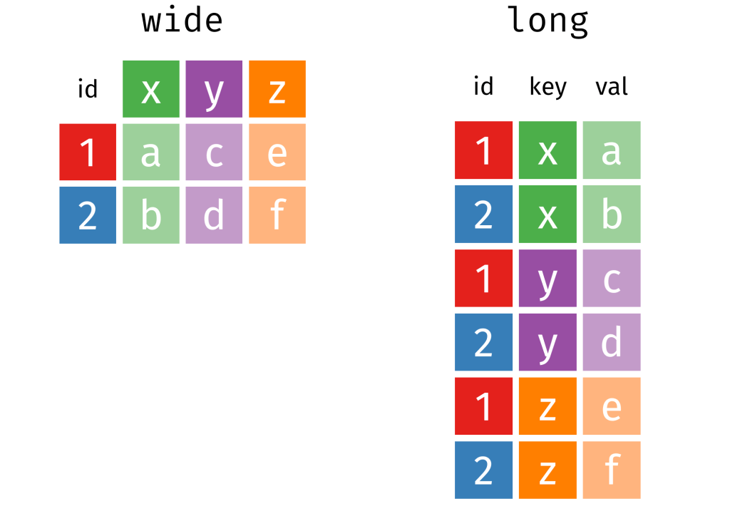
         rec_abbrev = "COMESA") -> comesa

The separate_rows() function comes from the tidyr package.

We use this to split a single column with comma-separated values into multiple rows, creating a “long” format.

With the mutate(country = trimws(country)) we can remove any spaces with whitespace trimming.

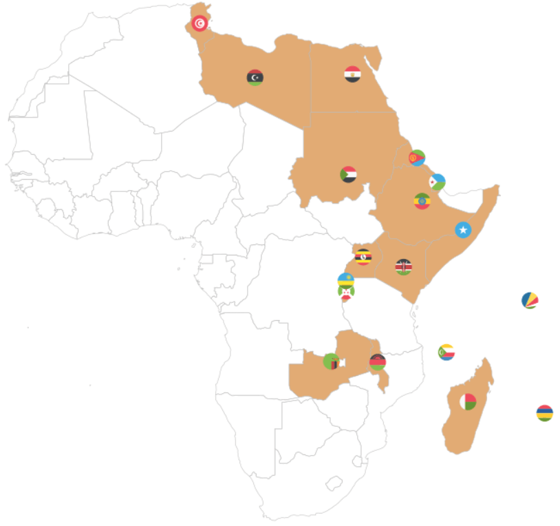
Onto the third REC – the Community of Sahel-Sahara States.

read_html("https://en.wikipedia.org/wiki/Community_of_Sahel%E2%80%93Saharan_States") %>% 
  html_table(header = TRUE, fill = TRUE) %>% 
  `[[`(5) %>%  
  janitor::clean_names()  %>% 
  pull() %>% as.data.frame() %>%
  select(country = '.', everything()) %>% 
  mutate(country = str_replace_all(country, "\\\n", ",")) %>% 
  separate_rows(country, sep = ",") %>% # create a column of words from the one cell vector of words!
  mutate(country = trimws(country)) %>%  # remove the white space
  mutate(rec = "Community of Sahel–Saharan States",
         geo = "Sahel Saharan States", 
         rec_abbrev = "CEN-SAD") -> censad

Fourth, onto the East African Community REC.

read_html("https://en.wikipedia.org/wiki/East_African_Community") %>% 
    html_table(header = TRUE, fill = TRUE) %>% 
    `[[`(2) %>%  
    janitor::clean_names() %>%
    pull(country) %>% 
    as.data.frame() %>% 
    mutate(rec = "East African Community",
           geo = "East Africa", 
           rec_abbrev = "EAC") %>% 
    select(country = '.', everything()) %>% 
  filter(str_trim(country) != "") -> eac

Fifth, we look at ECOWAS

read_html("https://en.wikipedia.org/wiki/Economic_Community_of_West_African_States") %>% 
  html_table(header = TRUE, fill = TRUE) %>% 
  `[[`(2) %>%  
  janitor::clean_names() %>%
  pull(country) %>% 
  as.data.frame() %>% 
  mutate(rec = "Economic Community of West African States",
         geo = "West Africa", 
         rec_abbrev = "ECOWAS") %>%
  select(country = '.', everything()) %>% 
  filter(str_trim(country) != "")  %>% 
  filter(str_trim(country) != "Total")  -> ecowas

Next the Economic Community of Central African States

read_html("https://en.wikipedia.org/wiki/Economic_Community_of_Central_African_States") %>% 
  html_table(header = TRUE, fill = TRUE) %>% 
  `[[`(4) %>%  
  janitor::clean_names() %>% 
  pull(country) %>% 
  as.data.frame() %>% 
    mutate(rec = "Economic Community of Central African States",
           geo = "Central Africa", 
           rec_abbrev = "ECCAS") %>% 
  select(country = '.', everything()) -> eccas

Seventh, we look at the Intergovernmental Authority on Development (IGAD)

data.frame(country = "Djibouti, Ethiopia, Somalia, Eritrea, Sudan, South Sudan, Kenya, Uganda") %>%  
separate_rows(country, sep = ",") %>%  
mutate(rec = "Intergovernmental Authority on Development", 
           geo = "Horn, Nile, Great Lakes",
           rec_abbrev = "IGAD") -> igad

Last, we will scrape Southern African Development Community (SADC)

read_html("https://en.wikipedia.org/wiki/Southern_African_Development_Community") %>% 
  html_table(header = TRUE, fill = TRUE) %>% 
  `[[`(3) %>%  
  janitor::clean_names() %>% 
  pull(country) %>% 
  as.data.frame() %>% 
  select(country = '.', everything()) %>% 
  mutate(country = sub("\\[.*", "", country),
    rec = "Southern African Development Community",
         geo = "Southern Africa", 
         rec_abbrev = "SADC") %>% 
  filter(!str_detect(country, fixed("Country", ignore_case = FALSE))) -> sadc

We can combine them all together with rbind to make a full dataset of all the countries.

  rbind(amu, censad, comesa, eac, eccas, ecowas, igad, sadc) %>% 
  mutate(country = trimws(country)) %>% 
  mutate(rec_abbrev = tolower(rec_abbrev)) -> rec

In the next blog post, we will complete the dataset (most importantly, clean up the country duplicates and make data visualisations / some data analysis with political and economic data!

References

Hartzenberg, T. (2011). Regional integration in Africa. World Trade Organization Publications: Economic Research and Statistics Division Staff Working Paper (ERSD-2011-14). PDF available

PDF available

UNCTAD (United Nations Conference on Trade and Development) (2021). Economic Development in Africa Report 2021: Reaping the Potential Benefits of the African Continental Free Trade Area for Inclusive Growth. PDF available

Songwe, V. (2019). Intra-African trade: A path to economic diversification and inclusion. Coulibaly, Brahima S, Foresight Africa: Top Priorities for the Continent in, 97-116. PDF available

Cleaning up messy World Bank data

Packages we will need:

library(tidyverse)
library(tidyr)
library(janitor)
library(magrittr)
library(democracyData)
library(countrycode)
library(ggimage)

When you come across data from the World Bank, often it is messy.

So this blog will go through how to make it more tidy and more manageable in R

For this blog, we will look at World Bank data on financial aid. Specifically, we will be using values for net ODA received as percentage of each country’s GNI. These figures come from the Development Assistance Committee of the Organisation for Economic Co-operation and Development (DAC OECD).

If we look at the World Bank data downloaded from the website, we have a column for each year and the names are quite messy.

This data is wide form.

Unacceptable.

So we will change the data from wide to long data.

Instead of a column for each year, we will have a row for each country-year.

Before doing that, we can clean up the variable names with the janitor package function: clean_names().

sdg %<>% 
  clean_names() 

ALSO, before we pivot the dataset to longer format, we choose the variables we want to keep (i.e. only country, year and ODA value)

sdg %<>% 
  select(country_name, x1990_yr1990:x2015_yr2015) 

Now we are ready to turn the data from wide to long.

We can use the pivot_longer() function from the tidyr package.

Instead of 286 rows and 27 columns, we will ultimately end up with 6968 rows and only 3 columns.

Source: Garrick Aden-Buie’s (@grrrckTidy Animated Verbs

Thank you to Mr. Aden-Buie for your page visualising all the different ways to transform datasets with dplyr. Click the link to check out more.

Back to the pivoting, we want to create a row for each year, 1990, 1991, 1992 …. up to 2015

And we will have a separate cell for each value of the ODA variable for each country-year value.

In the pivot_longer() function we exclude the country names,

We want a new row for each year, so we make a “year” variable with the names_to() argument.

And we create a separate value for each ODA as a percentage of GNI with the values_to() argument.

sdg %>% 
  pivot_longer(!country_name, names_to = "year", 
               values_to = "oda_gni") -> oda

The year values are character strings, not numbers. So we will convert with parse_number(). This parses the first number it finds, dropping any non-numeric characters before the first number and all characters after the first number.

oda %>% 
     mutate(year = parse_number(year)) -> oda 

Next we will move from the year variable to ODA variable. There are many ODA values that are empty. We can see that there are 145 instances of empty character strings.

oda %>% 
  count(oda_gni) %>% 
  arrange(oda_gni)

So we can replace the empty character strings with NA values using the na_if() function. Then we can use the parse_number() function to turn the character into a string.

oda %>%
  mutate(oda_gni = na_if(oda_gni, "")) %>% 
  mutate(oda_gni = parse_number(oda_gni)) -> oda

Now we need to delete the year variables that have no values.

oda %<>% 
  filter(!is.na(year))

Also we need to delete non-countries.

The dataset has lots of values for regions that are not actual countries. If you only want to look at politically sovereign countries, we can filter out countries that do not have a Correlates of War value.

oda %<>%
  mutate(cow = countrycode(oda$country_name, "country.name", 'cown')) %>% 
  filter(!is.na(cow))

We can also make a variable for each decade (1990s, 2000s etc).

oda %>% 
  mutate(decade = substr(year, 1, 3)) %>% 
  mutate(decade = paste0(decade, "0s"))

And download data for countries’ region, continent and govenment regime. To do this we use the democracyData package and download the PACL dataset.

Click here to read more about this package.

pacl <- democracyData::redownload_pacl()

pacl %>% 
  select(cow = pacl_cowcode,
         year,
         region = un_region_name,
         continent = un_continent_name,
         demo_dummy = democracy,
         regime = regime
         ) -> pacl_subset

We use the left_join() function to join both datasets together with Correlates of War code and year variables.

oda %>% 
  left_join(pacl_subset, by = c("cow", "year")) -> oda_pacl

Now if we look at the dataset, we can see that it is much tidier and we can start analysing.

Below we can create a bar chart of the top ten countries that received the most aid as a percentage of their economic income (gross national income)

First we need to get the average oda per country with the group_by() and summarise() functions

oda_pacl %>%
  mutate(oda_gni = ifelse(is.na(oda_gni), 0, oda_gni)) %>%  
  group_by(country_name,region, continent) %>% 
  summarise(avg_oda = mean(oda_gni, na.rm = TRUE)) -> oda_mean

We use the slice() function to only have the top ten countries

oda_mean %>% 
  arrange(desc(avg_oda)) %>%
  ungroup() %>% 
  slice(1:10) -> oda_slice

We add an ISO code for each country for the flags

Click here to read more about the ggimage package

oda_slice %<>% 
  mutate(iso2 = countrycode(country_name, "country.name", "iso2c"))

And some nice hex colours

my_palette <- c( "#44bec7", "#ffc300", "#fa3c4c")

And finally, plot it out with ggplot()

oda_slice %>%
  ggplot(aes(x = reorder(country_name, avg_oda),
             y = avg_oda, fill = continent)) + 
  geom_bar(stat = "identity") + 
  ggimage::geom_flag(aes(image = iso2), size = 0.1)  +
  coord_flip() +
  scale_fill_manual(values = my_palette) + 
  labs(title = "ODA aid as % GNI ",
       subtitle = "Source: OECD DAC via World Bank",
       x = "Donor Country",
       y = "ODA per capita") + bbplot::bbc_style()

Improve your visualizations with ggsave in R

When we save our plots and graphs in R, we can use the ggsave() function and specify the type, size and look of the file.

We are going to look two features in particular: anti-aliasing lines with the Cairo package and creating transparent backgrounds.

Make your graph background transparent

First, let’s create a pie chart with a transparent background. The pie chart will show which party has held the top spot in Irish politics for the longest.

After we prepare and clean our data of Irish Taoisigh start and end dates in office and create a doughnut chart (see bottom of blog for doughnut graph code), we save it to our working directory with ggsave().

To see where we set that to, we can use getwd().

ggsave(pie_chart, filename = 'pie_chart.png', width = 50, height = 50, units = 'cm')

If we want to add our doughnut chart to a power point but we don’t want it to be a white background, we can ask ggsave to save the chart as transparent and then we can add it to our powerpoint or report!

To do this, we specify bg argument to "transparent"

ggsave(pie_chart, filename = 'pie_chart_transparent.png', bg = "transparent", width = 50, height = 50, units = 'cm')

This final picture was made in canva.com

Hex color values come from coolors.co

Remove aliasing lines

Aliasing lines are jagged and pixelated.

When we save our graph in R with ggsave(), we can specify in the type argument that we want type = cairo.

I make a quick graph that looks at the trends in migration and GDP from 1960s to 2018 in Ireland. I made the lines extra large to demonstrate the difference between aliased and anti-aliased lines in the graphs.

library(Cairo)
ggsave(mig_trend, file="mig_alias.png", width = 80, height = 50, units = "cm")
ggsave(mig_trend, file="mig_antialias.png", type="cairo-png", dpi = 300,
 width = 80, height = 50, units = "cm")

When we zoom in, we can see the difference due to the anti-aliasing.

First, picture 1 appears far more jagged when we zoom in :

Figure 1: Aliased lines

And after we add Cairo package adjustment, we can see the lines are smoother in figure 2

Figure 2: Anti-aliasing lines

Doughnut graph code:

terms$duration <- as.Date(terms$end) - as.Date(terms$start)
terms$duration_number <- as.numeric(terms$duration)

terms %>%
  group_by(party) %>% 
  dplyr::summarise(max_count = cumsum(duration_number)) %>%  
  slice(which.max(max_count)) %>% 
  select(party, max_count) %>% 
  arrange(desc(max_count))

counts <- data.frame(party = c("Cumann na nGaedheal", "Fine Gael" ,"Fianna Fáil"), 
                     value = c(3381, 10143, 22539))

data <- counts %>% 
  arrange(desc(party)) %>%
  dplyr::mutate(proportion = value / sum(counts$value)*100) %>%
  dplyr::mutate(ypos = cumsum(prop)- 0.35*proportion)

data$duration <- as.factor(data$value)
data$party_factor <- as.factor(data$party)


pie_chart <- ggplot(data, aes(x = 2, y = proportion, fill = party)) +
  geom_bar(stat = "identity", width = 1, color = "white") +
  coord_polar("y", start = 0) +
  xlim(0.5, 2.5) +
  theme(legend.position="none") +
  geom_text(aes(y = ypos-1, label = duration), color = "white", size = 10) +
  scale_fill_manual(values = c("Fine Gael" = "#004266", "Fianna Fáil" = "#FCB322", "Cumann na nGaedheal" = "#D62828")) +
  labs(title = "Which party held the office of Taoiseach longest?",
       subtitle = "From 1922 to 2021")

pie_chart <- pie_chart + theme_void() + theme(legend.title = element_blank(), 
                                 legend.position = "top",
                                 text = element_text(size = 25))

Migration and GNP trend graph code:

migration_trend <- ire_scale %>% 
  dplyr::filter(!is.na(mig_value)) %>% 
  ggplot() + 
  geom_rect(aes(ymin= 0, ymax = -Inf, xmin =-Inf, xmax =Inf), fill = "#9d0208", colour = NA, alpha = 0.07) +
  geom_rect(aes(ymin= 0, ymax = Inf, xmin =-Inf, xmax =Inf), fill = "#2a9d8f", colour = NA, alpha = 0.07) +
  geom_line(aes(x = year, y = gnp_scale), linetype = "dashed", color = "#457b9d", size = 3.5, alpha = 0.7) +
  geom_line(aes(x = year, y = mig_scale), size = 2.5) +
  labs(title = "Relationship between GNP and net migration in Ireland?",
       subtitle = "From 1960 to 2018")


mig_trend <- migration_trend + 
  annotate(geom = "text", x = 1983, y = 1.3, label = "Net Migration", size = 10, hjust = "left") +
  annotate(geom = "curve", x = 1990, y = 1.4, xend = 2000, yend = 1.5, curvature = -0.3, arrow = arrow(length = unit(0.7, "cm")), size = 3) +
  annotate(geom = "text", x = 1995, y = -1.2, label = "GNP", color = "#457b9d", size = 10, hjust = "left") +
  annotate(geom = "curve", x = 1999, y = -1.1, xend = 2000, color = "#457b9d", yend = -0.1, curvature = 0.3, arrow = arrow(length = unit(0.7, "cm")), size = 3)

mig_trend <- mig_trend  + 
  theme_fivethirtyeight() + 
  scale_y_continuous(name = "Net Migration", labels = comma) +
  bbplot::bbc_style() +
  theme(text = element_text(size = 25))

Add rectangular flags to graphs with ggimage package in R

This quick function can add rectangular flags to graphs.

Click here to add circular flags with the ggflags package.

Latina GIF by Latinx Heritage Month - Find & Share on GIPHY

The data comes from a Wikipedia table on a recent report by OECD’s Overseas Development Aid (ODA) from donor countries in 2019.

Click here to read about scraping tables from Wikipedia with the rvest package in R.

library(countrycode)
library(ggimage)

In order to use the geom_flag() function, we need a country’s two-digit ISO code (For example, Ireland is IE!)

To add the ISO code, we can use the countrycode() function. Click here to read about a quick blog about the countrycode() function.

In one function we can quickly add a new variable that converts the country name in our dataset into to ISO codes.

oda$iso2 <- countrycode(oda$donor, "country.name", "iso2c")

Also we can use the countrycode() function to add a continent variable. We will use that to fill the colors of our bars in the graph.

oda$continent <- countrycode(oda$iso2, "iso2c", "continent")

We can now add the the geom_flag() function to the graph. The y = -50 prevents the flags overlapping with the bars and places them beside their name label. The image argument takes the iso2 variable.

Quick tip: with the reorder argument, if we wanted descending order (rather than ascending order of ODA amounts, we would put a minus sign in front of the oda_per_capita in the reorder() function for the x axis value.

oda_bar <- oda %>% 
  ggplot(aes(x = reorder(donor, oda_per_capita), y = oda_per_capita, fill = continent)) + 
  geom_flag(y = -50, aes(image = iso2))  +
       geom_bar(stat = "identity") + 
       labs(title = "ODA donor spending ",
                   subtitle = "Source: OECD's Development Assistance Committee, 2019 ",
                   x = "Donor Country",
                   y = "ODA per capita")

The fill argument categorises the continents of the ODA donors. Sometimes I take my hex colors from https://www.color-hex.com/ website.

my_palette <- c("Americas" = "#0084ff", "Asia" = "#44bec7", "Europe" = "#ffc300", "Oceania" = "#fa3c4c")

Last we print out the bar graph. The expand_limits() function moves the graph to fit the flags to the left of the y-axis.

Seth Meyers Omg GIF by Late Night with Seth Meyers - Find & Share on GIPHY
oda_bar +
  coord_flip() +
  expand_limits(y = -50) + scale_fill_manual(values = my_palette)

Download WorldBank data with WDI package in R

Packages we will need:

library(WDI)
library(tidyverse)
library(magrittr) # for pipes
library(ggthemes)
library(rnaturalearth)
 # to create maps
library(viridis) # for pretty colors

We will use this package to really quickly access all the indicators from the World Bank website.

Below is a screenshot of the World Bank’s data page where you can search through all the data with nice maps and information about their sources, their available years and the unit of measurement et cetera.

You can look at the World Bank website and browse all the indicators available.

In R when we download the WDI package, we can download the datasets directly into our environment.

With the WDIsearch() function we can look for the World Bank indicator.

For this blog, we want to map out how dependent countries are on oil. We will download the dataset that measures oil rents as a percentage of a country’s GDP.

WDIsearch('oil rent')

The output is:

indicator             name 
"NY.GDP.PETR.RT.ZS"   "Oil rents (% of GDP)"

Copy the indicator string and paste it into the WDI() function. The country codes are the iso2 codes, which you can input as many as you want in the c().

If you want all countries that the World Bank has, do not add country argument.

We can compare Iran and Saudi Arabian oil rents from 1970 until the most recent value.

data = WDI(indicator='NY.GDP.PETR.RT.ZS', country=c('IR', 'SA'), start=1970, end=2019)

And graph out the output. All only takes a few steps.

my_palette = c("#DA0000", "#239f40")
 #both the hex colors are from the maps of the countries

oil_graph <- ggplot(oil_data, aes(year, NY.GDP.PETR.RT.ZS, color =  country)) + 
  geom_line(size = 1.4) +
  labs(title = "Oil rents as a percentage of GDP",
       subtitle = "In Iran and Saudi Arabia from 1970 to 2019",
       x = "Year",
       y = "Average oil rent as percentage of GDP",
       color = " ") +
  scale_color_manual(values = my_palette)

oil_graph + 
ggthemes::theme_fivethirtyeight() + 
theme(
plot.title = element_text(size = 30), 
      axis.title.y = element_text(size = 20),
      axis.title.x = element_text(size = 20))

For some reason the World Bank does not have data for Iran for most of the early 1990s. But I would imagine that they broadly follow the trends in Saudi Arabia.

I added the flags myself manually after I got frustrated with geom_flag() . It is something I will need to figure out for a future blog post!

It is really something that in the late 1970s, oil accounted for over 80% of all Saudi Arabia’s Gross Domestic Product.

Now we see both countries rely on a far smaller percentage. Due both to the fact that oil prices are volatile, climate change is a new constant threat and resource exhaustion is on the horizon, both countries have adjusted policies in attempts to diversify their sources of income.

Next we can use the World Bank data to create maps and compare regions on any World Bank scores.

We will compare all Asian and Middle Eastern countries with regard to all natural rents (not just oil) as a percentage of their GDP.

So, first we create a map with the rnaturalearth package. Click here to read a previous tutorial about all the features of this package.

I will choose only the geographical continent of Asia, which covers the majority of Middle East also.

asia_map <- ne_countries(scale = "medium", continent = 'Asia', returnclass = "sf")

Then, once again we use the WDI() function to download our World Bank data.

nat_rents = WDI(indicator='NY.GDP.TOTL.RT.ZS', start=2016, end=2018)

Next I’ll merge the with the asia_map object I created.

asia_rents <- merge(asia_map, nat_rents, by.x = "iso_a2", by.y = "iso2c", all = TRUE)

We only want the value from one year, so we can subset the dataset

map_2017 <- asia_rents [which(asia_rents$year == 2017),]

And finally, graph out the data:

nat_rent_graph <- ggplot(data = map_2017) +
  geom_sf(aes(fill = NY.GDP.TOTL.RT.ZS), 
          position = "identity") + 
  labs(fill ='Natural Resource Rents as % GDP') +
  scale_fill_viridis_c(option = "viridis")

nat_rent_graph + theme_map()