The tidymodels framework in R is a collection of packages for modeling.
Within tidymodels, the parsnip package is primarily responsible for specifying models in a way that is independent of the underlying modeling engines. The set_engine() function in parsnip allows users to specify which computational engine to use for modeling, enabling the same model specification to be used across different packages and implementations.
In this blog series, we will look at some commonly used models and engines within the tidymodels package
Linear Regression (lm): The classic linear regression model, with the default engine being stats, referring to the base R stats package.
Logistic Regression (logistic_reg): Used for binary classification problems, with engines like stats for the base R implementation and glmnet for regularized regression.
Random Forest (rand_forest): A popular ensemble method for classification and regression tasks, with engines like ranger and randomForest.
Boosted Trees (boost_tree): Used for boosting tasks, with engines such as xgboost, lightgbm, and catboost.
Decision Trees (decision_tree): A base model for classification and regression, with engines like rpart and C5.0.
K-Nearest Neighbors (nearest_neighbor): A simple yet effective non-parametric method, with engines like kknn and caret.
Principal Component Analysis (pca): For dimensionality reduction, with the stats engine.
Lasso and Ridge Regression (linear_reg): For regression with regularization, specifying the penalty parameter and using engines like glmnet.
The loess method in ggplot2 fits a smoothing line to our data.
We can do this with the method = "loess" in the geom_smooth() layer.
LOESS stands “Locally Weighted Scatterplot Smoothing.” (I am not sure why it is not called LOWESS … ?)
The loess line can help show non-linear relationships in the scatterplot data, while taking care of stopping the over-influence of outliers.
Loess gives more weight to nearby data points and less weight to distant ones. This means that nearby points have a greater influence on the squiggly-ness of the line.
The degree of smoothing is controlled by the span parameter in the geom_smooth() layer.
When we set the span, we can choose how many nearby data points are considered when estimating the local regression line.
A smaller span (e.g. span = 0.5) results in more local (flexible) smoothing, while a larger span (e.g. span = 1.5) produces more global (smooth) smoothing.
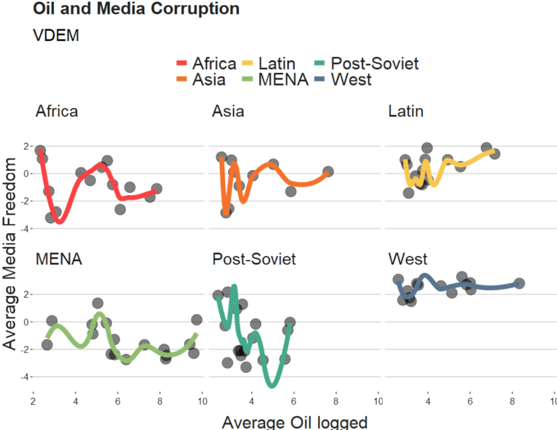
We will take the variables from the Varieties of Democracy dataset and plot the relationship between oil produciton and media freedoms across different regions.
df %>%
  ggplot(aes(x = log_avg_oil,
             y = avg_media)) +
  geom_point(size = 6, alpha = 0.5) +
  geom_smooth(aes(color = region),
              method = "loess",
              span = 2,
              se = FALSE,
              size = 3,
              alpha = 0.6) +
  facet_wrap(~region) +
  labs(title = "Oil and Media Corruption", subtitle = "VDEM",
       x = "Average Oil logged",
       y = "Average Media Freedom") +
  scale_color_manual(values = my_pal) +
  my_theme()
If we change the span to 0.5, we get the following graph:
span = 0.5
When examining the connection between oil production and media freedoms across various regions, there are many ways to draw the line.
If we think the relationship is linear, it is no problem to add method = "lm" to the graph.
However, if outliers might overly distort the linear relationship, method = "rlm" (robust linear model” can help to take away the power from these outliers.
Linear and robust linear models (lm and rlm) can also accommodate parametric non-linear relationships, such as quadratic or cubic, when used with a proper formula specification.
For example, “geom_smooth(method=’lm’, formula = y ~ x + I(x^2))” can be used for estimating a quadratic relationship using lm.
If the outcome variable is binary (such as “is democracy” versus “is not democracy” or “is oil producing” versus “is not oil producing”) we can use method = “glm” (which is generalised linear model). It models the log odds of a oil producing as a linear function of a predictor variable, like age.
If the relationship between age and log odds is non-linear, the gam method is preferred over glm. Both glm and gam can handle outcome variables with more than two categories, count variables, and other complexities.
library(tidyverse)
library(magrittr)     # for pipes

library(broom)        # add model variables
library(easystats)    # diagnostic graphs

library(WDI)           # World Bank data
library(democracyData) # Freedom House data

library(countrycode)   # add ISO codes
library(bbplot)        # pretty themes
library(ggthemes)      # pretty colours
library(knitr)         # pretty tables
library(kableExtra)    # make pretty tables prettier
This blog will look at the augment() function from the broom package.
After we run a liner model, the augment() function gives us more information about how well our model can accurately preduct the model’s dependent variable.
It also gives us lots of information about how does each observation impact the model. With the augment() function, we can easily find observations with high leverage on the model and outlier observations.
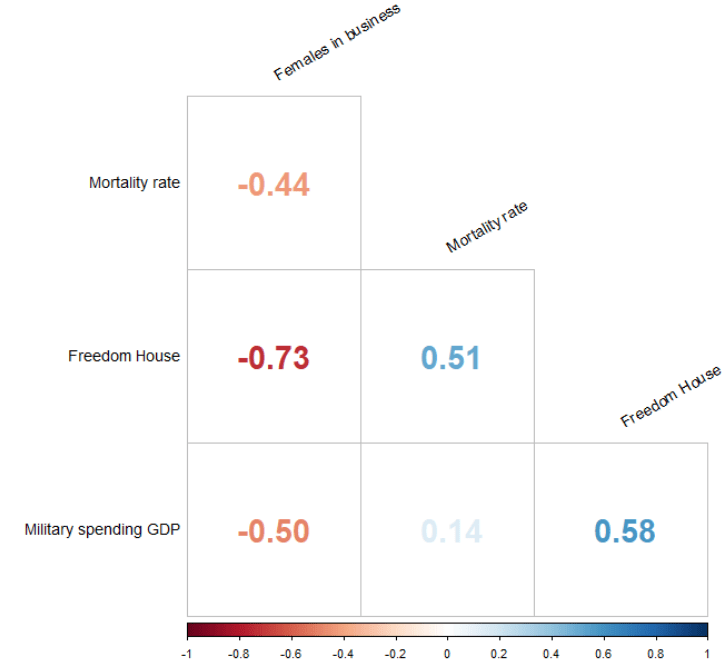
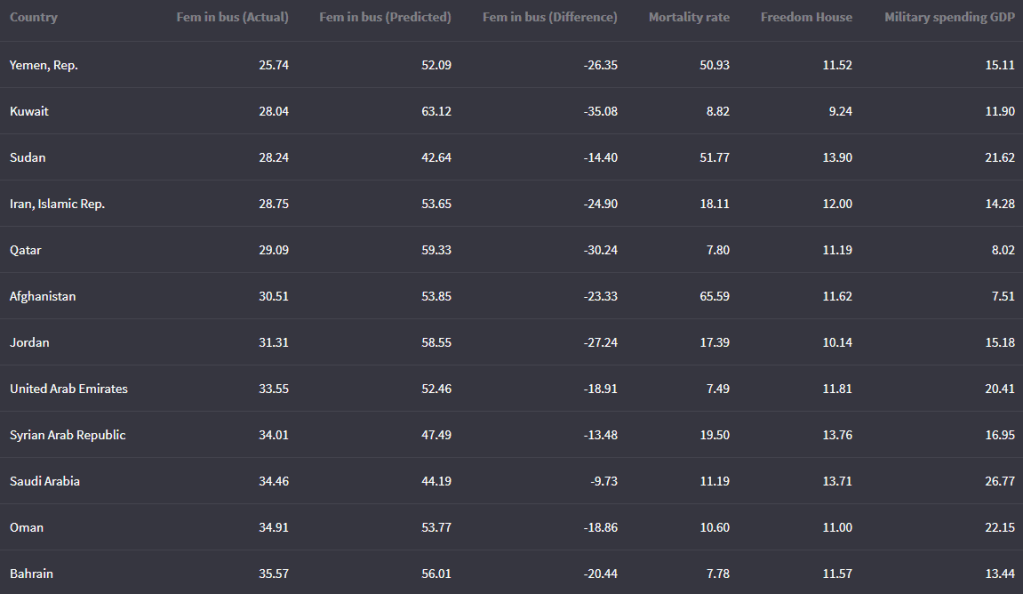
For our model, we are going to use the “women in business and law” index as the dependent variable.
According to the World Bank, this index measures how laws and regulations affect women’s economic opportunity.
Overall scores are calculated by taking the average score of each index (Mobility, Workplace, Pay, Marriage, Parenthood, Entrepreneurship, Assets and Pension), with 100 representing the highest possible score.
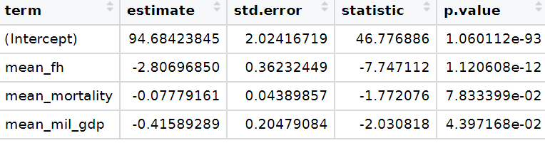
Into the right-hand side of the model, our independent variables will be child mortality, military spending by the government as a percentage of GDP and Freedom House (democracy) Scores.
First we download the World Bank data and summarise the variables across the years.
We get the average across 60 ish years for three variables. I don’t want to run panel data regression, so I get a single score for each country. In total, there are 160 countries that have all observations. I use the countrycode() function to add Correlates of War codes. This helps us to filter out non-countries and regions that the World Bank provides. And later, we will use COW codes to merge the Freedom House scores.
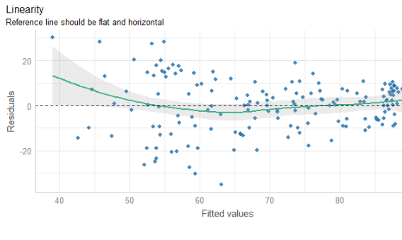
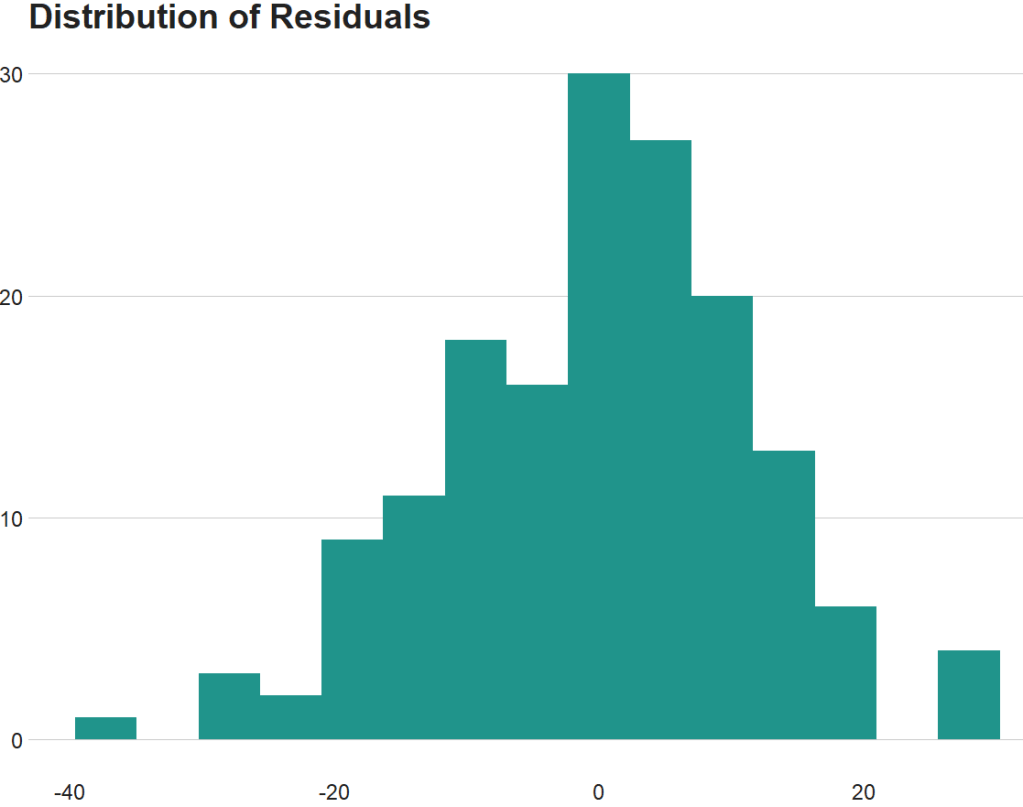
The line is not flat at the beginning so that is not ideal..
We will look more into this later with the variables we create with augment() a bit further down this blog post.
None of our variables have a VIF score above 5, so that is always nice to see!
From the broom package, we can use the augment() function to create a whole heap of new columns about the variables in the model.
fem_bus_pred <- broom::augment(fem_bus_lm)
.fitted = this is the model prediction value for each country’s dependent variable score. Ideally we want them to be as close to the actual scores as possible. If they are totally different, this means that our independent variables do not do a good job explaining the variance in our “women in business” index.
.resid = this is actual dependent variable value minus the .fitted value.
We can look at the fitted values that the model uses to predict the dependent variable – level of women in business – and compare them to the actual values.
The third column in the table is the difference between the predicted and actual values.
fem_bus_pred %>%
  mutate(across(where(is.numeric), ~round(., 2))) %>%
  arrange(mean_fem_bus) %>%
  select(Country = country,
    `Fem in bus (Actual)` = mean_fem_bus,
    `Fem in bus (Predicted)` = .fitted,
    `Fem in bus (Difference)` = .resid,
                  `Mortality rate` = mean_mortality,
                  `Freedom House` = mean_fh,
                  `Military spending GDP` = mean_mil_gdp)  %>%
  kbl(full_width = F)
Country
Leverage of country
Fem in bus (Actual)
Fem in bus (Predicted)
Austria
0.02
88.92
88.13
Belgium
0.02
92.13
87.65
Costa Rica
0.02
79.80
87.84
Denmark
0.02
96.36
87.74
Finland
0.02
94.23
87.74
Iceland
0.02
96.36
88.90
Ireland
0.02
95.80
88.18
Luxembourg
0.02
94.32
88.33
Sweden
0.02
96.45
87.81
Switzerland
0.02
83.81
87.78
And we can graph them out:
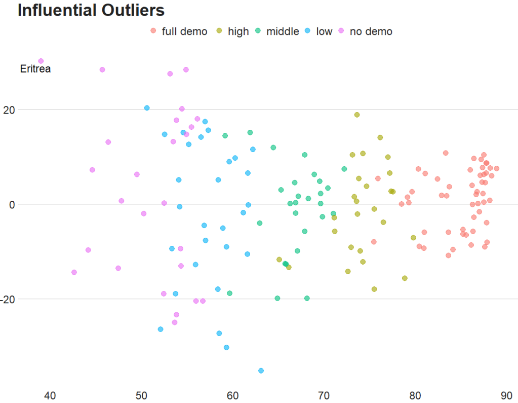
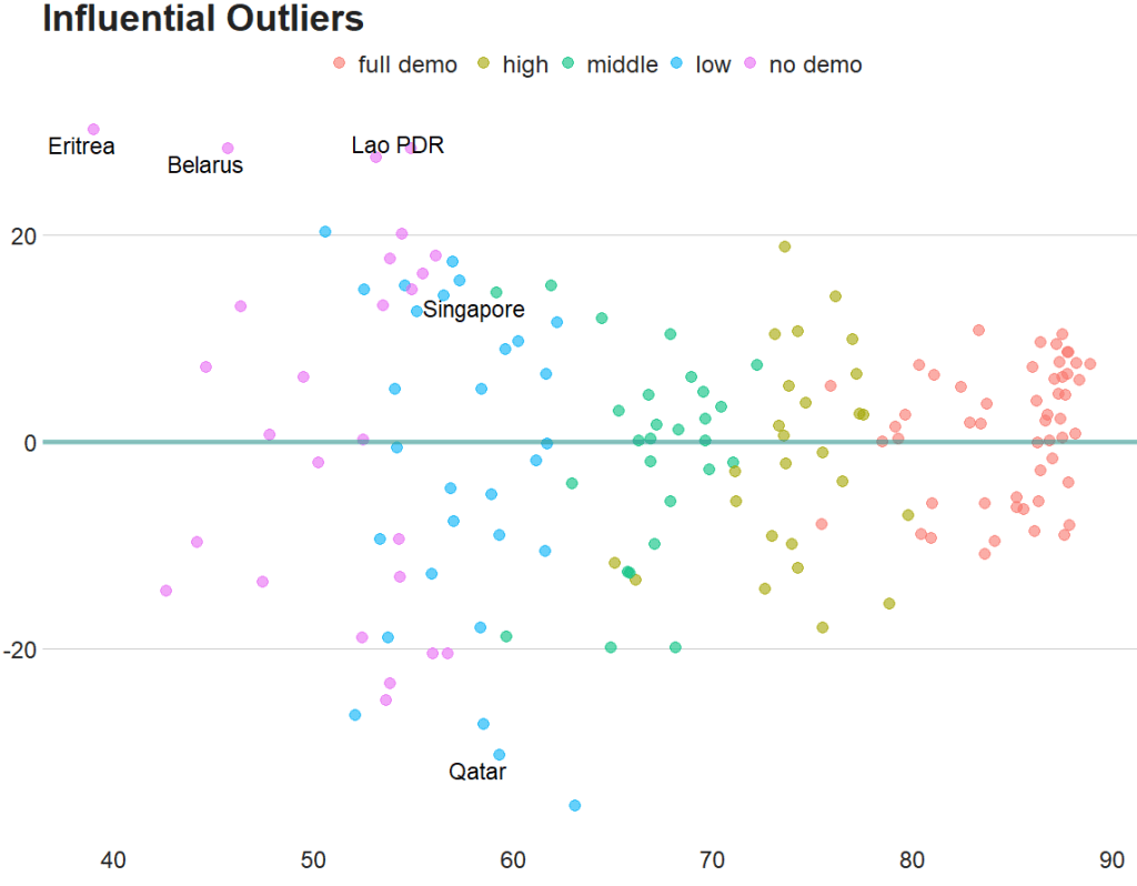
fem_bus_pred %>%
  mutate(fh_category = cut(mean_fh, breaks =  5,
  labels = c("full demo ", "high", "middle", "low", "no demo"))) %>%         ggplot(aes(x = .fitted, y = mean_fem_bus)) +
  geom_point(aes(color = fh_category), size = 4, alpha = 0.6) +
  geom_smooth(method = "loess", alpha = 0.2, color = "#20948b") +
  bbplot::bbc_style() +
  labs(x = '', y = '', title = "Fitted values versus actual values")
In addition to the predicted values generated by the model, other new columns that the augment function adds include:
.hat = this is a measure of the leverage of each variable.
.cooksd = this is the Cook’s Distance. It shows how much actual influence the observation had on the model. Combines information from .residual and .hat.
.sigma = this is the estimate of residual standard deviation if that observation is dropped from model
.std.resid = standardised residuals
If we look at the .hat observations, we can examine the amount of leverage that each country has on the model.
fem_bus_pred %>%
  mutate(dplyr::across(where(is.numeric), ~round(., 2))) %>%
  arrange(desc(.hat)) %>%
  select(Country = country,
         `Leverage of country` = .hat,
         `Fem in bus (Actual)` = mean_fem_bus,
         `Fem in bus (Predicted)` = .fitted)  %>%
  kbl(full_width = F) %>%
  kable_material_dark()
Next, we can look at Cook’s Distance. This is an estimate of the influence of a data point. According to statisticshowto website, Cook’s D is a combination of each observation’s leverage and residual values; the higher the leverage and residuals, the higher the Cook’s distance.
If a data point has a Cook’s distance of more than three times the mean, it is a possible outlier
Any point over 4/n, where n is the number of observations, should be examined
To find the potential outlier’s percentile value using the F-distribution. A percentile of over 50 indicates a highly influential point
This blog post will look at the plot_model() function from the sjPlot package. This plot can help simply visualise the coefficients in a model.
Packages we need:
library(sjPlot)
library(kable)
We can look at variables that are related to citizens’ access to public services.
This dependent variable measures equal access access to basic public services, such as access to security, primary education, clean water, and healthcare and whether they are distributed equally or unequally according to socioeconomic position.
Higher scores indicate a more equal society.
I will throw some variables into the model and see what relationships are statistically significant.
The variables in the model are
level of judicial constraint on the executive branch,
freedom of information (such as freedom of speech and uncensored media),
level of democracy,
level of regime corruption and
strength of civil society.
So first, we run a simple linear regression model with the lm() function:
We can use knitr package to produce a nice table or the regression coefficients with kable().
I write out the independent variable names in the caption argument
I also choose the four number columns in the col.names argument. These numbers are:
beta coefficient,
standard error,
t-score
p-value
I can choose how many decimals I want for each number columns with the digits argument.
And lastly, to make the table, I can set the type to "html". This way, I can copy and paste it into my blog post directly.
my_model %>%
tidy() %>%
kable(caption = "Access to public services by socio-economic position.",
col.names = c("Predictor", "B", "SE", "t", "p"),
digits = c(0, 2, 3, 2, 3), "html")
Access to public services by socio-economic position
Predictor
B
SE
t
p
(Intercept)
1.98
0.380
5.21
0.000
Judicial constraints
-0.03
0.485
-0.06
0.956
Freedom information
-0.60
0.860
-0.70
0.485
Democracy Score
2.61
0.807
3.24
0.001
Regime Corruption
-2.75
0.381
-7.22
0.000
Civil Society Strength
-1.67
0.771
-2.17
0.032
Higher democracy scores are significantly and positively related to equal access to public services for different socio-economic groups.
There is no statistically significant relationship between judicial constraint on the executive.
But we can also graphically show the coefficients in a plot with the sjPlot package.
There are many different arguments you can add to change the colors of bars, the size of the font or the thickness of the lines.
p <-  plot_model(my_model,
      line.size = 8,
      show.values = TRUE,
      colors = "Set1",
      vline.color = "#d62828",
      axis.labels = c("Civil Society Strength",  "Regime Corruption", "Democracy Score", "Freedom information", "Judicial constraints"), title = "Equal access to public services distributed by socio-economic position")

p + theme_sjplot(base_size = 20)
So how can we interpret this graph?
If a bar goes across the vertical red line, the coefficient is not significant. The further the bar is from the line, the higher the t-score and the more significant the coefficient!
Next, we can go create a dichotomous factor variable and divide the continuous “freedom from torture scale” variable into either above the median or below the median score. It’s a crude measurement but it serves to highlight trends.
Blue means the country enjoys high freedom from torture. Yellow means the county suffers from low freedom from torture and people are more likely to be tortured by their government.
Then we feed our variables into the ggpairs() function from the GGally package.
I use the columnLabels to label the graphs with their full names and the mapping argument to choose my own color palette.
I add the bbc_style() format to the corr_matrix object because I like the font and size of this theme. And voila, we have our basic correlation matrix (Figure 1).
First off, in Figure 2 we can see the centre plots in the diagonal are the distribution plots of each variable in the matrix
Figure 2.
In Figure 3, we can look at the box plot for the ‘civil liberties index’ score for both high (blue) and low (yellow) ‘freedom from torture’ categories.
The median civil liberties score for countries in the high ‘freedom from torture’ countries is far higher than in countries with low ‘freedom from torture’ (i.e. citizens in these countries are more likely to suffer from state torture). The spread / variance is also far great in states with more torture.
Figure 3.
In Figur 4, we can focus below the diagonal and see the scatterplot between the two continuous variables – civil liberties index score and class equality index scores.
We see that there is a positive relationship between civil liberties and class equality. It looks like a slightly U shaped, quadratic relationship but a clear relationship trend is not very clear with the countries with higher torture prevalence (yellow) showing more randomness than the countries with high freedom from torture scores (blue).
Saying that, however, there are a few errant blue points as outliers to the trend in the plot.
The correlation score is also provided between the two categorical variables and the correlation score between civil liberties and class equality scores is 0.52.
Examining at the scatterplot, if we looked only at countries with high freedom from torture, this correlation score could be higher!
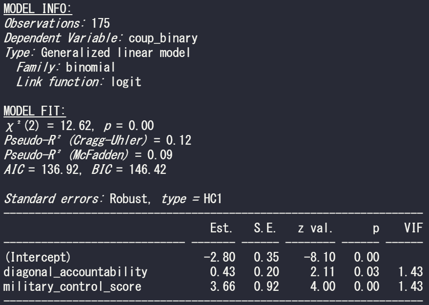
This blog post will look at a simple function from the jtools package that can give us two different pseudo R2 scores, VIF score and robust standard errors for our GLM models in R
Packages we need:
library(jtools)
library(tidyverse)
From the Varieties of Democracy dataset, we can examine the v2regendtype variable, which codes how a country’s governing regime ends.
It turns out that 1994 was a very coup-prone year. Many regimes ended due to either military or non-military coups.
We can extract all the regimes that end due to a coup d’etat in 1994. Click here to read the VDEM codebook on this variable.
With this new binary variable, we run a straightforward logistic regression in R.
To do this in R, we can run a generalised linear model and specify the family argument to be “binomial” :
summary(model_bin_1 <- glm(coup_binary ~ diagonal_accountability + military_control_score,
 family = "binomial", data = vdem_2)
However some of the key information we want is not printed in the default R summary table.
This is where the jtools package comes in. It was created by Jacob Long from the University of South Carolina to help create simple summary tables that we can modify in the function. Click here to read the CRAN package PDF.
The summ() function can give us more information about the fit of the binomial model. This function also works with regular OLS lm() type models.
Set the vifs argument to TRUE for a multicollineary check.
summ(model_bin_1, vifs = TRUE)
And we can see there is no problem with multicollinearity with the model; the VIF scores for the two independent variables in this model are well below 5.
Click here to read more about the Variance Inflation Factor and dealing with pesky multicollinearity.
In the above MODEL FIT section, we can see both the Cragg-Uhler (also known as Nagelkerke) and the McFadden Pseudo R2 scores give a measure for the relative model fit. The Cragg-Uhler is just a modification of the Cox and Snell R2.
There is no agreed equivalent to R2 when we run a logistic regression (or other generalized linear models). These two Pseudo measures are just two of the many ways to calculate a Pseudo R2 for logistic regression. Unfortunately, there is no broad consensus on which one is the best metric for a well-fitting model so we can only look at the trends of both scores relative to similar models. Compared to OLS R2 , which has a general rule of thumb (e.g. an R2 over 0.7 is considered a very good model), comparisons between Pseudo R2 are restricted to the same measure within the same data set in order to be at all meaningful to us. However, a McFadden’s Pseudo R2 ranging from 0.3 to 0.4 can loosely indicate a good model fit. So don’t be disheartened if your Pseudo scores seems to be always low.
If we add another continuous variable – judicial corruption score – we can see how this affects the overall fit of the model.
summary(model_bin_2 <- glm(coup_binary ~
     diagonal_accountability +
     military_control_score +
     judicial_corruption,
     family = "binomial",
     data = vdem_2))
And run the summ() function like above:
summ(model_bin_2, vifs = TRUE)
The AIC of the second model is smaller, so this model is considered better. Additionally, both the Pseudo R2 scores are larger! So we can say that the model with the additional judicial corruption variable is a better fitting model.
Click here to learn more about the AIC and choosing model variables with a stepwise algorithm function.
stargazer(model_bin, model_bin_2, type = "text")
One additional thing we can specify in the summ() function is the robust argument, which we can use to specify the type of standard errors that we want to correct for.
The assumption of homoskedasticity is does not need to be met in order to run a logistic regression. So I will run a “gaussian” general linear model (i.e. a linear model) to show the impact of changing the robust argument.
We suffer heteroskedasticity when the variance of errors in our model vary (i.e are not consistently random) across observations. It causes inefficient estimators and we cannot trust our p-values.
We can set the robust argument to “HC1” This is the default standard error that Stata gives.
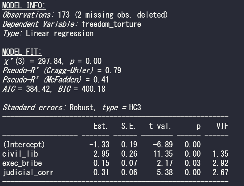
Set it to “HC3” to see the default standard error that we get with the sandwich package in R.
So run a simple regression to see the relationship between freedom from torture scale and the three independent variables in the model
summary(model_glm1 <- glm(freedom_torture ~ civil_lib + exec_bribe + judicial_corr, data = vdem90, family = "gaussian"))
Now I run the same summ() function but just change the robust argument:
First with no standard error correction. This means the standard errors are calculated with maximum likelihood estimators (MLE). The main problem with MLE is that is assumes normal distribution of the errors in the model.
summ(model_glm1, vifs = TRUE)
Next with the default STATA robust argument:
summ(model_glm1, vifs = TRUE, robust = "HC1")
And last with the default from R’s sandwich package:
summ(model_glm1, vifs = TRUE, robust = "HC3")
If we compare the standard errors in the three models, they are the highest (i.e. most conservative) with HC3 robust correction. Both robust arguments cause a 0.01 increase in the p-value but this is so small that it do not affect the eventual p-value significance level (both under 0.05!)