From loop to purrr

The first instinct for many R users (especially those coming from other programming languages) is to use run of the mill for loop:

for (i in 1:8) {  
  col_name <- paste0("country_", i)
  
  if (col_name %in% colnames(press_releases_speech)) {
    press_releases_speech[[col_name]] <- countrycode(press_releases_speech[[col_name]], "country.name", "cown")
  }
}

This works fine.

It loops through country_1 to country_8, checks if each column exists, and converts the country names into COW codes.

Buuut there’s another way to do this.

Enter purrr and dplyr

Instead of writing out a loop, we can use the across() function from dplyr (which works with purrr) to apply the conversion to all relevant columns at once:

Use purrr::map to convert all country columns from country name to COW code

#Max number of country columns
country_columns <- paste0("country_", 1:8)

press_releases_speech <- press_releases_speech %>%
  mutate(across(all_of(country_columns), ~ countrycode(.x, "country.name", "cown")))

country_columns <- paste0("country_", 1:8)

This creates a vector of column names: "country_1", "country_2", …, "country_8".

mutate(across(all_of(country_columns), ~ countrycode(.x, "country.name", "cown")))

across(all_of(country_columns), ...): selects only country_1 to country_8 columns.

~ countrycode(.x, "country.name", "cown"): uses countrycode() to convert country names to COW codes.


    Why purrr is Easier than a For Loop

    1. Less Typing, More Doing
      • No need to manually track column names or index values.
      • across() applies the function to all specified columns at once.
    2. More Readable
      • The mutate(across(...)) approach is way easier to scan than a loop.
      • Anyone reading your code will immediately understand, “Oh, we’re applying countrycode() to multiple columns.”
    3. Vectorized Processing = Faster Execution
      • R is optimized for vectorized operations, meaning functions like mutate(across(...)) are generally faster than loops.
      • Instead of processing one column at a time, across() processes them all at once in a more efficient way.
    4. Scalability
      • Need to apply the function to 10 or 100 country columns instead of 8? No problem! Just update country_columns, and you’re good to go.
      • With a for loop, you’d have to adjust your loop range (1:100) and manually ensure it still works.

    When Should You Still Use a For Loop?

    To be fair, for loops aren’t evil—they’re just not always the best tool for the job. If you need more custom logic (e.g., different transformations depending on the column), a loop might be the better choice. But for straightforward “apply this function to multiple columns” situations, purrr or across() is the way to go..

    Graphing female politicians in Irish parliament with R PART 2: Trends and Maps

    Packages we will need

    library(tidyverse)
    library(magrittr)
    library(waffle)
    library(geojsonio)
    library(sf)

    In PART 1, we looked at the gender package to help count the number of women in the 33rd Irish Parliament.

    I repeated that for every session since 1921. The first and second Dail are special in Ireland as they are technically pre-partition.

    Cleaned up the data aaaand now we have a full dataset with constituencies data.

    If anyone wants a copy of the dataset, I can upload it here for those who are curious ~

    So first… a simple pie chart!

    First we calculate proportion of seats held by women

    dail %>% 
      mutate(decade = substr(year, 1, 3)) %>% 
      mutate(decade = paste0(decade, "0s")) %>%
      group_by(decade) %>% 
      ungroup() %>% 
      group_by(decade, gender) %>% 
      count() %>% 
      group_by(decade) %>% 
      mutate(proportion = n / sum(n)) -> dail_pie
    # A tibble: 22 × 4
    # Groups:   decade [11]
       decade gender     n proportion
       <chr>  <chr>  <int>      <dbl>
     1 1920s  female    20     0.0261
     2 1920s  male     747     0.974 
     3 1930s  female    10     0.0172
     4 1930s  male     572     0.983 
     5 1940s  female    12     0.0284
     6 1940s  male     411     0.972 
     7 1950s  female    16     0.0363
     8 1950s  male     425     0.964 
     9 1960s  female    11     0.0255
    10 1960s  male     421     0.975 
    # 12 more rows
    

    We will be looking at how proportions changed over the decades.

    When using facet_wrap() with coord_polar(), it’s a pain in the arse.

    This is because coord_polar() does not automatically allow each facet to have a different scale. Instead, coord_polar() treats all facets as having the same axis limits.

    This will mess everything up.

    If we don’t change the coord_polar(), we will just distort pie charts when the facet groups have different total values. There will be weird gaps and make some phantom pacman non-charts.

    function() TRUE is an anonymous function that always returns TRUE.

    my_coord_polar$is_free <- function() TRUE forces coord_polar() to allow different scales for each facet.

    In our case, we call my_coord_polar$is_free, which means that whenever ggplot2 checks whether the coordinate system allows free scales across facets, it will now always return TRUE!!!

    Overriding is_free() to always return TRUE signals to ggplot2 that coord_polar() means that our pie charts NOOWW will respect the "free" scaling specified in facet_wrap(scales = "free").

    my_coord_polar <- coord_polar(theta = "y")
    my_coord_polar$is_free <- function() TRUE

    If you want to look more at this, check out this blog:

    And we can go and create the ggplot:

    dail_pie %>%
      ggplot(aes(x = "", 
             y = proportion, 
             fill = as.factor(gender))) +
    
      geom_bar(stat="identity", width = 1) +
      
      geom_text(
        data = . %>% filter(gender == "female"), aes(label = scales::percent(proportion, 
        accuracy = 0.1)), 
        color = "white",
        size = 8) +
      
      my_coord_polar +
    
      facet_wrap(~decade, scales = "free") + 
      scale_fill_manual(values =c("#bc4749", "#003049")) +
      # my_style() +
      theme(axis.text.x = element_blank(),
            panel.grid.major = element_blank(),
            panel.grid.minor = element_blank(),
            panel.grid = element_blank(), 
            panel.background = element_blank(), 
            axis.text = element_blank(), 
            axis.ticks = element_blank()) 

    And with Canva, I add the arrows and titles~

    Sorry I couldn’t figure it out in R. I just hate all the times I need to re-run graphics to move a text or number by a nano-centimeter. Websites like Canva are just far better for my sanity and short attention span.

    Next, we can make a facetted waffle plot!

    dail %>% 
      group_by(decade) %>% 
      ungroup() %>% 
      group_by(decade, gender) %>% 
      count() %>% 
      ggplot(aes(fill = as.factor(gender), values = n)) +
      waffle::geom_waffle(color = "white", 
                          size = 0.5, 
                          n_rows = 10, 
                          flip = TRUE) +
      facet_wrap(~decade, nrow = 1, strip.position = "bottom") +
    # my_style  +
      scale_fill_manual(values =c("#003049", "#bc4749")) +
      theme(axis.text.x.bottom = element_blank(),
            text = element_text(size = 40))

    And mea culpa, I finished the annotation and titles are with Canva.

    Once again, life is too short to be messing with annotation in ggplot.

    Next, we can make a simple trend line of the top Irish parties and see how they have fared with women TDs.

    Let’s get a dataframe with average number of TDs elected to each party over the decades

    dail %>% 
      filter(constituency != "National University") %>% 
      filter(party %in% c("Fianna Fáil", "Fine Gael", "Labour", "Sinn Féin")) %>% 
      group_by(party, decade) %>% 
      summarise(avg_female = mean(gender == "female")) -> dail_avg
    # A tibble: 39 × 3
    # Groups:   party [4]
       party       decade avg_female
       <chr>       <chr>       <dbl>
     1 Fianna Fáil 1920s     0.0198 
     2 Fianna Fáil 1930s     0.00685
     3 Fianna Fáil 1940s     0.0284 
     4 Fianna Fáil 1950s     0.0425 
     5 Fianna Fáil 1960s     0.0230 
     6 Fianna Fáil 1970s     0.0327 
     7 Fianna Fáil 1980s     0.0510 
     8 Fianna Fáil 1990s     0.0897 
     9 Fianna Fáil 2000s     0.0943 
    10 Fianna Fáil 2010s     0.0938 
    # 29 more rows
    

    We create a new mini data.frame of four values so that we can have the geom_text() only at the end of the year (so similar to the final position of the graph).

    final_positions <- dail_avg %>%
      group_by(party) %>%
      filter(decade == "2020s")  %>% 
      mutate(color = ifelse(party == "Sinn Féin", "#2fb66a",
             ifelse(party == "Fine Gael","#6699ff",
             ifelse(party == "Fianna Fáil","#ee9f27", 
             ifelse(party == "Labour", "#780000", "#495051")))))
    # A tibble: 4 × 4
    # Groups:   party [4]
      party       decade avg_female color  
      <chr>       <chr>       <dbl> <chr>  
    1 Fianna Fáil 2020s       0.140 #ee9f27
    2 Fine Gael   2020s       0.219 #6699ff
    3 Labour      2020s       0.118 #780000
    4 Sinn Féin   2020s       0.368 #2fb66a
    

    A hex colour for each major party

    party_pal <- c("Sinn Féin" = "#2fb66a",
                    "Fine Gael" = "#6699ff",
                    "Fianna Fáil" = "#ee9f27", 
                    "Labour" = "#780000")

    And a geom_bump() layer in the plot using the ggbump() package for more wavy lines.

    dail_avg %>% 
      ggplot(aes(x = decade,
                 y = avg_female, 
                 group = party, 
                 color = party)) + 
    
      ggbump::geom_bump(aes(color = party),
                smooth = 5,
                alpha = 0.5,
                size = 4)  +
    
      geom_point(color = "white", 
                 size = 7, 
                 stroke = 4) + 
    
      geom_point(size = 6) +
    
      ggrepel::geom_text_repel(data = final_positions,
                aes(color = party,
                    y = avg_female,
                    x = decade,
                label = party),
                family = "Arial Rounded MT Bold",
                vjust = -2,
                hjust = -1,
                size = 15) +
    # my_style() 
      scale_color_manual(values = party_pal) +
      scale_y_continuous(labels = scales::label_percent()) +
      scale_x_discrete(expand = expansion(add = c(0.2, 2))) +
      theme(legend.position = "none") 

    This graph looks at major Irish political parties from the 1920s to the 2020s.

    For most of Irish history, female representation remained under 10%.

    The Labour Party surged ahead like crazy in the 1990s; it got over 30% female TDs!

    Now in the 2020s, Sinn Féin has the largest proportion of female TDs and goes way above and beyond the other major parties.


    Now, onto constituency maps.

    We can go to the Irish government’s website with heaps of data! Yay free data.

    This page brings us to the election constituencies GeoJSON map data.

    For more information about making GeoJSON and SF maps click here to read about how to create maps in R ~

    So we read in the data and convert to SF dataframe.

    constituency_map <- geojson_read(file.choose(), what = "sp")
    
    constituency_sf <- st_as_sf(constituency_map)

    This constituency_sf has 64 variables but most of them are meta-data info like the dates that each variable was updated. The vaaast majority, we don’t need so we can just pull out the consituency var for our use:

    constituency_sf %>% 
      select(constituency = ENG_NAME_VALUE, 
             geometry) -> mini_constituency_sf
    Simple feature collection with 1072 features and 1 field
    Geometry type: POLYGON
    Dimension:     XY
    Bounding box:  xmin: 417437.9 ymin: 516356.4 xmax: 734489.6 ymax: 966899.7
    Projected CRS: IRENET95 / Irish Transverse Mercator
    First 10 features:
              constituency                       geometry
    1  Cork South-West (3) POLYGON ((501759.8 527442.6...
    2            Kerry (5) POLYGON ((451686.2 558529.2...
    3            Kerry (5) POLYGON ((426695 561869.8, ...
    4            Kerry (5) POLYGON ((451103.9 555882.8...
    5            Kerry (5) POLYGON ((434925.3 572926.2...
    6          Donegal (5) POLYGON ((564480.8 917991.7...
    7          Donegal (5) POLYGON ((571201.9 892870.7...
    8          Donegal (5) POLYGON ((615249.9 944590.2...
    9          Donegal (5) POLYGON ((563593.8 897601, ...
    10         Donegal (5) POLYGON ((647306 966899.4, ...
    

    As we see, the number of seats in each constituency is in brackets behind the name of the county. So we can separate them and create a seat variable:

      mini_constituency_sf %<>% 
       separate(constituency, 
                into = c("constituency", "seats"), 
                sep = " \\(", fill = "right") %>%
       mutate(seats = as.numeric(gsub("\\)", "", seats))) 

    One problem I realised along the way when I was trying to merge the constituency map with the TD politicians data is that one data.frame uses a hyphen and one uses a dash in the constituency variable.

    So we can make a quick function to replace en dash (–) with hyphen (-).

     replace_dash <- function(x) {
       if (is.character(x)) {
         gsub("–", "-", x)  
       } else {x}
    }
    
     mini_constituency_sf %<>%
       mutate(across(where(is.character), replace_dash))

    And now we can merge!

     dail %<>%
       right_join(mini_constituency_sf, by = "constituency") 

    Now a quick map ~

     dail %<>%
      mutate(n = ifelse(is.na(percentage_women), 0, percentage_women)) %>%
       ggplot(aes(geometry = geometry)) +
       geom_sf(aes(fill = percentage_women),
               color = "black") +  s
       labs(title = "Map of Irish Constituencies") +
       # my_style() +
       scale_fill_viridis_c(option = "plasma")  +
    
        scale_fill_gradient2(low = "#57cc99",
                             mid = "#38a3a5",
                             high = "#22577a") +
    
       theme(axis.text = element_blank(),
         axis.text.x.bottom = element_blank(),
         legend.key.width = unit(1.5, "cm"), 
         legend.key.height = unit(0.4, "cm"), 
         legend.position = "bottom")

    We can see that some constituencies have 3 seats, some 5~

    So we cannot directly compare who has more female TDs.

    A way to deal with this is scaling the data.

    In PART 3, we will look at scaling data and analysing trends across the years!

    Yay!

    How to download and graph interactive country maps in R

    Packages we will be using:

    library(tidyverse)
    library(geojsonio)
    library(sf)

    In this blog, we will make maps! Mapppsss!!!

    Go to this website and find the country GeoJSON you want to download:

    We can choose the country we want.

    For example, Ireland

    https://simplemaps.com/gis/country/ie#admin1

    Or South Korea, maybe~

    https://simplemaps.com/gis/country/kr#admin1

    Click the blue button to download the file.

    I saved it on my desktop so it’s easy to read in~

    ireland_map <- geojson_read("ie.json", what = "sp")

    Next we need to convert a spatial object into an sf (Simple Features) object

    ireland_sf <- st_as_sf(ireland_map)

    I will be working on the Irish dataset and make a simple map

    geojson_read() reads a GeoJSON file (from the geojsonio package).

    A GeoJSON file is a file format for map data using JavaScript Object Notation (JSON). 

    It’s an open standard used a lot to represent points, lines, and polygonzzz.

    "ie.json" will be our GeoJSON file containing Ireland’s geographic data. That will be the 26 counties.

    The argument what = "sp" makes it so that the output should be a spatial object (from the sp package).

    We can add data for the four provinces of Ireland

    leinster <- c("Carlow", "Dublin", "Kildare", "Kilkenny", "Laois", "Longford", "Louth", "Meath", "Offaly", "Westmeath", "Wexford", "Wicklow")
    
    munster <- c("Clare", "Cork", "Kerry", "Limerick", "Tipperary", "Waterford")
    
    connacht <- c("Galway", "Leitrim", "Mayo", "Roscommon", "Sligo")
    
    ulster <- c("Cavan", "Donegal", "Monaghan", "Antrim", "Armagh", "Derry", "Down", "Fermanagh", "Tyrone")

    And some hex colours for the palette

    province_pal <- c(
      "Leinster" = "#122229",
      "Munster" = "#0a9396",
      "Connacht" = "#ee9b00",
      "Ulster" = "#991226") 

    And we can add all this data with the geom_sf() to the graph:

    ireland_sf %>%
      mutate(county = name) %>% 
      mutate(county = ifelse(county == "Laoighis", "Laois", county)) %>% 
      mutate(province = ifelse(county %in% leinster, "Leinster",
                        ifelse(county %in% munster, "Munster",
                        ifelse(county %in% connacht, "Connacht",
                        ifelse(county %in% ulster, "Ulster", NA))))) %>% 
      ggplot() +
      geom_sf(aes(fill = province),
              linewidth = 1, color = "white") +
      bbplot::bbc_style() +
      scale_fill_manual(values = province_pal)

    We can also make interactive maps that look like Google maps with the leaflet package!

    Click here to read the cran PDF on the leaflet package.

    It’s super easy but different from ggplot in many ways.

    Instead of all the ifelse() statements and mutate(), we can alternatively use a case_when() function!

    ireland_sf %<>% 
      mutate(county = name, 
             county = recode(county, "Laoighis" = "Laois"),
             province = case_when(
               county %in% leinster ~ "Leinster",
               county %in% munster  ~ "Munster",
               county %in% connacht ~ "Connacht",
               county %in% ulster   ~ "Ulster",
               TRUE ~ NA_character_))

    We can add colours using the colorFactor() function from the leaflet package.
    In colorFactor() specifies the set of possible input values that will be mapped to colours.

    province_colorFactor <- colorFactor(
      palette = c("Leinster" = "#122229",
                  "Munster"  = "#0a9396",
                  "Connacht" = "#ee9b00",
                  "Ulster"   = "#991226"), 
      domain = ireland_sf$province)

    We can now use the leaflet() function with the input of our SF data.frame.

    With the addProviderTiles(), we can choose a map style.

    providers$CartoDB.Positron refers to the “Positron” tile set from CartoDB.

    When we use the leaflet.extra package, the CartoDB means we can use a clean map style

    Next, we add the addPolygons() function adds polygon shapes to the map. For us. these polygons are for each Irish county.

    fillColor = ~province_colorFactor(province) sets the fill color of each of the fours province polygon!

    Finally, we can add the thickness of the map border lines, color and opacity to make it all pretty!

    leaflet(ireland_sf) %>% 
      addProviderTiles(providers$CartoDB.Positron) %>%  
      addPolygons(fillColor = ~province_colorFactor(province),
                  weight = 2, 
                  color = "black", 
                  opacity = 1)

    Here are some commonly used provider tiles that we can feed into the addProviderTiles()

    • OpenStreetMap
      • providers$OpenStreetMap.Mapnik
      • providers$OpenStreetMap.DE
      • providers$OpenStreetMap.France
    • Stamen
      • providers$Stamen.Toner
      • providers$Stamen.Watercolor
      • providers$Stamen.Terrain
    • CartoDB
      • providers$CartoDB.Positron
      • providers$CartoDB.DarkMatter
    • Esri
      • providers$Esri.WorldStreetMap
      • providers$Esri.WorldImagery
      • providers$Esri.NatGeoWorldMap
    • Hike & Bike
      • providers$HikeBike.HikeBike
    • Thunderforest
      • providers$Thunderforest.Landscape
      • providers$Thunderforest.Outdoors
    • NASAGIBS
      • providers$NASAGIBS.ModisTerraTrueColorCR
    ireland_leaflet %>% 
      addProviderTiles(providers$Esri.WorldImagery)

    The watercolour style is pretty!

    leaflet(ireland_pop_sf) %>%
      addProviderTiles(providers$Stadia.StamenWatercolor) %>%  
      addPolygons(fillColor = ~province_colorFactor(province),
                  weight = 2, 
                  color = "white", 
                  opacity = 1) 

    leaflet(ireland_pop_sf) %>%
      addPolygons(fillColor = ~province_colorFactor(province),
                  weight = 2, 
                  color = "white", 
                  opacity = 1) %>% 
      addProviderTiles(providers$SafeCast) 

    And we can add the towns and cities with the Stadia as the map provider.

    
    leaflet(ireland_pop_sf) %>%
      addPolygons(fillColor = ~province_colorFactor(province),
                  weight = 2, 
                  color = "white", 
                  opacity = 1) %>% 
      addProviderTiles(providers$Stadia) 

    Next we can take 2023 population data for each county from Wikipedia (using rvest's read_html()

    read_html("https://en.wikipedia.org/wiki/List_of_Irish_counties_by_population") %>% 
      html_table(header = TRUE, fill = TRUE) %>% 
      `[[`(1) %>% 
      janitor::row_to_names(row_number = 1) %>% 
      janitor::clean_names() %>% 
      mutate(population = as.numeric(gsub(",", "", population)) %>% 
      select(county, population) -> ireland_pop

    Add join the population data to the SF map data with the county variable.

    ireland_sf %>% 
      inner_join(ireland_pop, by = "county") -> ireland_pop_sf

    First, we can prepare a colour palette

    pop_pal <- colorNumeric(
      palette = "RdYlBu",
      domain = ireland_pop_sf$population)

    We can create a leaflet map object …

    leaflet(ireland_pop_sf) %>% 
      addProviderTiles(providers$CartoDB.Positron) -> ireland_leaflet

    … and use this to add population data with a legend in the corner

    ireland_leaflet %>%
      addPolygons(fillColor = ~pop_pal(population),  # Color by population
                  weight = 1, 
                  color = "white",
                  fillOpacity = 0.7,
                  popup = ~paste0("<b>", county, "</b><br>Population: ", population)) %>%
      addLegend(pal = pop_pal, 
                values = ireland_pop_sf$population, 
                title = legend_title, 
                position = "bottomright")

    Graphing female politicians in Irish parliament R PART 1: Predicting names

    Packages we will be using:

    library(gender)
    library(tidyverse)
    library(stringi)
    library(toOrdinal)
    library(rvest)
    library(janitor)
    library(magrittr)

    I heard a statistic a while ago that there are more men named Mike than total women in charge of committees in the US Senate.

    In this blog, we can whether the number of women in the Irish parliament outnumber any common male name.

    A quick glance on the most common names in the Irish parliament, we can see that from 1921 to 2024, there have been over 600 seats won by someone named John.

    There are a LOT of men in Irish politics with the name Patrick (and variants thereof).

    Worldcloud made with wordcloud2() package!

    So, in this blog, we will:

    1. scrape data on Irish TDs,
    2. predict the gender of each politician and
    3. graph trends on female TDs in the parliament across the years.

    The gender package attempts to infer gender (or more precisely, sex assigned at birth) based on first names using historical data.

    Of course, gender is a spectrum. It is not binary.

    As of 2025, there are no non-binary or transgender politicians in Irish parliament.

    In this package, we can use the following method options to predict gender based on the first name:

    1. “ssa” method uses U.S. Social Security Administration (SSA) baby name data from 1880 onwards (based on an implementation by Cameron Blevins)

    2. “ipums” (Integrated Public Use Microdata Series) method uses U.S. Census data in the Integrated Public Use Microdata Series (contributed by Ben Schmidt)

    3. “napp” uses census microdata from Canada, UK, Denmark, Iceland, Norway, and Sweden from 1801 to 1910 created by the North Atlantic Population Project

    4. “kantrowitz” method uses the Kantrowitz corpus of male and female names, based on the SSA data.

    5. The “genderize” method uses the Genderize.io API based on user profiles from social networks.

    We can also add in a “countries” variable for just the NAPP method

    For the “ssa” and “ipums” methods, the only valid option is “United States” which will be assumed if no argument is specified. For the “kantrowitz” and “genderize” methods, no country should be specified.

    For the “napp” method, you may specify a character vector with any of the following countries: “Canada”, “United Kingdom”, “Denmark”, “Iceland”, “Norway”, “Sweden”.

    We can compare these different method with the true list of the genders that I manually checked.

    So let’s look at the 33rd Dail from Wikipedia.

    https://en.wikipedia.org/wiki/33rd_D%C3%A1il

    We can create a new variable with separate() so that it only holds the first name of each politician. We will predict the gender based on this.

    dail_33 %<>% 
      separate(
        col = "name",
        into = c("first_name", "rest_name"),
        sep = " ",
        remove = FALSE,
        extra = "merge",
        fill = "warn") 

    Irish names often have fadas so we can remove them from the name and make it easier for the prediction function.

    remove_fada <- function(x) {
      stri_trans_general(x, id = "Latin-ASCII")
    }
    
    dail_33 %<>% 
      mutate(first_name = remove_fada(first_name)) 

    Now we’re ready.

    We can extract two variables of interest with the gender() function:

    1. gender variable (prediction of male or female name) and
    2. proportion_male (level of certainty about that prediction from 0 to 1).

    If the method is confident about predicting male, it will give a higher score.

    dail_33 %<>% 
      rowwise() %>%
      mutate(
        gender_ssa = gender(first_name, method = "ssa")$gender[1],  
        prop_male_ssa = gender(first_name, method ="ssa")$proportion_male[1])  

    We can add both these to the dail_33 data.frame and check how confident the SSA method is about predicting the gender of all the names.

    We can now create a histogram of this level of certainty about the prediction.

    Before we graph it out, we

    • filter out the NA values,
    • remove duplicate first names,
    • round up the certainty to three decimal points and
    • choose the bin size for the histogram
    • find some nice hex colours for the graphs
    dail_33 %<>% 
      filter(is.finite(prop_male_ssa)) %>% 
      distinct(first_name, .keep_all = TRUE) %>% 
      mutate(
        prop_male_ssa = round(prop_male_ssa, 3),
        bin_category = cut(prop_male_ssa, breaks = 10, labels = FALSE))
    
     gender_palette <- c("#f72585","#b5179e","#7209b7","#560bad","#480ca8","#3a0ca3","#3f37c9","#4361ee","#4895ef","#4cc9f0")

    We can graph it out with the above palette of hex colours.

    We can add label_percent() from the scales package for adding percentage signs on the x axis.

    dail_33 %>%
      ggplot(aes(x = prop_male_ssa, fill = prop_male_ssa, 
    group = prop_male_ssa)) +
      geom_histogram(binwidth = 0.05, color = "white") +  
      scale_fill_gradientn(colors = gender_palette) +  
     # my_style() +
      scale_x_continuous(labels = scales::label_percent()) +
      theme(legend.position = "none")

    I added the arrows and texts on Canva.

    Don’t judge. I just hate the annotate() part of ggplotting.

    Two names that the prediction function was unsure about:

      full_name     prop_male_ssa  gender_ssa
        
    Pat Buckley      0.359         female    
    Jackie Cahill    0.446         female  
    

    In these two instances, the politicians are both male, so it was good that the method flagged how unsure it was about labeling them as “female”.

    And the names that the function had no idea about so assigned them as NA:

    Violet-Anne Wynne    
    Aindrias Moynihan    
    Donnchadh Ó Laoghaire
    Bríd Smith           
    Sorca Clarke         
    Ged Nash             
    Peadar Tóibín 
    

    Which is fair.

    We can graph out whether the SSA predicted gender are the same as the actual genders of the TDs.

    So first, we create a new variable that classifies whether the predictions were correct or not. We can also call NA results as incorrect. Although god bless any function attempting to guess what Donnchadh is.

    dail_33 %>%
        mutate(correct = ifelse(gender == gender_ssa, "Correct", "Incorrect"), correct = ifelse(is.na(gender_ssa), "Incorrect", correct)) -> dail_correct

    And graph it out:

    dail_correct %>%
      ggplot(aes(x = gender, y = gender_ssa, color = correct )) +
      geom_jitter(width = 0.3, height = 0.3, alpha = 0.5, size = 4) +
      labs(
        x = "Actual Gender",
        y = "Predicted Gender",
        color = "Prediction") +
      scale_color_manual(values = c("Correct" = "#217653", "Incorrect" = "#780000")) +
      # my_style()

     dail %<>% 
       select(first_name, contains("gender")) %>% 
       distinct(first_name, .keep_all = TRUE) %>%  
       mutate(across(everything(), ~ ifelse(. == "either", NA, .))) 

    Now, we can compare the SSA method with the other methods in the gender package and see which one is most accurate.

    First, we repeat the same steps with the gender() function like above, and change the method arguments.

    dail_33 %<>% 
      rowwise() %>%
      mutate(
        gender_ipums = gender(first_name, method = "ipums")$gender[1])
    
    dail_33 %<>% 
      rowwise() %>%
      mutate(gender_napp = gender(first_name, method = "napp")$gender[1])
    
    dail_33 %<>% 
      rowwise() %>%
      mutate(gender_kantro = gender(first_name, method = "kantrowitz" )$gender[1])
    
    dail_33 %<>% 
      rowwise() %>%
      mutate(gender_ize = gender(first_name, method = "genderize" )$gender[1])

    Or we can remove duplicates with purrr package

    dail_33 %<>% 
      rowwise() %>%
      mutate(across(
        c("ipums", "napp", "kantrowitz", "genderize"), 
        ~ gender(first_name, method = .x)$gender[1], 
        .names = "gender_{.col}"
      ))

    Then we calculate which one is closest to the actual measures.

    dail_33 %>% 
    summarise(accuracy_ssa = mean(ifelse(is.na(gender == gender_ssa), FALSE, gender == gender_ssa)),
    
         accuracy_ipums = mean(ifelse(is.na(gender == gender_ipums), FALSE, gender == gender_ipums)),
    
         accuracy_napp = mean(ifelse(is.na(gender == gender_napp), FALSE, gender == gender_napp)),
    
         accuracy_kantro = mean(ifelse(is.na(gender == gender_kantro), FALSE, gender == gender_kantro))) -> acc

    Or to make it cleaner with across()

    acc <- dail_33 %>%
      summarise(across(
        c(gender_ssa, gender_ipums, gender_napp, gender_kantro),
        ~ mean(ifelse(is.na(gender == .x), FALSE, gender == .x)),
        .names = "accuracy_{.col}"
      ))

    Pivot the data.frame longer so that each method is in a single variable and each value is in an accuracy method.

    acc %<>%
      pivot_longer(cols = everything(), names_to = "method", values_to = "accuracy") %>% 
      mutate(method = fct_reorder(method, accuracy, .desc = TRUE)) %>% 
      mutate(method = factor(method, levels = c("accuracy_kantro", "accuracy_napp", "accuracy_ipums", "accuracy_ssa"))) 
    
    my_pal <- c(
      "accuracy_kantro" = "#122229",
      "accuracy_napp" = "#005f73",
      "accuracy_ipums" = "#0a9396",
      "accuracy_ssa" = "#ae2012")

    And then graph it all out!

    We can use scale_x_discrete() to change the labels of each different method

    # Cairo::CairoWin()
    
    acc %>% 
      ggplot(aes(x = method, y = accuracy, fill = method)) +  
      geom_bar(stat = "identity", width = 0.7) +
      coord_flip() + 
      ylim(c(0,160)) +
      theme(legend.position = "none",
            text = element_text(family = "Arial Rounded MT Bold")) +
      scale_fill_manual(values = sample(my_pal)) +
      scale_x_discrete(labels = c("accuracy_ssa" = "SSA",
                                  "accuracy_napp" = "NAPP",
                                  "accuracy_ipums" = "IPUMS", 
                                  "accuracy_kantro" = "Kantro")) +
    # my_style() 

    Once again, I added the title and the annotations in Canva. I will never add arrow annotations in R if I have other options.

    Coming up next, PART 2 on how we can analyse variations on women in the Irish parliament, such as the following graph:

    How to web scrape and graph 2024 Irish election data with R

    Packages we will use:

    library(tidyverse)
    library(rvest)
    library(janitor)
    library(magrittr)
    library(ggparliament)
    library(ggbump)
    library(bbplot)

    I am an Irish person living abroad. I did NOT follow the elections last year. So, as penance (as I just mentioned, I am Irish and therefore full of phantom Catholic guilt for neglecting political news back home), we will be graphing some of the election data and familiarise ourselves with the new contours of Irish politics in this blog.

    Click here to visit the wikipedia page we will be scraping with the rvest package.

    Click here to read more about the rvest package for webscraping.

    The data we want is in the 11th table on the page:

    The columns that we will want are the Party and the Elected 2024 columns.

    So using the read_html() function, we can feed in the URL, save all the tables with html_table() and then only keep the eleventh table with `[[`(11)

    read_html("https://en.wikipedia.org/wiki/2024_Irish_general_election") %>% 
      html_table(header = TRUE, fill = TRUE) %>% 
      `[[`(11) -> dail_2024

    It’s a bit of a hot mess at this stage.

    Right now, all the variable names are empty.

    We can use the row_to_names() function from the janitor package. This moves a row up to became the variable names. Also we can use clean_names() (also a janitor package staple) to make every variable lowercase snake_case with underscores.

    dail_2024 %<>% 
      row_to_names(row_number = 2) %>% 
      clean_names() %>% 

    As you can see in the table above, the PBP cell is very crowded. This is due to the fact that many similar left-wing parties formed a loose coaltion when campaigning.

    Because they are all in one cell, every number was shoved together without spaces. So instead of each party in the loose grouping, it was all added together. It makes the table wholly incorrect; the PBP coalition did not win trillions of votes.

    Things like this highlights the importance of always checking the raw data after web scraping.

    So I just brute recode the value according to what is actually on the Wiki page.

    dail_2024 %<>% 
      mutate(elected2024 = if_else(party_2 == "PBP–Solidarity[c]•People Before Profit•Solidarity", "3", elected2024))

    Next we need to remove the annoying [footnotes in square brackets] on the page with some regex nonsense.

    dail_2024 %<>% 
      mutate(across(everything(), ~ str_replace(., "\\[.*$", ""))) 

    And finally, we just need to select, rename and change the seat numbers from character to numeric

    dail_2024 %<>%  
      select(party = party_2, seats = elected2024)  %>% 
      mutate(seats= parse_number(seats))

    Next, we just need to graph it out with the geom_parliament_seats() layer of the ggplot graph with ggparliament package.

    Click here to read more about the ggparliament package:

    First, we generate the circle coordinates

    dail_2024_coord <- parliament_data(election_data = dail_2024,
                       type = "semicircle", 
                       parl_rows = 6,  
                       party_seats = dail_2024$seats_2024)

    x: the horizontal position of a point in the semi-circle graph.

    y: the vertical position of a point in the semi-circle graph.

    row: The row or layer of the semi-circle in which the point (seat) is positioned. Rows are arranged from the base (row 1) to the top of the semi-circle.

    theta: The angle (in radians) used to calculate the position of each seat in the semi-circle. It determines the angular placement of each point, starting at 0 radians (rightmost point of the semi-circle) and increasing counterclockwise to π\piπ radians (leftmost point of the semi-circle).

    We want to have the biggest parties first and the smallest parties at the right of the graph

    dail_elected %<>% 
      mutate(party = fct_reorder(party, table(party)[party], .desc = TRUE))

    and we can add some hex colors that represent the parties’ representative colours.

    dail_elected_coord %<>% 
      mutate(party_colour = case_when(party == "Fianna Fáil" ~ "#66bb66",
                           party == "Fine Gael" ~ "#6699ff",
                           party == "Green" ~ "#2fb66a",
                           party == "Labour" ~ "#e71c38",
                           party == "Sinn Féin" ~ "#326760",
                           party == "PBP–Solidarity" ~ "#e91d50",
                           party ==  "Social Democrats" ~ "#742a8b",
                           party == "Independent Ireland" ~ "#ee9f27",
                           party == "Aontú" ~ "#4f4e31",
                           party == "100% Redress" ~ "#8e2420"))

    And we graph out the ggplot with the simple bbc_style() from the bbplot package

    dail_elected_coord %>% 
      ggplot(aes(x = x, y = y,
                 colour = party)) +
      geom_parliament_seats(size = 13) +
      bbplot::bbc_style()  +
      ggtitle("34th Irish Parliament") +
      theme(text = element_text(size = 50),
            legend.title = element_blank(),
            axis.text.x = element_blank(),
            axis.text.y = element_blank())  +
      scale_colour_manual(values = dail_elected_coord$party_colour,
                          limits = dail_elected_coord$party)

    HONESTY TIME… I will admit, I replaced the title as well as the annotated text and arrows with Canva dot comm

    Hell is … trying to incrementally make annotations to go to place we want via code. Why would I torment myself when drag-and-drop options are available for free.

    Next, let’s compare this year with previous years

    I was also hoping to try replicate this blog post about bump plots with highlighted labels from the r-graph-gallery website.

    We can use this kind of graph to highlight a particular trend.

    For example, the rise of Sinn Fein as a heavy-hitter in Irish politics.

    We will need to go to many of the Wikipedia pages on the elections and scrape seat data for the top parties for each year.

    Annoyingly, across the different election pages, the format is different so we have to just go by trial-and-error to find the right table for each election year and to find out what the table labels are for each given year.

    Since going to many different pages ends up with repeating lots of code snippets, we can write a process_election_data() function to try cut down on replication.

    process_election_data <- function(url, table_index, header_row, party_col, seats_col, top_parties, extra_mutate = NULL) {
      read_html(url) %>%
        html_table(header = TRUE, fill = TRUE) %>%
        `[[`(table_index) %>%
        row_to_names(row_number = header_row) %>%
        clean_names() %>%
        mutate(across(everything(), ~ str_replace(., "\\[.*$", ""))) %>%
        select(party = !!sym(party_col), seats = !!sym(seats_col)) %>%
        mutate(seats = parse_number(seats)) %>%
        filter(party %in% top_parties)
    }

    In this function, mutate(across(everything(), ~ str_replace(., "\\[.*$", ""))) removes all those annoying footnotes in square brackets from the Wiki table with regex code.

    Annoyingly, the table for the 2024 election is labelled differently to the table with the 2016 results on le Wikipedia. So when we are scraping from each webpage, we will need to pop in a sliiiightly different string.

    We can use the sym() and the !! to accomodate that.

    When we type on !! (which the coder folks call bang-bang), this unquotes the string we feed in. We don’t want the function to treat our string as a string.

    After this !! step, we can now add them as variables within the select() function.

    We will only look at the biggest parties that have been on the scene since 1980s

    top_parties <- c("Fianna Fáil", "Fine Gael", "Sinn Féin", "Labour Party", "Green Party")

    Now, we feed in the unique features that are unique for scraping each web page:

    dail_2024 <- process_election_data(
      url = "https://en.wikipedia.org/wiki/2024_Irish_general_election
      table_index = 11,
      header_row = 2,
      party_col = "party_2",
      seats_col = "elected2024",
      top_parties = top_parties)
    
    dail_2020 <- process_election_data(
      url = "https://en.wikipedia.org/wiki/2020_Irish_general_election",
      table_index = 10,
      header_row = 2,
      party_col = "party_2",
      seats_col = "elected2020",
      top_parties = top_parties)
    
    dail_2016 <- process_election_data(
      url = "https://en.wikipedia.org/wiki/2016_Irish_general_election",
      table_index = 10,
      header_row = 3,
      party_col = "party_2",
      seats_col = "elected2016_90",
      top_parties = top_parties)
    
    dail_2011 <- process_election_data(
      url = "https://en.wikipedia.org/wiki/2011_Irish_general_election",
      table_index = 14,
      header_row = 2,
      party_col = "party_2",
      seats_col = "t_ds",
      top_parties = top_parties)
    
    dail_2007 <- process_election_data(
      url = "https://en.wikipedia.org/wiki/2007_Irish_general_election",
      table_index = 8,
      header_row = 2,
      party_col = "party_2",
      seats_col = "seats",
      top_parties = top_parties)
    
    dail_2002 <- process_election_data(
      url = "https://en.wikipedia.org/wiki/2002_Irish_general_election",
      table_index = 8,
      header_row = 2,
      party_col = "party_2",
      seats_col = "seats",
      top_parties = top_parties)
    
    dail_1997 <- process_election_data(
      url = "https://en.wikipedia.org/wiki/1997_Irish_general_election",
      table_index = 9,
      header_row = 2,
      party_col = "party_2",
      seats_col = "seats",
      top_parties = top_parties)
    
    dail_1992 <- process_election_data(
      url = "https://en.wikipedia.org/wiki/1992_Irish_general_election",
      table_index = 6,
      header_row = 2,
      party_col = "party_2",
      seats_col = "seats",
      top_parties = top_parties)
    
    dail_1989 <- process_election_data(
      url = "https://en.wikipedia.org/wiki/1989_Irish_general_election",
      table_index = 5,
      header_row = 2,
      party_col = "party_2",
      seats_col = "seats",
      top_parties = top_parties)
    
    dail_1987 <- process_election_data(
      url = "https://en.wikipedia.org/wiki/1987_Irish_general_election",
      table_index = 5,
      header_row = 2,
      party_col = "party_2",
      seats_col = "seats",
      top_parties = top_parties)
    
    dail_1982_11 <- process_election_data(
      url = "https://en.wikipedia.org/wiki/November_1982_Irish_general_election",
      table_index = 5,
      header_row = 2,
      party_col = "party_2",
      seats_col = "seats",
      top_parties = top_parties)
    
    dail_1982_2 <- process_election_data(
      url = "https://en.wikipedia.org/wiki/February_1982_Irish_general_election",
      table_index = 5,
      header_row = 2,
      party_col = "party_2",
      seats_col = "seats",
      top_parties = top_parties)

    After we scraped every election, we can join them together

    dail_years <- dail_2024 %>% 
      left_join(dail_2020, by = c("party")) %>% 
      left_join(dail_2016, by = c("party")) %>% 
      left_join(dail_2011, by = c("party")) %>% 
      left_join(dail_2007, by = c("party")) %>% 
      left_join(dail_2002, by = c("party")) %>%   
      left_join(dail_1997, by = c("party")) %>% 
      left_join(dail_1992, by = c("party")) %>% 
      left_join(dail_1989, by = c("party")) %>% 
      left_join(dail_1987, by = c("party")) %>% 
      left_join(dail_1982_11, by = c("party")) %>% 
      left_join(dail_1982_2, by = c("party"))

    Or I can use a list and iterative left joins.

    dail_list <- list(
      dail_2024,
      dail_2020,
      dail_2016,
      dail_2011,
      dail_2007,
      dail_2002,
      dail_1997,
      dail_1992,
      dail_1989,
      dail_1987,
      dail_1982_11,
      dail_1982_2)
    
    dail_years <- reduce(dail_list, left_join, by = "party")

    For the x axis ticks, we can quickly make a vector of all the election years we want to highlight on the graph.

    election_years <- c(2024, 2020, 2016, 2011, 2007, 2002, 1997, 1992, 1989, 1987, 1982)

    Next we pivot the data to long format:

    dail_years %>% pivot_longer(
      cols = starts_with("seats_"),
      names_to = "year",
      names_prefix = "seats_",
      values_to = "seats") -> dail_longer

    Then we can add specific hex colours for the main parties.

    dail_longer %<>%
      mutate(color = ifelse(party == "Sinn Féin", "#2fb66a",
             ifelse(party == "Fine Gael","#6699ff",
             ifelse(party == "Fianna Fáil","#ee9f27","#495051"))))

    Next, we can create a final_positions data.frame so that can put the names of the political parties at the end of the trend line instead of having a legend floating at top of the graph.

    final_positions <_ dail_longer %>%
      group_by(party) %>%
      filter(year == max(year))  %>% 
      mutate(color = ifelse(party == "Sinn Féin", "#2fb66a",
             ifelse(party == "Fine Gael","#6699ff",
             ifelse(party == "Fianna Fáil","#ee9f27", "#495051")))

    Click here to read more about the ggbump package

    dail_longer %>% 
      ggplot(aes(x = year, y = seats, group = party)) +
    
      geom_bump(aes(color = color,
               alpha = ifelse(party == "Sinn Féin", 0.5, 0.2),
               linewidth = ifelse(party == "Sinn Féin", 0.8, 0.7)),
                smooth = 5) +
    
      geom_text(data = final_positions,
                aes(color = color,
                y = ifelse(party == "Fine Gael", seats - 3, seats),
                label = party,
                family = "Georgia"),
                x = x_position + 1.5,  
                hjust = 0, 
                size = 10) +
    
      geom_point(color = "white", 
                 size = 6, 
                 stroke = 3) +
      
      geom_point(aes(color = color,
                 alpha = ifelse(party == "Sinn Féin", 0.5, 0.1)),
                 size = 4) +
    
      scale_linewidth_continuous(range = c(2, 5)) +
    
      scale_alpha_continuous(range = c(0.2, 1)) +
    
      bbplot::bbc_style()  +
    
      theme(legend.position = "none",
            plot.title = element_text(size = 48)) +
    
      scale_color_identity() + 
    
      scale_x_continuous(limits = c(1980, 2030), breaks = election_years) +
    
      labs(title = "Sinn Féin has seen a steady increase in Dáil vote\n share after years hovering around zero seats")
    

    How to use parallel processing to speed up executing large / complex models in R

    Packages we will need:

    library(tidyverse)
    library(plm)
    library(parallel)
    library(foreach)
    library(doParallel)
    library(vdemdata)

    In this blog, we look at a few lines of code that help us run multiple models with panel data more quickly with parallel processing.

    We can use the Varieties of Democracy (V-DEM) package to download our data!

    Click here to read more about downloading V-DEM data from the vdemdata package

    vdemdata::vdem %>% 
      distinct(COWcode, year, .keep_all =  TRUE) %>% 
      filter(year %in% c(1945:2024)) -> vdem_df

    First, we set up our panel regression model and choose our independent variables.

    In the ols_dependent_vars, I will look at three ways to look at Civil Society Organisations (how the are created, whether they are repressed, whether they are consulted by the state).

    run_plm <- function(ols_dependent_var) {
      formula <- as.formula(paste(ols_dependent_var, " ~ +
                                   v2x_polyarchy + 
                                   log(e_pop + 1) + 
                                   log(e_gdppc + 1)"))
      plm::plm(formula, data = vdem_df, index = c("COWcode", "year"))
    }
    
    ols_dependent_vars <- c("v2cseeorgs",  "v2csreprss", "v2cscnsult")
    
    ols_model_names <- c("CSO entry / exit", "CSO repression", "CSO consultation")

    We will use the ols_model_names at the end for pretty regression output with the modelsummary table

    Now that we have our function, we can set up the parallel processing for quicker model running.

    We first need to chose the number of cores to run concurrently.

    num_cores <- detectCores() - 1  

    This sets up the number of CPU cores that we will use for parallel processing.

    detectCores() finds out how many CPU cores your computer has.

    When we subtract 1 from this number, we leave one core free.

    This one free core avoids overloading the system, so the computer can do other things while we are parallel processing.

    Like playing Tetris.

    With 15 cores, a CPU can manage loads of processes at the same time,

    We can check how many cores the computer that we’re using has with detectCores()

    detectCores() 
    [1] 16

    My computer has 16 cores.

    Next, we will set up the parallel processing for our model.

    We first need to set up a cluster of worker nodes that can execute multiple tasks at the same time.

    cl <- makeCluster(num_cores)

    makeCluster(num_cores) initialises a cluster of our 15 cores.

    The cluster indicates specified number of worker nodes.

    cl stores our cluster object, which will be used to manage and distribute tasks among the worker nodes.

    Next, we register the cl object

    registerDoParallel(cl)

    By registering the parallel backend, we enable the distribution of tasks across the 15 cores.

    This speeds up the computation process and improves efficiency.

    Why bother register the parallel backend?

    When you use the foreach() package for parallel processing, it needs to know which parallel backend to use. By registering the cluster with registerDoParallel(cl), you inform the foreach() function below to use the specified cluster (cl) for executing tasks in parallel.

    This step is essential for enabling parallel execution of the code inside the foreach() loop.

    Before we can perform parallel processing, we need to ensure that all the worker nodes in our cluster have access to the necessary data and functions.

    This is achieved using the clusterExport() function.

    clusterExport(cl, varlist = c("vdem_df", "plm", "run_plm", "ols_dependent_vars"))

    clusterExport() exports variables from the master R session to each worker node in the cluster.

    It ensures that all worker nodes have the required data and functions to perform the computations.

    In our example, the varlist argument specifies:

    • dataframe “vdem_df”
    • package “plm”
    • function “run_plm”
    • vector of variables “ols_dependent_vars”

    Why export variables?

    In a parallel processing setup, each worker node runs as an independent and separate R session.

    By default, these sessions do not share the environment of the master session.

    Boo.

    Therefore, any data or functions needed for the computation must be explicitly exported to the workers.

    To make sure that these workers can perform the necessary tasks, we need to load the required packages in each of the separate worker’s environment. We can do this by using the clusterEvalQ function:

    clusterEvalQ(cl, library(plm, logical.return = TRUE))

    By using clusterEvalQ(cl, library(plm)), we can see that each of the 15 nodes is set up with panel regression package – that we will use in our run_plm function defined above – as it returns TRUE fifteen times.

    [[1]]
    [1] TRUE
    
    [[2]]
    [1] TRUE
    
    [[3]]
    [1] TRUE
    
    [[4]]
    [1] TRUE
    
    [[5]]
    [1] TRUE
    
    [[6]]
    [1] TRUE
    
    [[7]]
    [1] TRUE
    
    [[8]]
    [1] TRUE
    
    [[9]]
    [1] TRUE
    
    [[10]]
    [1] TRUE
    
    [[11]]
    [1] TRUE
    
    [[12]]
    [1] TRUE
    
    [[13]]
    [1] TRUE
    
    [[14]]
    [1] TRUE
    
    [[15]]
    [1] TRUE
    

    Now we will use the foreach() function to combine the results together for the three CSO models.

    Click here to read more about the foreach package as a method of iteration

    plm_results <- foreach(dependent_var = ols_dependent_vars, 
                            .combine = list, 
                            .multicombine = TRUE, 
                            .packages = 'plm') %dopar% {
      run_plm(dependent_var)
    }

    foreach() iterate over a list in parallel rather than sequentially.

    Woo ~

    In this function, we initialise all the variables we need in the model.

    dependent_var = ols_dependent_vars: This part initialises the loop by setting dependent_var to each element in the ols_dependent_vars vector.

    Next we combine the results

    .combine = list means that the results of each iteration will be stored as elements in a list.

    .multicombine = TRUE allows foreach to combine results in stages – this can improve efficiency with a huuuuuge dataset or complex model.

    .packages = 'plm' makes sure that the plm package is loaded in each worker’s environment. We will need this when we are running the run_plm function!

    The strange-looking %dopar% indicates that the loop is executed in parallel.

    Quick! Quick! Quick!

    { run_plm(dependent_var) } is the actual operation performed in each iteration of the loop. The run_plm function is called with dependent_var as its argument. This function fits a regression model for the current dependent variable and returns the result.

    The code snippet runs the run_plm function for each dependent variable in the ols_dependent_vars vector in parallel. Here’s a step-by-step explanation:

    Stopping the cluster with stopCluster(cl) is an essential step in parallel processing:

    stopCluster(cl)

    Stopping the cluster ensures that these resources are properly cleaned up and we get our 15 cores back!

    We assign names to the three models when we print them out

    names(plm_results) <- ols_model_names

    And we print out the models with the modelsummary() function

    modelsummary::modelsummary(plm_results, stars = TRUE)

    Yay!

    How to automate panel data modelling with dynamic formulas in R

    Packages we will need:

    library(plm)
    library(modelsummary)

    When I am running a bunch of regressions, I can get bogged down with lines and lines of code.

    As a result, it is annoying if I want to change just one part of the formula.

    This means I have to go to EACH model and change the variable (or year range or lags or regions or model type) again and again.

    We can make this much easier!

    If we separately make a formula string, we can feed that string into the models.

    Now, if we want to change the models, we only have to change it in one string.

    So let’s make a function to run a panel linear regression model.

    A plm takes in many arguments including:

    • the formula,
    • the dataset
    • the panel data index
    • the model type (i.e. “within“, “random“, “between” or “pooling“)

    In our argument code below, we can set the index and model type default.

    • the index for the dataset are “country_cown” and “year
    • the model type (I default it to “within“)

    Then, we create the handy run_panel_model function:

    run_panel_model <- function(formula_string, 
                                data,
                                index = c("country_cown", "year"), 
                                model_type = "within") {
      formula <- as.formula(formula_string)  
      model <- plm(formula, data = data, index = index, model = model_type)
      return(model)
    }

    With the following base_formula, we can now add the variables we want to put into our models.

    Now, whenever we want, we can change the formula of independent variables that we plug into the model

    base_formula <- " ~
      democracy + 
      log(gdp_per_capita) + 
      log(pop)"

    If we want to change the dependent variable, we add in the variable name – as a string in inverted commas – into the specific model formula using paste().

    Since we am looking a civil society levels as the main dependent variable, we can name it civil_society_formula

    civil_society_formula <- paste("civil_society", base_formula, sep = "")

    We feed in the arguments to the function

    civil_society_model <- run_panel_model(civil_society_formula, data = fp_mv3)

    And we can feed the model into a modelsummary function for a nice table:

    models_list <- list("Civil Society" = civil_society_model, ....)
    
    modelsummary(models_list, stars = TRUE)

    Adding year lags and regional average variables

    fit_panel_model <- function(data, 
    variable_name, 
    lag_period) {
    
      regional_avg_name <- paste("regional_avg", variable_name, sep = "_")
      
      # Computing the regional average
      data <- data %>%
        group_by(e_regionpol_6C, year) %>%
        mutate(!!regional_avg_name := mean(!!as.symbol(variable_name), na.rm = TRUE)) %>%
        ungroup()
      
      formula <- as.formula(
        paste(variable_name, "~ lag(", variable_name, ", ", lag_period, ") + lag(", regional_avg_name, ", ", lag_period, ")", sep = "")
      )
      model <- plm(formula, data = data, index = c("country_cown", "year"))
      
      list(model = model, data = data)
    }
    
    lag_number = 5
    
    democracy_model <- fit_panel_model(my_df, "demoracy_var", lag_number)
    

    Let us examine this specific line of code:

    mutate(!!regional_avg_name := mean(!!as.symbol(variable_name), na.rm = TRUE)) 

    This dynamically creates a regional average for each of the six regions in the dataset.

    !! and as.symbol()

    These are used to programmatically refer to variable names that are provided as strings.

    This method is part of tidy evaluation, a system used in the tidyverse to make functions that work with dplyr more programmable.

    • as.symbol(): This function converts a string into a symbol, which is necessary because dplyr operations need to work with expressions directly rather than strings.
    • !! (bang-bang): This operator is used to force the evaluation of the symbol in the context where it is used. It effectively tells R, “Don’t treat this as a name of a variable, but rather evaluate it as the variable it represents.”

    It ensures that the value of the symbol (i.e., the variable it refers to) is used in the computation.

    !!regional_avg_name :=

    The := operator within mutate() allows you to assign values to dynamically named variables.

    This is particularly useful when you want to create new variables whose names are stored in another variable.

    Below is for logistic regression in panel data!

    # I want to only keep the df data.frame in my environment
    all_objects <- ls()
    objects_to_remove <- setdiff(all_objects, "df")
    rm(list = objects_to_remove, envir = .GlobalEnv)  
    
    # Function
    fit_model <- function(dependent_variable) {
      formula <- as.formula(paste(dependent_variable, "~ polity + log(gdp) + log(pop)
      pglm::pglm(formula,
                 data = df,
                 index = c("COWcode", "year"),
                 family = binomial(link = "logit"))
    }
    
    # DVs
    dependent_variables <- c("dummy_1", "dummy_2", "dummy_3")
    
    # Model
    models <- lapply(dependent_variables, fit_model)
    
    # Labels
    names(all_my_models) <- c("First Model", "Second Model", "Third Model")
    
    # Summary
    modelsummary::modelsummary(all_my_models, stars = TRUE)

    How to improve graphs with themes and palettes: Top packages in R

    In this blog, we can look at ways to make our plots and graphs more appealing to the eye.

    1. Adding Studio Ghibli palette and ggthemes themes
    2. Adding Dutch painter palettes and ggdark themes
    3. Adding LaCroix palettes and ggtech themes

    Before we go about working on the aesthetics, let’s build and save a typical political science graph.

    We will examine the inverted U shape between democracy and level of mass mobilization across six different regions.

    The data will come from the V-DEM package.

    Click here to read more about downloading and animating Varieties of Democracy (V-DEM) variables with the vdemdata package in R.

    Packages we will be using to create our initial graph.

    library(tidyverse)
    library(magrittr) # for the %<>% pipe
    library(devtools)
    library(vdemdata)

    So first, we make a basic plot with all the ggplot defaults:

    vdem %>% 
      filter(year == 2010) %>% 
      ggplot(aes(x = v2x_polyarchy, 
                 y = v2cademmob)) + 
      geom_point() +
      geom_smooth(method = "gam") +
      labs(title = "Democracy and Mass Mobilization scatterplot", 
           subtitle = "Source: V-DEM",
           x = "Democracy", 
           y = "Mass Mobilization") +
      facet_wrap(~e_regionpol_6C) 

    Next, we can add some elements to add color and labels:

    vdem %>% 
      mutate(
        e_regionpol_6C = case_when(
          e_regionpol_6C == 1 ~ "Post-Soviet",
          e_regionpol_6C == 2 ~ "Latin America",
          e_regionpol_6C == 3 ~ "MENA",
          e_regionpol_6C == 4 ~ "Africa",
          e_regionpol_6C == 5 ~ "West",
          e_regionpol_6C == 6 ~ "Asia",
          TRUE ~ NA)) %>% 
      filter(year == 2010) %>% 
      ggplot(aes(x = v2x_polyarchy, 
                 y = v2cademmob)) +
      geom_smooth(aes(color = as.factor(e_regionpol_6C)), 
                  method = "loess", 
                  span = 2,
                  se = FALSE,
                  size = 2,
                  alpha = 0.3) + 
      geom_point(aes(color = as.factor(e_regionpol_6C)),
                     size = 4, alpha = 0.5) +
      labs(title = "Democracy and Mass Mobilization scatterplot", 
           subtitle = "Source: V-DEM",
           x = "Democracy", 
           y = "Mass Mobilization") +
      facet_wrap(~e_regionpol_6C) + 
      theme(text = element_text(size = 20),
            legend.position = "none") + 
      guides(fill = guide_legend(keywidth = 3, keyheight = 3)) -> my_plot

    Adding Studio Ghibli palette and ggthemes themes

    remotes::install_github("ewenme/ghibli")
    library(ghibli)

    This package comes from ewenme’s github.

    ghibli_palettes -> ghibli_palettes_list

    This shows the 27 ghibli colour palettes available in the package! We can print off and browse through the colours to choose what to add to our plot:

    To add the colours, we just need to add scale_colour_ghibli_d("MononokeMedium") to the plot object. I choose the pretty Mononoke Medium palette. The d at the end means we are using discrete data.

    Additionally, I will add a plot theme from the ggthemes package.

    devtools::install_github("jrnold/ggthemes")
    library(ggthemes)

    This package comes from Jeffrey Arnold’s github.

    FiveThirtyEight is a polling website with buckets of graphics, such as:

    Source: Google Images

    To add this theme, we just need to add theme_fivethirtyeight()

    my_plot +
      scale_colour_ghibli_d("MononokeMedium") + 
      ggthemes::theme_fivethirtyeight() + 
      theme(text = element_text(size = 25),
            legend.position = "none")

    We can mix and match with different palettes and themes.

    The following uses a template that resembles the Wall Street Journal graphs and MarnieMedium1 colours!

    my_plot +
      scale_colour_ghibli_d("MarnieLight1") + 
      ggthemes::theme_wsj() + 
      theme(text = element_text(size = 25),
            legend.position = "none")

    And another mix and match:

    Studio Ghibli PonyoMedium palette with the graph style from the Economist magazine

    my_plot +
      scale_colour_ghibli_d("PonyoMedium", direction = -1) + 
      ggthemes::theme_economist() +
      theme(text = element_text(size = 25),
            legend.position = "none")

    For continous variables, we can use scale_fill_ghibli_c()

    We can look at average democracy scores around the world for all countries between 1945 to 2023.

    We need to download a map object from the rnaturalearth package and merge it with the V-DEM dataset.

    Click here to learn more about making maps in R

    my_map <- ne_countries(scale = "medium", returnclass = "sf")
    
    my_map %<>% 
      mutate(COWcode = countrycode::countrycode(admin, "country.name", "cown"))
    
    vdem_map <- left_join(vdem, my_map, by = c("COWcode"))
    
    vdem_map %>% 
      filter(year %in% c(1945:2023)) %>% 
      filter(sovereignt != "Antarctica") %>% 
      group_by(admin, geometry) %>% 
      summarise(avg_polyarchy = mean(v2x_polyarchy, na.rm = TRUE)) %>% 
      ungroup() %>% 
      ggplot() +
      geom_sf(aes(geometry = geometry, fill = avg_polyarchy),  
              position = "identity", color = "#212529", linewidth = 0.2, alpha = 0.85) +
      ghibli::scale_fill_ghibli_c("PonyoLight") + 
      ggdark::dark_theme_void() +
      theme(legend.title = element_blank(),
            legend.position = "left") + 
      guides(fill = guide_legend(keywidth = 5, keyheight = 5)) 

    Adding Dutch painter palettes and ggdark themes

    The next palette we will look at comes from Edward Theon and takes the colors from Dutch master painters such as Vermeer and Rembrandt.

    devtools::install_github("EdwinTh/dutchmasters")
    library(dutchmasters)
    Source: Google search

    The themes for these plots come from Neal Grantham. They offer dark or black backgrounds; I always think this makes plots and charts look more professional, I don’t know why.

    devtools::install_github("nsgrantham/ggdark")
    library(ggdark)

    So adding this palette and theme, we get:

    my_plot + 
      dark_theme_gray() +
      scale_color_dutchmasters(palette = "pearl_earring") +
      theme(text = element_text(size = 25),
            legend.position = "none")

    Adding LaCroix palettes and ggtech themes

    Next we will look at LaCroixColoRpalettes. I’ll be honest, I have never lived in a country that sells this drink in the store so I’ve never tried it. But it looks pretty.

    devtools::install_github("johannesbjork/LaCroixColoR")
    
    LaCroixColoR::lacroix_palettes -> lacroix_palettes_list

    This package comes from the brain of Johannes Bjork

    This list contains 21 palettes to choose from such as the following:

    For the next few graphs, we will also look at the ggtech package.

    They do random tech companies such as Google, AirBnB, Facebook and Etsy.

    devtools::install_github("ricardo-bion/ggtech")

    If we want to change the font, I have always found it tricky like Run DMC, no matter HOW MANY TIMES I do it.

    library(extrafont)
    Registering fonts with R
    

    For Google fonts, click the following link:
    http://social-fonts.com/assets/fonts/product-sans/product-sans.ttf

    And install the font onto your computer.

    font_import(pattern = 'product-sans.ttf', prompt = FALSE)
    
    loadfonts(device = "win")

    Now, we can make the plot:

    my_plot +
      scale_color_manual(values = LaCroixColoR::lacroix_palette("CranRaspberry")) +
      ggtech::theme_tech(theme = "google") +
      theme(text = element_text(size = 25, 
                                family = "Product Sans"),
            legend.position = "none",
            plot.title = element_text(color="#172869"),
            plot.subtitle = element_text(color="#172869"),
            axis.title.x = element_text(color="#088BBE"),
            axis.title.y = element_text(color="#088BBE"),
            strip.text = element_text(color="#172869"))
           

    And finally, two of my favorite packages, bbplot and wesanderson for making pretty plots.

    Click here to read more about the bbplot package and here to read more about the ggstream package

    vdem %>% 
      filter(year %in% c(1800:2020)) %>% 
      group_by(year, e_regionpol_6C) %>% 
      count() -> country_count
    
    country_count %>% 
      mutate(e_regionpol_6C = case_when(
        e_regionpol_6C == 1 ~ "Post-Soviet",
        e_regionpol_6C == 2 ~ "Latin America",
        e_regionpol_6C == 3 ~ "MENA",
        e_regionpol_6C == 4 ~ "Africa",
        e_regionpol_6C == 5 ~ "West",
        e_regionpol_6C == 6 ~ "Asia",
        TRUE ~ NA)) %>% 
      ggplot(aes(x = year, y = n, fill = as.factor(e_regionpol_6C))) +
      ggstream::geom_stream() +
      bbplot::bbc_style() + 
      scale_fill_manual(values = LaCroixColoR::lacroix_palette("Pamplemousse")) +
      scale_x_continuous(breaks = seq(min(country_count$year, na.rm = TRUE), 
                                      max(country_count$year, na.rm = TRUE), 
                                      by = 20)) +
      theme(legend.title = element_blank(),
            axis.text.y = element_blank()) +
      labs(title = "Number of Sovererign Countries 1800 - 2020", 
           subtitle = "Source: V-DEM")

    Click here to read more about the wesanderson package and click here to read more about the waffle package in R

    country_count %>% 
      ggplot(aes(fill = e_regionpol_6C, values = n)) + 
      waffle::geom_waffle(n_rows = 15, size = 0.5, colour = "white",
                          flip = TRUE, make_proportional = FALSE) + 
      bbplot::bbc_style() +
      scale_fill_manual(values = sample(wesanderson::wes_palette("Zissou1Continuous"))) +
      theme(legend.title = element_blank(),
            axis.text.y = element_blank(),
            plot.title = element_text(hjust = 0.5)) +
      labs(title = "Number of Sovereign Countries 1800 - 2020", 
           subtitle = "Source: V-DEM")

    A sample of the 24 wesanderson package options

    How to download and animate the Varieties of Democracy (V-DEM) dataset in R

    In this blog post, we will download the V-DEM datasets with their vdemdata package. It is still in development, so we will use the install_github() function from the devtools package

    devtools::install_github("vdeminstitute/vdemdata")
    
    library(vdemdata)

    And really quickly we can download the dataset with one line of code

    vdemdata::vdem -> vdem

    We can use the find_var function to get information on variables based on keywords.

    For example, we can look up variables that are concerned with protest mobilization.

    vdemdata::find_var("mobilization") -> mob
     mob %>% names
     [1] "question_id"              "question_number"          "metasection"             
     [4] "name"                     "vartype"                  "cb_section"              
     [7] "tag"                      "projectmanager"           "question"                
    [10] "clarification"            "responses"                "ordering"                
    [13] "scale"                    "answertype"               "sources"                 
    [16] "notes"                    "datarelease"              "citation"                
    [19] "coverage"                 "subsetof"                 "crosscoder_aggregation"  
    [22] "aggregation"              "ccp_tag"                  "clean_tag"               
    [25] "survey_id"                "vignettes_used"           "old_tag"                 
    [28] "compiler"                 "clarification_historical" "codebook_id"             
    [31] "conthistmerge"            "histmerged"               "years"                   
    [34] "hist_outside_coding"      "additional_versions"      "cleaning"                
    [37] "date_specific"            "available_versions"       "cont_outside_coding"     
    [40] "overlap_use_hist"         "is_party"                 "cb_section_type"         
    [43] "defaultdate"              "convergence"              "cy_aggregation"          
    [46] "no_update" 
    

    Or download the entire codebook:

    vdemdata::codebook -> vdem_codebook

    And we can look at information for a specific variable

    vdemdata::var_info("e_regionpol_6C") -> region_info 
    region_info$responses
    1: Eastern Europe and Central Asia (including Mongolia and German Democratic Republic)
    2: Latin America and the Caribbean
    3: The Middle East and North Africa (including Israel and Türkiye, excluding Cyprus)
    4: Sub-Saharan Africa
    5: Western Europe and North America (including Cyprus, Australia and New Zealand, but excluding German Democratic Republic)
    6: Asia and Pacific (excluding Australia and New Zealand; see 5)"
    

    For our analysis, we can focus on the years 1900 to 2022.

    vdem %<>% 
      filter(year %in% c(1900:2022))

    And we will create a ggplot() object that also uses the Five Thirty Eight theme from the ggthemes package.

    Click here to read more about the ggthemes options.

    Source: https://yutannihilation.github.io/allYourFigureAreBelongToUs/ggthemes/

    In the V-DEM package, we will look at a scatterplot of CSO consultation (v2cscnsult) and democracy score (v2x_polyarchy).

    • v2cscnsult asks are major civil society organizations (CSOs) routinely consulted by policymakers on policies relevant to their members?
    • v2x_polyarchy examines to what extent is the ideal of electoral democracy in its fullest sense achieved?

    First, find below the packages we will need to install and load

    install.packages("gganimate")
    install.packages("transformr")  # sometimes needed as a dependency
    
    library(gganimate)

    And we plot our graph:

    my_graph <- ggplot(vdem, aes(x = v2cscnsult, 
                          y = v2x_polyarchy, 
                          group = year)) +
      geom_point()  +
      ggthemes::theme_fivethirtyeight() +
      theme(text = element_text(size = 12),  # Default text size for all text elements
            plot.title = element_text(size = 20, face="bold"),  
            axis.title = element_text(size = 16), 
            axis.text = element_text(size = 14), 
            legend.title = element_text(size = 14),  
            legend.text = element_text(size = 12))  

    In the themes argument, we can change the size of the text for the various parts of the ggplot (legends, axes etc.)

    To make the ggplot object animated, we use the transition_time(year) function from the gganimate package.

    Also we can add a subtitle the displays the year and time frame in the graph.

    animated_graph <- my_graph +
      transition_time(year) +
      labs(title = "CSO consultation and Polyarchy Democracy",
           subtitle = "Time: {frame_time}",
           caption = "Source: VDEM 1900 to 2022",
           x = "CSO Consultation",
           y = "Polyarchy")

    And we can change how we render the graph with the animate() function.

    We choose duration = 15 so that the gif lasts 15 seconds

    We set frames per second to 20 fps (the higher the number, the smoother the gif changes, but the longer it takes to load)

    And finally we can choose a special renderer that makes the gif more smooth too.

    Finally we can save the gif to our computer (so I can upload it here on this blog)

    animate(animated_plot, duration = 15, fps = 20, renderer = gifski_renderer()) -> CSO_poly_gif
    
    anim_save("animated_plot.gif", animation = CSO_poly_gif)

    We can make a few changes so that it is divided by region and adds colors:

    Notice the change to subtitle = "Year: {as.integer(frame_time)}" so it only uses the year, not the year and frame rate.

    ggplot(vdem, aes(x = v2cscnsult, 
                          y = v2x_polyarchy, 
                          group = year,
                     size = e_pop, 
                     colour = as.factor(e_regionpol_6C))) +
      geom_point(alpha = 0.7, show.legend = FALSE) +
      ggthemes::theme_fivethirtyeight() +
      theme(text = element_text(size = 12),  
            plot.title = element_text(size = 20, face="bold"), 
            axis.title = element_text(size = 16),  
            axis.text = element_text(size = 14),  
            legend.title = element_text(size = 14),  
            legend.text = element_text(size = 12)) +
      facet_wrap(~e_regionpol_6C) +
      transition_time(year) +
      labs(title = "CSO consultation and Polyarchy Democracy",
           subtitle = "Year: {as.integer(frame_time)}",
           caption = "Source: VDEM 1900 to 2022",
           x = "CSO Consultation",
           y = "Polyarchy")  

    Next, we can animate a map

    library(sf)
    library(rnaturalearth)

    First we download a world object with the longitude and latitude data we need.

    Click here to read more about the rnaturalearth package

    my_map <- ne_countries(scale = "medium", returnclass = "sf")

    And we merge the two data.frames together

    my_map %<>% 
      mutate(COWcode = countrycode::countrycode(sovereignt, "country.name", "cown"))
    
    vdem_map <- left_join(vdem, my_map, by = c("COWcode"))

    Set up some colors for the map

    colors <- c("#001427", "#708d81", "#f4d58d", "#bf0603", "#8d0801")

    Next we draw the map:

    vdem_map %>% 
      filter(year %in% c(1945:2023)) %>% 
      filter(sovereignt != "Antarctica") %>% 
      group_by(country_name, geometry) %>% 
      summarise(avg_polyarchy = mean(v2x_polyarchy, na.rm = TRUE)) %>% 
      ungroup() %>% 
      ggplot() +
      geom_sf(aes(geometry = geometry, fill = avg_polyarchy),  
              position = "identity", color = "#212529", linewidth = 0.2, alpha = 0.85) +
      geom_tile(data = data.frame(value = seq(0, 1, length.out = length(colors))), 
                aes(x = 1, y = value, fill = value), 
                show.legend = FALSE) +
      scale_fill_gradientn(colors = colors, 
                           breaks = scales::pretty_breaks(n = length(colors)),
                           labels = scales::number_format(accuracy = 1)) +
      theme_minimal()

    When I made the first attempt to animate the polyarchy democracy data on the map, it was a bit of an affront to the senses:

    So attempt number two involved a bit more wrangling!

    vdem_map %>% 
      filter(year %in% c(1945:2023)) %>% 
      filter(sovereignt != "Antarctica") %>% 
      ggplot() +
      geom_sf(aes(geometry = geometry, fill = v2x_polyarchy, group = year),  
              position = "identity", color = "#212529", linewidth = 0.2, alpha = 0.85) +
      theme_minimal() +
      scale_fill_gradientn(colors = colors,
                           breaks = scales::pretty_breaks(n = length(colors)),
                           labels = scales::number_format(accuracy = 3)) +
      transition_time(year) + 
      labs(title = "Polyarchy Democracy annual global changes",
           subtitle = "Year: {as.integer(frame_time)}",
           caption = "Source: VDEM 1900 to 2023",
           x = " ",
           y = " ",
           fill = "Democracy Score")  -> my_plot
    
    animate(my_plot, duration = 40, fps = 40,
            renderer = gifski_renderer()) -> map_gif
    
    anim_save("animated_plot_3.gif", animation = map_gif)

    Tips and code snippets to improve ggplot graphs and plots in R

    Some code snippets to improve graph appearance and readability!

    Compare the first basic graph with the second more informative graph.

    Happy Birthday Reaction GIF - Find & Share on GIPHY
    pko %>% 
      group_by(year) %>% 
      count() -> ya
    
    ya %>% 
      ggplot(aes(x = year,
                 y = n)) +
      geom_point() + geom_line()

    Dealing with the z and y axes can be a pain.

    yo %>% 
      ggplot(aes(x = year, y = n)) + 
      geom_point() + 
      geom_line() +
      scale_x_continuous(breaks = seq(min(yo$year, na.rm = TRUE), 
                                      max(yo$year, na.rm = TRUE), 
                                      by = 1)) + 
      scale_y_continuous(limits = c(0, max(yo$n, na.rm = TRUE)),
                         breaks = function(limits) seq(floor(limits[1]), ceiling(limits[2]), by = 1)
      )

    In this code:

    The breaks argument of scale_y_continuous() is set using a custom function that takes limits as input (which represents the range of the y-axis determined by ggplot2 based on your data).

    seq() generates a sequence from the floor (rounded down) of the minimum limit to the ceiling (rounded up) of the maximum limit, with a step size of 1.

    This ensures that the sequence includes only whole integers.

    Using floor() for the start of the sequence ensures you start at a whole number not greater than the smallest data point, and ceiling() for the end of the sequence ensures you end at a whole number not less than the largest data point.

    This approach allows the y-axis to dynamically adapt to your data’s range while ensuring that only whole integers are used as ticks, suitable for counts or other integer-valued data.

    pko %>% 
      pivot_longer(!c(cown, year),
                   names_to = "organization",
                   values_to = "troops") %>% 
      group_by(year, organization) %>% 
      summarise(sum_troops = sum(troops, na.rm = TRUE)) %>% 
      ungroup() -> yo
    
    
    pal <- c("totals_intl" = "#DE2910",
             "totals_reg" = "#3C3B6E", 
             "totals_un" = "#FFD900")
    
    yo %>% 
      ggplot(aes(x = year, y = sum_troops,
                 group = organization,
                 color = organization)) + 
      geom_point(size = 3) +
      geom_line(size = 2, alpha = 0.7)  + 
      scale_y_continuous(labels = scales::label_comma()) + 
      # scale_y_continuous(limits = c(0, max(yo$n, na.rm = TRUE))) +
      scale_x_continuous(breaks = seq(min(yo$year, na.rm = TRUE), 
                                      max(yo$year, na.rm = TRUE), 
                                      by = 2)) +
      ggthemes::theme_fivethirtyeight() +
      scale_color_manual(values =  pal,
                         name = "Organization Type",  
                         labels = c("International",
                                    "Regional",
                                    "United Nations")) +
      labs(title = "Peacekeeping Operations",
           subtitle = "Number of troops per organization type",
           caption = "Source: Bara 2020",
           x = "Year",
           y = "Number of troops") +
      
      guides(color = guide_legend(override.aes = list(size = 8))) + 
      theme(text = element_text(size = 12),  # Default text size for all text elements
            plot.title = element_text(size = 20, face="bold"),  # Plot title
            axis.title = element_text(size = 16),  # Axis titles (both x and y)
            axis.text = element_text(size = 14),  # Axis text (both x and y)
            legend.title = element_text(size = 14),  # Legend title
            legend.text = element_text(size = 12))  # Legend items
    
    Cairo::CairoWin()    
    Happy Season 5 GIF by The Office - Find & Share on GIPHY

    Next, we will look at changing colors in our maps.

    We have a map and we want to make the colors pop more.

    Click here to read about downloading the V-DEM and map data:

       geom_tile(data = data.frame(value = seq(0, 1, length.out = length(colors))), 
                 aes(x = 1, y = value, fill = value), 
                 show.legend = FALSE) +
       scale_fill_gradientn(colors = colors, 
                            breaks = scales::pretty_breaks(n = length(colors)),
                            labels = scales::number_format(accuracy = 1)) +

    Creation of data for geom_tile():

    data = data.frame(value = seq(0, 1, length.out = length(colors))) 

    This line creates a data.frame with a single column named value. The column contains a sequence of values from 0 to 1. The length.out parameter is set to the length of the colors vector, meaning the sequence will be of the same length as the number of colors you have defined. This ensures that the gradient will have the same number of distinct colors as are in your colors vector.

    geom_tile()

    geom_tile(aes(x = 1, y = value, fill = value), show.legend = FALSE)

    geom_tile() is used here to create a series of rectangles (tiles). Each tile will have its y position set to the corresponding value from the sequence created earlier. The x position is fixed at 1, so all tiles will be in a straight line. The fill aesthetic is mapped to the value, so each tile’s fill color will be determined by its y value. The show.legend = FALSE parameter hides the legend for this layer, which is typically used when you want to create a custom legend.

    scale_fill_gradientn()

    scale_fill_gradientn(colors = colors, breaks = scales::pretty_breaks(n = length(colors)), labels = scales::number_format(accuracy = 1)) 

    scale_fill_gradientn() creates a color scale for the fill aesthetic based on the colors vector that we supplied.

    The breaks argument is set with scales::pretty_breaks(n = length(colors)), which calculates ‘pretty’ breaks for the scale, basically nice round numbers within the range of your data, and it is set to create as many breaks as there are colors.

    The labels argument is set with scales::number_format(accuracy = 2), which specifies how the labels on the legend should be formatted. The accuracy = 2 parameter means that the labels will be formatted to one decimal place

    How to only label the outliers in a ggplot graph with R

    Another blog I will make to have easy access to code snippets for my own record.

    Rosamund Pike Goosebumps GIF by Saltburn - Find & Share on GIPHY

    We will use an example with data from V-DEM.

    Click here to read more about downloading the V-DEM dataset

    string_vector <- c("_nr", "_codehigh", "_codelow", "_mean", "_sd", "_ord",
                       "_ord_codehigh", "_ord_codelow", "_osp", "_osp_codehigh",
                       "_osp_codelow", "_osp_sd")
    
    pattern <- paste(string_vector, collapse = "|")
    
    vdem %<>% 
      dplyr::select(-matches(pattern))
    
    
    vdem %<>% 
      filter(year %in% c(1900:2022))

    v2x_jucon: To what extent does the executive respect the constitution and comply with court rulings, and to what extent is the judiciary able to act in an independent fashion?

    v2x_corr: : How pervasive is political corruption?

    vdem %>%
      group_by(country_name) %>% 
      summarise(avg_corr = mean(v2x_corr, na.rm = TRUE),
                avg_judic = mean(v2x_jucon, na.rm = TRUE)) -> vdem_summarised
      ggplot(aes(x = avg_corr, 
                 y = avg_judic)) + 
      geom_point(alpha = 0.6) +
      scale_y_continuous(labels = scales::label_comma()) 

    First we need to model the variables in a linear regression

    Then we create a residuals variable

    And then we can find what residuals are two standard deviations from the OLS line

      model <- lm(avg_judic ~ avg_corr, data = vdem_summarised)
      
      vdem_summarised <- vdem_summarised %>%
        mutate(residuals = resid(model))
      
      residual_threshold <- 2 * sd(vdem_summarised$residuals)

    Next we flag certain countries as outliers based on the model residuals

      vdem_summarised <- vdem_summarised %>%
        mutate(outlier = ifelse(abs(residuals) > residual_threshold, TRUE, FALSE))

    And we plot it out

     vdem_summarised %>%
        ggplot(aes(x = avg_corr, y = avg_judic)) +
        geom_smooth(color = "#003d5b", 
                    method = "lm", 
                    se = FALSE,
                    size = 3,
                    alpha = 0.2) +
        geom_point(aes(color = outlier), 
                   size = 4, 
                   alpha = 0.6,
                   ) + 
        scale_color_manual(values = c("FALSE" = "#00798c", 
                                      "TRUE" = "#c1121f")) +
        ggrepel::geom_label_repel(
          data = filter(vdem_summarised, outlier),
          aes(label = country_name),
          size = 3, 
          nudge_x = 0.1, 
          nudge_y = 0.1, 
          color = "#c1121f"
        ) +
        theme_minimal() + 
        labs(title = "Judicial Independence vs. Political Corruption",
             caption = "V-DEM average 1900 - 2020",
             x = "Average Judicial Independence",
             y = "Average Political Corruption") +
        guides(color = guide_legend(override.aes = list(size = 4))) + 
        theme(text = element_text(size = 12),  # Default text size for all text elements
              plot.title = element_text(size = 20, face="bold"),  # Plot title
              axis.title = element_text(size = 16),  # Axis titles (both x and y)
              axis.text = element_text(size = 14),  # Axis text (both x and y)
              legend.title = element_text(size = 14),  # Legend title
              legend.text = element_text(size = 12))  # Legend items
     

    First, we will calculate the inter-quartile range and define outliers for our y variable.

    iqr <- IQR(df$y)
    upper_threshold <- quantile(df$y, 0.75) + 1.5 * iqr
    lower_threshold <- quantile(df$y, 0.25) - 1.5 * iqr

    And we use that iqr data.frame and add it to the df

    df <- df %>%
      mutate(outlier = ifelse(y < lower_threshold | y > upper_threshold, TRUE, FALSE))

    And we can graph the ggplot with the geom_text() only of the outliers.

    ggplot(df, aes(x = x, y = y)) +
      geom_point() +
      ggrepel::geom_label_repel(data = filter(df, outlier), aes(label = country_name), nudge_y = 0.25) +
      theme_minimal()

    How to rowwise sum the variables that contain the same variable string pattern in R

    This is another blog post so that I can keep a snippet of code for myself! And if you find it helpful too, all the better.

    Archie Madekwe Wow GIF by Saltburn - Find & Share on GIPHY

    We will be completing rowwise computations, which is not the default in R. Therefore, we need to explicitly state that is what we are hoping to do

    Source: https://cmdlinetips.com/2021/06/row-wise-operations-in-r/

    In this instance, we will be using c_across() to specify we want to sum across particular columns.

    Specifically… all columns that contain a string pattern of “totals_”

    df <- df %>% 
      rowwise() %>%
      mutate(totals_sum = sum(c_across(contains("totals_")), na.rm = TRUE)) %>%
      ungroup()  

    rowwise(): This function is used to indicate that operations following it should be applied row by row instead of column by column (which is the default behavior in dplyr).

    mutate(totals_sum = sum(c_across(contains("totals_")), na.rm = TRUE)):

    Within the mutate() function, sum(c_across(contains("totals_"))) computes the sum of all columns for each row that contain the pattern “totals_”.

    The na.rm = TRUE argument is used to ignore NA values in the sum. c_across() is used to select columns within rowwise() context.

    ungroup(): This function is used to remove the rowwise grouping imposed by rowwise(), returning the dataframe to a standard tbl_df.

    Usually I forget to ungroup. Oops. But this is important for performance reasons and because most dplyr functions expect data not to be in a rowwise format.

    Oh Yeah Hot Ones GIF by First We Feast - Find & Share on GIPHY

    Create a rowwise binary variable

    data <- data %>%
      rowwise() %>%
      mutate(has_ruler = as.integer(any(c_across(starts_with("broad_cat_")) == "ruler"))) %>%
      ungroup()
    

    Removing variables from V-DEM according to string suffixes

    In this blog, I just want to keep the code that removes the Varieties of Democracy variables that are not the continuous variables and the run exploratory correlation analysis.

    Click here to read more about downloading the V-DEM dataset directly into R via the vdemdata package in R

    Click here to download the V-DEM dataset from the website instead.

    suffixes <- str_extract(names(vdem), pattern = "_\\w+$")

    The str_extract() function from the stringr package is used to extract matches to a regex regular expression pattern from a string.

    The pattern "_\\w+$" will match any substring in the column names that starts with an underscore and is followed by one or more word characters until the end of the string.

    Essentially, this pattern is designed to extract suffixes from the column names that follow an underscore.

    suffixes_df <- data.frame(suffixes = suffixes) %>%
    filter(!is.na(suffixes))

    Above we create a suffixes_df data.frame to store all the strings that follow the _*** pattern.

    Next we will find the most common suffixes

    suffixes_df %>%
    group_by(suffixes) %>%
    summarise(count = n()) %>%
    arrange(desc(count)) %>%
    print(n = 30)

    # A tibble: 631 × 2
       suffixes      count
       <chr>         <int>
     1 _nr             288
     2 _codehigh       260
     3 _codelow        260
     4 _mean           260
     5 _sd             260
     6 _ord            257
     7 _ord_codehigh   257
     8 _ord_codelow    257
     9 _osp            257
    10 _osp_codehigh   257
    11 _osp_codelow    257
    12 _osp_sd         257
    13 _1               30
    14 _2               30
    15 _3               30
    16 _0               29
    17 _4               27
    18 _5               27
    19 _6               26
    20 _7               25
    21 _8               23
    22 _9               20
    23 _10              17
    24 _11              15
    25 _12              15
    26 _13              14
    27 _14               4
    28 _15               4
    29 _16               4
    30 _17               4
    
    1. _nr: Numeric Rating – Indicates the numeric value assigned to a particular measure or indicator within the V-Dem dataset. This is typically used for quantifying various aspects of democracy or governance.
    2. _codehigh: Code High – Represents the highest value that can be assigned to a specific indicator within the V-Dem dataset. This establishes the upper limit of the scale used for measuring a particular aspect of democracy.
    3. _codelow: Code Low – Indicates the lowest value that can be assigned to a specific indicator within the V-Dem dataset. This establishes the lower limit of the scale used for measuring a particular aspect of democracy.
    4. _mean: Mean – Represents the average value of a specific indicator across all observations within the V-Dem dataset. It provides a measure of central tendency for the distribution of values.
    5. _sd: Standard Deviation – Indicates the measure of dispersion or variability of values around the mean for a specific indicator within the V-Dem dataset.
    6. _ord: Ordinal – Denotes that the variable is measured on an ordinal scale, where responses are ranked or ordered based on a defined criteria.
    7. _ord_codehigh: Ordinal Code High – Represents the highest value on the ordinal scale for a particular indicator within the V-Dem dataset.
    8. _ord_codelow: Ordinal Code Low – Represents the lowest value on the ordinal scale for a particular indicator within the V-Dem dataset.
    9. _osp: Ordinal Scale Point – Indicates the midpoint of the ordinal scale used to measure a particular indicator within the V-Dem dataset.
    10. _osp_codehigh: Ordinal Scale Point Code High – Represents the highest value on the ordinal scale for a particular indicator within the V-Dem dataset.
    11. _osp_codelow: Ordinal Scale Point Code Low – Represents the lowest value on the ordinal scale for a particular indicator within the V-Dem dataset.
    12. _osp_sd: Ordinal Scale Point Standard Deviation – Indicates the standard deviation of values around the midpoint of the ordinal scale for a specific indicator within the V-Dem dataset.

    We choose the top suffixes

    string_vector <- c("_nr", "_codehigh", "_codelow", "_mean", "_sd", "_ord",
    "_ord_codehigh", "_ord_codelow", "_osp", "_osp_codehigh",
    "_osp_codelow", "_osp_sd")

    pattern <- paste(string_vector, collapse = "|")
    [1] "_nr|_codehigh|_codelow|_mean|_sd|_ord|_ord_codehigh|_ord_codelow|_osp|_osp_codehigh|_osp_codelow|_osp_sd"
    

    And we create a new vdem to remove the variables that have any of the above suffixes.

    vdem_sub <- vdem %>% 
    select(-matches(pattern)) %>%
    select(where(is.numeric))
    Happy New Year GIF - Find & Share on GIPHY

    I also want to keep here my code to create correlations:

    We will look at the v2xed_ed_ptcon variable.

    It is the variable that measures patriotic indoctrination content in education.

    The V-DEM question asks to what extent is the indoctrination content in education patriotic?

    They argue that patriotism is a key tool that regimes can use to build political support for the broader political community. This v2xed_ed_ptcon index measures the extent of patriotic content in education by focusing on patriotic content in the curriculum as well as the celebration of patriotic symbols in schools more generally.

    target_var <- vdem_sub$v2xed_ed_ptcon 

    Next we will run the correlations;

    We run a safe_cor because there could be instances of two variables being NA.

    That would throw a proverbial spanner in the correlations.

    safe_cor <- possibly(function(x, y) cor(x, y, use = "complete.obs"), otherwise = NA_real_)

    correlations <- map_dbl(vdem_sub, ~safe_cor(target_var, .x))

    The possibly() function from the purrr package creates a new function that wraps around an existing one, but with an important difference: it allows the new function to return a default value when an error occurs, instead of stopping execution and throwing an error message.

    It’s useful when we are mapping a function over a list or vector and some of the function might fail.

    The map_dbl() function comes from the purrr package that we will use to iterate over the database.

    The tilda ~ create an anonymous function within map_dbl().

    And cor(target_var, .x, use = "complete.obs") is the function being applied.

    Here, cor() is used to calculate the correlation between our target_var and each element of vdem_sub.

    The .x is a placeholder that represents each variable of vdem_sub as map_dbl() iterates over it.

    If we add use = "complete.obs" is an argument passed to cor(), we secify the correlation should be calculated using complete cases only, i.e., pairs of observations where neither is missing (NA).

    names(correlations) <- names(vdem_sub)
    
    correlations_df <- tibble(
      variable = names(correlations),
      correlation = correlations)
    
    correlations_df <- correlations_df %>% filter(variable != "your_target_variable")
    
    correlations_df %>% 
      arrange(desc(correlation)) %>% 
      print(n = 100)
    
    # A tibble: 1,146 × 2
        variable               correlation
        <chr>                        <dbl>
      1 v2xed_ed_con                 1    
      2 v2xed_ed_dmcon               0.987
      3 v3lgbudgup                   0.985
      4 v3lgdomchm                   0.985
      5 v3lglegpup                   0.985
      6 v2edcritical                 0.857
      7 v2edplural                   0.829
      8 v2edideolch_rec              0.801
      9 v3ellocelc                   0.783
     10 v3elreappuc                  0.767
     11 v3lgbudglo                   0.764
     12 v2x_diagacc                  0.753
     13 v2edideolch_4                0.750
     14 v2xca_academ                 0.746
     15 v2x_accountability           0.742
     16 v2cafexch                    0.741
     17 v3lgcomslo                   0.738
     18 v2x_clpol                    0.736
     19 v2x_civlib                   0.736
     20 v2x_cspart                   0.732
     21 v2x_freexp                   0.732
     22 v2xcs_ccsi                   0.732
     23 v2cafres                     0.730
     24 v2x_liberal                  0.729
     25 v2clpolcl                    0.726
     26 v2x_freexp_altinf            0.724
     27 v2csreprss                   0.724
     28 v2cldiscw                    0.722
     29 v2x_libdem                   0.721
     30 v2x_delibdem                 0.721
    

    Happy Maya Rudolph GIF - Find & Share on GIPHY

    Without the inital suffix deletion, there are lots and lots of _od and _codelow et cetera variables.

    # A tibble: 4,602 × 2
        variable                     correlation
        <chr>                              <dbl>
      1 v2xed_ed_con                       1    
      2 v2xed_ed_dmcon                     0.987
      3 v3lginsesup_sd                     0.985
      4 v3lgbudgup_codelow                 0.985
      5 v3lgdomchm_ord_codelow             0.985
      6 v3lgdomchm_ord_codehigh            0.985
      7 v3lgdomchm_mean                    0.985
      8 v3lglegpup_codelow                 0.985
      9 v3lglegpup_osp_codelow             0.985
     10 v3lgbudgup                         0.985
     11 v3lgbudgup_sd                      0.985
     12 v3lgbudgup_osp_sd                  0.985
     13 v3lginsesup_osp_sd                 0.985
     14 v3lgdomchm                         0.985
     15 v3lgdomchm_codelow                 0.985
     16 v3lgdomchm_osp_codelow             0.985
     17 v3lgdomchm_osp_codehigh            0.985
     18 v3lglegpup                         0.985
     19 v3lglegpup_osp                     0.985
     20 v3lgbudgup_codehigh                0.985
     21 v3lgdomchm_codehigh                0.985
     22 v3lgdomchm_osp                     0.985
     23 v3lglegpup_codehigh                0.985
     24 v2xed_ed_con_codelow               0.982
     25 v2xed_ed_con_codehigh              0.981
     26 v2xed_ed_dmcon_codelow             0.971
     27 v2xed_ed_dmcon_codehigh            0.968
     28 v2edcritical_osp                   0.866
     29 v2edcritical                       0.861
     30 v2edcritical_codelow               0.860


    How to run multiple t-tests in a function with the broom package in R

    Packages we will need:

    library(tidyverse)
    library(broom)

    We will use the Varieties of Democracy dataset again.

    Excited Will Ferrell GIF - Find & Share on GIPHY

    We will use a t-test comparing democracies (boix == 1) and non-democracies (boix == 0) in the years 2000 to 2020.

    We need to remove the instances where boix is NA.

    I choose three t-tests to run simultaneously. Comparing democracies and non-democracies on:

    1. the extent to which the country consults religious groups (relig_consult)
    2. the extent to which the country consults Civil Society Organization (CSO) groups (cso_consult)
    3. level of freedom from judicial corruption (judic_corruption) – higher scores mean that there are FEWER instances of judicial corruption
    vdem %>% 
    filter(year %in% c(2000:2020)) %>%
    filter(!is.na(e_boix_regime)) %>%
    group_by(e_boix_regime) %>%
    select(relig_consult = v2csrlgcon,
    cso_consult = v2cscnsult,
    judic_corruption = v2jucorrdc) -> vdem

    Next we need to pivot the data from wide to long

      vdem %<>% pivot_longer(!e_boix_regime, 
    names_to = "variable",
    values_to = "value")

    Now we get to iterating over the three variables and conducting a t-test on each variable across democracies versus non-democracies

    Excited Elf GIF - Find & Share on GIPHY
    vdem %>%
    group_by(variable) %>%
    nest() %>%
    mutate(t_test = map(data, ~t.test(value ~ e_boix_regime, data = .x)),
    tidy = map(t_test, broom::tidy)) %>%
    select(variable, tidy) %>%
    unnest(tidy) -> ttest_results

    If we look closely at the line

    mutate(t_test = map(data, ~t.test(value ~ e_boix_regime, data = .x))):

    Here, mutate() adds a new column named t_test to the grouped and nested data.

    map() is used to apply a function to each element of the list-column (here, each nested data frame).

    The function applied is t.test(value ~ e_boix_regime, data = .x).

    This function performs a t-test comparing the means of value across two groups defined by e_boix_regime within each nested data frame.

    .x represents each nested data frame in turn.

    And here are the tidy results:

    If we save the above results in a data.frame, we can graph the following:

    ttest_results %>%
    ggplot(aes(x = variable, y = estimate, ymin = conf.low, ymax = conf.high)) +
    geom_point() +
    geom_errorbar(width = 0.2) +
    coord_flip() +
    labs(title = "T-Test Estimates with Confidence Intervals",
    x = "Variable",
    y = "Estimate Difference") +
    theme_minimal()

    Add some colors to highlight magnitude of difference

      ggplot(aes(x = variable, y = estimate, ymin = conf.low, ymax = conf.high, color = color_value)) +
    geom_point() +
    geom_errorbar(width = 0.7, size = 3) +
    scale_color_gradientn(colors = c("#0571b0", "#92c5de", "#f7f7f7", "#f4a582", "#ca0020")) +
    coord_flip() +
    labs(title = "T-Test Estimates with Confidence Intervals",
    x = "Variable",
    y = "Estimate Difference") +
    theme_minimal() +
    guides(color = guide_colorbar(title = ""))

    Sometimes vdem variables are reverse scored or on different scales

      # mutate(across(judic_corruption, ~ 1- .x)) %>% 
    # mutate(across(everything(), ~(.x - mean(.x, na.rm = TRUE)) / sd(.x, na.rm = TRUE), .names = "z_{.col}")) %>%
    # select(contains("z_"))

    How to use the assign() function in R

    We can use the assign function to create new variables.

    Most often I want to assign variables that I create to the Global Environment.

    assign particularly useful in loops, simulations, and scenarios involving conditional variable naming or creation.

    The basic syntax of the assign function is

    assign(x, value, pos = -1, envir = as.environment(pos), inherits = FALSE)

    envir: The environment in which to place the new variable. If not specified, it defaults to the current environment. .GlobalEnv is often used to assign variables in the global environment.

    Generate variables with dynamic names in a loop.

    for (i in 1:3) {
    assign(paste("var", i, sep = "_"), i^2)
    }


    var_3
    9
    

    Next, we will make a for loop that iterates over each element in the years vector.

    The paste0() function concatenates its arguments into a single string without any separator.

    Here, it is used to dynamically create variable names by combining the string "sales_" with the current year. For example, if year is 2020, the result would be "sales_2020".

    data.frame(month = 1:12, sales = sample(100:200, 12, replace = TRUE)) creates a new data frame for each iteration of the loop. The data frame has two columns:

    month 1 to 12 and a random sample of 12 numbers (with replacement) from the integers between 100 and 200. This simulates monthly sales data.

    The assign() function assigns a value to a variable in the R environment. The first argument is the name of the variable (as a string), and the second argument is the value to assign. In this snippet, assign() is used to create a new variable with the name generated by paste0() and assign the newly created data frame to it. This means that after each iteration, a new variable (e.g., sales_2020) will be created in the global environment, containing the corresponding data frame.

    years <- 2018:2022
    for (year in years) {
    assign(paste0("sales_", year), data.frame(month = 1:12, sales = sample(100:200, 12, replace = TRUE)))
    }

    sales_2022
       month sales
    1      1   118
    2      2   157
    3      3   163
    4      4   177
    5      5   185
    6      6   171
    7      7   151
    8      8   142
    9      9   141
    10    10   157
    11    11   137
    12    12   152
    
    set.seed(1111)
    years <- 2000:2005
    countries <- c("Country A", "Country B", "Country C")
    data <- expand.grid(year = years, country = countries)
    data$value <- runif(n = nrow(data), min = 100, max = 200)
       year  country    value
    1  2018  Austria 146.5503
    2  2019  Austria 141.2925
    3  2020  Austria 190.7003
    4  2021  Austria 113.7105
    5  2022  Austria 173.8817
    6  2018 Bahamams 197.6327
    7  2019 Bahamams 187.9960
    8  2020 Bahamams 111.6784
    9  2021 Bahamams 154.6289
    10 2022 Bahamams 114.0116
    11 2018   Canada 100.1690
    12 2019   Canada 174.8958
    13 2020   Canada 175.0958
    14 2021   Canada 163.3406
    15 2022   Canada 186.8168
    16 2018  Denmark 115.9363
    17 2019  Denmark 191.6828
    18 2020  Denmark 155.7007
    19 2021  Denmark 190.0419
    20 2022  Denmark 176.5887
    
    data_list <- split(data, data$year)
    data_list
    $`2018`
       year  country    value
    1  2018  Austria 146.5503
    6  2018 Bahamams 197.6327
    11 2018   Canada 100.1690
    16 2018  Denmark 115.9363
    
    $`2019`
       year  country    value
    2  2019  Austria 141.2925
    7  2019 Bahamams 187.9960
    12 2019   Canada 174.8958
    17 2019  Denmark 191.6828
    
    $`2020`
       year  country    value
    3  2020  Austria 190.7003
    8  2020 Bahamams 111.6784
    13 2020   Canada 175.0958
    18 2020  Denmark 155.7007
    
    $`2021`
       year  country    value
    4  2021  Austria 113.7105
    9  2021 Bahamams 154.6289
    14 2021   Canada 163.3406
    19 2021  Denmark 190.0419
    
    $`2022`
       year  country    value
    5  2022  Austria 173.8817
    10 2022 Bahamams 114.0116
    15 2022   Canada 186.8168
    20 2022  Denmark 176.5887
    

    env <- .GlobalEnv

    Now we can dynamically create variables within the environment

    assign_year_country_dataframes <- function(data, year_col, country_col, env) {
    # Get unique combinations of year and country
    combinations <- unique(data[, c(year_col, country_col)])

    # Iterate over each combination
    for (i in 1:nrow(combinations)) {
    combination <- combinations[i, ]
    year <- combination[[year_col]]
    country <- combination[[country_col]]

    # Subset the data for the current combination
    data_subset <- data[data[[year_col]] == year & data[[country_col]] == country, ]

    # Create a dynamic variable name based on year and country
    variable_name <- paste0(gsub(" ", "_", country), year)

    # Assign the subset data to a dynamically named variable in the specified environment
    assign(x = variable_name, value = data_subset, envir = env)
    }
    }

    Now we can run the function and put all the country-year pairs into the global environment

    assign_year_country_dataframes(data = data, year_col = "year", country_col = "country", env = env)
    Cat Vibes GIF by Evergreen Cannabis - Find & Share on GIPHY

    How to run cross-validation of decision-tree models with xgboost in R (PART 4 Tidymodels series)

    In this blog post, we will cross-validate different boosted tree models and find the one with best root mean square error (RMSE).

    Specifically, part 2 goes into more detail about RMSE as a way to choose the best model

    Click here to read part 1, part 2 or part 3 of this series on tidymodel package stuff.

    Packages we will need:

    library(tidymodels)
    library(tidyverse)

    Our resampling method will be 10-fold cross-validation.

    Click here to watch a Youtube explainer by StatQuest on the fundamentals of cross validation. StatQuest is the cat’s pyjamas.

    We can use the vfold_cv() function to create a set of “V-fold” cross-validation with 11 splits.

    My favorite number is 11 so I’ll set that as the seed too.

    set.seed(11) 
    cross_folds <- vfold_cv(vdem_1990_2019, v = 11)

    We put our formula into the recipe function and run the pre-processing steps: in this instance, we are just normalizing the variables.

    my_recipe <- recipe(judic_corruption ~ freedom_religion + polarization, 
    data = vdem_1990_2019) %>%
    step_normalize(all_predictors(), -all_outcomes())

    Here, we will initially define a boost_tree() model without setting any hyperparameters.

    This is our baseline model with defaults.

    With the vfolds, we be tuning them and choosing the best parameters.

    For us, our mode is “regression” (not categorical “classification”)

    my_tree <- boost_tree(
    mode = "regression",
    engine = "xgboost") %>%
    set_engine("xgboost") %>%
    set_mode("regression")

    Next we will set up a grid to explore a range of hyperparameters.

    my_grid <- grid_latin_hypercube(
    trees(range = c(500, 1500)),
    tree_depth(range = c(3, 10)),
    learn_rate(range = c(0.01, 0.1)),
    size = 20)

    We use the grid_latin_hypercube() function from the dials package in R is used to generate a sampling grid for tuning hyperparameters using a Latin hypercube sampling method.

    Latin hypercube sampling (LHS) is a way to generate a sample of plausible, semi-random collections of parameter values from a distribution.

    This method is used to ensure that each parameter is uniformly sampled across its range of values. LHS is systematic and stratified, but within each stratum, it employs randomness.

    Source: https://www.youtube.com/watch?app=desktop&v=Evua529dAgc

    Inside the grid_latin_hypercube() function,we can set the ranges for the model parameters,

    trees(range = c(500, 1500))

    This parameter specifies the number of trees in the model

    We can set a sampling range from 500 to 1500 trees.

    tree_depth(range = c(3, 10))

    This defines the maximum depth of each tree

    We set values ranging from 3 to 10.

    learn_rate(range = c(0.01, 0.1))

    This parameter controls the learning rate, or the step size at each iteration while moving toward a minimum of a loss function.

    It’s specified to vary between 0.01 and 0.1.

    size = 20

    We want the Latin Hypercube Sampling to generate 20 unique combinations of the specified parameters. Each of these combinations will be used to train a model, allowing for a systematic exploration of how different parameter settings impact model performance.

    > my_grid
    
    # A tibble: 20 × 3
       trees tree_depth learn_rate
       <int>      <int>      <dbl>
     1   803          7       1.03
     2   981          7       1.18
     3   862          6       1.09
     4  1185          9       1.06
     5   763          8       1.13
     6   593          4       1.11
     7   524          7       1.22
     8   743          3       1.17
     9  1347          5       1.07
    10  1010          5       1.15
    11   677          3       1.25
    12  1482          5       1.05
    13  1446          8       1.12
    14   917          4       1.23
    15  1296          6       1.04
    16  1391          8       1.23
    17  1106          9       1.18
    18  1203          5       1.14
    19   606         10       1.20
    20  1088          9       1.10
    

    So next, we will combine our recipe, model specification, and resampling method in a workflow, and use tune_grid() to find the best hyperparameters based on RMSE.

    my_workflow <- workflow() %>%
    add_recipe(my_recipe) %>%
    add_model(my_tree)

    The tune_grid() function does the hyperparameter tuning. We will make different combinations of hyperparameters specified in grid using cross-validation.

    tuning_results <- my_workflow %>%
    tune_grid(
    resamples = cv_folds,
    grid = my_grid,
    metrics = metric_set(rmse))
    # Tuning results
    # 10-fold cross-validation 
    # A tibble: 10 × 4
       splits             id     .metrics         .notes          
       <list>             <chr>  <list>           <list>          
     1 <split [3200/356]> Fold01 <tibble [1 × 4]> <tibble [0 × 3]>
     2 <split [3200/356]> Fold02 <tibble [1 × 4]> <tibble [0 × 3]>
     3 <split [3200/356]> Fold03 <tibble [1 × 4]> <tibble [0 × 3]>
     4 <split [3200/356]> Fold04 <tibble [1 × 4]> <tibble [0 × 3]>
     5 <split [3200/356]> Fold05 <tibble [1 × 4]> <tibble [0 × 3]>
     6 <split [3200/356]> Fold06 <tibble [1 × 4]> <tibble [0 × 3]>
     7 <split [3201/355]> Fold07 <tibble [1 × 4]> <tibble [0 × 3]>
     8 <split [3201/355]> Fold08 <tibble [1 × 4]> <tibble [0 × 3]>
     9 <split [3201/355]> Fold09 <tibble [1 × 4]> <tibble [0 × 3]>
    10 <split [3201/355]> Fold10 <tibble [1 × 4]> <tibble [0 × 3]>
    

    After tuning, we can extract and examine the best models.

    show_best(tuning_results, metric = "rmse")
      trees tree_depth learn_rate .metric .estimator  mean     n std_err .config              
      <int>      <int>      <dbl> <chr>   <chr>      <dbl> <int>   <dbl> <chr>                
    1   593          4       1.11 rmse    standard   0.496    10  0.0189 Preprocessor1_Model03
    2   677          3       1.25 rmse    standard   0.500    10  0.0216 Preprocessor1_Model02
    3  1296          6       1.04 rmse    standard   0.501    10  0.0238 Preprocessor1_Model09
    4  1010          5       1.15 rmse    standard   0.501    10  0.0282 Preprocessor1_Model08
    5  1482          5       1.05 rmse    standard   0.502    10  0.0210 Preprocessor1_Model05
    

    The best model is model number 3!

    The Fresh Prince Of Bel Air Reaction GIF - Find & Share on GIPHY

    Finally, we can plot it out.

    We use collect_metrics() to pull out the RMSE and other metrics from our samples.

    It automatically aggregates the results across all resampling iterations for each unique combination of model hyperparameters, providing mean performance metrics (e.g., mean accuracy, mean RMSE) and their standard errors.

    rmse_results <- tuning_results %>%
    collect_metrics() %>%
    filter(.metric == "rmse")
    rmse_results %>%
    mutate(.config = str_replace(.config, "^Preprocessor1_", "")) %>%
    ggplot(aes(x = .config, y = mean)) +
    geom_line(aes(group = 1), color = "#023047", size = 2, alpha = 0.6) +
    geom_point(size = 3) +
    bbplot::bbc_style() +
    labs(title = "Mean RMSE for Different Models") +
    theme(axis.text.x = element_text(angle = 45, hjust = 1))

    How to run decision tree analysis with xgboost in R (Tidymodels Series PART 3)

    Packages we will need:

    library(tidymodels)
    library(tidyverse)

    In this blog post, we are going to run boosted decision trees with xgboost in tidymodels.

    Boosted decision trees are a type of ensemble learning technique.

    Ensemble learning methods combine the predictions from multiple models to create a final prediction that is often more accurate than any single model’s prediction.

    The ensemble consists of a series of decision trees added sequentially, where each tree attempts to correct the errors of the preceding ones.

    Source: https://towardsdatascience.com/10-decision-trees-are-better-than-1-719406680564

    Similar to the previous blog, we will use Varieties of Democracy data and we will examine the relationship between judicial corruption and public sector theft.

    Click here to read Part 1 of the tidymodels series

    vdem <- read.csv(file.choose))

    vdem %>%
    select(judic_corruption = v2jucorrdc,
    ps_theft = v2exthftps,
    country_name,
    year) -> vdem_vars

    vdem_vars <- na.omit(vdem_vars)

    We will divide the dataset into one from years 1990 to 2019 and a separate 2020 dataset.

    vdem_vars %>% 
    filter(year > 1989 & year < 2020) -> vdem_1990_2019

    vdem_vars %>%
    filter(year == 2020) -> vdem_2020

    Now we will create our recipe with the model formula and any steps to mutate the variables

    recipe_spec <- recipe(judic_corruption ~ ps_theft, 
    data = vdem_1990_2019) %>%
    step_normalize(all_predictors(), -all_outcomes())

    Next we will set our decision tree.

    boost_tree_spec <- boost_tree(
    mode = "regression",
    trees = 1000,
    tree_depth = 3,
    min_n = 10,
    loss_reduction = 0.01,
    sample_size = 0.5,
    mtry = 2,
    learn_rate = 0.01,
    engine = "xgboost"
    )

    Let’s take a look at each part of this big step.

    mode specifies the type of predictive modeling that we are running.

    Common modes are:

    • "regression" for predicting numeric outcomes,
    • "classification" for predicting categorical outcomes,
    • "censored" for time-to-event (survival) models.

    The mode we choose is regression.

    Next we add the number of trees to include in the ensemble.

    More trees can improve model accuracy but also increase computational cost and risk of overfitting. The choice of how many trees to use depends on the complexity of the dataset and the diminishing returns of adding more trees.

    We will choose 1000 trees.

    tree_depth indicates the maximum depth of each tree. The depth of a tree is the length of the longest path from a root to a leaf, and it controls the complexity of the model.

    Deeper trees can model more complex relationships but also increase the risk of overfitting. A smaller tree depth helps keep the model simpler and more generalizable.

    Our model is quite simple, so we can choose 3.

    When your model is very simple, for instance, having only one independent variable, the need for deep trees diminishes. This is because there are fewer interactions between variables to consider (in fact, no interactions in the case of a single variable), and the complexity that a model can or should capture is naturally limited.

    For a model with a single predictor, starting with a lower max_depth value (e.g., 3 to 5) is sensible. This setting can provide a balance between model simplicity and the ability to capture non-linear relationships in the data.

    The best way to determine the optimal max_depth is with cross-validation. This involves training models with different values of max_depth and evaluating their performance on a validation set. The value that results in the best cross-validated metric (e.g., RMSE for regression, accuracy for classification) is the best choice.

    We will look at RMSE at the end of the blog.

    Next we look at the min_n, which is the minimum number of data points allowed in a node to attempt a new split. This parameter controls overfitting by preventing the model from learning too much from the noise in the training data. Higher values result in simpler models.

    We choose min_n of 10.

    loss_reduction is the minimum loss reduction required to make a further partition on a leaf node of the tree. It’s a way to control the complexity of the model; larger values result in simpler models by making the algorithm more conservative about making additional splits.

    We input a loss_reduction of 0.01.

    A low value (like 0.01) means that the model will be more inclined to make splits as long as they provide even a slight improvement in loss reduction.

    This can be advantageous in capturing subtle nuances in the data but might not be as critical in a simple model where the potential for overfitting is already lower due to the limited number of predictors.

    sample_size determines the fraction of data to sample for each tree. This parameter is used for stochastic boosting, where each tree is trained on a random subset of the full dataset. It introduces more variation among the trees, can reduce overfitting, and can improve model robustness.

    Our sample_size is 0.5.

    While setting sample_size to 0.5 is a common practice in boosting to help with overfitting and improve model generalization, its optimality for a model with a single independent variable may not be suitable.

    We can test different values through cross-validation and monitoring the impact on both training and validation metrics

    mtry indicates the number of variables randomly sampled as candidates at each split. For regression problems, the default is to use all variables, while for classification, a commonly used default is the square root of the number of variables. Adjusting this parameter can help in controlling model complexity and overfitting.

    For this regression, our mtry will equal 2 variables at each split

    learn_rate is also known as the learning rate or shrinkage. This parameter scales the contribution of each tree.

    We will use a learn_rate = 0.01.

    A smaller learning rate requires more trees to model all the relationships but can lead to a more robust model by reducing overfitting.

    Finally, engine specifies the computational engine to use for training the model. In this case, "xgboost" package is used, which stands for eXtreme Gradient Boosting.

    Season 6 Nbc GIF - Find & Share on GIPHY

    When to use each argument:

    Mode: Always specify this based on the type of prediction task at hand (e.g., regression, classification).

    Trees, tree_depth, min_n, and loss_reduction: Adjust these to manage model complexity and prevent overfitting. Start with default or moderate values and use cross-validation to find the best settings.

    Sample_size and mtry: Use these to introduce randomness into the model training process, which can help improve model robustness and prevent overfitting. They are especially useful in datasets with a large number of observations or features.

    Learn_rate: Start with a low to moderate value (e.g., 0.01 to 0.1) and adjust based on model performance. Smaller values generally require more trees but can lead to more accurate models if tuned properly.

    Engine: Choose based on the specific requirements of the dataset, computational efficiency, and available features of the engine.

    NOW, we add the two steps together in the oven.

    Season 5 Cooking GIF by Living Single - Find & Share on GIPHY
    workflow_spec <- workflow() %>%
    add_recipe(recipe_spec) %>%
    add_model(boost_tree_spec)

    And we fit the model with the data

    fit <- workflow_spec %>%
    fit(data = vdem_1990_2019)
    ══ Workflow [trained] 
    Preprocessor: Recipe
    Model: boost_tree()
    
    ── Preprocessor 
    1 Recipe Step
    
    • step_normalize()
    
    ── Model 
    ##### xgb.Booster
    raw: 2.2 Mb 
    call:
      xgboost::xgb.train(params = list(eta = 0.01, 
                                                                 max_depth = 6, 
                                                                 gamma = 0.01, 
    colsample_bytree = 1, 
    colsample_bynode = 1, 
    min_child_weight = 10, 
    subsample = 0.5), 
    data = x$data, 
    nrounds = 1000,
    watchlist = x$watchlist, 
    verbose = 0, 
    nthread = 1, 
    objective = "reg:squarederror")
    
    params (as set within xgb.train):
    eta = "0.01", 
    max_depth = "6", 
    gamma = "0.01", 
    colsample_bytree = "1", 
    colsample_bynode = "1", 
    min_child_weight = "10", 
    subsample = "0.5", 
    nthread = "1", 
    objective = "reg:squarederror", 
    validate_parameters = "TRUE"
    xgb.attributes: niter
    callbacks: cb.evaluation.log()
    # of features: 1 
    niter: 1000
    nfeatures : 1 
    evaluation_log:
         iter training_rmse
        <num>         <num>
            1     1.5329271
            2     1.5206092
    ---                    
          999     0.4724800
         1000     0.4724075
    

    We can now see how well our model can predict year 2020 data.

    predictions <- predict(fit, new_data = vdem_2020)
    predicted_values <- predictions$.pred

    predicted_probabilities <- predict(fit, new_data = new_data, type = "prob") 
    # For probabilities

    Evaluating regression model performance using true values of judicial corruption

      actual_vs_predicted <- vdem_2020 %>%
    select(judic_corruption) %>%
    bind_cols(predictions)

    Finally, we calculate metrics like RMSE, MAE, etc., using `yardstick`

      metrics <- actual_vs_predicted %>%
    metrics(truth = judic_corruption, estimate = .pred)

    rmse_val <- actual_vs_predicted %>%
    rmse(truth = judic_corruption, estimate = .pred)

    mae_val <- actual_vs_predicted %>%
    mae(truth = judic_corruption, estimate = .pred)

    print(metrics)
    print(rmse_val)
    print(mae_val)
    .metric .estimator .estimate
      <chr>   <chr>          <dbl>
    1 rmse    standard       0.661
    2 rsq     standard       0.796
    3 mae     standard       0.525
    

    How to run linear regression analysis with tidymodels in R for temporal prediction (Tidymodels Series PART 2)

    Packages we will need:

    library(tidyverse)
    library(tidymodels)
    library(magrittr)

    We will look at Varieties of Democracy dataset

    vdem %>% 
    select(judic_corruption = v2jucorrdc,
    corruption = v2xnp_regcorr,
    freedom_kill= v2clkill,
    freedom_torture = v2cltort,
    freedom_religion = v2clrelig,
    ps_theft = v2exthftps,
    country_name,
    year) -> vdem

    We will create two datasets: one for all years EXCEPT 2020 and one for only 2020

    vdem %>% 
    filter(year > 1989 & year < 2020) -> vdem_1990_2019

    vdem %>%
    filter(year == 2020) -> vdem_2020

    First we build the model. We will look at whether level of public sector theft can predict the judicial corruption levels.

    The model will have three parts

    linear_reg() : This is the foundational step indicating the type of regression we want to run

    set_engine() : This is used to specify which package or system will be used to fit the model, along with any arguments specific to that software. With a linear regression, we don’t really need any special package.

    set_mode("regression") : In our regression model, the model predicts continuous outcomes. If we wanted to use a categorical variable, we would choose “classification

    linear_spec <- linear_reg() %>%
    set_engine("lm") %>%
    set_mode("regression")

    If we print out the linear_spec object, it gives us information about the model specifications we had just fed in!

    > linear_spec
    Linear Regression Model Specification (regression)
    
    Computational engine: lm 
    
    class(linear_spec)
    [1] "linear_reg" "model_spec"
    

    Now we create a “recipe” with our model formula and any steps we take to change the variables.

    recipe_spec <- recipe(judic_corruption ~ ps_theft, data = vdem_1990_2019) %>%
    step_normalize(all_predictors(), -all_outcomes())

    Click here to look at all the possible steps we can add to the regression recipe

    https://recipes.tidymodels.org/reference

    When we print this out, it shows us the stages in our lm “recipe”

    ── Recipe 
    
    ── Inputs 
    Number of variables by role
    outcome:   1
    predictor: 2
    
    ── Operations 
    • Centering and scaling for: all_predictors(), 


    Finally, we are going to feed the recipe and the model specification into the workflow “oven”, if we want to keep the cooking metaphor going.

    linear_workflow <- workflow() %>%
    add_recipe(recipe_spec) %>%
    add_model(linear_spec) %>%
    fit(data = vdem_1990_2019)

    We can tidy up the results of the linear regression with the tidy() function

    linear_workflow %>% tidy()

    Printing out a tidy version of the data

    linear_workflow %>% tidy()
    # A tibble: 31 × 5
       term                   estimate std.error statistic p.value
       <chr>                     <dbl>     <dbl>     <dbl>   <dbl>
     1 (Intercept)            0.0822      0.0584   1.41      0.160
     2 ps_theft                    1.29        0.0105 123.        0    
     3 year-1.57179471038752 -0.0175      0.0825  -0.212     0.832
     4 year-1.45612480773099 -0.0119      0.0824  -0.144     0.885
     5 year-1.34045490507446 -0.0321      0.0823  -0.390     0.697
     6 year-1.22478500241793  0.00679     0.0823   0.0825    0.934
     7 year-1.1091150997614   0.000206    0.0823   0.00250   0.998
     8 year-0.99344519710487 -0.00175     0.0823  -0.0213    0.983
     9 year-0.87777529444834  0.00339     0.0823   0.0412    0.967
    10 year-0.76210539179181 -0.00774     0.0822  -0.0942    0.925
    # ℹ 21 more rows
    # ℹ Use `print(n = ...)` to see more rows
    

    Now we can see does the model from 1990 to 2019 predict the values in 2020?

    Natasha Lyonne GIF by Golden Globes - Find & Share on GIPHY
    predictions <- predict(linear_workflow, new_data = vdem_2020) %>%
    bind_cols(vdem_2020)
    > predictions
    # A tibble: 179 × 6
        .pred judic_corruption ps_theft country_name   year  diff
        <dbl>            <dbl>    <dbl> <chr>         <int> <dbl>
     1 -0.447           -2.21    -0.693 Pakistan       2020  1.77
     2  1.03            -0.722    1.04  Tunisia        2020  1.76
     3  0.319           -1.38     0.205 Burkina Faso   2020  1.70
     4  0.228           -1.33     0.098 Bolivia        2020  1.56
     5 -0.569           -2.05    -0.837 Comoros        2020  1.48
     6 -1.73            -3.01    -2.19  Azerbaijan     2020  1.28
     7  0.469           -0.781    0.381 Peru           2020  1.25
     8  0.623           -0.578    0.562 Burma/Myanmar  2020  1.20
     9  1.64             0.478    1.76  Benin          2020  1.16
    10  2.65             1.52     2.94  Luxembourg     2020  1.13
    # ℹ 169 more rows
    # ℹ Use `print(n = ...)` to see more rows
    

    We can look at the RMSE, R square and MAE scores

    In regression analysis, Root Mean Square Error (RMSE), R-squared (R²), and Mean Absolute Error (MAE) are metrics used to evaluate the performance and accuracy of regression models.

    We use the metrics function from the yardstick package.

    predictions represents the predicted values generated by your model. These are typically the values your model predicts for the outcome variable based on the input data.

    truth is the actual or true values of the outcome variable. It is what you are trying to predict with your model. In the context of your code, judic_corruption is likely the true values of judicial corruption, against which the predictions are being compared.

    The estimate argument is optional. It is used when the predictions are stored under a different name or within a different object.

    metrics <- yardstick::metrics(predictions, truth = judic_corruption, estimate = .pred)

    And here are the three metrics to judge how “good” our predictions are~

    > metrics
    # A tibble: 3 × 3
      .metric .estimator .estimate
      <chr>   <chr>          <dbl>
    1 rmse    standard       0.774
    2 rsq     standard       0.718
    3 mae     standard       0.622
    

    Determining whether RMSE, R-squared (R2), and MAE values are “good” depends on several factors, including the context of your specific problem, the scale of the outcome variable, and the performance of other models in the same domain.

    RMSE (Root mean square deviation)

    rmse <- sqrt(mean(predictions$diff^2))
    • RMSE measures the average magnitude of the errors between predicted and actual values.
    • Lower RMSE values indicate better model performance, with 0 representing a perfect fit.
    • Lower RMSE values indicate better model performance.
    • It’s common to compare the RMSE of your model to the RMSE of a baseline model or other competing models in the same domain.
    • The interpretation of “good” RMSE depends on the scale of your outcome variable. A small RMSE relative to the range of the outcome variable suggests better predictive accuracy.

    R-squared

    • Higher R-squared values indicate a better fit of the model to the data.
    • However, R-squared alone does not indicate whether the model is “good” or “bad” – it should be interpreted in conjunction with other factors.
    • A high R-squared does not necessarily mean that the model makes accurate predictions.
    • This is especially if it is overfitting the data.
    • R-squared represents the proportion of the variance in the dependent variable that is predictable from the independent variables.
    • Values closer to 1 indicate a better fit, with 1 representing a perfect fit.

    MAE (Mean Absolute Error):

    • Similar to RMSE, lower MAE values indicate better model performance.
    • MAE is less sensitive to outliers compared to RMSE, which may be advantageous depending on the characteristics of your data.
    • MAE measures the average absolute difference between predicted and actual values.
    • Like RMSE, lower MAE values indicate better model performance, with 0 representing a perfect fit.

    And now we can plot out the differences between predicted values and actual values for judicial corruption scores

    We can add labels for the countries that have the biggest difference between the predicted values and the actual values – i.e. the countries that our model does not predict well. These countries can be examined in more detail.

    First we add a variable that calculates the absolute difference between the actual judicial corruption variable and the value that our model predicted.

    Then we use filter to choose the top ten countries

    And finally in the geom_repel() layer, we use this data to add the labels to the plot

    predictions <- predictions %>%
    mutate(difference = abs(judic_corruption - .pred),
    rank = rank(-difference))

    top_countries <- predictions %>%
    filter(rank <= 10)

    predictions %>%
    ggplot(aes(x = judic_corruption, y = .pred)) +
    geom_point(color = "#1d3557", alpha = 0.6, size = 4) +
    ggrepel::geom_label_repel(data = top_countries, aes(label = country_name),
    nudge_y = 0.15, color = "#14213d", size = 3.5, alpha = 0.7) +
    geom_abline(intercept = 0, slope = 1, linetype = "dashed",
    color = "#6a040f", size = 3, alpha = 0.75) +
    ggtitle("Actual vs. Predicted Judicial Corruption Scores") +
    xlab("Actual Scores") +
    ylab("Predicted Scores") +
    xlim(c(-3, 3)) +
    ylim(c(-3, 3)) +
    bbplot::bbc_style() +
    theme(plot.title = element_text(hjust = 0.5))

    How to run regressions with the tidymodels package in R: PART 1


    The tidymodels framework in R is a collection of packages for modeling.

    Within tidymodels, the parsnip package is primarily responsible for specifying models in a way that is independent of the underlying modeling engines. The set_engine() function in parsnip allows users to specify which computational engine to use for modeling, enabling the same model specification to be used across different packages and implementations.

     - Find & Share on GIPHY

    In this blog series, we will look at some commonly used models and engines within the tidymodels package

    1. Linear Regression (lm): The classic linear regression model, with the default engine being stats, referring to the base R stats package.
    2. Logistic Regression (logistic_reg): Used for binary classification problems, with engines like stats for the base R implementation and glmnet for regularized regression.
    3. Random Forest (rand_forest): A popular ensemble method for classification and regression tasks, with engines like ranger and randomForest.
    4. Boosted Trees (boost_tree): Used for boosting tasks, with engines such as xgboost, lightgbm, and catboost.
    5. Decision Trees (decision_tree): A base model for classification and regression, with engines like rpart and C5.0.
    6. K-Nearest Neighbors (nearest_neighbor): A simple yet effective non-parametric method, with engines like kknn and caret.
    7. Principal Component Analysis (pca): For dimensionality reduction, with the stats engine.
    8. Lasso and Ridge Regression (linear_reg): For regression with regularization, specifying the penalty parameter and using engines like glmnet.

    Click here for some resources I found:

    1. https://rviews.rstudio.com/2019/06/19/a-gentle-intro-to-tidymodels
    2. https://rpubs.com/chenx/tidymodels_tutorial
    3. https://bookdown.org/paul/ai_ml_for_social_scientists/06_01_ml_with_tidymodels.html

    How to use the mget() function in R

    The mget() fuction is a multiple get() function

    We use mget() to retrieve multiple objects by their names

    I have found this helpful when I want to perform operations on many df (with similar names) without having to type out each name.

    For example, I can create four data.frames. They all have similar name patterns. The only difference is the number.

    df_1_pr <- data.frame(x = 1:4, y = letters[1:4])
    df_2_pr <- data.frame(x = 5:8, y = letters[5:8])
    df_3_pr <- data.frame(x = 9:12, y = letters[9:12])
    df_4_pr <- data.frame(x = 13:16, y = letters[13:16])

    Here is a quick look at the df1 data.frame

          x    y   
    1    1    a      
    2    2    b      
    3    3    c      
    4    4    d      
    

    We can make a list of the four data.frames using mget()

    df_list <- mget(c("df_1_pr", "df_2_pr", "df_3_pr", "df_4_pr))

    Or we can alternatively add paste0() and feed in a sequence from 1:4 to write the code more quickly in mget() instead

    df_list <- mget(paste0("df_", 1:4, "_pr"))

    We can make a function to create a new column to each data frame in the list

    df_list <- lapply(df_list, function(df) { 
    df$x_mult_2 <- df$x * 2
    return(df) })

    We can look at the fourth data.frame in the list,

    df_list[4]
       x y x_mult_2
    1 13 m       26
    2 14 n       28
    3 15 o       30
    4 16 p       32
    

    Before we combine all the data.frames, we can make an ID variable for each df with the following function:

    add_id_variable <- function(df_list) {
    for (i in seq_along(df_list)) {
    df_list[[i]]$id <- i}
    return(df_list)}

    Add a year variable

    add_year_variable <- function(df_list) {
    years <- 2017:2020
    for (i in seq_along(df_list)) {
    df_list[[i]]$year <- rep(years[i], nrow(df_list[[i]]))}
    return(df_list)}

    The rep(years[i], nrow(df_list[[i]])) repeats the i-th year from the years vector (years[i]) for nrow(df_list[[i]]) times.

    nrow(df_list[[i]]) is the number of rows in the selected data frame.

    We can run the function with the df_list

    df_list <- add_id_variable(df_list)

    Now we can convert the list into a data.frame with the do.call() function in R

    all_df_pr <- do.call(rbind, df_list)

    do.call() runs a function with a list of arguments we supply.

    do.call(fun, args)

    For us, we can feed in the rbind() function with all the data.frames in the df_list. It is quicker than writing out all the data.frames names into the rbind() function direction.

    Birthday Party Cute Dog GIF by DOGTV - Find & Share on GIPHY

    Random coding tips I always forget: 50+ tips for tidyverse, purrr, stringr, lubridate, janitor and other packages

    Packages we will need:

    library(rnaturalearth)
    library(tidyverse)
    library(skimr)
    library(lubridate)
    library(magrittr)

    I use this post to keep code bits all in one place so I can check back here when I inevitably forget them.

    Forget Will Smith GIF - Find & Share on GIPHY

    For most of the snippets, we can use a map data.frame that we can download from the rnaturalearth package. So the code below downloads a map of the world.

    my_map <- ne_countries(scale = "medium", returnclass = "sf")

    my_map %>% View

    my_map %<>% select(sovereignt,
    iso_a2,
    pop_est,
    gdp_md_est,
    economy,
    income_grp,
    region_un:region_wb)

    my_map %<>% select(-geometry) %>% as_tibble()
    1. How to KEEP only one data.frame from the R environment.
    all_objects <- ls()
    objects_to_remove <- setdiff(all_objects, "my_map")
    rm(list = objects_to_remove, envir = .GlobalEnv)

    2. Add an ID variable based on row number

    my_map %<>% mutate(id = row_number())

    3. Replace NAs across all the df with 0 (also using the assignment operator from magrittr pacakge)

    my_map %<>% 
      mutate_all(~replace_na(., 0))

    4. Plot missing variables in a data.frame

    library(DataExplorer)
    plot_missing(my_map)

    5. Summarise all variables with skimr package

    library(skimr)
    skim(df)

    6. Reverse score a variable

    df %>%
    mutate(reversed_score_var = max(score_var) + min(score_var) - score_var)

    Lots and lots of stringr package stuff (and a bit of regex)

    7. To remove footnote brackets – like [4] and [11] - from a string

     df <- df %>%
    mutate(column = str_replace_all(column, "\\[[0-9]+\\]", ""))

    \\[ : Matches the opening square bracket

    [0-9]+ : Matches one or more digits

    \\]: Matches the closing square bracket

    8. Remove a string pattern from all variables in a data.frame

    my_map %<>%
    rename_all(~str_remove(., "_map"))

    9. How to extract s substring based on a pattern

    my_map %<>%
    mutate(my_pattern_substring = str_extract(my_string_variable, "my_pattern"))

    10. To concatenate (link together) strings

    str_c("a", "b", "c") 
    [1] "abc"
    

    11. And how to compute the length of strings

    str_length("abcdefme")  
    [1] 8
    

    12. Extract substrings from a character variable

    my_map %<>% 
    mutate(income_substring = substr(income_grp,
    start = 1, stop = 3))

    13. Split a string into pieces

    str_split("a,b,c", ","str_split("Merry, Christmas, to, you", ",")  
    [[1]]
    [1] "Merry"      " Christmas" " to"        " you" 
    

    14. Replace matched patterns in a string

    my_map %<>% 
    mutate(earning_grp =str_replace(income_grp, "income", "earning"))
    1 4. Lower middle earning     60
    2 3. Upper middle earning     58
    3 2. High earning: nonOECD    46
    4 5. Low earning              42
    5 1. High earning: OECD       35

    15. Detect the presence or absence of a pattern

    my_map %<>% 
    mutate(asia = str_detect(region_wb, "Asia"))
      asia      n
    
    1 FALSE   127
    2 TRUE    114
    

    16. Count the number of occurrences of a pattern

       oecd     n

    1 0 160
    2 1 81

    17. Trim leading and trailing whitespace

    str_trim("   abc   ")

    Leaving stringr, back to other random code bits

    18. Calculates the sum of values across all columns for each row in a data.frame

    df %>% rowwise() %>%
    mutate(sum = sum(c_across(everything())))

    19. Using reduce() function from purrr package to iteratively combine elements in a vector

    character_vector <- c("Good", "Will ", "Hunting")

    reduce(character_vector, paste0)

    20. Finding the maximum value in the disp column

    reduce(mtcars$disp, pmax)

    Map package code bits

    21. Applying a summary function across variables in a data.frame

    summary_stats_fun <- function(df, var, grouping_var) {
    result <- df %>%
    group_by({{ grouping_var }}) %>%
    summarise(
    count = n(),
    sum_var = sum({{ var }}, na.rm = TRUE)
    ) %>%
    arrange(desc(count))
    return(result)
    }

    map_summary_stats <- function(list_of_data, var, grouping_var) {
    result <- map(list_of_data, ~ summary_stats_fun(.x, var = var, grouping_var = grouping_var))
    return(result)

    }

    list_of_data <- list(
    data.frame(country = c("A", "B", "A", "C", "B", "C"), value = c(10, 15, 20, 5, 8, 12)),
    data.frame(country = c("A", "A", "B", "B", "C", "C"), value = c(8, 12, 15, 10, 5, 20))
    )

    result_summary_stats <- map_summary_stats(list_of_data, var = "value", grouping_var = "country")

    22. How to remove rows from a data.frame that match a string pattern

    df <- df %>%
    filter(!grepl("pattern", column))

    23. How to remove non-numeric characters

    df <- df %>%
    mutate(column = str_replace_all(column, "[^0-9]", ""))

    24. Removing parentheses and contents within

    df <- df %>%
    mutate(column = str_replace_all(column, "\\(.*?\\)", ""))

    25. How to split a string into two new variables

    df <- df %>%
    separate(column, into = c("new_col_1", "new_col_2"), sep = ",
    ")

    26. Extracting alphabetic characters

    df <- df %>%
    mutate(alpha_chars = str_extract_all(column, "[A-Za-z]"))

    27. Remove scientific notation

    old_scipen <- options("scipen") # Save the current scipen value
    options(scipen = 999) # Disable scientific notation
    options(old_scipen) # Reset

    Some functions from the forcats package for factor variables

    28. Count the occurrences of each level in a factor

    fct_count(factor_variable)

    29. Order levels by their frequency.

    fct_infreq(factor_variable)

    30. Lump levels into a specified number of top or bottom levels.

    fct_lump(factor_variable, n = 5)

    31. Collapse factor levels into broader categories.

    fct_collapse(factor_variable, new_levels = c("Category1", "Category2"))

    32. Relabel factor levels

    fct_relabel(factor_variable, new_labels = c("Label1", "Label2"))

    33. Reverse the order of factor levels.

    fct_rev(factor_variable)

    34. Make NAs explicit by adding a level for missing values.

    fct_explicit_na(factor_variable)

    35. Group infrequent levels into “Other” category.

    fct_other(factor_variable, keep = 5)

    36. Create a cross-tabulation of two factors.

    fct_cross(factor1, factor2)

    37. Recode factor levels.

    fct_recode(factor_variable, new_levels = c("NewLevel1" = "OldLevel1", "NewLevel2" = "OldLevel2"))

    38. Count the occurrences of each level in a factor.

    fct_count(factor_variable)

    And next we will look at lubridate functions I always need to look up. Dates are a pain.

    39. Parse date character in the “Year-Month-Day” format.

    ymd("2023-12-16")

    40. Get the current date and time.

    now()

    41. Get the current date only

    today()

    42. How to extract a year from a date class.

    year(ymd("2023-12-16"))

    43. And to extract the hour from the time now

    hour(now())

    44. How to extrac the day of the week from a data class

    wday(ymd("2023-12-16"))

    45. Rounding up or rounding down to the nearest time unit

    floor_date(now(), "months")

    ceiling_date(now(), "hours")

    46. Create an interval object.

    my_interval <- interval(start = ymd("2023-01-01"), end = ymd("2023-12-31"))

    47. Get the timezone of date and time now

    timezone(now())

    And last the janitor package for cleaning variables

    48. Clean names with lowercase letters and _underscores_

    library(janitor)
    cleaned_data <- clean_names(original_data)

    49. Clean and remove away empty rows and columns from a data.frame

    cleaned_data <- remove_empty(original_data)

    50. How to remove columns with constant values

    cleaned_data <- remove_constant(original_data)

    51. How to find duplicate rows in a data.frame

    duplicate_rows <- get_dupes(original_data, columns = c("col1", "col2"))

    52. How to add percentage sign (%) to a contingency table

    table_with_percentages <- tabyl(original_data, col1, col2) %>%
    adorn_percentages("row")

    53. Add row or column counts to a contingency table

    table_with_counts <- tabyl(original_data, col1, col2) %>%
    adorn_ns()

    54: Changing Data Types

    df %>%
    mutate(across(starts_with("num"), as.character))

    55. Scaling Numeric Variables

    df %>%
    mutate(across(where(is.numeric), scale))

    56. Applying a Custom Function

    df %>%
    mutate(across(contains("price"), ~ .x * 1.1))

    57. Filter based on a condition

    df %>%
    filter(across(ends_with("score"), ~ .x > 80))

    58. Inpute a missing variable

    df %>%
    mutate(across(starts_with("var"), ~ifelse(is.na(.x), mean(.x, na.rm = TRUE), .x)))

    59. Selecting Columns with Specific Data Types:

    df %>%
    select(across(where(is.character)))

    60. Rename columns with paste()

    df %>%
    rename(across(contains("old"), ~ paste0("new_", .x)))

    61. How to calculate row sums

    df %>%
    mutate(total = rowSums(across(starts_with("quantity"))))

    62. Group-wise scaling

    df %>%
    group_by(category) %>%
    mutate(across(starts_with("value"), scale))

    63. How to conditionally mutate

      df %>% mutate(across(starts_with("sales"), ~ ifelse(.x > 100, "High", "Low")))

    64. Output tidy regression model without scientific notatio

    plm(lead(dep_var, 2) ~ ind_var, index = c("country", "year"), 
    data = df) %>%
    broom::tidy() %>%
    arrange(desc(estimate)) %>%
    mutate(across(c(estimate, std.error, statistic, p.value), ~sprintf("%.10f", .)))
    print(n = 100)

    65. How to choose the reference factor for a regression

    df %<>%
    mutate(factor_var = relevel(as.factor(factor_var), ref = "ref_level"))

    66. Remove variables that end with a character string.

    vdem %<>%
    select(-ends_with("_sd"),
    -ends_with("_codelow"),
    -ends_with("_codehigh"),
    -ends_with("_3C"),
    -ends_with("_4C"),
    -ends_with("_5C"))

    Can you add more code snippets in the commets???

    Schitts Creek Yes GIF by CBC - Find & Share on GIPHY

    How to graph model variables with the tidy package in R

    Packages we will need:

    library(tidyverse)
    library(broom)
    library(stargazer)
    library(janitor)
    library(democracyData)
    library(WDI)

    We will make a linear regression model and graph the coefficients to show which variables are statistically significant in the regression with ggplot.

    First we will download some variables from the World Bank Indicators package.

    Click here to read more about the WDI package.

    We will use Women Business and the Law Index Score as our dependent variable.

    The index measures how laws and regulations affect women’s economic opportunity. Overall scores are calculated by taking the average score of each index (Mobility, Workplace, Pay, Marriage, Parenthood, Entrepreneurship, Assets and Pension), with 100 representing the highest possible score.

    And then a few independent variables for the model

    women_business = WDI(indicator = "SG.LAW.INDX")

    gdp_percap = WDI(indicator = "NY.GDP.PCAP.KD")
    pop <- WDI(indicator = "SP.POP.TOTL")
    mil_spend_gdp = WDI(indicator = "MS.MIL.XPND.ZS")
    mortality = WDI(indicator = "SP.DYN.IMRT.IN")

    We will merge them all together and rename the columns with inner_join()

    women_business %>%
    filter(year > 1999) %>%
    inner_join(mortality) %>%
    inner_join(mil_spend_gdp) %>%
    inner_join(gdp_percap) %>%
    inner_join(pop) %>%
    inner_join(mortality) %>%
    select(country, year, iso2c,
    pop = SP.POP.TOTL,
    fem_bus = SG.LAW.INDX,
    mortality = SP.DYN.IMRT.IN,
    gdp_percap = NY.GDP.PCAP.KD,
    mil_gdp = MS.MIL.XPND.ZS) -> wdi

    We will remove all NA values and take a summary of all the variables.

    Finally, we will filter out al the variables that are not countries according to the Correlates of War project.

      wdi %>%  mutate_all(~ifelse(is.nan(.), NA, .)) %>% 
    select(-year) %>%
    group_by(country, iso2c) %>%
    summarize(across(where(is.numeric), mean,
    na.rm = TRUE, .names = "mean_{col}")) %>%
    ungroup() %>%
    mutate(cown = countrycode::countrycode(iso2c, "iso2c", "cown")) %>%
    filter(!is.na(cown)) -> wdi_summary

    Next we will also download Freedom House values from the democracyData package.

    fh <- download_fh()

    fh %>%
    group_by(fh_country) %>%
    filter(year > 1999) %>%
    summarise(mean_fh = mean(fh_total, na.rm = TRUE)) %>%
    mutate(cown = countrycode::countrycode(fh_country, "country.name", "cown")) %>%
    mutate_all(~ifelse(is.nan(.), NA, .)) %>%
    filter(!is.na(cown)) -> fh_summary

    If you want to find resources for more data packages, click here.

    We merge the Freedom House and World Bank data

    fh_summary %>%
    inner_join(wdi_summary, by = "cown") %>%
    select (-c(cown, iso2c, fh_country)) -> wdi_fh

    We can look at the summarise of all the variables with the skimr package.

    wdi_fh %>% 
    skim()

    And we will take the log of some of the following variables:

    wdi_fh %<>% 
    mutate(log_mean_pop = log10(mean_pop),
    log_mean_gdp_percap = log10(mean_gdp_percap),
    log_mean_mil_gdp = log10(mean_mil_gdp)) %>%
    select(!c(country, mean_pop, mean_gdp_percap, mean_mil_gdp))

    Next, we run a quick linear regression model

    wdi_fh %>% 
    lm(mean_fem_bus ~ ., data = .) -> my_model

    We can print the model output with the stargazer package

    my_model %>% 
    stargazer(type = "html")
    Dependent variable:
    mean_fem_bus
    mean_fh2.762***
    (0.381)
    mean_mortality-0.131**
    (0.065)
    log_mean_pop1.065
    (1.434)
    log_mean_gdp_percap-3.201
    (2.735)
    log_mean_mil_gdp-10.038**
    (3.870)
    Constant61.030***
    (16.263)
    Observations154
    R20.566
    Adjusted R20.551
    Residual Std. Error11.912 (df = 148)
    F Statistic38.544*** (df = 5; 148)
    Note:*p<0.1; **p<0.05; ***p<0.01

    And we will use the tidy() function from the broom package to extract the estimates and confidence intervals from the model

    my_model %>%
    tidy(., conf.int = TRUE) %>%
    filter(term != "(Intercept)") %>%
    janitor::clean_names() %>%
    mutate(term = ifelse(term == "log_mean_mil_gdp", "Military spending (ln)",
    ifelse(term == "log_mean_gdp_percap", "GDP per capita (ln)",
    ifelse(term == "log_mean_pop", "Population (ln)",
    ifelse(term == "mean_mortality", "Mortality rate",
    ifelse(term == "mean_fh", "Freedom House", "Other")))))) -> tidy_model

    And we can plot the tidy values

    tidy_model %>% 
    ggplot(aes(x = reorder(term, estimate), y = estimate)) +
    geom_hline(yintercept = 0, color = "#bc4749", size = 4, alpha = 0.4) +
    geom_errorbar(aes(ymin = conf_low, ymax = conf_high,
    color = ifelse(conf_low * conf_high > 0, "#023047",
    ifelse(term == "Mortality rate", "#ca6702", "#ca6702"))), width = 0.1, size = 2) +
    geom_point(aes(color = ifelse(conf_low * conf_high > 0, "#023047",
    ifelse(term == "Mortality rate", "#ca6702", "#ca6702"))), size = 4) +
    coord_flip() +
    scale_color_manual(labels = c("Significant", "Insignificant"), values = c("#023047", "#ca6702")) +
    labs(title = "Model Variables", x = "", y = "", caption = "Source: Your Data Source") + bbplot::bbc_style()

    How to graph proportions with the waffle and treemapify packages in R

    Packages we will need:

    library(tidyverse)
    library(magrittr)
    library(waffle)
    library(treemapify)
    

    In this blog, we will look at visualising proportions in a few lines.

    I have some aid data and I want to see what proportion of the aid does not have a theme category.

    This can be useful to visualise incomplete data across years or across categories.

    First, we can make a waffle chart with the waffle package.

    30 Rock Pizza GIF - Find & Share on GIPHY

    First, we will create a binary variable that has 1 if the theme is “Other Theme” and 0 if it has a theme value. We will do this for every year.

    aid_data %>% 
      group_by(start_year) %>% 
      mutate(binary_variable = as.numeric(theme_1 == "Other Theme")) %>% 
      ungroup() %>% count()
    # Groups:   start_year [10]
       start_year     n
            <int> <int>
     1       2012     1
     2       2013     3
     3       2014    17
     4       2015    91
     5       2016   100
     6       2017    94
     7       2018   198
     8       2019   144
     9       2020   199
    10       2021   119
    

    Then we will count the number of 0 and 1s for each year with group_by(start_year, binary_variable)

    aid_data %>% 
      group_by(start_year) %>% 
      mutate(binary_variable = as.numeric(theme_1 == "Other Theme")) %>%
      ungroup() %>% 
      group_by(start_year, binary_variable) %>% 
      count() %>% 
    # A tibble: 14 × 3
    # Groups:   start_year, binary_variable [14]
       start_year binary_variable     n
            <int>           <dbl> <int>
     1       2012               0     1
     2       2013               0     3
     3       2014               0    17
     4       2015               0    90
     5       2015               1     1
     6       2016               0   100
     7       2017               0    94
     8       2018               0   124
     9       2018               1    74
    10       2019               0    18
    11       2019               1   126
    12       2020               1   199
    13       2021               0     1
    14       2021               1   118
    

    We can do the two steps above together in one step and then create the ggplot object with the geom_waffle() layer.

    For the ggplot layers:

    We use the binary_variable in the fill argument.

    We use the n variable in the values argument.

    We will facet_wrap() with the start_year argument.

    aid_date %>%
     group_by(start_year) %>% 
      mutate(binary_variable = as.numeric(theme_1 == "Other Theme")) %>%
      ungroup() %>% 
      group_by(start_year, binary_variable) %>% 
      count() %>% 
      ggplot(aes(fill = as.factor(binary_variable), values = n)) +
      geom_waffle(color = "white", size = 0.3, n_rows = 10, flip = TRUE) +
      facet_wrap(~start_year, nrow = 1, strip.position = "bottom") + 
      bbplot::bbc_style() +
      scale_fill_manual(values =c("#003049", "#bc4749"),
                        name = "No theme?",
                        labels = c("Theme", "No Theme")) +
      theme(axis.text.x.bottom = element_blank(),
            text = element_text(size = 40))

    We can see that all the years up to 2018 have most of the row categorised. After 2019, it all goes awry; most of the aid rows are not categorised at all. Messy.

    Although, I prefer the waffle charts, because it also shows a quick distribution of aid rows across years (only 1 in 2012 and many in later years), we can also look at pie charts

    We can facet_wrap() with pie charts…

    … however, there are a few steps to take so that the pie charts do not look like this:

    Get Out Ugh GIF - Find & Share on GIPHY

    We cannot use the standard coord_polar argument.

    Rather, we set a special my_coord_polar to use as a layer in the ggplot.

    my_coord_polar <- coord_polar(theta = "y")
    my_coord_polar$is_free <- function() TRUE

    Then we use the same count variables as above.

    We also must change the facet_wrap() to include scales = "free"

    aid_data %>%
      group_by(start_year) %>% 
      mutate(binary_variable = as.numeric(theme_1 == "Other Theme")) %>% 
      ungroup() %>% 
      group_by(start_year, binary_variable) %>% 
      count() %>% 
      ungroup() %>% 
      ggplot(aes(x = "", y = n, fill = as.factor(binary_variable))) +
      geom_bar(stat="identity", width=1) +
      my_coord_polar +
      theme_void() + 
      facet_wrap(~start_year, scales = "free")+ 
      scale_fill_manual(values =c("#003049", "#bc4749"),
                        name = "No theme?",
                        labels = c("Theme", "No Theme"))

    And we can create a treemap to see the relative proportion of regions that receieve an allocation of aid:

    First some nice hex colors.

    pal <- c("#005f73", "#006f57", "#94d2bd", "#ee9b00", "#ca6702", "#8f2d56", "#ae2012")

    Then we create characters strings for the numeric region variable and use it for the fill argument in the ggplot.

    aid_data %>% 
      mutate(region = case_when(
        pol_region_6 == 1 ~ "Post-Soviet",
        pol_region_6 == 2 ~ "Latin America",
        pol_region_6 == 3 ~ "MENA",
        pol_region_6 == 4 ~ "Africa",
        pol_region_6 == 5 ~ "West",
        pol_region_6 == 6 ~ "Asia",
        TRUE ~ "Other"))  %>% 
      group_by(region) %>% 
      count() %>% 
      ggplot(aes(area = n, fill = region, 
                 label = paste(region, n, sep = "\n"))) +
      geom_treemap(color = "white", size = 3) +
      geom_treemap_text(
        place = "centre",
        size = 20) +
      theme(legend.position = "none")  +
      scale_fill_manual(values = sample(pal))

    How to graph bubble charts and treemap charts in R

    Packages we will need:

    library(tidyverse)
    library(bubbles)
    library(treemapify)
    library(democracyData)
    library(magrittr)

    In this blog, we will look at different types of charts that we can run in R.

    Approve Always Sunny GIF by It's Always Sunny in Philadelphia - Find & Share on GIPHY

    Both the bubble and treemap charts are simple to run.

    Before we begin, we will choose some hex colors for the palette. I always use the coolors palettes website to find nice colours.

    pal <- c("#bc4749", "#005f73", 
             "#0a9396", "#94d2bd", 
             "#bb3e03","#003049",
             "#fca311", "#99d98c",
             "#9a5059", "#ee9b00")

    First, we can download the data we will graph.

    In this case, we will use the DD (democracies and dictatorships) regime data from PACL dataset on different government regimes.

    The DD dataset encompasses annual data points for 199 countries spanning from 1946 to 2008. The visual representations on the left illustrate the outcomes in 1988 and 2008.

    Cheibub, Gandhi, and Vreeland devised a six-fold regime classification scheme, giving rise to what they termed the DD datasets. The DD index categorises regimes into two types: democracies and dictatorships.

    Democracies are divided into three types: parliamentary, semi-presidential, and presidential democracies.

    Dictatorships are subcategorized into monarchic, military, and civilian dictatorship.

    democracyData::pacl -> pacl

    First, we create a new variable with the regime names, not just the number. The values come from the codebook.

    Tv Show Drinking GIF - Find & Share on GIPHY
    pacl %<>% 
      mutate(regime_name = ifelse(regime == 0, "Parliamentary democracies",
                     ifelse(regime == 1, "Mixed democracies",
                     ifelse(regime == 2, "Presidential democracies",
                     ifelse(regime == 3, "Civilian autocracies",
                     ifelse(regime == 4, "Military dictatorships",
                     ifelse(regime ==  5,"Royal dictatorships", regime))))))) %>%
      mutate(regime = as.factor(regime)) 
      order pacl_country  year regime_name        
      <dbl> <chr>        <dbl> <chr>              
    1     1 Afghanistan   1946 Royal dictatorships
    2     2 Afghanistan   1947 Royal dictatorships
    3     3 Afghanistan   1948 Royal dictatorships
    4     4 Afghanistan   1949 Royal dictatorships
    5     5 Afghanistan   1950 Royal dictatorships
    6     6 Afghanistan   1951 Royal dictatorships
    

    We want to count the number of different regime types.

    pacl %>% 
      group_by(regime_name) %>% 
      count() -> pacl_count

    We can graph out the geom_treemap() layer in the ggplot() object

    pacl_count %>% 
      ggplot(aes(area = n, fill = regime_name, 
               label = paste(regime_name, n, sep = "\n"))) +
      geom_treemap(color = "white", size = 3) +
      geom_treemap_text(
        place = "centre",
        size = 20) +
      theme(legend.position = "none") + 
      scale_fill_manual(values = sample(pal)) 

    And we can use the bubbles() function from the bubbles package.

    Unfortunately, it is not pipable into ggplot, so it is hard to edit factors such as the font size.

    bubbles::bubbles(label = pacl_count$regime_name,
                     value = pacl_count$n, 
                     color = sample(pal, size = length(pacl_count$regime_name)))

    Thank you for reading!

    How to analyse Afrobarometer survey data with R. PART 3: Cronbach’s Alpha, Exploratory Factor Analysis and Correlation Matrices

    Packages we will need:

    library(tidyverse)
    library(psych)
    library(ggcorrplot)
    library(lavaan)
    library(gt)
    library(gtExtras)
    library(skimr)

    How do people view the state of the economy in the past, present and future for the country and how they view their own economic situation?

    Are they highly related concepts? In fact, are all these questions essentially asking about one thing: how optimistic or pessimistic a person is about the economy?

    In this blog we will look at different ways to examine whether the questions answered in a survey are similiar to each other and whether they are capturing an underlying construct or operationalising a broader concept.

    In our case, the underlying concept relates to levels of optimism about the economy.

    We will use Afrobarometer survey responses in this blog post.

    Click here to follow links to download Afrobarometer data and to recode the country variables.

    First, we can make a mini data.frame to look at only the variables that ask the respondents to describe how they think:

    1. the state of the economy is now (state_econ_now),
    2. their own economic condition is now (my_econ_now),
    3. the economy was a year ago (state_econ_past),
    4. the economy will be in a year (state_econ_future)

    In the data, variables range from:

    1 = Very bad, 2 = Fairly bad, 3 = Neither good nor bad, 4 = Fairly good, 5 = Very good.

    or in the variables comparing the past and the future:

    1 = Much worse, 2 = Worse, 3 = Same, 4 = Better, 5 = Much better

    The variables we want to remove:

    8 = Refused, 9 = Don’t know, -1 = Missing

    ab %>% 
      select(country_name,
             state_econ_now = Q4A,
             my_econ_now = Q4B,
             state_econ_past = Q6A,
             state_econ_future = Q6B)  %>% 
      filter(across(where(is.numeric), ~ . <= 7)) -> ab_econ

    With the skim() package and gt() package we can look at some descriptive statistics.

    Click here to read more about the gtExtras() theme options:

    ab_econ %>%  
      select(!country_name) %>% 
      skimr::skim(.) %>%
      mutate(across(where(is.numeric), ~ round(., 2))) %>% 
      rename_with(~ sub("numeric\\.|skim_", "", .), everything()) %>% 
      gt::gt() %>% 
      gtExtras::gt_theme_nytimes() %>% gt::as_raw_html()
    type variable n_missing complete_rate mean sd p0 p25 p50 p75 p100 hist
    numeric state_econ_now 0 1 2.41 1.32 1 1 2 4 5 ▇▆▃▅▂
    numeric my_econ_now 0 1 2.68 1.28 1 2 3 4 5 ▇▇▅▇▂
    numeric state_econ_past 0 1 2.51 1.15 1 2 2 3 5 ▆▇▆▅▁
    numeric state_econ_future 0 1 3.18 1.29 1 2 4 4 5 ▃▃▃▇▃

    First off, we can run a Chronbach’s alpha to examine whether these variables are capturing an underlying construct.

    Do survey respondents have an overall positive or overall negative view of the economy (past, present and future) and is it related to respondents’ views of their own economic condition?

    The Cronbach’s alpha statistic is a measure of internal consistency reliability for a number of questions in a survey.

    Chronbach’s alpha assesses how well the questions in the survey are correlated with each other.

    We can interpret the test output and examine the extent to which they measure the same underlying construct – namely the view that people are more optimistic about the economy or not.

    ab_econ %>% 
      select(!country_name) %>% 
      psych::alpha() -> cronbach_results
    raw_alpha std.alpha G6(smc) Avg_r S/N ase mean sd median_r
    0.66 0.66 0.62 0.33 2 0.0026 2.7 0.89 0.32


    When we interpret the output, the main one is the Raw Alpha score.

    raw_alpha:

    The raw Cronbach’s alpha coefficient ranges from 0 to 1.

    For us, the Chronbach’s Alpha is 0.66. Higher values indicate greater internal consistency among the items. So, our score is a bit crappy.

    Season 1 Netflix GIF by Gilmore Girls  - Find & Share on GIPHY

    std.alpha:

    Standardized Cronbach’s alpha, which adjusts the raw alpha based on the number of items and their intercorrelations. It is also 0.66 because we only have a handful of variables

    G6(smc):

    The Guttman’s Lambda 6 is alternative estimate of internal consistency that we can consider. For our economic construct, it is 0.62.

    Click this link if you want to go into more detail to discuss the differences between the alpha and the Guttman’s Lambda.

    For example, they argue that Guttman’s Lambda is sensitive to the factor structure of a test. It is influenced by the degree of “lumpiness” or correlation among the test items.

    For tests with a high degree of intercorrelation among items, G6 can be greater than Cronbach’s Alpha (α), which is a more common measure of reliability. In contrast, for tests with items that have very low intercorrelation, G6 can be lower than α

    average_r:

    The average inter-item correlation, which shows the average correlation between each item and all other items in the scale.

    For us, the correation is 0.33. Again, not great. We can examine the individual correlations later.

    S/N:

    The Signal-to-Noise ratio, which is a measure of the signal (true score variance) relative to the noise (error variance). A higher value indicates better reliability.

    For us, it is 2. This is helpful when we are comparing to different permutations of variables.

    ase:

    The standard error of measurement, which provides an estimate of the error associated with the test scores. A lower score indicates better reliability.

    In our case, it is 0.0026. Again, we can compare with different sets of variables if we add or take away questions from the survey.

    mean:

    The mean score on the scale is 2.7. This means that out of a possible score of 5 across all the questions on the economy, a respondent usually answers on average in the middle (near to the answer that the economy stays the same)

    sd:

    The standard deviation is 0.89.

    median_r:

    The median inter-item correlation between the median item and all other items in the economic optimism scale is 0.32.

    Looking at the above eight scores, the most important is the Cronbach’s alpha of 0.66 . This only suggests a moderate level of internal consistency reliability for our four questions.

    But there is still room for improvement in terms of internal consistency.

    lower alpha upper
    Feldt 0.66 0.66 0.67
    Duhachek 0.66 0.66 0.67

    Next we will look to see if we can improve the score and increase the Chronbach’s alpha.

    Reliability if an item is dropped:

    raw_alpha std.alpha G6(smc) Avg_r S/N alpha se var.r med.r
    Econ now 0.52 0.53 0.43 0.27 1.1 0.004 0.004 0.26
    My econ 0.59 0.59 0.49 0.33 1.5 0.003 0.001 0.34
    Econ past 0.61 0.61 0.53 0.34 1.5 0.003 0.025 0.29
    Future 0.65 0.64 0.57 0.38 1.8 0.003 0.017 0.35

    Again, we can focus on the raw Chronbach’s alpha score in the first column if that given variable is removed.

    We see that if we cut out any one of the the questions, the score goes down.

    We don’t want that, because that would decrease the internal consistency of our underlying “optimism about the economy” type construct.

    Item n raw.r std.r r.cor r.drop mean sd
    Now 43,702 0.77 0.76 0.67 0.54 2.4 1.3
    My econ 43,702 0.71 0.71 0.57 0.45 2.7 1.3
    Past 43,702 0.67 0.69 0.52 0.43 2.5 1.1
    Future 43,702 0.66 0.65 0.45 0.36 3.2 1.3

    These item statistics provide insights into the characteristics of each individual variable

    We will look at the first variable in more detail.

    state_econ_now

    • raw.r: The raw correlation between this item and the total score is 0.77, indicating a strong positive relationship with the overall score.
    • std.r: The standardized correlation is 0.76, showing that this item contributes significantly to the total score’s variance.
    • r.cor: This is the corrected item-total correlation and is 0.67, suggesting that the item correlates well with the overall construct even after removing it from the total score.
    • r.drop: The corrected item-total correlation when the item is dropped is 0.54, indicating that the item still has a reasonable correlation even when not included in the total score.
    • mean: The average response for this item is 2.4.
    • sd: The standard deviation of responses for this item is 1.3.

    Item 1 2 3 4 5 miss
    state_econ_now 0.33 0.27 0.12 0.22 0.07 0
    my_econ_now 0.23 0.26 0.17 0.27 0.06 0
    state_econ_past 0.22 0.32 0.21 0.21 0.03 0
    state_econ_future 0.15 0.17 0.16 0.39 0.13 0

    Next we will lok at factor analysis.

    Factor analysis can be divided into two main types: 

    1. exploratory
    2. confirmatory  

    Exploratory factor analysis (EFA) is good when we want to check out initial psychometric properties of an unknown scale.

    Confirmatory factor analysis borrows many of  the same concepts from exploratory factor analysis.

    However, instead of letting the data tell us the factor structure, we choose the factor structure beforehand and verify the psychometric structure of a previously developed scale.

    For us, we are just exploring whether there is an underlying “optimism” about the economy or not.

    For the EFA, we will run as Structural Equation Model with the sem() function from the lavaan package

    efa_model <- sem(model, data = ab_econ, fixed.x = FALSE)

    When we set fixed.x = FALSE, as in your example, it means we are estimating the factor loadings as part of the EFA model.

    With fixed.x = FALSE, the factor loadings are allowed to vary freely and are estimated based on the data

    This is typical in an exploratory factor analysis, where we are trying to understand the underlying structure of the data, and we let the factor loadings be determined by the analysis.

    Next let’s look at a summary of the EFA model:

    summary(efa_model, standardized = TRUE)
    table { font-family: Arial, sans-serif; border-collapse: collapse; width: 100%; } th { background-color: #f2f2f2; } th, td { border: 1px solid #dddddd; text-align: left; padding: 8px; } tr:nth-child(even) { background-color: #f2f2f2; }
    lavaan 0.6.16 ended normally after 33 iterations
    Estimator: ML
    Optimization method: NLMINB
    Number of model parameters: 9
    Number of observations: 43,702
    Model Test User Model:
    Test statistic: 0.015
    Degrees of freedom: 1
    P-value (Chi-square): 0.903
    Parameter Estimates:
    Standard errors: Standard
    Information: Expected
    Information saturated (h1) model: Structured

    Time for interpreting the output.

    Model Test (Chi-Square Test):

    • When we look at this, we evaluate the goodness of fit of the model.
    • In this case, the test statistic is 0.015, the degrees of freedom is 1, and the p-value is 0.903.
    • The high p-value (close to 1) suggests that the model fits the data well. Yay! (A non-significant p-value is generally a good sign for model fit).

    Parameter Estimates:

    • The output provides parameter estimates for the latent variables and covariances between them.
    • The standardized factor loadings (Std.lv) and standardized factor loadings (Std.all) indicate how strongly each observed variable is associated with the latent factors.
    • For example, “state_econ_now” has a strong loading on “f1” with Std.lv = 1.098 and Std.all = 0.833.
    • Similarly, “state_econ_pst” and “state_econ_ftr” load on “f2” with different factor loadings.

    Covariances:

    • The covariance between the two latent factors, “f1” and “f2,” is estimated as 0.529. This implies a relationship between the two factors.

    Variances:

    • The estimated variances for the observed variables and latent factors. These variances help explain the amount of variability in each variable or factor.
    • For example, “state_econ_now” has a variance estimate of 0.530.

    Factor Loadings:

    High factor loadings (close to 1) suggest that the variables are capturing the same construct.

    For our output, we can say that factor loadings of “state_econ_now” and “my_econ_now” on “f1” are relatively high, which indicates that these variables share a common underlying construct. This captures how the respondent thinks about the current economy

    Similarly, “state_econ_past” and “state_econ_future” load highly on “f2.”

    This means that comparing to different times is a different variable of interest.

    Finally, we can run correlations to visualise the different variables:

    ab %>% 
      select(country_name,
             state_econ_now = Q4A,
             my_econ_now = Q4B,
             state_econ_past = Q6A,
             state_econ_future = Q6B)  %>% 
      filter(across(where(is.numeric), ~ . <= 7)) -> ab_econ
    
    cor_matrix <- ab_econ %>% 
      select(!country_name) %>% 
      cor(., method = "spearman") %>% 
      ggcorrplot(, type = "lower", lab = TRUE) +
      theme_minimal() +
      labs(x = " ", y = " ")

    We can breakdown the correlations in each country to see if they differ.

    We will pull out a vector of country that we can use to iterate over in our for loop below.

    country_vector <- ab_econ %>% 
      distinct(country_name) %>% pull()

    Adter, we create an empty list to store our correlation matrices

     correlation_matrices <- list()

    Then we iterate over the countries in the country_vector and create correlation matrices

    for (country in country_vector) {
        country_data <- ab_mini %>% 
        filter(country_name == country)
        cor_matrix <- country_data %>%
        select(-country_name) %>%
        cor(method = "spearman")
        round(., 2)
        correlation_matrices[[country]] <- cor_matrix
    }

    Last we print out the correlation between the “state of the economy now” and “my economic condition now” variables for each of the 34 countries

     correlation_matrix_list <- list()
      for (country in country_vector) {
       correlation_matrix_list[[country]] <- correlation_matrices[[country]][2]}
    
     correlation_matrix_df %>% 
       t %>% 
      as.data.frame() %>% 
      rownames_to_column(var = "country") %>% 
      select(country, corr = V1) %>% 
      arrange(desc(corr)) -> state_econ_my_econ_corr

    Let’s look at the different levels of correlation between the respondents’ answers to how the COUNTRY’S economic situation is doing and how the respondent thinks THEIR OWN economic situation.

    state_econ_my_econ_corr %>%  
       gt() %>% 
      gtExtras::gt_theme_nytimes() %>% gt::as_raw_html()
    country corr
    Nigeria 0.7316334
    Ghana 0.6650589
    Morocco 0.6089823
    Togo 0.6079971
    Guinea 0.6047750
    Ethiopia 0.5851686
    Lesotho 0.5787015
    Sierra Leone 0.5684559
    Zimbabwe 0.5666740
    Malawi 0.5610069
    Angola 0.5551344
    Niger 0.5234742
    Uganda 0.5182954
    Mauritius 0.4950726
    Gambia 0.4904879
    Liberia 0.4878153
    Benin 0.4871915
    Kenya 0.4821280
    Côte d’Ivoire 0.4800034
    Tanzania 0.4787999
    Burkina Faso 0.4749373
    Zambia 0.4460212
    Mali 0.4264943
    Cameroon 0.4239547
    Sudan 0.4005615
    Namibia 0.3981573
    Senegal 0.3902534
    South Africa 0.3342683
    Botswana 0.3146411
    Tunisia 0.3109102
    Cabo Verde 0.2881491
    Mozambique 0.2793023
    Gabon 0.2771796
    Eswatini 0.2724921

    Thank you for reading!

    Season 3 Netflix GIF by Gilmore Girls  - Find & Share on GIPHY

    How to calculate a linguistic Herfindahl-Hirschman Index (HHI) with Afrobarometer survey data in R PART 2

    Packages we will need:

    library(tidyverse)
    library(haven) # import SPSS data
    library(rnaturalearth) # download map data
    library(countrycode) # add country codes for merging
    library(gt) # create HTML tables
    library(gtExtras) # customise HTML tables

    In this blog, we will look at calculating a variation of the Herfindahl-Hirschman Index (HHI) for languages. This will give us a figure that tells us how diverse / how concentrated the languages are in a given country.

    We will continue using the Afrobarometer survey in the post!

    Click here to read more about downloading the Afrobarometer survey data in part one of the series.

    You can use the file.choose() to import the Afrobarometer survey round you downloaded. It is an SPSS file, so we need to use the read_sav() function from have package

    ab <- read_sav(file.choose())

    First, we can quickly add the country names to the data.frame with the case_when() function

    ab %>% 
      mutate(country_name = case_when(
        COUNTRY == 2 ~ "Angola",
        COUNTRY == 3 ~ "Benin",
        COUNTRY == 4 ~ "Botswana",
        COUNTRY == 5 ~ "Burkina Faso",
        COUNTRY == 6 ~ "Cabo Verde",
        COUNTRY == 7 ~ "Cameroon",
        COUNTRY == 8 ~ "Côte d'Ivoire",
        COUNTRY == 9 ~ "Eswatini",
        COUNTRY == 10 ~ "Ethiopia",
        COUNTRY == 11 ~ "Gabon",
        COUNTRY == 12 ~ "Gambia",
        COUNTRY == 13 ~ "Ghana",
        COUNTRY == 14 ~ "Guinea",
        COUNTRY == 15 ~ "Kenya",
        COUNTRY == 16 ~ "Lesotho",
        COUNTRY == 17 ~ "Liberia",
        COUNTRY == 19 ~ "Malawi",
        COUNTRY == 20 ~ "Mali",
        COUNTRY == 21 ~ "Mauritius",
        COUNTRY == 22 ~ "Morocco",
        COUNTRY == 23 ~ "Mozambique",
        COUNTRY == 24 ~ "Namibia",
        COUNTRY == 25 ~ "Niger",
        COUNTRY == 26 ~ "Nigeria",
        COUNTRY == 28 ~ "Senegal",
        COUNTRY == 29 ~ "Sierra Leone",
        COUNTRY == 30 ~ "South Africa",
        COUNTRY == 31 ~ "Sudan",
        COUNTRY == 32 ~ "Tanzania",
        COUNTRY == 33 ~ "Togo",
        COUNTRY == 34 ~ "Tunisia",
        COUNTRY == 35 ~ "Uganda",
        COUNTRY == 36 ~ "Zambia",
        COUNTRY == 37 ~ "Zimbabwe")) -> ab 

    If we consult the Afrobarometer codebook (check out the previous blog post to access), Q2 asks the survey respondents what is their primary langugage. We will count the responses to see a preview of the languages we will be working with

    ab %>% 
       count(Q2) %>% 
       arrange(desc(n))
    # A tibble: 445 x 2
           Q2              n
       <dbl+lbl>      <int>
     1      3 [Portuguese]   2508
     2      2 [French]       2238
     3      4 [Swahili]      2223
     4   1540 [Sudanese Arabic]  1779
     5      1 [English]      1549
     6    260 [Akan]          1368
     7    220 [Crioulo]      1197
     8    340 [Sesotho]     1160
     9   1620 [siSwati]     1156
    10    900 [Créole]      1143
    # ... with 435 more rows


    Most people use Portuguese. This is because Portugese-speaking Angola had twice the number of surveys administered than most other countries. We will try remedy this oversampling later on.

    We can start off my mapping the languages of the survey respondents.

    We download a map dataset with the geometry data we will need to print out a map

    ne_countries(scale = "medium", returnclass = "sf") %>% 
      filter(region_un == "Africa") %>% 
      select(geometry, name_long) %>% 
      mutate(cown = countrycode(name_long, "country.name", "cown")) -> map
    
    map
    Simple feature collection with 57 features and 2 fields
    Geometry type: MULTIPOLYGON
    Dimension:     XY
    Bounding box:  xmin: -25.34155 ymin: -46.96289 xmax: 57.79199 ymax: 37.34038
    Geodetic CRS:  +proj=longlat +datum=WGS84 +no_defs +ellps=WGS84 +towgs84=0,0,0
    First 10 features:
                              name_long                       geometry cown
    1                            Angola MULTIPOLYGON (((14.19082 -5...  540
    2                           Burundi MULTIPOLYGON (((30.55361 -2...  516
    3                             Benin MULTIPOLYGON (((3.59541 11....  434
    4                      Burkina Faso MULTIPOLYGON (((0.2174805 1...  439
    5                          Botswana MULTIPOLYGON (((25.25879 -1...  571
    6          Central African Republic MULTIPOLYGON (((22.86006 10...  482
    7                     Côte d'Ivoire MULTIPOLYGON (((-3.086719 5...  437
    8                          Cameroon MULTIPOLYGON (((15.48008 7....  471
    9  Democratic Republic of the Congo MULTIPOLYGON (((27.40332 5....  490
    10                Republic of Congo MULTIPOLYGON (((18.61035 3....  484
    

    We then calculate the number of languages that respondents used in each country

    ab %>% 
      dplyr::select(country_name, lang = Q2) %>% 
      mutate(lang = labelled::to_factor(lang)) %>% 
      group_by(country_name) %>% 
      distinct(lang) %>% 
      count() %>% 
      ungroup() %>%  
      arrange(desc(n)) -> ab_number_languages

    We use right_join() to merge the map to the ab_number_languages dataset

    ab_number_languages %>% 
      mutate(cown = countrycode::countrycode(country_name, "country.name", "cown")) %>% 
      right_join(map , by = "cown") %>% 
      ggplot() +
      geom_sf(aes(geometry = geometry, fill = n),
              position = "identity", color = "grey", linewidth = 0.5) +
      scale_fill_gradient2(midpoint = 20, low = "#457b9d", mid = "white",
                           high = "#780000", space = "Lab") +
      theme_minimal() + labs(title = "Total number of languages of respondents")
    ab %>% group_by(country_name) %>% count() %>% 
      arrange(n)

    There is an uneven number of respondents across the 34 countries. Angola has the most with 2400 and Mozambique has the fewest with 1110.

    One way we can deal with that is to sample the data and run the analyse multiple times. We can the graph out the distribution of Herfindahl Index results.

    set.seed(111)
    sample_ab <- ab %>%
    group_by(country_name) %>%
    sample_n(500, replace = TRUE)

    First we will look at just one country, Nigeria.

    The Herfindahl-Hirschman Index (HHI) is a measure of market concentration often used in economics and competition analysis. The formula for the HHI is as follows:

    HHI = (s1^2 + s2^2 + s3^2 + … + sn^2)

    Where:

    • “s1,” “s2,” “s3,” and so on represent the market shares (expressed as percentages) of individual firms or entities within a given market.
    • “n” represents the total number of firms or entities in that market.

    Each firm’s market share is squared and then summed to calculate the Herfindahl-Hirschman Index. The result is a number that quantifies the concentration of market share within a specific industry or market. A higher HHI indicates greater market concentration, while a lower HHI suggests more competition.

    sample_ab %>%
    filter(country_name == "Nigeria") %>%
    dplyr::select(country_name, lang = Q2) %>%
    group_by(lang) %>%
    summarise(percentage_lang = n() / nrow(.) * 100,
    number_speakers = n()) %>%
    ungroup() %>%
    mutate(square_per_lang = (percentage_lang / 100) ^ 2) %>%
    summarise(lang_hhi = sum(square_per_lang))

    And we see that the linguistic Herfindahl index is 16.4%

    lang_hhi
         <dbl>
    1    0.164
    

    The Herfindahl Index ranges from 0% (perfect diversity) to 100% (perfect concentration).

    16% indicates a moderate level of diversity or variation within the sample of 500 survey respondents. It’s not extremely concentrated (e.g., one dominant category) and highlight tht even in a small sample of 500 people, there are many languages spoken in Nigeria.

    We can repeat this sampling a number of times and see a distribution of sample index scores.

    We can also compare the Herfindahl score between all countries in the survey.

    First step, we will create a function to calculate lang_hhi for a single sample, according to the HHI above.

    calculate_lang_hhi <- function(sample_data) { 
    sample_data %>%
    dplyr::select(country_name, lang = Q2) %>%
    group_by(country_name, lang) %>%
    summarise(count = n()) %>%
    mutate(percent_lang = count / sum(count) * 100) %>%
    ungroup() %>%
    group_by(country_name) %>%
    mutate(square_per_lang = (percent_lang / 100) ^ 2) %>%
    summarise(lang_hhi = sum(square_per_lang))
    }

    The next step, we run the code 100 times and calculate a lang_hhi index for each country_name

    results <- replicate(100, { ab %>%
    group_by(country_name) %>%
    sample_n(100, replace = TRUE) %>%
    calculate_lang_hhi()
    }, simplify = FALSE)

    simplify = FALSE is used in the replicate() function.

    This guarantees that output will not be simplified into a more convenient format. Instead, the results will be returned in a list.

    If we want to extract the 11th iteration of the HHI scores from the list of 100:

    results[11] %>% as.data.frame() %>%
       mutate(lang_hhi = round(lang_hhi *100, 2)) %>%  
       arrange(desc(lang_hhi)) %>%
       gt() %>%
      gt_theme_guardian() %>% 
      gt_color_rows(lang_hhi) %>% as_raw_html()
    

    We can see the most concentrated to least concentrated in this sample (Cabo Verde, Sudan) to the most liguistically diverse (Uganda)

    country_name lang_hhi
    Cabo Verde 100.00
    Sudan 100.00
    Lesotho 96.08
    Mauritius 92.32
    Eswatini 88.72
    Morocco 76.94
    Gabon 66.24
    Botswana 65.18
    Angola 63.72
    Zimbabwe 54.40
    Malawi 54.16
    Tunisia 52.00
    Tanzania 48.58
    Niger 41.84
    Senegal 41.72
    Ghana 35.10
    Burkina Faso 30.80
    Mali 28.48
    Namibia 28.12
    Guinea 28.08
    Benin 26.70
    Ethiopia 26.60
    Gambia 26.40
    Sierra Leone 25.52
    Mozambique 24.66
    Togo 20.52
    Cameroon 19.84
    Zambia 17.56
    Liberia 17.02
    South Africa 16.92
    Nigeria 16.52
    Kenya 15.22
    Côte d’Ivoire 15.06
    Uganda 10.58

    This gives us the average across all the 100 samples

    average_lang_hhi <- results %>%
    bind_rows(.id = "sample_iteration") %>%
    group_by(country_name) %>%
    summarise(avg_lang_hhi = mean(lang_hhi))

    After that, we just need to combine all 100 results lists into a single tibble. We add an ID for each sample from 1 to 100 with .id = "sample"

    combined_results <- bind_rows(results, .id = "sample")

    And finally, we graph:

    combined_results %>%
      ggplot(aes(x = lang_hhi)) +
      geom_histogram(binwidth = 0.01, 
                     fill = "#3498db", 
                     alpha = 0.6, color = "#708090") +
      facet_wrap(~factor(country_name), scales = "free_y") +
      labs(title = "Distribution of Linguistic HHI", x = "HHI") +
      theme_minimal()

    From the graphs, we can see that the average HHI score in the samples is pretty narrow in countries such as Sudan, Tunisia (we often see that most respondents speak the same language so there is more linguistic concentration) and in countries such as Liberia and Uganda (we often see that the diversity in languages is high and it is rare that we have a sample of 500 survey respondents that speak the same language). Countries such as Zimbabwe and Gabon are in the middle in terms of linguistic diversity and there is relatively more variation (sometimes more of the random survey respondents speak the same langage, sometimes fewer!)

    How to analyse Afrobarometer survey data with R. PART 1: Exploratory analysis

    Packages we will need:

    library(tidyverse)
    library(haven)    # to read in the .sav file
    library(magrittr)

    In this blog, we will look at some ways to analyse survey data in R.

    The data we will use is from the Afrobarometer survey.

    This series examines and tracks public attitudes towards democracy, economic markets, and civil society in around 30 countries across the African continent.

    Follow this link to download the latest round of data (round 8 from 2022).

    https://www.afrobarometer.org/data/merged-data/

    First we read in the SPSS .sav file:

    ab <- read_sav(file.choose())

    The following code removes all the .sav metadata. This is so we can more easily play with it in R without it freaking out a bit.

    ab[] <- lapply(ab, function(x) {attributes(x) <- NULL; x}) %>% 
      as_tibble()

    Next, we need to manually add the country_name variables.

    ab %<>% 
      mutate(country_name = case_when(
        COUNTRY == 2 ~ "Angola",
        COUNTRY == 3 ~ "Benin",
        COUNTRY == 4 ~ "Botswana",
        COUNTRY == 5 ~ "Burkina Faso",
        COUNTRY == 6 ~ "Cabo Verde",
        COUNTRY == 7 ~ "Cameroon",
        COUNTRY == 8 ~ "Côte d'Ivoire",
        COUNTRY == 9 ~ "Eswatini",
        COUNTRY == 10 ~ "Ethiopia",
        COUNTRY == 11 ~ "Gabon",
        COUNTRY == 12 ~ "Gambia",
        COUNTRY == 13 ~ "Ghana",
        COUNTRY == 14 ~ "Guinea",
        COUNTRY == 15 ~ "Kenya",
        COUNTRY == 16 ~ "Lesotho",
        COUNTRY == 17 ~ "Liberia",
        COUNTRY == 19 ~ "Malawi",
        COUNTRY == 20 ~ "Mali",
        COUNTRY == 21 ~ "Mauritius",
        COUNTRY == 22 ~ "Morocco",
        COUNTRY == 23 ~ "Mozambique",
        COUNTRY == 24 ~ "Namibia",
        COUNTRY == 25 ~ "Niger",
        COUNTRY == 26 ~ "Nigeria",
        COUNTRY == 28 ~ "Senegal",
        COUNTRY == 29 ~ "Sierra Leone",
        COUNTRY == 30 ~ "South Africa",
        COUNTRY == 31 ~ "Sudan",
        COUNTRY == 32 ~ "Tanzania",
        COUNTRY == 33 ~ "Togo",
        COUNTRY == 34 ~ "Tunisia",
        COUNTRY == 35 ~ "Uganda",
        COUNTRY == 36 ~ "Zambia",
        COUNTRY == 37 ~ "Zimbabwe")) %>%
      select(country_name, everything()) 

    In total, there are 34 countries in the dataset.

    We can take a few select survey questions that we want to play with and give short variable names based on the codebook. Click here to read the Nigerian codebook for round 8.

    https://www.afrobarometer.org/survey-resource/nigeria-round-8-survey-2021/

    ab %>% 
      select(country_name,
             age = Q1,
             edu = Q97,
             gender = THISINT,
             state_dir = Q3,
             state_econ_now = Q4A,
             my_econ_now = Q4B,
             govt_fair = Q5,
             state_econ_past = Q6A,
             state_econ_future = Q6B,
             free_election = Q14,
             one_party_rule = Q20A,
             mil_rule = Q20B,
             one_man_rule = Q20C,
             pro_demo = Q21,
             is_demo = Q36)  -> ab_mini

    We can visualise the educational status of the respondents across the countries in the survey.

    In the codebook, the responses are coded as:

    Question Number: Q97
    Question: What is your highest level of education?
    Variable Label: Q97. Education of respondent
    Values: 0-9, 98, 99, -1
    Value Labels: 0=No formal schooling, 1=Informal schooling only (including Koranic schooling), 2=Some primary schooling, 3=Primary school completed, 4=Intermediate school or some secondary school/high school, 5=Secondary school/high school completed, 6=Post-secondary qualifications, other than university, 7=Some university, 8=University completed, 9=Post-graduate, 98=Refused, 99=Don’t know, -1=Missing
    Source: SAB

    Before we graph the education levels, we can make sure they are in the order from the fewest to most years in education (rather than alphabetically).

    edu_order <- c("Did not answer / Did not know",
                   "Informal schooling",
                   "Primary/Secondary school",
                   "Post-secondary/Some university",
                   "University/Post-graduate")

    If we don’t add this following step, the pie charts end up incomplete this when we use facet_wrap()

    Season 1 Netflix GIF by Gilmore Girls  - Find & Share on GIPHY

    So the next step is essential.

    my_coord_polar <- coord_polar(theta = "y")
    my_coord_polar$is_free <- function() TRUE

    We can add some nice hex colors before we finish the graph.

    traffic_light_palette <- c("#003049", "#2a9d8f", "#e9c46a", "#f4a261", "#780000")

    And create broader categories from the ten levels in the survey.

    ab_mini %<>%
      filter(edu != -1) %>%  
      mutate(edu_cat = case_when(
        edu %in% c(0, 1) ~ "Informal schooling",
        edu %in% c(2, 3, 4) ~ "Primary/Secondary school",
        edu %in% c(5, 6) ~ "Post-secondary/Some university",
        edu %in% c(7, 8, 9) ~ "University/Post-graduate",
        edu %in% c(98, 99) ~ "Did not answer / Did not know",
        TRUE ~ "Other")) %>%  
      mutate(edu_cat = factor(edu_cat, levels = edu_order))
    Season 1 Netflix GIF by Gilmore Girls  - Find & Share on GIPHY

    And finally, we can graph.

    ab_mini %<>%
      mutate(edu_cat = factor(edu_cat, levels = edu_order)) %>%
      group_by(edu_cat, country_name) %>% 
      count() %>% 
      arrange(desc(n)) %>% 
      ggplot(aes(x = "", y = n, 
                 fill = edu_cat), alpha = 0.75, color = "white",
             size = 1) +
      geom_bar(stat = "identity", width = 1) +
      my_coord_polar +
      theme_void() + 
      facet_wrap(~country_name, scales = "free") +
      theme(aspect.ratio = 1) +
      labs(title = "Education Level")  +
      scale_fill_manual(values = rev(traffic_light_palette)) +
      my_theme() + 
      theme(
        legend.text = element_text(size = 10),
        legend.position = "right",
        axis.text = element_blank(), 
        axis.text.y = element_blank(),  
        axis.text.x = element_blank(), 
        axis.title = element_blank(),   
        axis.ticks = element_blank(),
        strip.background = element_blank(),  
        strip.text = element_text(size = 10))  

    We can reorganise the order of the pie charts according to a specific value. In this case, we will organise from highest percentage of respondents with university-level education to lowest.

    uni_order <- c("Sudan", "Gabon", "South Africa", "Mauritius", "Liberia", "Angola", "Tunisia", "Morocco", "Cameroon", "Kenya", "Nigeria", "Botswana", "Ghana", "Namibia", "Côte d'Ivoire", "Cabo Verde", "Togo", "Guinea", "Eswatini", "Ethiopia", "Senegal", "Benin","Tanzania", "Sierra Leone", "Zimbabwe", "Zambia", "Mali", "Burkina Faso", "Gambia", "Uganda", "Lesotho", "Mozambique", "Niger", "Malawi")

    And when we add the mutate(uni_country = factor(country_name, levels = uni_order)) line and replace all instances of country_name with uni_country, we can change the order of pie charts.

    ab_mini %>% 
      mutate(uni_country = factor(country_name, levels = uni_order)) %>% 
      group_by(edu_cat, uni_country) %>% 
      count() %>% 
      arrange(desc(n)) %>% 
      ggplot(aes(x = "", y = n, 
                 fill = edu_cat), alpha = 0.75, color = "white",
             size = 1) +
      geom_bar(stat = "identity", width = 1) +
      my_coord_polar +
      theme_void() + 
      facet_wrap(~uni_country, scales = "free") +
      theme(aspect.ratio = 1) +
      labs(title = "Education Level")  +
      scale_fill_manual(values = rev(traffic_light_palette)) +
      my_theme() + 
      theme(
        legend.text = element_text(size = 10),
        legend.position = "right",
        axis.text = element_blank(), 
        axis.text.y = element_blank(),  
        axis.text.x = element_blank(), 
        axis.title = element_blank(),   
        axis.ticks = element_blank(),
        strip.background = element_blank(),  
        strip.text = element_text(size = 10))  

    If we look at Sudan, we see that a large percentage of the respondents have a university degree. This is very different from the actual population.

    https://idea.usaid.gov/cd/sudan/education

    In a later blog, we will look at the survey weights that we can use in R. There are two weights supplied by the Afrobarometer dataset.

    Hopefully, this accounts for the education level oversampling.

    Next, we can create bard charts to compare countries and a lollipop plot to compare the responses of men and women to the question:

    “How often, if ever, are people like you treated unfairly by the government based on your economic status, that is, how rich or poor you are?”

    The respondents are as followed:

    Value Labels: 0=Never, 1=Sometimes, 2=Often, 3=Always, 8=Refused, 9=Don’t know, -1=Missing

    All the labels to the Likert questions are the following four categories. So we can feed this function in to our graphs to label the bar charts.

    map_to_labels <- function(numeric_value) {
      case_when(
        numeric_value == 0 ~ "Never",
        numeric_value == 1 ~ "Sometimes",
        numeric_value == 2 ~ "Often",
        numeric_value == 3 ~ "Always",
        TRUE ~ as.character(numeric_value))
    }

    First, a simple histogram.

    ab_mini %>% 
      filter(govt_fair < 8) %>%
      ggplot(aes(x = govt_fair)) +
      geom_histogram(aes(fill = as.factor(govt_fair)), binwidth = 1, color = "black", 
                     size = 2, 
                     alpha = 0.5) +
      labs(title = "Average belief government treats respondents unfairly", 
           x = " ", 
           y = "Frequency") +
      scale_x_continuous(breaks = 0:3, 
                         labels = map_to_labels(0:3)) +
      scale_fill_manual(values = traffic_light_palette) +
      my_theme() +
      theme(legend.position = "none")

    We can use facet_wrap() again to compare countries:

    ab_mini %>% 
      filter(govt_fair < 8) %>%
      ggplot(aes(x = govt_fair)) +
      geom_histogram(aes(fill = as.factor(govt_fair)), 
                     binwidth = 1, color = "black", 
                     size = 1, 
                     alpha = 0.5) +
      labs(title = "Average belief government treats respondents unfairly", 
           x = " ", y = "Frequency") +
      scale_fill_manual(values = traffic_light_palette) +
      scale_x_continuous(breaks = 0:3, labels = map_to_labels(0:3)) +
      my_theme() +
      theme(legend.position = "none",
            axis.text.y = element_text(size = 10),
            axis.text.x = element_text(size = 10),
            axis.title.y =element_text(size = 15),
            strip.text = element_text(size = 10)) +
      facet_wrap(~country_name, scales = "free_y",
                 ncol = 5)

    And finally we can look at geom_segment to compare men and women across countries.

    We have one extra step before we plot the geom_segments so that they are in order of highest level to lowest

    ab_mini %>%
      group_by(country_name, gender) %>% 
      summarise(mean_govt_fair = mean(govt_fair, na.rm = TRUE)) %>%
      ungroup() %>%
      pivot_wider(names_from = gender,
                  values_from = mean_govt_fair) %>% 
      select(country_name, male = `1`, female = `2`) %>% 
      rowwise() %>% 
      mutate(mymean = mean(c(male, female) )) %>% 
      arrange(mymean) %>% 
      mutate(country_name = as.factor(country_name)) -> ab_lollipop

    After we arrange according to the highest to lowest mean levels per country, we can graph:

    ab_lollipop %>%
      ggplot() +
      geom_segment( aes(x = country_name, xend = country_name, 
                        y = female, yend = male), color = "#000814", alpha = 0.5, size = 2) +
      geom_point( aes(x = country_name, y = female), color = "#780000", alpha = 0.75, size = 5) +
      geom_point( aes(x = country_name, y = male), color = "#003049", alpha = 0.75, size = 5) +
      coord_flip() +
      labs(title = "Average belief government treats respondents unfairly",
           x = " ",
           y = "I am treated unfairly by government based on economic status") +
      my_theme() +
      theme(axis.text.y = element_text(size = 10),
            axis.title.x =element_text(size = 20)) 

    Finally we will graph out the variables on a map of Africa.

    We can download the map coordinates with the rnaturalearth package.

    Click here to read more about this package.

    We can use the ne_countries() function to download the map and just just the continent of Africa.

    ne_countries(scale = "medium", returnclass = "sf") %>% 
      filter(region_un == "Africa") %>% 
      select(geometry, name_long) -> map


    We can look at the average age of the survey respondents in the countries.

    Before we map out the average age per country, we calculate the overall age in the full survey. This is so we can use it as the midpoint for the color gradients for our map!

    ab_mid <- ab %>% 
      summarise(mid = mean(age, na.rm = TRUE)) 
    37.3 years
    

    We calculate the age for each country and graph out the map

    ab_mini %>% 
      filter(age < 100) %>% 
      group_by(iso) %>%
      summarise(mean_age = mean(age, na.rm = TRUE)) %>% 
      ungroup() %>% 
      right_join(map, by = "iso") %>% 
      ggplot() +
      geom_sf(aes(geometry = geometry, fill = mean_age),
              position = "identity", color = "#333333", linewidth = 0.75) +
      scale_fill_gradient2(midpoint = ab_mid$mid, low = "#457b9d", mid = "white",
                           high = "#780000", space = "Lab") + my_map_theme() +
      labs(title = "Average age of survey respondents"
    Season 1 Netflix GIF by Gilmore Girls  - Find & Share on GIPHY

    We can compare country means to the overall survey means on the question about how the respondents see the economy in the future.

    Question Number: Q6B
    Question: Looking ahead, do you expect economic conditions in this country to be better or worse in twelve months’ time?
    Value Labels:

    1=Much worse,

    2=Worse,

    3=Same,

    4=Better,

    5=Much better,

    8=Refused,

    9=Don’t know,

    -1=Missing

    We take the above question and filter out 8 and 9:

    ab_mini %>% 
      group_by(state_econ_future) %>% 
      count()
    # A tibble: 5 × 2
    # Groups:   state_econ_future [5]
      state_econ_future     n
                  <dbl> <int>
    1                 1  6396
    2                 2  7275
    3                 3  6640
    4                 4 16454
    5                 5  5595
    

    We can add the labels as a new string variable in factor form.

    value_labels <- c("1" = "Much worse", "2" = "Worse", "3" = "Same", "4" = "Better", "5" = "Much better")
    
    ab_mini %<>%
      filter(state_econ_future < 8) %>% 
      mutate(state_econ_future_factor = factor(state_econ_future, levels = as.character(1:5), labels = value_labels))

    Next we calculate the mean for each country – state_econ_future_mean – and then a grand mean for all respondents in the survey regardless of their country – grand_state_econ_mean.

    ab_demo_gdp %>% 
      group_by(country_name) %>% 
      mutate(state_econ_future_mean = mean(state_econ_future)) %>% 
      ungroup() %>% 
      mutate(grand_state_econ_mean = mean(state_econ_future)) %>% 
      distinct(country_name, state_econ_future_mean, grand_state_econ_mean) %>% 
      mutate(diff_grand_country_mean =  state_econ_future_mean - grand_state_econ_mean) %>% 
      arrange(desc(diff_grand_country_mean)) -> econ_means

    If we want to add flags, we add ISO 2 character codes (in lower text, not in capital letters).

    Click here to read more about the ggflags package!

    econ_means %<>% 
      mutate(iso2 = tolower(countrycode(country_name, "country.name", "iso2c")))

    And we use the geom_hline() to add a vertical line for the overall grand survey mean.

    The geom_segment() allows us to draw the horizontal line from the mean of the country to the overall grand mean.

    Click here to read more about using the geom_segment() layer in ggplot

    econ_means %>%
      ggplot(aes(x = reorder(country_name, state_econ_future_mean),
                 y = state_econ_future_mean)) +
      geom_point(alpha = 0.7, width = 0.15, size = 5) +
      geom_hline(aes(yintercept = grand_state_econ_mean), color = "black", size = 2) +
      geom_segment(aes(x = country_name, 
                       xend = country_name,
                       yend = grand_state_econ_mean, 
                       color = ifelse(state_econ_future_mean > grand_state_econ_mean, 
                                      "#008000" , "#E4002B"), alpha = 0.5), size = 4) +
      ggflags::geom_flag(aes(x = country_name, y = 1.75, country = iso2), size = 6) + 
      coord_flip() +
      scale_color_manual(values = c("#008000", "#E4002B")) + 
      my_theme() +
      theme(legend.position = "none") +
      labs(title = "Economy will be better in 12 months", 
           subtitle = "Afrobarometer, 2022",
           x = " ",
           y = " ")

    Go back

    Your message has been sent

    Warning
    Warning
    Warning
    Warning

    Warning.

    How to graph Locally Weighted Scatterplot Smoothing (LOESS) in R

    The loess method in ggplot2 fits a smoothing line to our data.

    We can do this with the method = "loess" in the geom_smooth() layer.

    LOESS stands “Locally Weighted Scatterplot Smoothing.” (I am not sure why it is not called LOWESS … ?)

    The loess line can help show non-linear relationships in the scatterplot data, while taking care of stopping the over-influence of outliers.

    Loess gives more weight to nearby data points and less weight to distant ones. This means that nearby points have a greater influence on the squiggly-ness of the line.

    The degree of smoothing is controlled by the span parameter in the geom_smooth() layer.

    When we set the span, we can choose how many nearby data points are considered when estimating the local regression line.

    A smaller span (e.g. span = 0.5) results in more local (flexible) smoothing, while a larger span (e.g. span = 1.5) produces more global (smooth) smoothing.

    We will take the variables from the Varieties of Democracy dataset and plot the relationship between oil produciton and media freedoms across different regions.

    df %>% 
      ggplot(aes(x = log_avg_oil,
                 y = avg_media)) +
      geom_point(size = 6, alpha = 0.5) + 
      geom_smooth(aes(color = region), 
                  method = "loess", 
                  span = 2,
                  se = FALSE,
                  size = 3,
                  alpha = 0.6) + 
      facet_wrap(~region) + 
      labs(title = "Oil and Media Corruption", subtitle = "VDEM",
           x = "Average Oil logged",
           y = "Average Media Freedom") +
      scale_color_manual(values = my_pal) + 
      my_theme()

    If we change the span to 0.5, we get the following graph:

                  span = 0.5
    George Costanza Dancing GIF by Crave - Find & Share on GIPHY

    When examining the connection between oil production and media freedoms across various regions, there are many ways to draw the line.

    If we think the relationship is linear, it is no problem to add method = "lm" to the graph.

    However, if outliers might overly distort the linear relationship, method = "rlm" (robust linear model” can help to take away the power from these outliers.

    Linear and robust linear models (lm and rlm) can also accommodate parametric non-linear relationships, such as quadratic or cubic, when used with a proper formula specification.

    For example, “geom_smooth(method=’lm’, formula = y ~ x + I(x^2))” can be used for estimating a quadratic relationship using lm.

    If the outcome variable is binary (such as “is democracy” versus “is not democracy” or “is oil producing” versus “is not oil producing”) we can use method = “glm” (which is generalised linear model). It models the log odds of a oil producing as a linear function of a predictor variable, like age.

    If the relationship between age and log odds is non-linear, the gam method is preferred over glm. Both glm and gam can handle outcome variables with more than two categories, count variables, and other complexities.
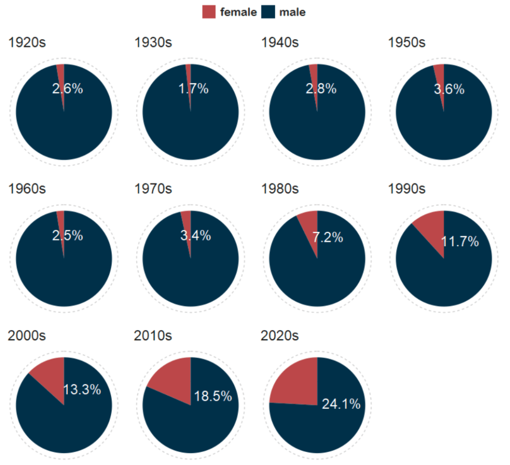
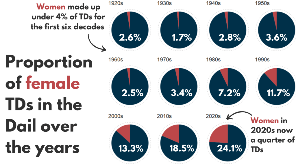
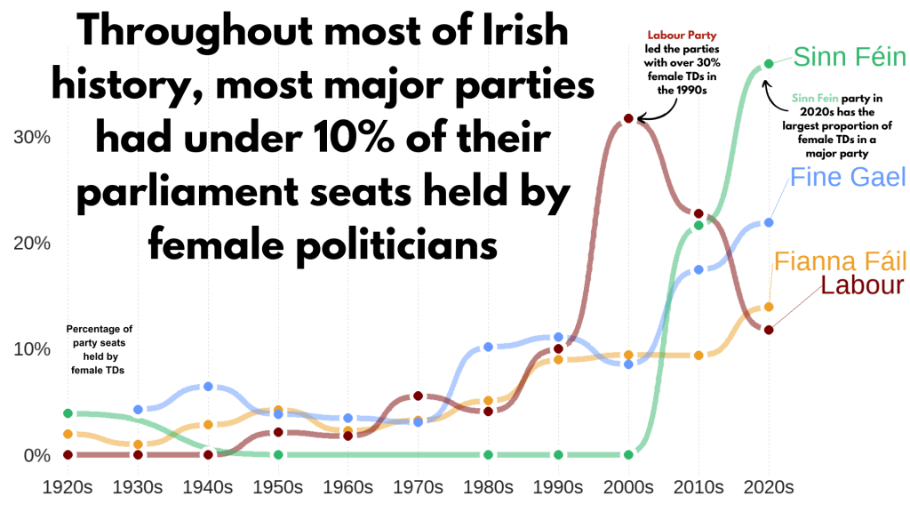
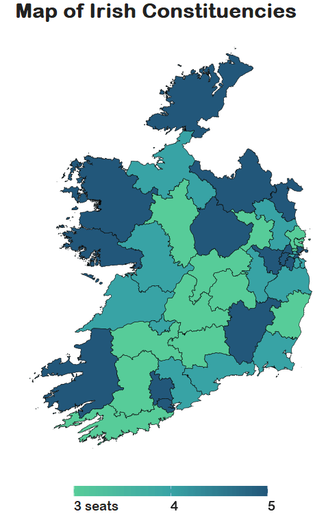
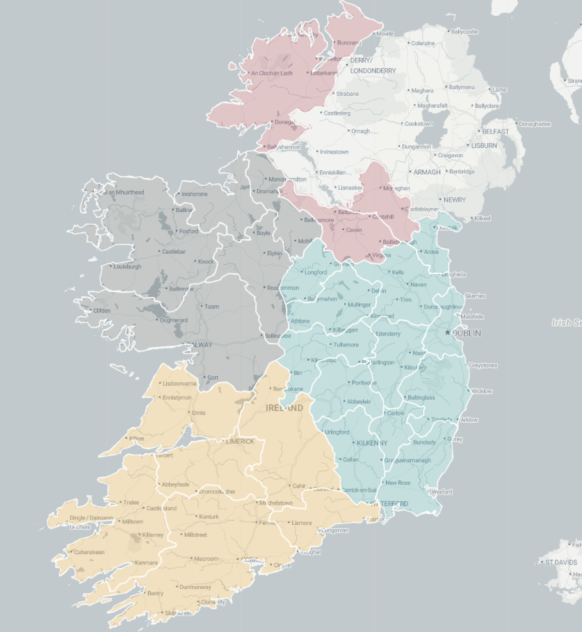
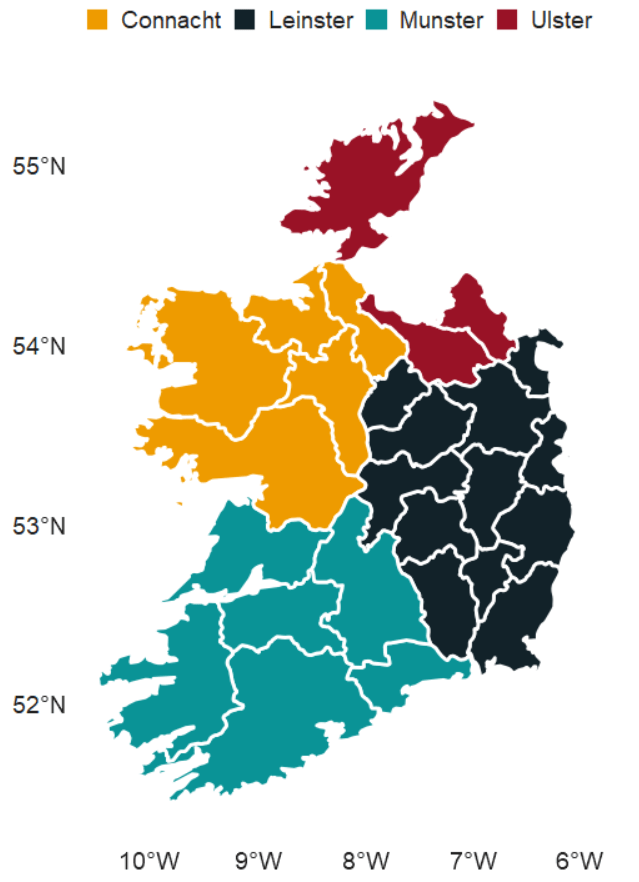
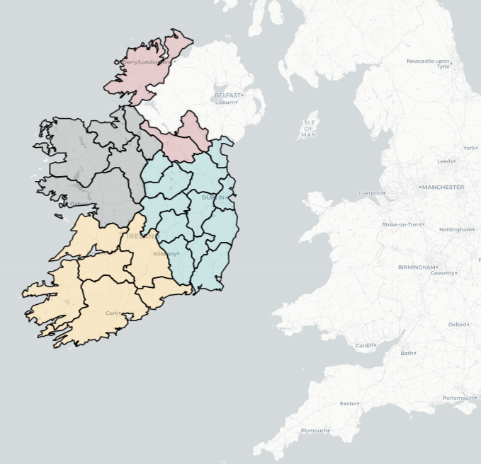
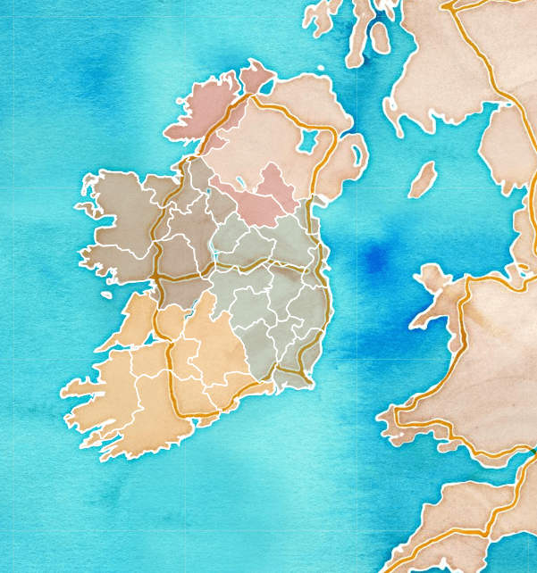
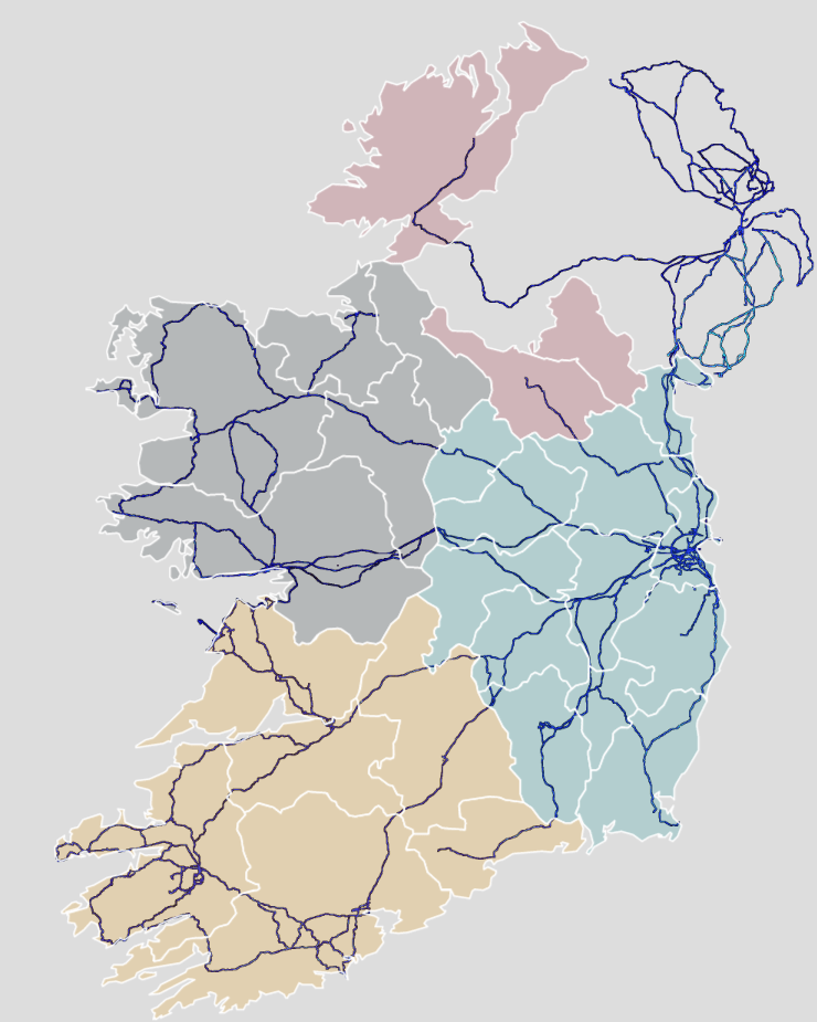
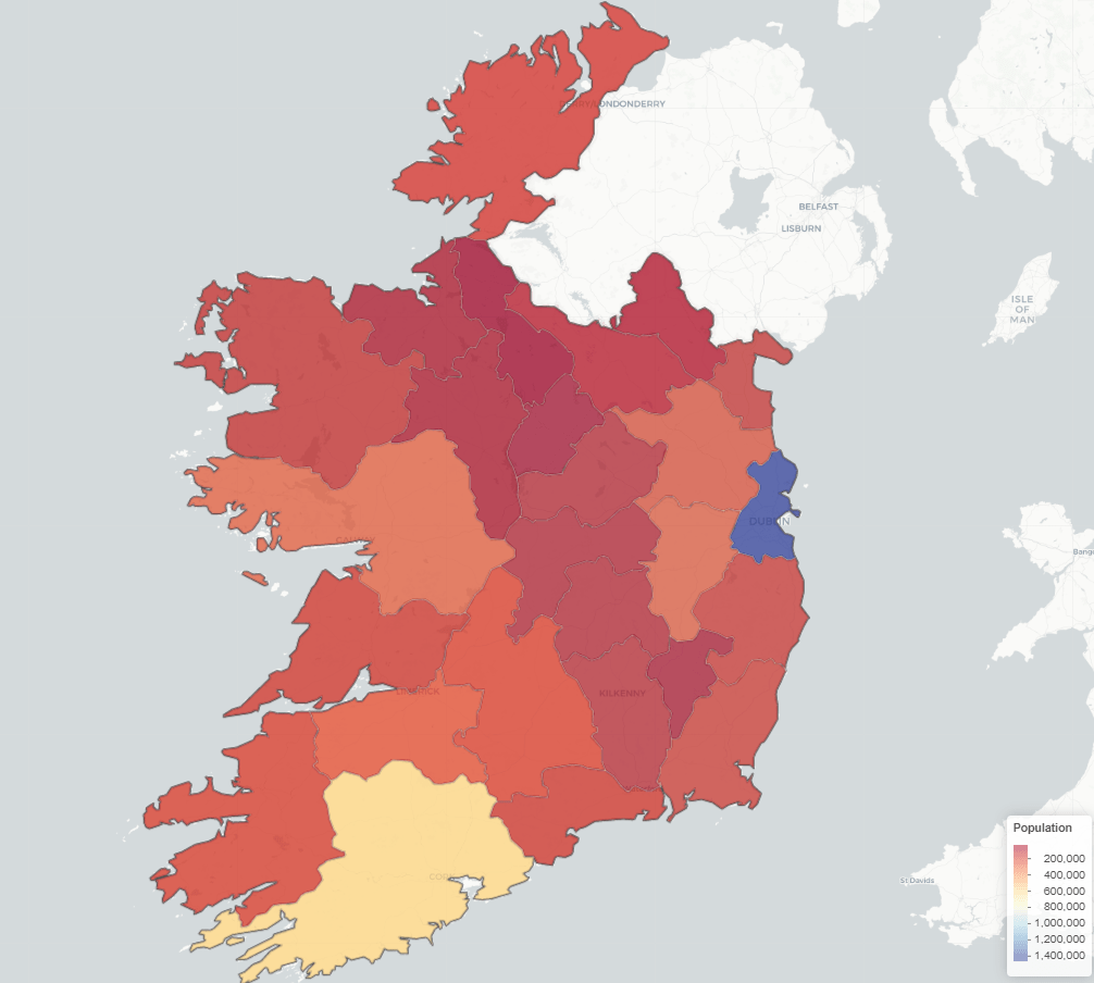
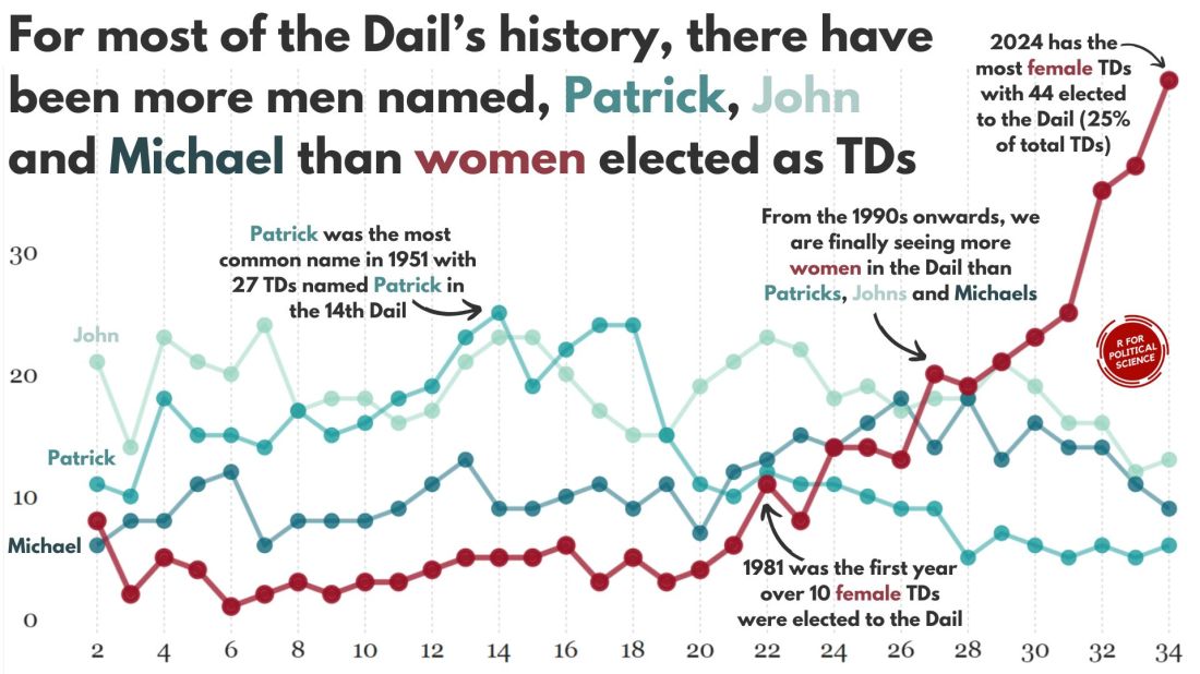
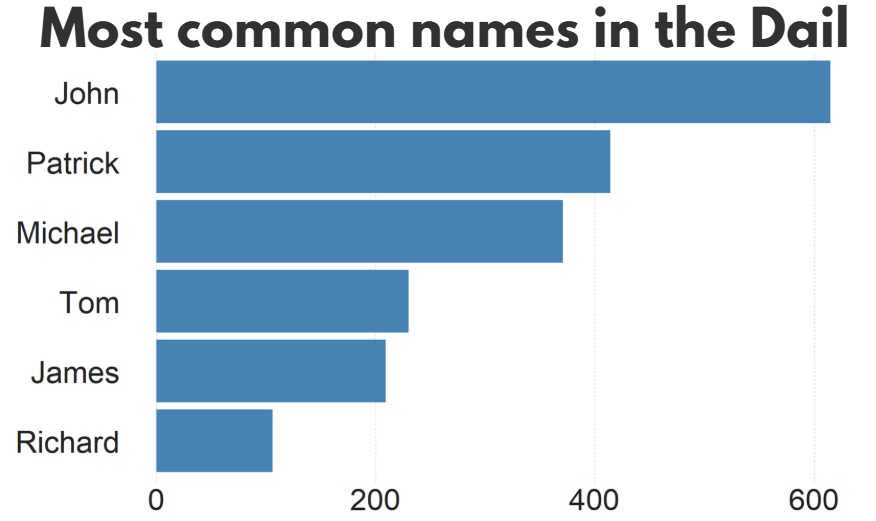
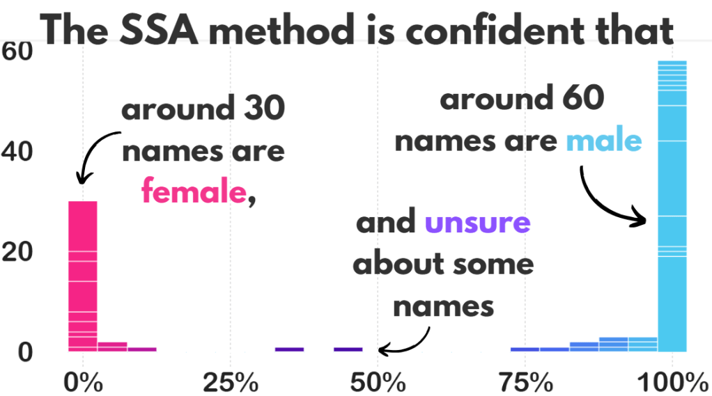
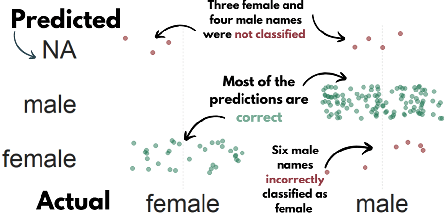
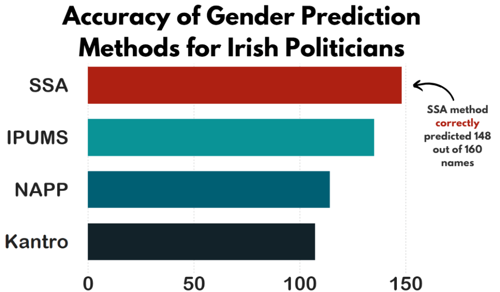
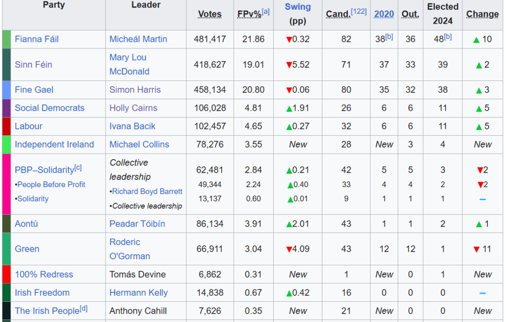
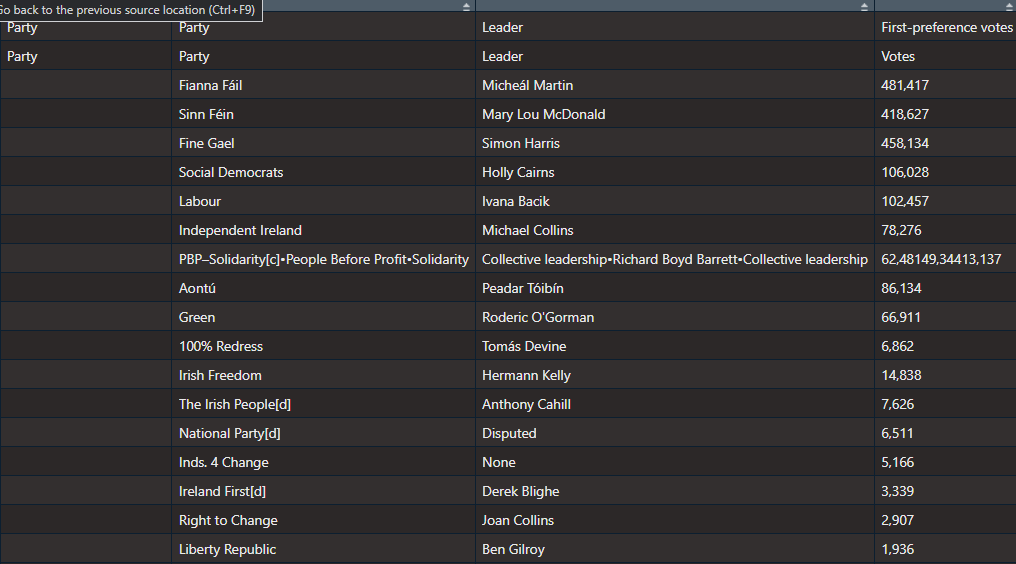
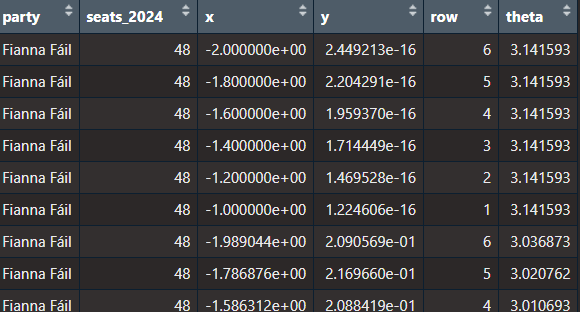
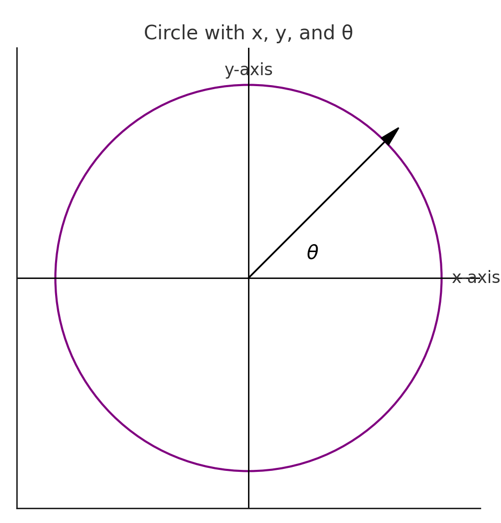
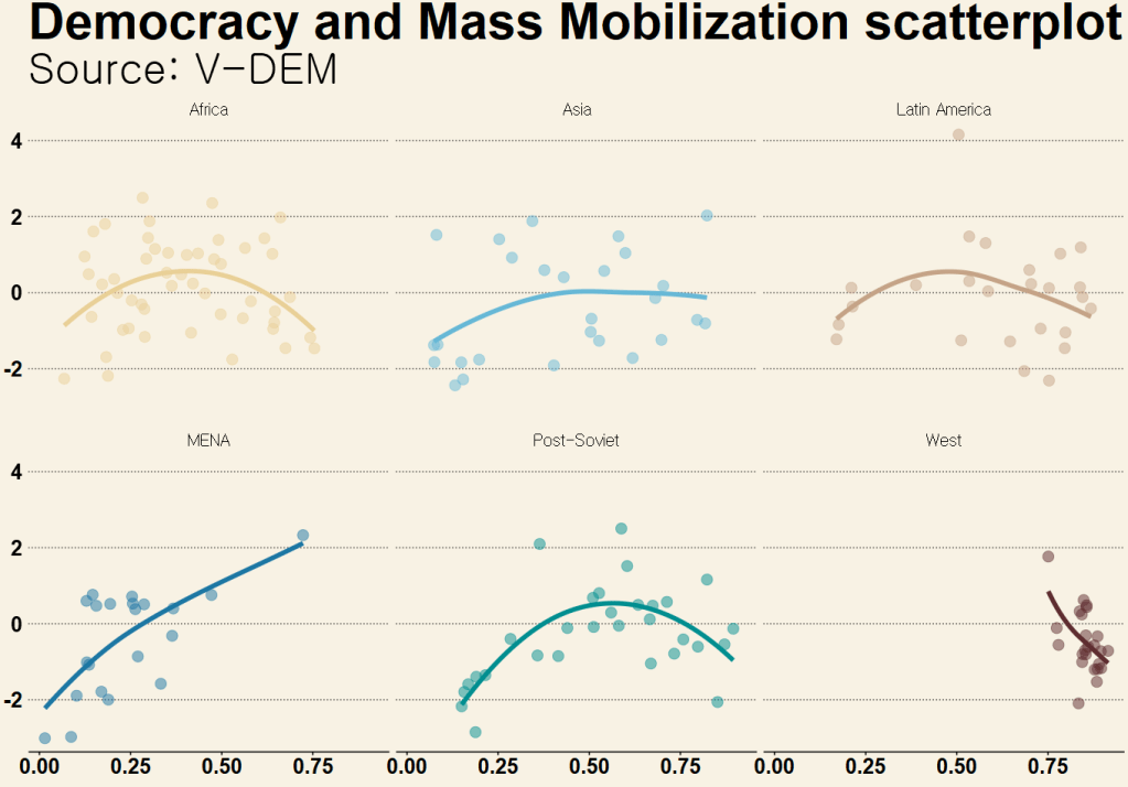
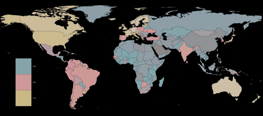
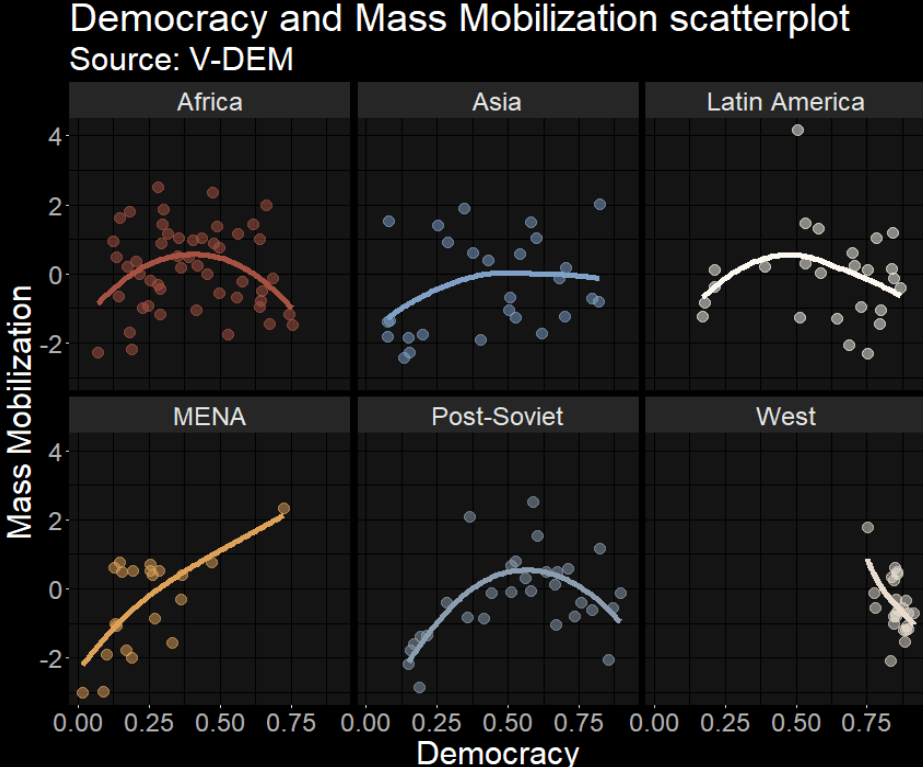
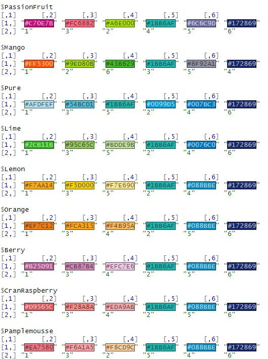
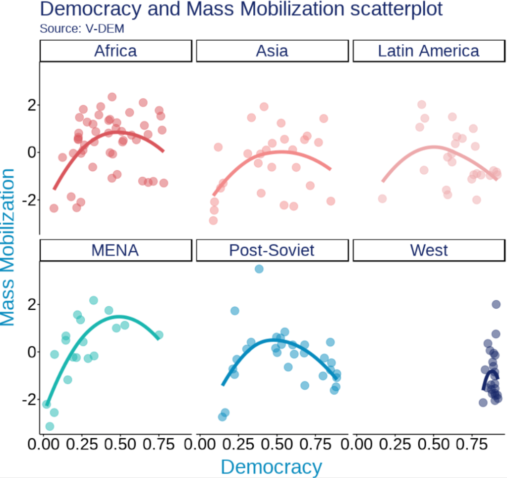
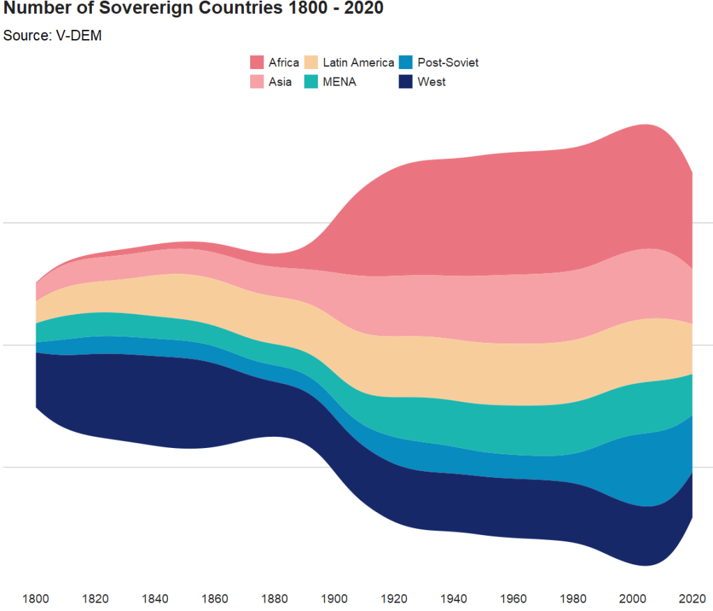
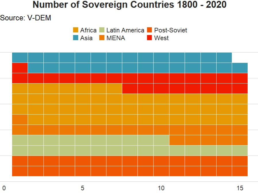
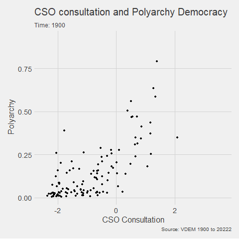
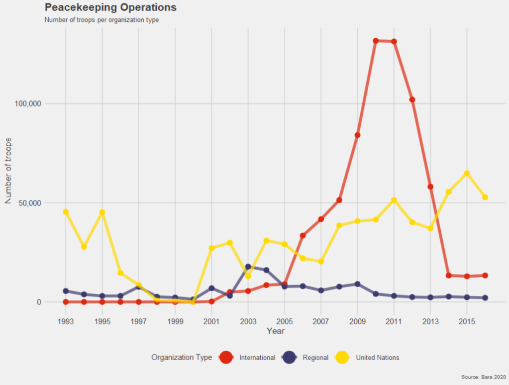
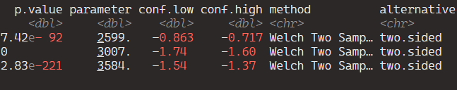
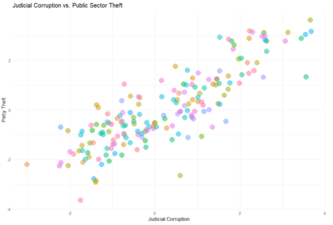
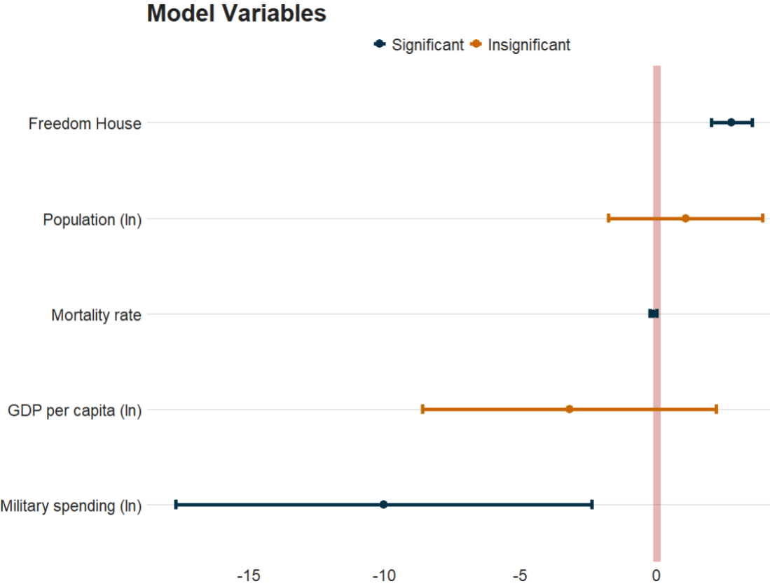
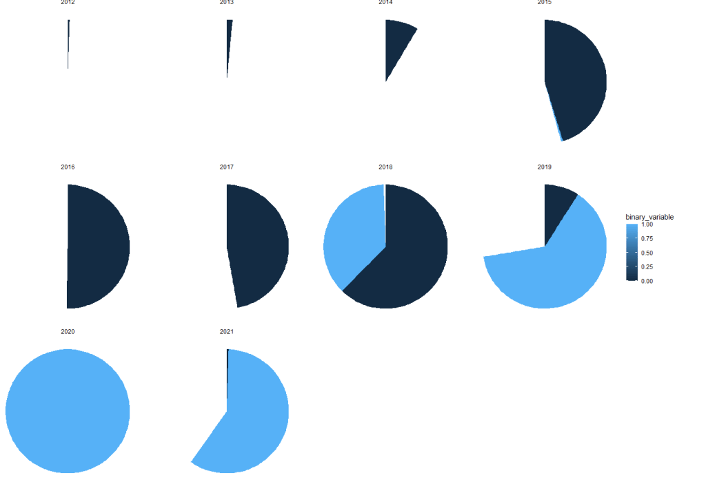
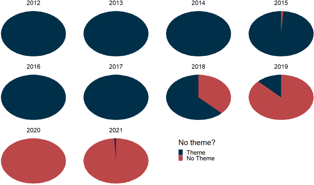
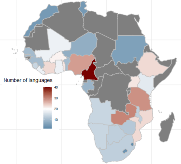
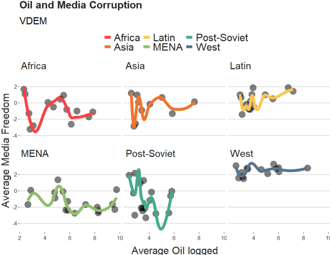
    How to graph different distributions for political science analysis in R. PART 1: Binomial, Bernoulli and Geometric Distributions.

    Packages we will need:

    library(tidyverse)

    In this blog, we will look at three distributions.

    Distributions are fundamental to statistical inference and probability.

    Cbc No GIF by Kim's Convenience - Find & Share on GIPHY

    The data we will be using is on Irish legislative elections from 1919.

    Binomial Distribution

    First we can look at the binomial distribution.

    We can model the number of successful elections (e.g., a party winning) out of a fixed number of elections (trials).

    In R, we use rbinom() to create the distribution.

    rbinom(n, size, prob)

    We need to feed in three pieces of information into this function

    Parameters

    • n: The number of random samples we want.

    • size: The number of trials.

    • prob: The probability of success for each trial.

    We can use rbinom() to simulate 100 elections and see how likely there will be a change in the party in power.

    ire_leg %>% 
      filter(leg_election_change != "No election") %>% 
      summarise(avg_change = mean(change_binary, na.rm = TRUE))

    When we print this, we learn that in 20% of the elections in Ireland, there has been a change in winning party.

    So we will use the Binomial distribution to simulate 10 years of elections.

    We will do this 100 times and create a graph of change probabilities.

    Essentially we can visualise how likely there will we see a change in the party in power.

    First, we choose how many times we want to estimate the probability

    num_simulations <- 100  

    Next, we choose the number of years that we want to look at

    years <- 10

    Then, we set the probability that an election ends with new party in power :

    probability_of_change <- 0.2 

    And we throw them all together into the rbinom() function

    simulations <- rbinom(n = num_simulations, 
    size = years, 
    prob = probability_of_change)
    
    proportion_of_changes <- mean(simulations > 0)

    We can see that there is an 87% chance that the party in power will change in the next 10 years, according to 100 simulations.

    We can use geom_histogram() to examine the distributions

    ggplot(data.frame(simulations), aes(x = simulations)) +
      geom_histogram(binwidth = 1, fill = "#023047",
                     color = "black", alpha = 0.7) +
      labs(title = "Distribution of Party Changes",
           x = "Number of Changes",
           y = "Probability") +
      scale_y_continuous(labels = scales::percent_format(scale = 1)) +
      scale_x_continuous(breaks = seq(0, 5, by = 1)) +
      bbplot::bbc_style()

    And if we think the probability is high, we can graph that too.

    So we can set the probability that the party in power wll change in one year to 0.8

    probability_of_change <- 0.8 

    Geometric Distribution

    While we use the binomial distribution to simulate the number of sucesses in a fixed number of trials, we use the geometric distribution to simulate number of trials needed until the first success (e.g. first instance that a new party comes into power after an election).

    It can answer questions like, “On average, how many elections did a party need to contest before winning its first election?”

    # Set the probability of that a party will change power in one year
    prob_success <- 0.2   
    
    # Generate values for the number of years until the first change in power
    trials_values <- 1:20  
    
    # Calculate the PMF values for the geometric distribution
    pmf_values <- dgeom(trials_values - 1, prob = prob_success)
    
    # Create a data frame
    df <- data.frame(k = trials_values, pmf = pmf_values)

    The dgeom() function in R is used to calculate the probability mass function (PMF) for the geometric distribution.

    It returns the probability of obtaining a specific number of trials (k) until the first success occurs in a sequence of independent Bernoulli trials.

    Each trial has a constant probability of success (p).

    In this instance, the dgeom() function calculates the PMF for the number of trials until the first success (from 0 to 10 years).

    This is estimated with a success probability of 0.2.

    prob_success <- 0.2  
    
    # Generate the number of trials until the first success
    trials_values <- 1:20  
    
    # Calculate the PMF values 
    pmf_values <- dgeom(trials_values - 1, prob = prob_success)
    
    # Create a data frame
    my_dist <- data.frame(k = trials_values, pmf = pmf_values)

    And we will graph the geometric distribution

    my_dist %>%
      ggplot(aes(x = k,  y = pmf)) +
      geom_bar(stat = "identity", 
               fill = "#023047",
               alpha = 0.7) +
      labs(title = "Geometric Distribution",
        x = "Number of Years Until New Party",
        y = "Probability") +
      my_theme()

    To interpret this graph, there is a 20% chance that there will be a new party next year and 10% chance that it will take 3 yaers until we see a new party in power.

    Bernoulli Distribution

    Nature of Trials

    The Bernoulli distribution is the most simple case where each election is considered as an independent Bernoulli trial, resulting in either success (1) or failure (0) based on whether a party wins or loses.

    • The binomial distribution focuses on the number of successful elections out of a fixed number of trials (years).

    • The geometric distribution focuses on the number of trials (year) required until the first success (change of party in power) occurs.

    • The Bernoulli distribution is the simplest case, treating each change as an independent success/failure trial.

    Thank you for readdhing. Next we will look at F and T distributiosn in police science resaerch.

    How to create a Regional Economic Communities dataset. PART TWO: consolidating string variables to dummy variables

    Click here to read PART ONE of the blog series on creating the Regional Economic Communities dataset

    Packages we will need:

    library(tidyverse)
    library(countrycode)
    library(WDI)

    There are eight RECs in Africa. Some countries are only in one of the RECs, some are in many. Kenya is the winner with membership in four RECs: CEN-SAD, COMESA, EAC and IGAD.

    In this blog, we will create a consolidated dataset for all 54 countries in Africa that are in a REC (or TWO or THREE or FOUR groups). Instead of a string variable for each group, we will create eight dummy group variables for each country.

    To do this, we first make a vector of all the eight RECs.

    patterns <- c("amu", "cen-sad", "comesa", "eac", "eccas", "ecowas", "igad", "sadc")

    We put the vector of patterns in a for-loop to create a new binary variable column for each REC group.

    We use the str_detect(rec_abbrev, pattern)) to see if the rec_abbrev column MATCHES the one of the above strings in the patterns vector.

    The new variable will equal 1 if the variable string matches the pattern in the vector. Otherwise it will be equal to 0.

    The double exclamation marks (!!) are used for unquoting, allowing the value of var_name to be treated as a variable name rather than a character string.

    Then, we are able to create a variable name that were fed in from the vector dynamically into the for-loop. We can automatically do this for each REC group.

    In this case, the iterated !!var_name will be replaced with the value stored in the var_name (AMU, CEN-SAD etc).

    We can use the := to assign a new variable to the data frame.

    The symbol := is called the “walrus operator” and we use it make or change variables without using quotation marks.

    for (pattern in patterns) {
      var_name <- paste0(pattern, "_binary")
      rec <- rec %>%
        mutate(!!var_name := as.integer(str_detect(rec_abbrev, pattern)))
    }

    This is the dataset now with a binary variables indicating whether or not a country is in any one of the REC groups.

    However, we quickly see the headache.

    We do not want four rows for Kenya in the dataset. Rather, we only want one entry for each country and a 1 or a 0 for each REC.

    We use the following summarise() function to consolidate one row per country.

    rec %>%
    group_by(country) %>%
      summarise(
        geo = first(geo),
        rec_abbrev = paste(rec_abbrev, collapse = ", "),
        across(ends_with("_binary"), ~ as.integer(any(. == 1)))) ->  rec_consolidated

    The first() function extracts the first value in the geo variable for each country. This first() function is typically used with group_by() and summarise() to get the value from the first row of each group.

    We use the the across() function to select all columns in the dataset that end with "_binary".

    The ~ as.integer(any(. == 1)) checks if there’s any value equal to 1 within the binary variables. If they have a value of 1, the summarised data for each country will be 1; otherwise, it will be 0.

    The following code can summarise each filtered group and add them to a new dataset that we can graph:

    summ_group_pop <- function(my_df, filter_var, rec_name) {
      my_df %>%
        filter({{ filter_var }} == 1) %>% 
        summarize(total_population = sum(pop, na.rm = TRUE)) %>% 
        mutate(group = rec_name)
    }
    
    filter_vars <- c("amu_binary", "cen.sad_binary", "comesa_binary", 
                     "eac_binary", "eccas_binary", "ecowas_binary",
                     "igad_binary", "sadc_binary")
    group_names <- c("AMU", "CEN-SAD", "COMESA", "EAC", "ECCAS", "ECOWAS",
                     "IGAD", "SADC")
    
    rec_pop_summary <- data.frame()
    
    for (i in seq_along(filter_vars)) {
      summary_df <- summ_group_pop(rec_wdi, !!as.name(filter_vars[i]), group_names[i])
      rec_pop_summary <- bind_rows(rec_pop_summary, summary_df)
    }

    And we graph it with geom_bar()

    rec_pop_summary %>% 
      ggplot(aes(x = reorder(group, total_population),
                 y = total_population)) + 
      geom_bar(stat = "identity", 
               width = 0.7, 
               color = "#0a85e5", 
               fill = "#0a85e5") +
      bbplot::bbc_style() + 
      scale_y_continuous(labels = scales::comma_format()) +
      coord_flip() + 
      labs(x = "RECs", 
           y = "Population", 
           title = "Population of REC groups in Africa", 
           subtitle = "Source: World Bank, 2022")

    Cline Center Coup d’État Project Dataset

    tailwind_palette <- c("001219","005f73","0a9396","94d2bd","e9d8a6","ee9b00","ca6702","bb3e03","ae2012","9b2226")
    
    add_hashtag <- function(my_vec){
        hash_vec <-  paste0('#', my_vec)
        return(hash_vec)
      
      tailwind_hash <- add_hashtag(tailwind_palette)

    Coups per million people in each REC

    create_stateyears(system = "cow") %>% 
        add_democracy() -> demo
    
    rec_wdi %>% 
      select(!c(year, country)) %>% 
      left_join(demo, by = c("cown" = "ccode")) %>% 
      filter(year > 1989) %>% 
      filter(amu_binary == 1) %>% 
      group_by(year) %>% 
      summarize(mean_demo = mean(v2x_polyarchy, na.rm = TRUE)) %>% 
      mutate(rec = "AMU") -> demo_amu

    We can use a function to repeat the above code with all eight REC groups:

     create_demo_summary <- function(my_df, filter_var, group_name) {
      my_df %>%
        select(!c(year, country)) %>% 
        left_join(demo, by = c("cown" = "ccode")) %>% 
        filter(year > 1989) %>% 
        filter({{ filter_var }} == 1) %>% 
        group_by(year) %>% 
        summarize(mean_demo = mean(v2x_polyarchy, na.rm = TRUE)) %>% 
        mutate(rec = group_name)
    }
    
    rec_democracy_df <- data.frame()
    
    for (i in seq_along(filter_vars)) {
      summary_df <- create_demo_summary(rec_wdi, !!as.name(filter_vars[i]), group_names[i])
      rec_democracy_df <- bind_rows(rec_democracy_df, summary_df)
    }

    And we graph out the average democracy scores cross the years

    rec_democracy_df %>% 
      ggplot(aes(x = year, y = mean_demo, group = rec)) + 
      geom_line(aes(fill = rec, color = rec), size = 2, alpha = 0.8) + 
      # geom_point(aes(fill = rec, color = rec), size = 4) + 
      geom_label(data = . %>% group_by(rec) %>% filter(year == 2019), 
                 aes(label = rec, 
                     fill = rec, 
                     x = 2019), color = "white",
                 legend = FALSE, size = 3) +  
      scale_color_manual(values = tailwind_hash) + 
      scale_fill_manual(values = tailwind_hash) + 
      theme(legend.position = "none")