Packages we will need:
library(tidyverse)In this blog, we will look at three distributions.
Distributions are fundamental to statistical inference and probability.

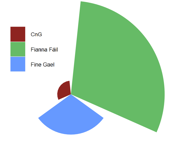
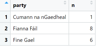
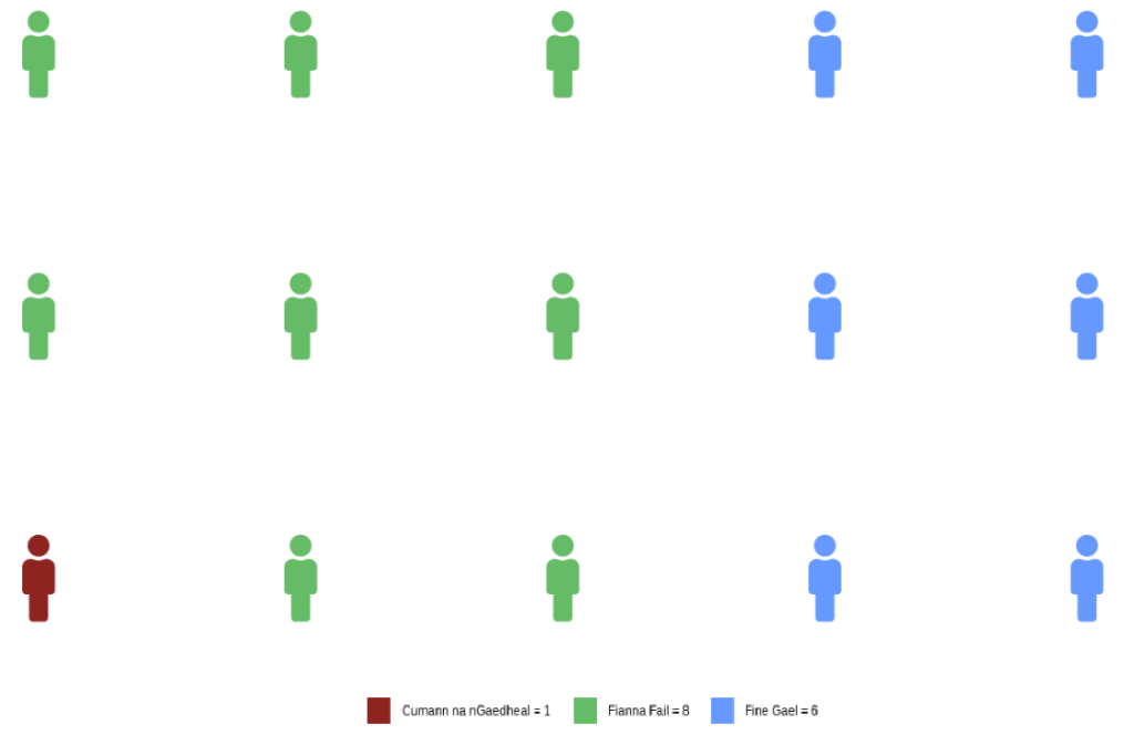
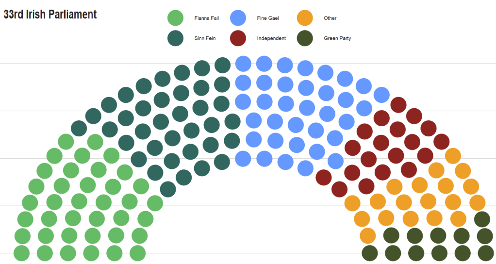
The data we will be using is on Irish legislative elections from 1919.
Binomial Distribution
First we can look at the binomial distribution.
We can model the number of successful elections (e.g., a party winning) out of a fixed number of elections (trials).
In R, we use rbinom() to create the distribution.
rbinom(n, size, prob)We need to feed in three pieces of information into this function
Parameters
n: The number of random samples we want.
size: The number of trials.
prob: The probability of success for each trial.
We can use rbinom() to simulate 100 elections and see how likely there will be a change in the party in power.
ire_leg %>%
  filter(leg_election_change != "No election") %>%
  summarise(avg_change = mean(change_binary, na.rm = TRUE))
When we print this, we learn that in 20% of the elections in Ireland, there has been a change in winning party.
So we will use the Binomial distribution to simulate 10 years of elections.
We will do this 100 times and create a graph of change probabilities.
Essentially we can visualise how likely there will we see a change in the party in power.
First, we choose how many times we want to estimate the probability
num_simulations <- 100 Next, we choose the number of years that we want to look at
years <- 10Then, we set the probability that an election ends with new party in power :
probability_of_change <- 0.2 And we throw them all together into the rbinom() function
simulations <- rbinom(n = num_simulations,
size = years,
prob = probability_of_change)

proportion_of_changes <- mean(simulations > 0)
We can see that there is an 87% chance that the party in power will change in the next 10 years, according to 100 simulations.
We can use geom_histogram() to examine the distributions
ggplot(data.frame(simulations), aes(x = simulations)) +
  geom_histogram(binwidth = 1, fill = "#023047",
                 color = "black", alpha = 0.7) +
  labs(title = "Distribution of Party Changes",
       x = "Number of Changes",
       y = "Probability") +
  scale_y_continuous(labels = scales::percent_format(scale = 1)) +
  scale_x_continuous(breaks = seq(0, 5, by = 1)) +
  bbplot::bbc_style()
And if we think the probability is high, we can graph that too.
So we can set the probability that the party in power wll change in one year to 0.8
probability_of_change <- 0.8 
Geometric Distribution
While we use the binomial distribution to simulate the number of sucesses in a fixed number of trials, we use the geometric distribution to simulate number of trials needed until the first success (e.g. first instance that a new party comes into power after an election).
It can answer questions like, “On average, how many elections did a party need to contest before winning its first election?”
# Set the probability of that a party will change power in one year
prob_success <- 0.2

# Generate values for the number of years until the first change in power
trials_values <- 1:20

# Calculate the PMF values for the geometric distribution
pmf_values <- dgeom(trials_values - 1, prob = prob_success)

# Create a data frame
df <- data.frame(k = trials_values, pmf = pmf_values)
The dgeom() function in R is used to calculate the probability mass function (PMF) for the geometric distribution.
It returns the probability of obtaining a specific number of trials (k) until the first success occurs in a sequence of independent Bernoulli trials.
Each trial has a constant probability of success (p).
In this instance, the dgeom() function calculates the PMF for the number of trials until the first success (from 0 to 10 years).
This is estimated with a success probability of 0.2.
prob_success <- 0.2

# Generate the number of trials until the first success
trials_values <- 1:20

# Calculate the PMF values
pmf_values <- dgeom(trials_values - 1, prob = prob_success)

# Create a data frame
my_dist <- data.frame(k = trials_values, pmf = pmf_values)
And we will graph the geometric distribution
my_dist %>%
  ggplot(aes(x = k,  y = pmf)) +
  geom_bar(stat = "identity",
           fill = "#023047",
           alpha = 0.7) +
  labs(title = "Geometric Distribution",
    x = "Number of Years Until New Party",
    y = "Probability") +
  my_theme()
To interpret this graph, there is a 20% chance that there will be a new party next year and 10% chance that it will take 3 yaers until we see a new party in power.
Bernoulli Distribution
Nature of Trials
The Bernoulli distribution is the most simple case where each election is considered as an independent Bernoulli trial, resulting in either success (1) or failure (0) based on whether a party wins or loses.
- The binomial distribution focuses on the number of successful elections out of a fixed number of trials (years).
- The geometric distribution focuses on the number of trials (year) required until the first success (change of party in power) occurs.
- The Bernoulli distribution is the simplest case, treating each change as an independent success/failure trial.
Thank you for readdhing. Next we will look at F and T distributiosn in police science resaerch.


