This blog post will look at the plot_model() function from the sjPlot package. This plot can help simply visualise the coefficients in a model.
Packages we need:
library(sjPlot)
library(kable)
We can look at variables that are related to citizens’ access to public services.
This dependent variable measures equal access access to basic public services, such as access to security, primary education, clean water, and healthcare and whether they are distributed equally or unequally according to socioeconomic position.
Higher scores indicate a more equal society.
I will throw some variables into the model and see what relationships are statistically significant.
The variables in the model are
level of judicial constraint on the executive branch,
freedom of information (such as freedom of speech and uncensored media),
level of democracy,
level of regime corruption and
strength of civil society.
So first, we run a simple linear regression model with the lm() function:
We can use knitr package to produce a nice table or the regression coefficients with kable().
I write out the independent variable names in the caption argument
I also choose the four number columns in the col.names argument. These numbers are:
beta coefficient,
standard error,
t-score
p-value
I can choose how many decimals I want for each number columns with the digits argument.
And lastly, to make the table, I can set the type to "html". This way, I can copy and paste it into my blog post directly.
my_model %>%
tidy() %>%
kable(caption = "Access to public services by socio-economic position.",
col.names = c("Predictor", "B", "SE", "t", "p"),
digits = c(0, 2, 3, 2, 3), "html")
Access to public services by socio-economic position
Predictor
B
SE
t
p
(Intercept)
1.98
0.380
5.21
0.000
Judicial constraints
-0.03
0.485
-0.06
0.956
Freedom information
-0.60
0.860
-0.70
0.485
Democracy Score
2.61
0.807
3.24
0.001
Regime Corruption
-2.75
0.381
-7.22
0.000
Civil Society Strength
-1.67
0.771
-2.17
0.032
Higher democracy scores are significantly and positively related to equal access to public services for different socio-economic groups.
There is no statistically significant relationship between judicial constraint on the executive.
But we can also graphically show the coefficients in a plot with the sjPlot package.
There are many different arguments you can add to change the colors of bars, the size of the font or the thickness of the lines.
p <-  plot_model(my_model,
      line.size = 8,
      show.values = TRUE,
      colors = "Set1",
      vline.color = "#d62828",
      axis.labels = c("Civil Society Strength",  "Regime Corruption", "Democracy Score", "Freedom information", "Judicial constraints"), title = "Equal access to public services distributed by socio-economic position")

p + theme_sjplot(base_size = 20)
So how can we interpret this graph?
If a bar goes across the vertical red line, the coefficient is not significant. The further the bar is from the line, the higher the t-score and the more significant the coefficient!
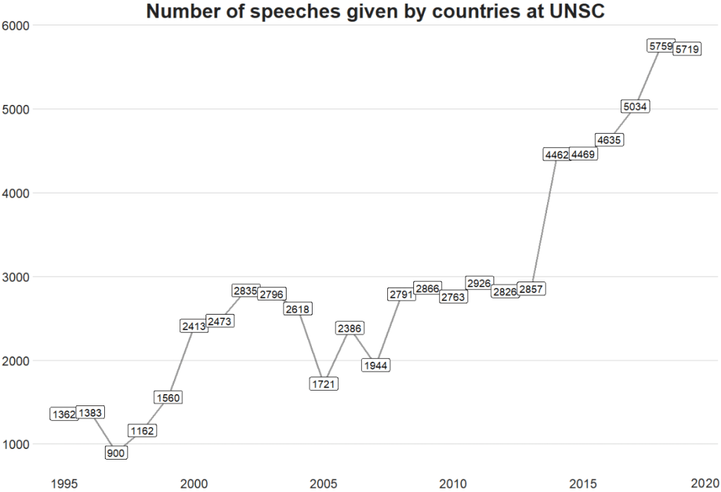
Let’s look at how many speeches took place at the UN Security Council every year from 1995 until 2019.
I want to only look at countries, not organisations. So a quick way to do that is to add a variable to indicate whether the speaker variable has an ISO code.
Only countries have ISO codes, so I can use this variable to filter away all the organisations that made speeches
library(countrycode)

speech$iso2 <- countrycode(speech$country, "country.name", "iso2c")

library(bbplot)

speech %>%
  dplyr::filter(!is.na(iso2)) %>%
  group_by(year) %>%
  count() %>%
  ggplot(aes(x = year, y = n)) +
  geom_line(size = 1.2, alpha = 0.4) +
  geom_label(aes(label = n)) +
  bbplot::bbc_style() +
  theme(plot.title = element_text(hjust = 0.5)) +
  labs(title = "Number of speeches given by countries at UNSC")
We can see there has been a relatively consistent upward trend in the number of speeches that countries are given at the UN SC. Time will tell what impact COVID will have on these trends.
There was a particularly sharp increase in speeches in 2015.
We can look and see who was talking, and in the next post, we can examine what they were talking about in 2015 with some simple text analytic packages and functions.
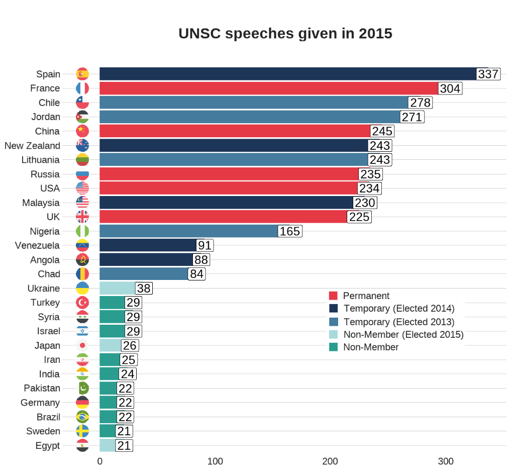
First, we will filter only the year 2015 and count the number of observations per group (i.e. the number of speeches per country this year).
To add flags to the graph, add the iso2 code to the dataset (and it must be in lower case).
We can clean up the names and create a variable that indicates whether the country is one of the five Security Council Permanent Members, a Temporary Member elected or a Non-,ember.
I also clean up the names to make the country’s names in the dataset smaller. For example, “United Kingdom Of Great Britain And Northern Ireland”, will be very cluttered in the graph compared to just “UK” so it will be easier to plot.
library(ggflags)
library(ggthemes)

speech_2015 %>%
# To avoid the graph being too busy, we only look at countries that gave over 20 speeches
  dplyr::filter(speech_count > 20) %>%

# Clean up some names so the graph is not too crowded
  dplyr::mutate(country = ifelse(country == "United Kingdom Of Great Britain And Northern Ireland", "UK", country)) %>%
  dplyr::mutate(country = ifelse(country == "Russian Federation", "Russia", country)) %>%
  dplyr::mutate(country = ifelse(country == "United States Of America", "USA", country)) %>%
  dplyr::mutate(country = ifelse(country == "Republic Of Korea", "South Korea", country)) %>%
  dplyr::mutate(country = ifelse(country == "Venezuela (Bolivarian Republic Of)", "Venezuela", country)) %>%
  dplyr::mutate(country = ifelse(country == "Islamic Republic Of Iran", "Iran", country)) %>%
  dplyr::mutate(country = ifelse(country == "Syrian Arab Republic", "Syria", country)) %>%

# Create a Member status variable:
# China, France, Russia, the United Kingdom, and the United States are UNSC Permanent Members
  dplyr::mutate(Member = ifelse(country == "UK", "Permanent",
  ifelse(country == "USA", "Permanent",
  ifelse(country == "China", "Permanent",
  ifelse(country == "Russia", "Permanent",
  ifelse(country == "France", "Permanent",

# Non-permanent members in their first year (elected October 2014)
  ifelse(country == "Angola", "Temporary (Elected 2014)",
  ifelse(country == "Malaysia", "Temporary (Elected 2014)",
  ifelse(country == "Venezuela", "Temporary (Elected 2014)",
  ifelse(country == "New Zealand", "Temporary (Elected 2014)",
  ifelse(country == "Spain", "Temporary (Elected 2014)",

# Non-permanent members in their second year (elected October 2013)
  ifelse(country == "Chad", "Temporary (Elected 2013)",
  ifelse(country == "Nigeria", "Temporary (Elected 2013)",
  ifelse(country == "Jordan", "Temporary (Elected 2013)",
  ifelse(country == "Chile", "Temporary (Elected 2013)",
  ifelse(country == "Lithuania", "Temporary (Elected 2013)",

# Non members that will join UNSC next year (elected October 2015)
  ifelse(country == "Egypt", "Non-Member (Elected 2015)",
  ifelse(country == "Sengal", "Non-Member (Elected 2015)",
  ifelse(country == "Uruguay", "Non-Member (Elected 2015)",
  ifelse(country == "Japan", "Non-Member (Elected 2015)",
  ifelse(country == "Ukraine", "Non-Member (Elected 2015)",

# Everyone else is a regular non-member
               "Non-Member"))))))))))))))))))))) -> speech_2015
When we have over a dozen nested ifelse() statements, we will need to check that we have all our corresponding closing brackets.
Next choose some colours for each Memberships status. I always take my hex values from https://coolors.co/
And all that is left to do is create the bar chart.
With geom_bar(), we can indicate stat = "identity" because we are giving the plot the y values and ggplot does not need to do the automatic aggregation on its own.
To make sure the bars are descending from most speeches to fewest speeches, we use the reorder() function. The second argument is the variable according to which we want to order the bars. So for us, we give the speech_count integer variable to order our country bars with x = reorder(country, speech_count).
We can change the bar from vertical to horizontal with coordflip().
I add flags with geom_flag() and feed the lower case ISO code to the country = iso2_lower argument.
I add the bbc_style() again because I like the font, size and sparse lines on the plot.
We can move the title of the plot into the centre with plot.title = element_text(hjust = 0.5))
Finally, we can supply the membership_palette vector to the values = argument in the scale_fill_manual() function to specify the colours we want.
speech_2015 %>%  ggplot(aes(x = reorder(country, speech_count), y = speech_count)) +
  geom_bar(stat = "identity", aes(fill = as.factor(Member))) +
  coord_flip() +
  ggflags::geom_flag(mapping = aes(y = -15, x = country, country = iso2_lower), size = 10) +
  geom_label(mapping = aes( label = speech_count), size = 8) +
  theme(legend.position = "top") +
  labs(title = "UNSC speeches given in 2015", y = "Number of speeches", x = "") +
  bbplot::bbc_style() +
  theme(text = element_text(size = 20),
  plot.title = element_text(hjust = 0.5)) +
  scale_fill_manual(values =  membership_palette)
In the next post, we will look at the texts themselves. Here is a quick preview.
We count the number of tokens (i.e. words) for each country in each year. With the distinct() function we take only one observation per year per country. This reduces the number of rows from 16601520 in speech_tokesn to 3142 rows in speech_words_count :
It is a bit convoluted to put the flags ONLY at the start and end of the lines. We need to subset the dataset two times with the geom_flag() sections. First, we subset the data.frame to year == 1995 and the flags appear at the start of the word_count on the y axis. Then we subset to year == 2019 and do the same
ggplot(data = permanent_word_summary) +
  geom_line(aes(x = year, y = word_count, group = as.factor(country), color = as.factor(country)),
size = 2) +
  ggflags::geom_flag(data = subset(permanent_word_summary, year == 1995), aes(x = 1995, y = word_count,  country = iso2_lower), size = 9) +
  ggflags::geom_flag(data = subset(permanent_word_summary,
year == 2019),
aes(x = 2019,
y = word_count,
country = iso2_lower),
size = 12) +
  bbplot::bbc_style() +
 theme(legend.position = "right") + labs(title = "Number of words spoken by Permanent Five in the UN Security Council") +
  scale_color_manual(values = five_pal)
We can see that China has been the least chattiest country if we are measuring chatty with number of words spoken. Translation considerations must also be taken into account. We can see here again at around the 2015 mark, there was a discernible increase in the number of words spoken by most of the countries!
When we save our plots and graphs in R, we can use the ggsave() function and specify the type, size and look of the file.
We are going to look two features in particular: anti-aliasing lines with the Cairo package and creating transparent backgrounds.
Make your graph background transparent
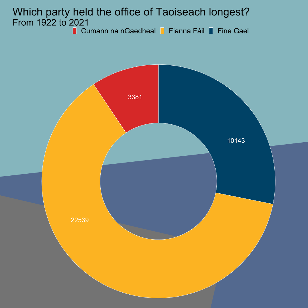
First, let’s create a pie chart with a transparent background. The pie chart will show which party has held the top spot in Irish politics for the longest.
After we prepare and clean our data of Irish Taoisigh start and end dates in office and create a doughnut chart (see bottom of blog for doughnut graph code), we save it to our working directorywith ggsave().
If we want to add our doughnut chart to a power point but we don’t want it to be a white background, we can ask ggsave to save the chart as transparent and then we can add it to our powerpoint or report!
To do this, we specify bg argument to "transparent"
When we save our graph in R with ggsave(), we can specify in the type argument that we want type = cairo.
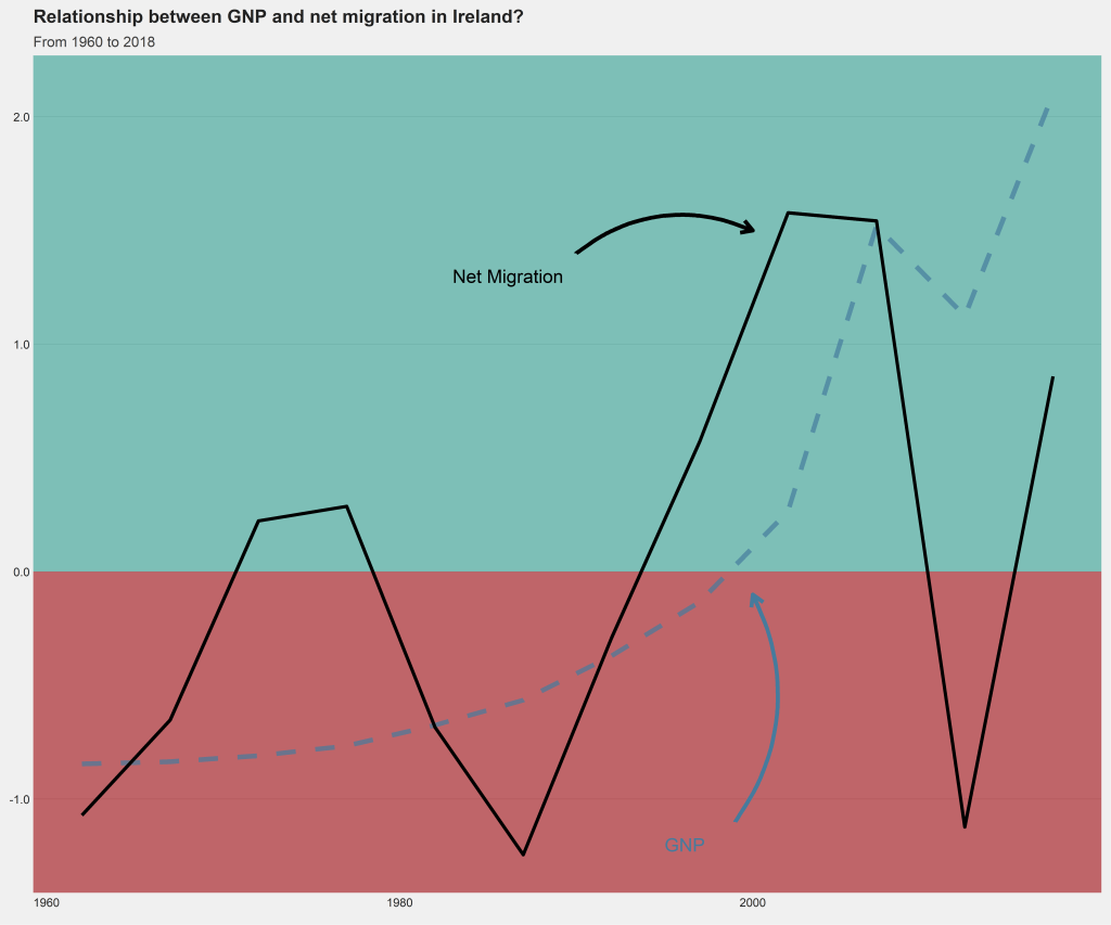
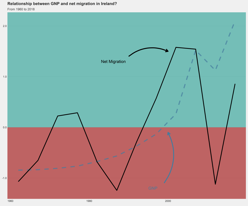
I make a quick graph that looks at the trends in migration and GDP from 1960s to 2018 in Ireland. I made the lines extra large to demonstrate the difference between aliased and anti-aliased lines in the graphs.
Next, we can go create a dichotomous factor variable and divide the continuous “freedom from torture scale” variable into either above the median or below the median score. It’s a crude measurement but it serves to highlight trends.
Blue means the country enjoys high freedom from torture. Yellow means the county suffers from low freedom from torture and people are more likely to be tortured by their government.
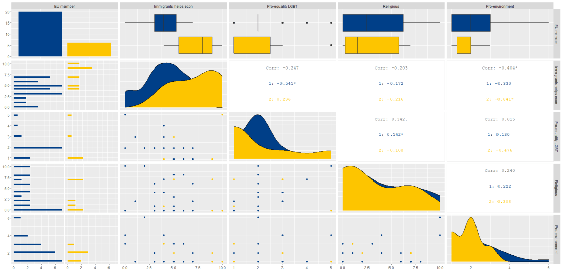
Then we feed our variables into the ggpairs() function from the GGally package.
I use the columnLabels to label the graphs with their full names and the mapping argument to choose my own color palette.
I add the bbc_style() format to the corr_matrix object because I like the font and size of this theme. And voila, we have our basic correlation matrix (Figure 1).
First off, in Figure 2 we can see the centre plots in the diagonal are the distribution plots of each variable in the matrix
Figure 2.
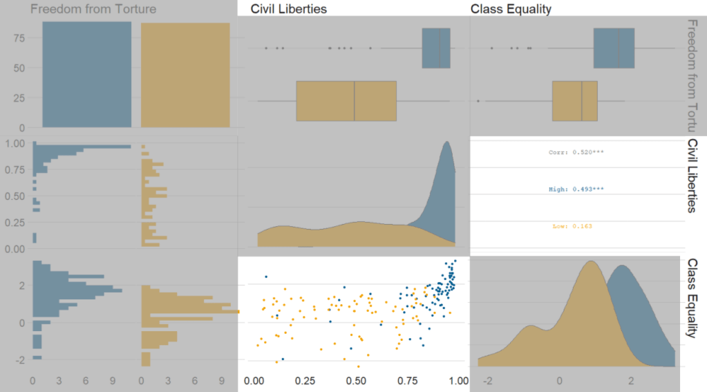
In Figure 3, we can look at the box plot for the ‘civil liberties index’ score for both high (blue) and low (yellow) ‘freedom from torture’ categories.
The median civil liberties score for countries in the high ‘freedom from torture’ countries is far higher than in countries with low ‘freedom from torture’ (i.e. citizens in these countries are more likely to suffer from state torture). The spread / variance is also far great in states with more torture.
Figure 3.
In Figur 4, we can focus below the diagonal and see the scatterplot between the two continuous variables – civil liberties index score and class equality index scores.
We see that there is a positive relationship between civil liberties and class equality. It looks like a slightly U shaped, quadratic relationship but a clear relationship trend is not very clear with the countries with higher torture prevalence (yellow) showing more randomness than the countries with high freedom from torture scores (blue).
Saying that, however, there are a few errant blue points as outliers to the trend in the plot.
The correlation score is also provided between the two categorical variables and the correlation score between civil liberties and class equality scores is 0.52.
Examining at the scatterplot, if we looked only at countries with high freedom from torture, this correlation score could be higher!
library(ggflags)
library(bbplot) # for pretty BBC style graphs
library(countrycode) # for ISO2 country codes
library(rvest) # for webscrapping
Click here to add rectangular flags to graphs and click here to add rectangular flags to MAPS!
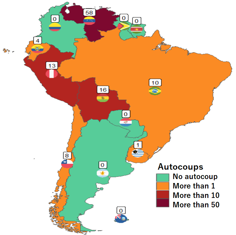
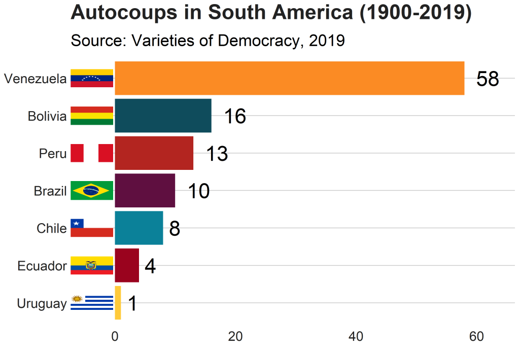
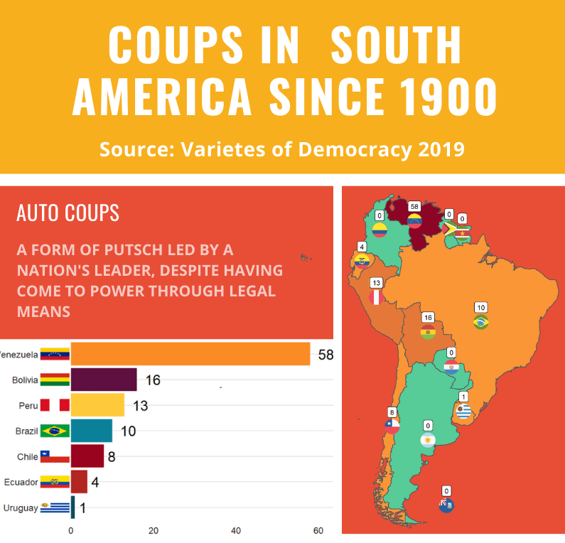
Apropos of this week’s US news, we are going to graph the number of different or autocoups in South America and display that as both maps and bar charts.
According to our pals at the Wikipedia, a self-coup, or autocoup (from the Spanish autogolpe), is a form of putsch or coup d’état in which a nation’s leader, despite having come to power through legal means, dissolves or renders powerless the national legislature and unlawfully assumes extraordinary powers not granted under normal circumstances.
In order to add flags to maps, we need to make sure our dataset has three variables for each country:
Longitude
Latitude
ISO2 code (in lower case)
In order to add longitude and latitude, I will scrape these from a website with the rvest dataset and merge them with my existing dataset.
In this case, a warning message pops up to tell me:
Some values were not matched unambiguously: Kosovo, Somaliland, Zanzibar
One important step is to convert the ISO codes from upper case to lower case. The geom_flag() function from the ggflag package only recognises lower case (e.g Chile is cl, not CL).
Finally we can graph our maps comparing the different types of coups in South America.
Click here to learn how to graph variables onto maps with the rnaturalearth package.
The geom_flag() function requires an x = longitude, y = latitude and a country argument in the form of our lower case ISO2 country codes. You can play around the latitude and longitude flag and also label position by adding or subtracting from them. The size of the flag can be added outside the aes() argument.
We can place the number of coups under the flag with the geom_label() function.
The theme_map() function we add comes from ggthemes package.
autocoup_map <- autocoup_df%>%
  dplyr::filter(subregion == "South America") %>%
  ggplot() +
  geom_sf(aes(fill = coup_cat)) +
  ggflags::geom_flag(aes(x = longitude, y = latitude+0.5, country = iso2_lower), size = 8) +
  geom_label(aes(x = longitude, y = latitude+3, label = auto_coup_sum, color = auto_coup_sum), fill  =  "white", colour = "black") +
  theme_map()


autocoup_map + scale_fill_manual(values = coup_palette, name = "Auto Coups", labels = c("No autocoup", "More than 1", "More than 10", "More than 50"))
Not hard at all.
And we can make a quick barchart to rank the countries. For this I will use square flags from the ggimage package. Click here to read more about the ggimage package
Additionally, I will use the theme from the bbplot pacakge. Click here to read more about the bbplot package.
Click here to check out the vignette to read about all the different graphs with which you can use bbplot !
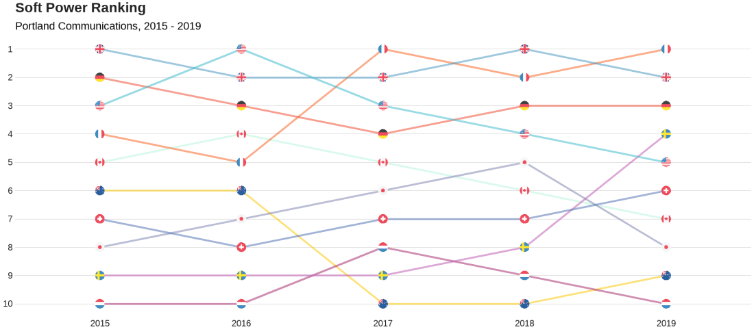
We will look at the Soft Power rankings from Portland Communications. According to Wikipedia, In politics (and particularly in international politics), soft power is the ability to attract and co-opt, rather than coerce or bribe other countries to view your country’s policies and actions favourably. In other words, soft power involves shaping the preferences of others through appeal and attraction.
A defining feature of soft power is that it is non-coercive; the currency of soft power includes culture, political values, and foreign policies.
Joseph Nye’s primary definition, soft power is in fact:
“the ability to get what you want through attraction rather than coercion or payments. When you can get others to want what you want, you do not have to spend as much on sticks and carrots to move them in your direction. Hard power, the ability to coerce, grows out of a country’s military and economic might. Soft power arises from the attractiveness of a country’s culture, political ideals and policies. When our policies are seen as legitimate in the eyes of others, our soft power is enhanced”
(Nye, 2004: 256).
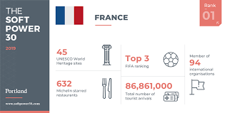
Every year, Portland Communication ranks the top countries in the world regarding their soft power. In 2019, the winner was la France!
Click here to read the most recent report by Portland on the soft power rankings.
We will also add circular flags to the graphs with the ggflags package. The geom_flag() requires the ISO two letter code as input to the argument … but it will only accept them in lower case. So first we need to make the country code variable suitable:
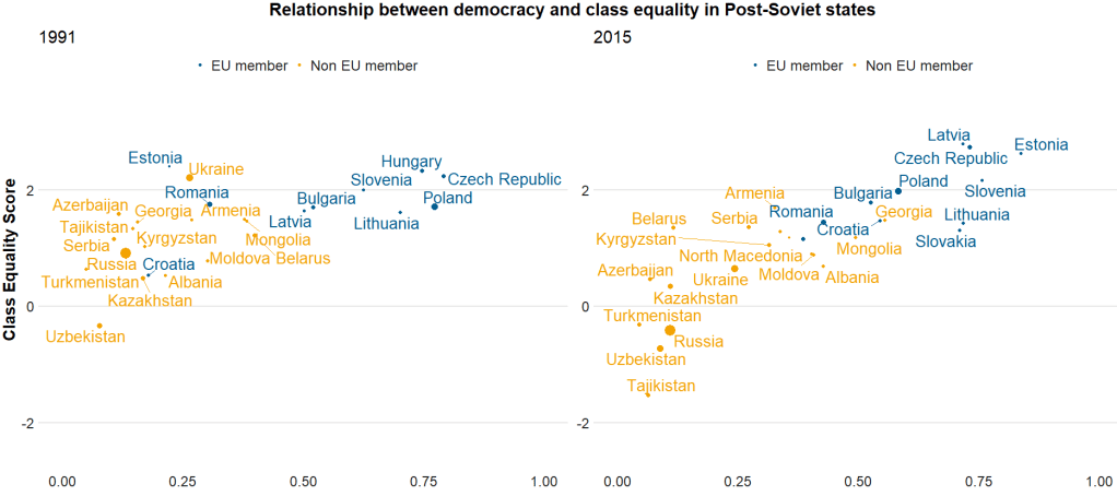
Here I run a simple scatterplot and compare Post-Soviet states and see whether there has been a major change in class equality between 1991 after the fall of the Soviet Empire and today. Is there a relationship between class equality and demolcratisation? Is there a difference in the countries that are now in EU compared to the Post-Soviet states that are not?
library(ggrepel)  # to stop text labels overlapping
library(gridExtra)  # to place two plots side-by-side
library(ggbubr)  # to modify the gridExtra titles

region_liberties_91 <- vdem %>%
  dplyr::filter(year == 1991) %>%
  dplyr::filter(regions == 'Post-Soviet') %>%
  dplyr::filter(!is.na(EU_member)) %>%
  ggplot(aes(x = democracy, y = class_equality, color = EU_member)) +
  geom_point(aes(size = population)) +
  scale_alpha_continuous(range = c(0.1, 1))

plot_91 <- region_liberties_91 +
  bbplot::bbc_style() +
  labs(subtitle = "1991") +
  ylim(-2.5, 3.5) +
  xlim(0, 1) +
  geom_text_repel(aes(label = country_name), show.legend = FALSE, size = 7) +
  scale_size(guide="none")

region_liberties_18 <- vdem %>%
  dplyr::filter(year == 2018) %>%
  dplyr::filter(regions == 'Post-Soviet') %>%
  dplyr::filter(!is.na(EU_member)) %>%
  ggplot(aes(x = democracy_score, y = class_equality, color = EU_member)) +
  geom_point(aes(size = population)) +
  scale_alpha_continuous(range = c(0.1, 1))

plot_18 <- region_liberties_15 +
  bbplot::bbc_style() +
  labs(subtitle = "2015") +
  ylim(-2.5, 3.5) +
  xlim(0, 1) +
  geom_text_repel(aes(label = country_name), show.legend = FALSE, size = 7) +
  scale_size(guide = "none")

my_title = text_grob("Relationship between democracy and class equality in Post-Soviet states", size = 22, face = "bold")
my_y = text_grob("Democracy Score", size = 20, face = "bold")
my_x = text_grob("Class Equality Score", size = 20, face = "bold", rot = 90)

grid.arrange(plot_1, plot_2, ncol=2,  top = my_title, bottom = my_y, left = my_x)
The BBC cookbook vignette offers the full function. So we can tweak it any way we want.
For example, if I want to change the default axis labels, I can make my own slightly adapted my_bbplot() function
With the European Social Survey (ESS), we will examine the different variables that are related to levels of trust in politicians across Europe in the latest round 9 (conducted in 2018).
Click here to learn about downloading ESS data into R with the essurvey package.
Packages we will need:
library(survey)
library(srvyr)
The survey package was created by Thomas Lumley, a professor from Auckland. The srvyr package is a wrapper packages that allows us to use survey functions with tidyverse.
Why do we need to add weights to the data when we analyse surveys?
When we import our survey data file, R will assume the data are independent of each other and will analyse this survey data as if it were collected using simple random sampling.
However, the reality is that almost no surveys use a simple random sample to collect data (the one exception being Iceland in ESS!)
Rather, survey institutions choose complex sampling designs to reduce the time and costs of ultimately getting responses from the public.
Their choice of sampling design can lead to different estimates and the standard errors of the sample they collect.
For example, the sampling weight may affect the sample estimate, and choice of stratification and/or clustering may mean (most likely underestimated) standard errors.
As a result, our analysis of the survey responses will be wrong and not representative to the population we want to understand. The most problematic result is that we would arrive at statistical significance, when in reality there is no significant relationship between our variables of interest.
Therefore it is essential we don’t skip this step of correcting to account for weighting / stratification / clustering and we can make our sample estimates and confidence intervals more reliable.
This table comes from round 8 of the ESS, carried out in 2016. Each of the 23 countries has an institution in charge of carrying out their own survey, but they must do so in a way that meets the ESS standard for scientifically sound survey design (See Table 1).
Sampling weights aim to capture and correct for the differing probabilities that a given individual will be selected and complete the ESS interview.
For example, the population of Lithuania is far smaller than the UK. So the probability of being selected to participate is higher for a random Lithuanian person than it is for a random British person.
Additionally, within each country, if the survey institution chooses households as a sampling element, rather than persons, this will mean that individuals living alone will have a higher probability of being chosen than people in households with many people.
Click here to read in detail the sampling process in each country from round 1 in 2002. For example, if we take my country – Ireland – we can see the many steps involved in the country’s three-stage probability sampling design.
The Primary Sampling Unit (PSU) is electoral districts. The institute then takes addresses from the Irish Electoral Register. From each electoral district, around 20 addresses are chosen (based on how spread out they are from each other). This is the second stage of clustering. Finally, one person is randomly chosen in each house to answer the survey, chosen as the person who will have the next birthday (third cluster stage).
Click here for more information about Design Effects (DEFF) and click here to read how ESS calculates design effects.
DEFF p refers to the design effect due to unequal selection probabilities (e.g. a person is more likely to be chosen to participate if they live alone)
DEFF c refers to the design effect due to clustering
According to Gabler et al. (1999), if we multiply these together, we get the overall design effect. The Irish design that was chosen means that the data’s variance is 1.6 times as large as you would expect with simple random sampling design. This 1.6 design effects figure can then help to decide the optimal sample size for the number of survey participants needed to ensure more accurate standard errors.
So, we can use the functions from the survey package to account for these different probabilities of selection and correct for the biases they can cause to our analysis.
In this example, we will look at demographic variables that are related to levels of trust in politicians. But there are hundreds of variables to choose from in the ESS data.
Click here for a list of all the variables in the European Social Survey and in which rounds they were asked. Not all questions are asked every year and there are a bunch of country-specific questions.
We can look at the last few columns in the data.frame for some of Ireland respondents (since we’ve already looked at the sampling design method above).
The dweight is the design weight and it is essentially the inverse of the probability that person would be included in the survey.
The pspwght is the post-stratification weight and it takes into account the probability of an individual being sampled to answer the survey AND ALSO other factors such as non-response error and sampling error. This post-stratificiation weight can be considered a more sophisticated weight as it contains more additional information about the realities survey design.
The pweight is the population size weight and it is the same for everyone in the Irish population.
When we are considering the appropriate weights, we must know the type of analysis we are carrying out. Different types of analyses require different combinations of weights. According to the ESS weighting documentation:
when analysing data for one country alone – we only need the design weight or the poststratification weight.
when comparing data from two or more countries but without reference to statistics that combine data from more than one country – we only need the design weight or the poststratification weight
when comparing data of two or more countries and with reference to the average (or combined total) of those countries – we need BOTH design or post-stratification weight AND population size weights together.
when combining different countries to describe a group of countries or a region, such as “EU accession countries” or “EU member states” = we need BOTH design or post-stratification weights AND population size weights.
ESS warn that their survey design was not created to make statistically accurate region-level analysis, so they say to carry out this type of analysis with an abundance of caution about the results.
ESS has a table in their documentation that summarises the types of weights that are suitable for different types of analysis:
Since we are comparing the countries, the optimal weight is a combination of post-stratification weights AND population weights together.
Click here to read Part 2 and run the regression on the ESS data with the survey package weighting design
Below is the code I use to graph the differences in mean level of trust in politicians across the different countries.
library(ggimage) # to add flags
library(countrycode) # to add ISO country codes

# r_agg is the aggregated mean of political trust for each countries' respondents.

r_agg %>%
  dplyr::mutate(country, EU_member = ifelse(country == "BE" | country == "BG" | country == "CZ" | country == "DK" | country == "DE" | country == "EE" | country == "IE" | country == "EL" | country == "ES" | country == "FR" | country == "HR" | country == "IT" | country == "CY" | country == "LV" | country == "LT" | country == "LU" | country == "HU" | country == "MT" | country == "NL" | country == "AT" | country == "AT" | country == "PL" | country == "PT" | country == "RO" | country == "SI" | country == "SK" | country == "FI" | country == "SE","EU member", "Non EU member")) -> r_agg


r_agg %>%
  filter(EU_member == "EU member") %>%
  dplyr::summarize(eu_average = mean(mean_trust_pol))


r_agg$country_name <- countrycode(r_agg$country, "iso2c", "country.name")


#eu_average <- r_agg %>%
 # summarise_if(is.numeric, mean, na.rm = TRUE)


eu_avg <- data.frame(country = "EU average",
                     mean_trust_pol = 3.55,
                     EU_member =  "EU average",
                     country_name = "EU average")

r_agg <- rbind(r_agg, eu_avg)


my_palette <- c("EU average" = "#ef476f",
                "Non EU member" = "#06d6a0",
                "EU member" = "#118ab2")

r_agg <- r_agg %>%
  dplyr::mutate(ordered_country = fct_reorder(country, mean_trust_pol))


r_graph <- r_agg %>%
  ggplot(aes(x = ordered_country, y = mean_trust_pol, group = country, fill = EU_member)) +
  geom_col() +
  ggimage::geom_flag(aes(y = -0.4, image = country), size = 0.04) +
  geom_text(aes(y = -0.15 , label = mean_trust_pol)) +
  scale_fill_manual(values = my_palette) + coord_flip()

r_graph
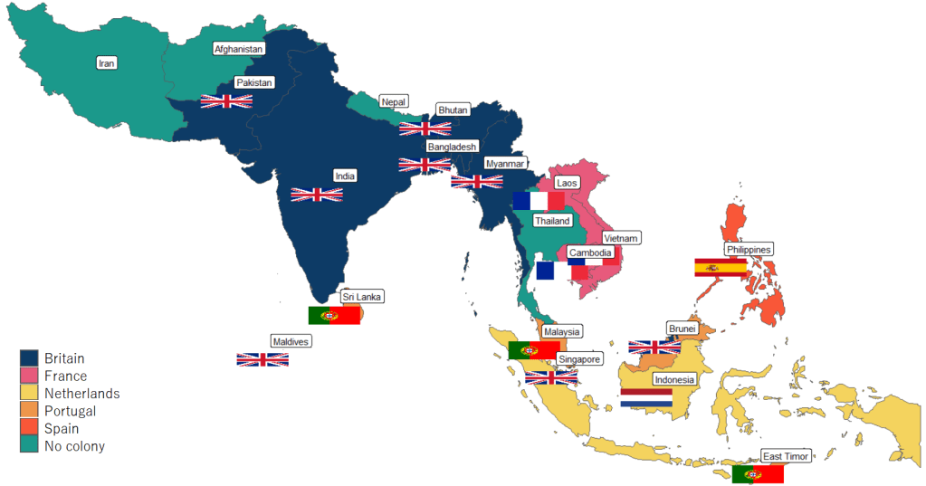
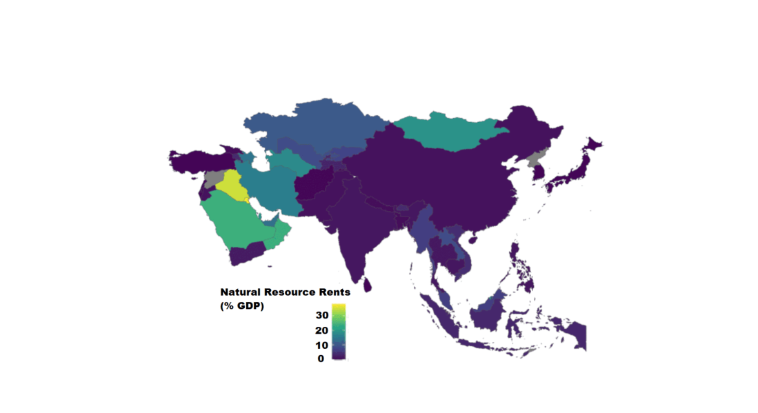
Next, to graph a map to look at colonialism in Asia, we can extract countries according to the subregion variable from the rnaturalearth package and graph.
The European Social Survey (ESS) measure attitudes in thirty-ish countries (depending on the year) across the European continent. It has been conducted every two years since 2001.
The survey consists of a core module and two or more ‘rotating’ modules, on social and public trust; political interest and participation; socio-political orientations; media use; moral, political and social values; social exclusion, national, ethnic and religious allegiances; well-being, health and security; demographics and socio-economics.
So lots of fun data for political scientists to look at.
install.packages("essurvey")
library(essurvey)
The very first thing you need to do before you can download any of the data is set your email address.
set_email("rforpoliticalscience@gmail.com")
Don’t forget the email address goes in as a string in “quotations marks”.
Show what countries are in the survey with the show_countries() function.
It’s important to know that country names are case sensitive and you can only use the name printed out by show_countries(). For example, you need to write “Russian Federation” to access Russian survey data; if you write “Russia”…
Using these country names, we can download specific rounds or waves (i.e survey years) with import_country. We have the option to choose the two most recent rounds, 8th (from 2016) and 9th round (from 2018).
ire_data <- import_all_cntrounds("Ireland")
The resulting data comes in the form of nine lists, one for each round
These rounds correspond to the following years:
ESS Round 9 – 2018
ESS Round 8 – 2016
ESS Round 7 – 2014
ESS Round 6 – 2012
ESS Round 5 – 2010
ESS Round 4 – 2008
ESS Round 3 – 2006
ESS Round 2 – 2004
ESS Round 1 – 2002
I want to compare the first round and most recent round to see if Irish people’s views have changed since 2002. In 2002, Ireland was in the middle of an economic boom that we called the “Celtic Tiger”. People did mad things like buy panini presses and second house in Bulgaria to resell. Then the 2008 financial crash hit the country very hard.
Irish people during the Celtic Tiger:
Irish people after the Celtic Tiger crash:
Ireland in 2018 was a very different place. So it will be interesting to see if these social changes translated into attitude changes.
First, we use the import_country() function to download data from ESS. Specify the country and rounds you want to download.
The resulting ire object is a list, so we’ll need to extract the two data.frames from the list:
ire_1 <- ire[[1]]

ire_9 <- ire[[2]]
The exact same questions are not asked every year in ESS; there are rotating modules, sometimes questions are added or dropped. So to merge round 1 and round 9, first we find the common columns with the intersect() function.
All the variables in the dataset are a special class called “haven_labelled“. So we must convert them to numeric variables with a quick function. We exclude the first variable because we want to keep country name as a string character variable.
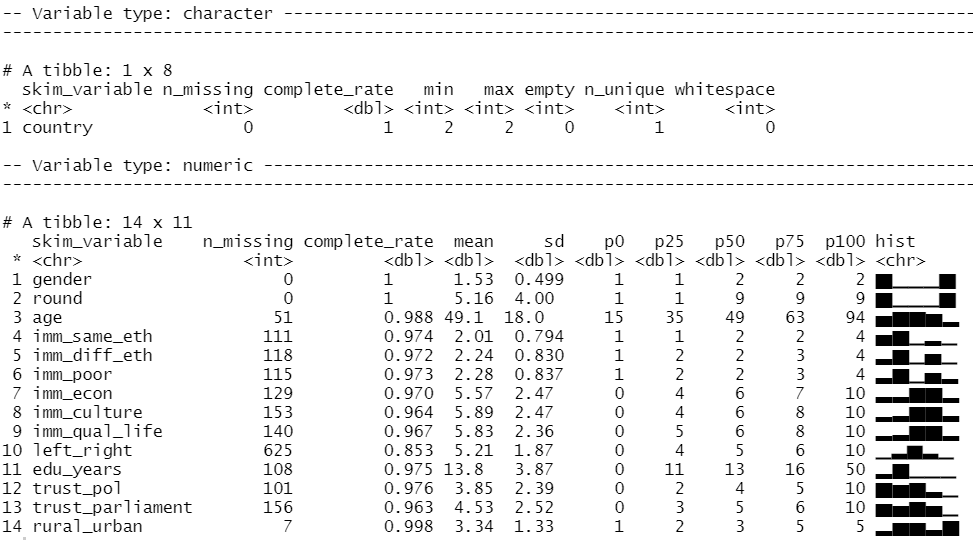
We can look at the distribution of our variables and count how many missing values there are with the skim() function from the skimr package
library(skimr)

skim(att_df)
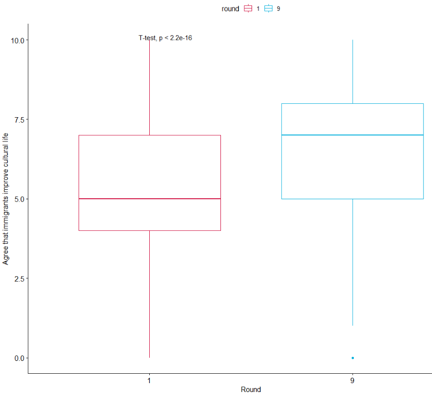
We can run a quick t-test to compare the mean attitudes to immigrants on the statement: “Immigrants make country worse or better place to live” across the two survey rounds.
Lower scores indicate an attitude that immigrants undermine Ireland’ quality of life and higher scores indicate agreement that they enrich it!
t.test(att_df$imm_qual_life ~ att_df$round)
In future blog, I will look at converting the raw output of R into publishable tables.
The results of the independent-sample t-test show that if we compare Ireland in 2002 and Ireland in 2018, there has been a statistically significant increase in positive attitudes towards immigrants and belief that Ireland’s quality of life is more enriched by their presence in the country.
As I am currently an immigrant in a foreign country myself, I am glad to come from a country that sees the benefits of immigrants!
If we load the ggpubr package, we can graphically look at the difference in mean attitude scores.
library(ggpubr)

box1 <- ggpubr::ggboxplot(att_df, x = "round", y = "imm_qual_life", color = "round", palette = c("#d11141", "#00aedb"),
 ylab = "Attitude", xlab = "Round")

box1 + stat_compare_means(method = "t.test")
It’s not the most glamorous graph but it conveys the shift in Ireland to more positive attitudes to immigration!
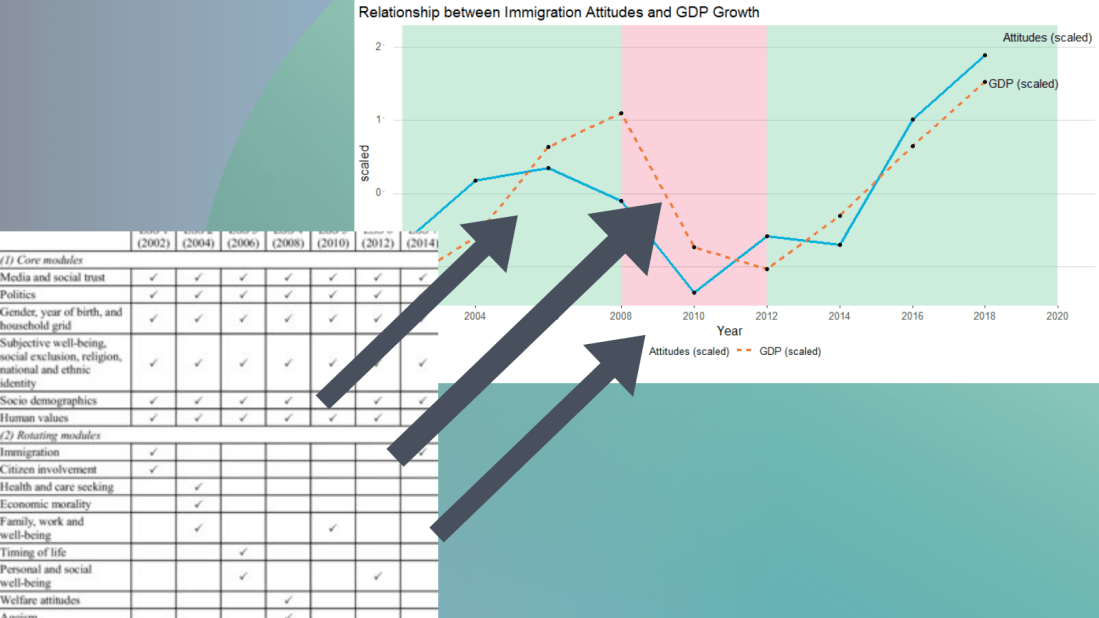
I suspect that a country’s economic growth correlates with attitudes to immigration.
The geom_rect() function graphs the coloured rectangles on the plot. I take colours from this color-hex website; the green rectangle for times of economic growth and red for times of recession. Makes sure the geom-rect() comes before the geom_line().
And we can see that there is a relationship between attitudes to immigrants in Ireland and Irish GDP growth. When GDP is growing, Irish people see that immigrants improve quality of life in Ireland and vice versa. The red section of the graph corresponds to the financial crisis.
library(WDI)
library(tidyverse)
library(magrittr) # for pipes
library(ggthemes)
library(rnaturalearth)
 # to create maps
library(viridis) # for pretty colors
We will use this package to really quickly access all the indicators from the World Bank website.
Below is a screenshot of the World Bank’s data page where you can search through all the data with nice maps and information about their sources, their available years and the unit of measurement et cetera.
In R when we download the WDI package, we can download the datasets directly into our environment.
With the WDIsearch() function we can look for the World Bank indicator.
For this blog, we want to map out how dependent countries are on oil. We will download the dataset that measures oil rents as a percentage of a country’s GDP.
WDIsearch('oil rent')
The output is:
indicator             name
"NY.GDP.PETR.RT.ZS"   "Oil rents (% of GDP)"
Copy the indicator string and paste it into the WDI() function. The country codes are the iso2 codes, which you can input as many as you want in the c().
If you want all countries that the World Bank has, do not add country argument.
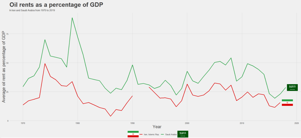
We can compare Iran and Saudi Arabian oil rents from 1970 until the most recent value.
data = WDI(indicator='NY.GDP.PETR.RT.ZS', country=c('IR', 'SA'), start=1970, end=2019)
And graph out the output. All only takes a few steps.
my_palette = c("#DA0000", "#239f40")
 #both the hex colors are from the maps of the countries

oil_graph <- ggplot(oil_data, aes(year, NY.GDP.PETR.RT.ZS, color =  country)) +
  geom_line(size = 1.4) +
  labs(title = "Oil rents as a percentage of GDP",
       subtitle = "In Iran and Saudi Arabia from 1970 to 2019",
       x = "Year",
       y = "Average oil rent as percentage of GDP",
       color = " ") +
  scale_color_manual(values = my_palette)

oil_graph +
ggthemes::theme_fivethirtyeight() +
theme(
plot.title = element_text(size = 30),
      axis.title.y = element_text(size = 20),
      axis.title.x = element_text(size = 20))
For some reason the World Bank does not have data for Iran for most of the early 1990s. But I would imagine that they broadly follow the trends in Saudi Arabia.
I added the flags myself manually after I got frustrated with geom_flag() . It is something I will need to figure out for a future blog post!
It is really something that in the late 1970s, oil accounted for over 80% of all Saudi Arabia’s Gross Domestic Product.
Now we see both countries rely on a far smaller percentage. Due both to the fact that oil prices are volatile, climate change is a new constant threat and resource exhaustion is on the horizon, both countries have adjusted policies in attempts to diversify their sources of income.
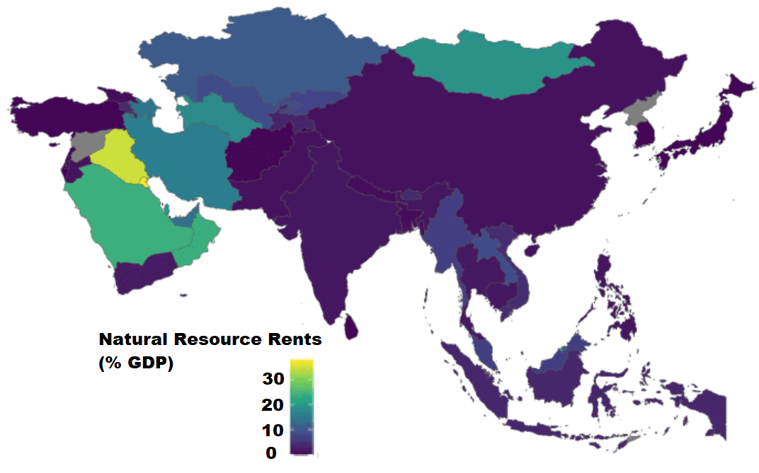
Next we can use the World Bank data to create maps and compare regions on any World Bank scores.
We will compare all Asian and Middle Eastern countries with regard to all natural rents (not just oil) as a percentage of their GDP.