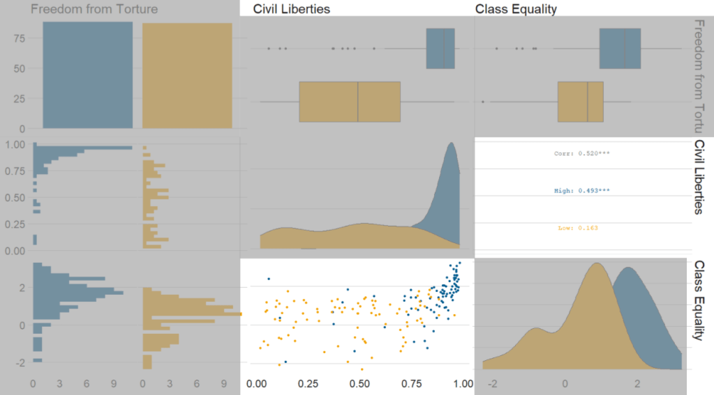
Next, we can go create a dichotomous factor variable and divide the continuous “freedom from torture scale” variable into either above the median or below the median score. It’s a crude measurement but it serves to highlight trends.
Blue means the country enjoys high freedom from torture. Yellow means the county suffers from low freedom from torture and people are more likely to be tortured by their government.
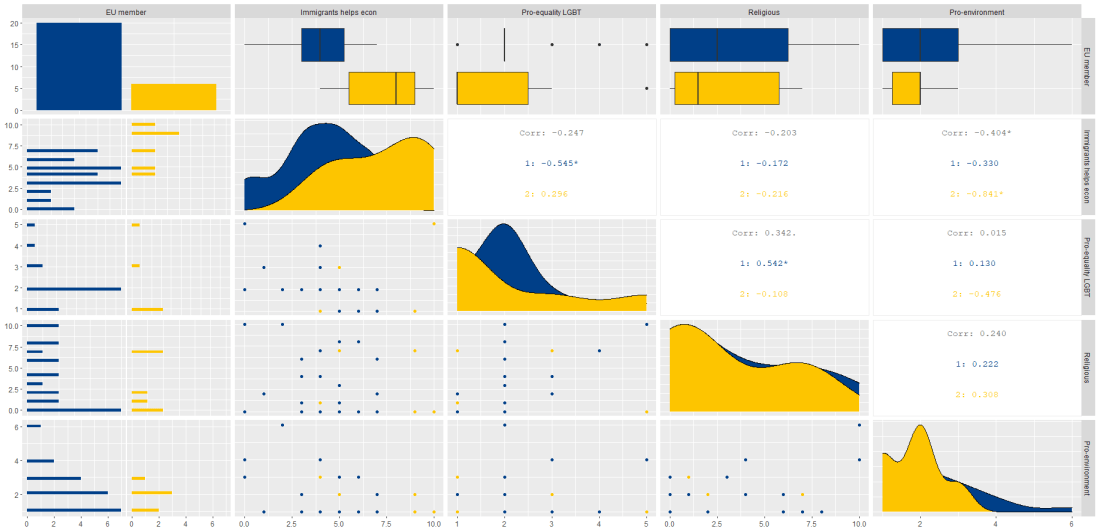
Then we feed our variables into the ggpairs() function from the GGally package.
I use the columnLabels to label the graphs with their full names and the mapping argument to choose my own color palette.
I add the bbc_style() format to the corr_matrix object because I like the font and size of this theme. And voila, we have our basic correlation matrix (Figure 1).
First off, in Figure 2 we can see the centre plots in the diagonal are the distribution plots of each variable in the matrix
Figure 2.
In Figure 3, we can look at the box plot for the ‘civil liberties index’ score for both high (blue) and low (yellow) ‘freedom from torture’ categories.
The median civil liberties score for countries in the high ‘freedom from torture’ countries is far higher than in countries with low ‘freedom from torture’ (i.e. citizens in these countries are more likely to suffer from state torture). The spread / variance is also far great in states with more torture.
Figure 3.
In Figur 4, we can focus below the diagonal and see the scatterplot between the two continuous variables – civil liberties index score and class equality index scores.
We see that there is a positive relationship between civil liberties and class equality. It looks like a slightly U shaped, quadratic relationship but a clear relationship trend is not very clear with the countries with higher torture prevalence (yellow) showing more randomness than the countries with high freedom from torture scores (blue).
Saying that, however, there are a few errant blue points as outliers to the trend in the plot.
The correlation score is also provided between the two categorical variables and the correlation score between civil liberties and class equality scores is 0.52.
Examining at the scatterplot, if we looked only at countries with high freedom from torture, this correlation score could be higher!
Click here to learn how to access and download ESS round data for the thirty-ish European countries (depending on the year).
So with the essurvey package, I have downloaded and cleaned up the most recent round of the ESS survey, conducted in 2018.
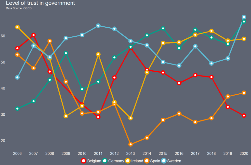
We will examine the different demographic variables that relate to levels of trust in politicians across 29 European countries (education level, gender, age et cetera).
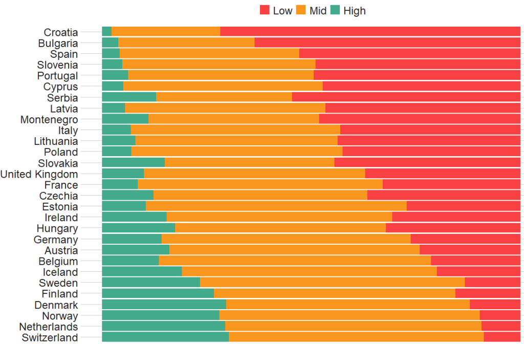
Before we create the survey weight objects, we can first make a bar chart to look at the different levels of trust in the different countries.
We can use the cut() function to divide the 10-point scale into three groups of “low”, “mid” and “high” levels of trust in politicians.
I also choose traffic light hex colors in color_palette vector and add full country names with countrycode() so it’s easier to read the graph
The graph lists countries in descending order according to the percentage of sampled participants that indicated they had low trust levels in politicians.
The respondents in Croatia, Bulgaria and Spain have the most distrust towards politicians.
Croatians when they see politicians
For this example, I want to compare different analyses to see what impact different weights have on the coefficient estimates and standard errors in the regression analyses:
with no weights (dEfIniTelYy not recommended by ESS)
with post-stratification weights only (not recommended by ESS) and
with the combined post-strat AND population weight (the recommended weighting strategy according to ESS)
First we create two special svydesign objects, with the survey package. To create this, we need to add a squiggly ~ symbol in front of the variables (Google tells me it is called a tilde).
The ids argument takes the cluster ID for each participant.
psu is a numeric variable that indicates the primary sampling unit within which the respondent was selected to take part in the survey. For example in Ireland, this refers to the particular electoral division of each participant.
The strata argument takes the numeric variable that codes which stratum each individual is in, according to the type of sample design each country used.
The first svydesign object uses only post-stratification weights: pspwght
Finally we need to specify the nest argument as TRUE. I don’t know why but it throws an error message if we don’t …
WITHOUT weights AND WITH weights (post-stratification and population weights)
We can see that gender variable is more equally balanced between males (1) and females (2) in the data with weights
Additionally, average trust in politicians is lower in the sample with full weights.
Participants are more left-leaning on average in the sample with full weights than in the sample with no weights.
Next, we can look at a general linear model without survey weights and then with the two survey weights we just created.
Do we see any effect of the weighting design on the standard errors and significance values?
So, we first run a simple general linear model. In this model, R assumes that the data are independent of each other and based on that assumption, calculates coefficients and standard errors.
With the stargazer package, we can compare the models side-by-side:
library(stargazer)
stargazer(simple_glm, post_strat_glm, full_weight_glm, type = "text")
We can see that the standard errors in brackets were increased for most of the variables in model (3) with both weights when compared to the first model with no weights.
The biggest change is the rural-urban scale variable. With no weights, it is positive correlated with trust in politicians. That is to say, the more urban a location the respondent lives, the more likely the are to trust politicians. However, after we apply both weights, it becomes negative correlated with trust. It is in fact the more rural the location in which the respondent lives, the more trusting they are of politicians.
Additionally, age becomes statistically significant, after we apply weights.
Of course, this model is probably incorrect as I have assumed that all these variables have a simple linear relationship with trust levels. If I really wanted to build a robust demographic model, I would have to consult the existing academic literature and test to see if any of these variables are related to trust levels in a non-linear way. For example, it could be that there is a polynomial relationship between age and trust levels, for example. This model is purely for illustrative purposes only!
Plus, when I examine the R2 score for my models, it is very low; this model of demographic variables accounts for around 6% of variance in level of trust in politicians. Again, I would have to consult the body of research to find other explanatory variables that can account for more variance in my dependent variable of interest!
We can look at the R2 and VIF score of GLM with the summ() function from the jtools package. The summ() function can take a svyglm object. Click here to read more about various functions in the jtools package.
library(ggflags)
library(bbplot) # for pretty BBC style graphs
library(countrycode) # for ISO2 country codes
library(rvest) # for webscrapping
Click here to add rectangular flags to graphs and click here to add rectangular flags to MAPS!
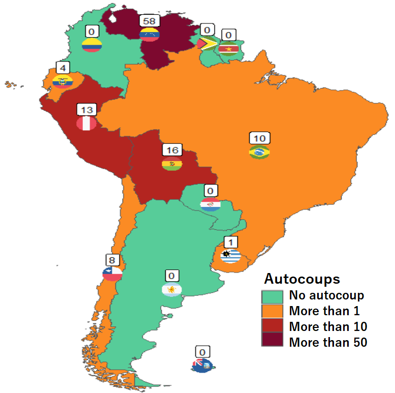
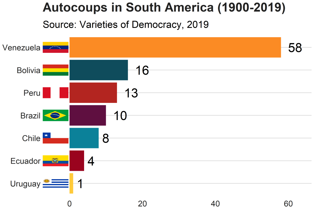
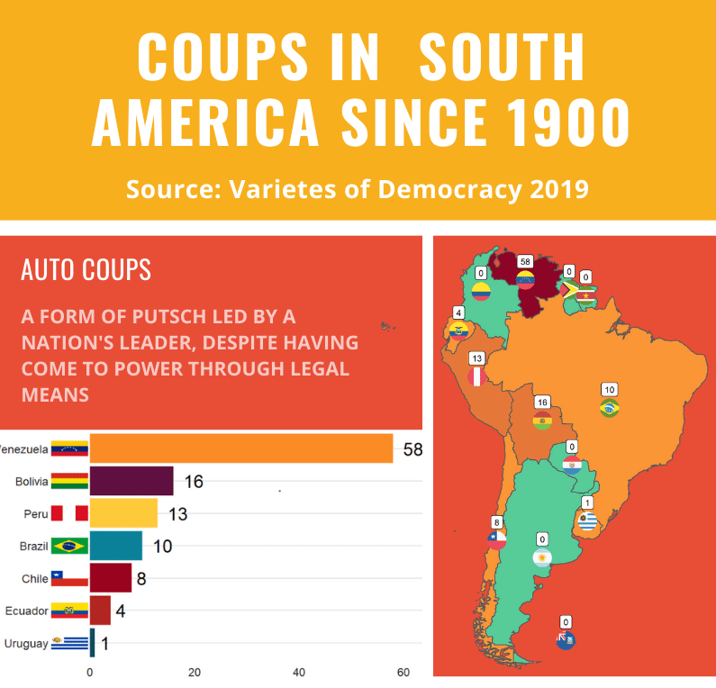
Apropos of this week’s US news, we are going to graph the number of different or autocoups in South America and display that as both maps and bar charts.
According to our pals at the Wikipedia, a self-coup, or autocoup (from the Spanish autogolpe), is a form of putsch or coup d’état in which a nation’s leader, despite having come to power through legal means, dissolves or renders powerless the national legislature and unlawfully assumes extraordinary powers not granted under normal circumstances.
In order to add flags to maps, we need to make sure our dataset has three variables for each country:
Longitude
Latitude
ISO2 code (in lower case)
In order to add longitude and latitude, I will scrape these from a website with the rvest dataset and merge them with my existing dataset.
In this case, a warning message pops up to tell me:
Some values were not matched unambiguously: Kosovo, Somaliland, Zanzibar
One important step is to convert the ISO codes from upper case to lower case. The geom_flag() function from the ggflag package only recognises lower case (e.g Chile is cl, not CL).
Finally we can graph our maps comparing the different types of coups in South America.
Click here to learn how to graph variables onto maps with the rnaturalearth package.
The geom_flag() function requires an x = longitude, y = latitude and a country argument in the form of our lower case ISO2 country codes. You can play around the latitude and longitude flag and also label position by adding or subtracting from them. The size of the flag can be added outside the aes() argument.
We can place the number of coups under the flag with the geom_label() function.
The theme_map() function we add comes from ggthemes package.
autocoup_map <- autocoup_df%>%
  dplyr::filter(subregion == "South America") %>%
  ggplot() +
  geom_sf(aes(fill = coup_cat)) +
  ggflags::geom_flag(aes(x = longitude, y = latitude+0.5, country = iso2_lower), size = 8) +
  geom_label(aes(x = longitude, y = latitude+3, label = auto_coup_sum, color = auto_coup_sum), fill  =  "white", colour = "black") +
  theme_map()


autocoup_map + scale_fill_manual(values = coup_palette, name = "Auto Coups", labels = c("No autocoup", "More than 1", "More than 10", "More than 50"))
Not hard at all.
And we can make a quick barchart to rank the countries. For this I will use square flags from the ggimage package. Click here to read more about the ggimage package
Additionally, I will use the theme from the bbplot pacakge. Click here to read more about the bbplot package.
Click here to check out the vignette to read about all the different graphs with which you can use bbplot !
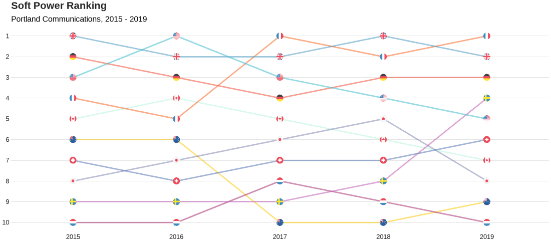
We will look at the Soft Power rankings from Portland Communications. According to Wikipedia, In politics (and particularly in international politics), soft power is the ability to attract and co-opt, rather than coerce or bribe other countries to view your country’s policies and actions favourably. In other words, soft power involves shaping the preferences of others through appeal and attraction.
A defining feature of soft power is that it is non-coercive; the currency of soft power includes culture, political values, and foreign policies.
Joseph Nye’s primary definition, soft power is in fact:
“the ability to get what you want through attraction rather than coercion or payments. When you can get others to want what you want, you do not have to spend as much on sticks and carrots to move them in your direction. Hard power, the ability to coerce, grows out of a country’s military and economic might. Soft power arises from the attractiveness of a country’s culture, political ideals and policies. When our policies are seen as legitimate in the eyes of others, our soft power is enhanced”
(Nye, 2004: 256).
Every year, Portland Communication ranks the top countries in the world regarding their soft power. In 2019, the winner was la France!
Click here to read the most recent report by Portland on the soft power rankings.
We will also add circular flags to the graphs with the ggflags package. The geom_flag() requires the ISO two letter code as input to the argument … but it will only accept them in lower case. So first we need to make the country code variable suitable:
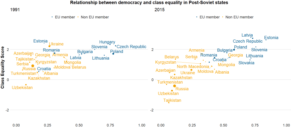
Here I run a simple scatterplot and compare Post-Soviet states and see whether there has been a major change in class equality between 1991 after the fall of the Soviet Empire and today. Is there a relationship between class equality and demolcratisation? Is there a difference in the countries that are now in EU compared to the Post-Soviet states that are not?
library(ggrepel)  # to stop text labels overlapping
library(gridExtra)  # to place two plots side-by-side
library(ggbubr)  # to modify the gridExtra titles

region_liberties_91 <- vdem %>%
  dplyr::filter(year == 1991) %>%
  dplyr::filter(regions == 'Post-Soviet') %>%
  dplyr::filter(!is.na(EU_member)) %>%
  ggplot(aes(x = democracy, y = class_equality, color = EU_member)) +
  geom_point(aes(size = population)) +
  scale_alpha_continuous(range = c(0.1, 1))

plot_91 <- region_liberties_91 +
  bbplot::bbc_style() +
  labs(subtitle = "1991") +
  ylim(-2.5, 3.5) +
  xlim(0, 1) +
  geom_text_repel(aes(label = country_name), show.legend = FALSE, size = 7) +
  scale_size(guide="none")

region_liberties_18 <- vdem %>%
  dplyr::filter(year == 2018) %>%
  dplyr::filter(regions == 'Post-Soviet') %>%
  dplyr::filter(!is.na(EU_member)) %>%
  ggplot(aes(x = democracy_score, y = class_equality, color = EU_member)) +
  geom_point(aes(size = population)) +
  scale_alpha_continuous(range = c(0.1, 1))

plot_18 <- region_liberties_15 +
  bbplot::bbc_style() +
  labs(subtitle = "2015") +
  ylim(-2.5, 3.5) +
  xlim(0, 1) +
  geom_text_repel(aes(label = country_name), show.legend = FALSE, size = 7) +
  scale_size(guide = "none")

my_title = text_grob("Relationship between democracy and class equality in Post-Soviet states", size = 22, face = "bold")
my_y = text_grob("Democracy Score", size = 20, face = "bold")
my_x = text_grob("Class Equality Score", size = 20, face = "bold", rot = 90)

grid.arrange(plot_1, plot_2, ncol=2,  top = my_title, bottom = my_y, left = my_x)
The BBC cookbook vignette offers the full function. So we can tweak it any way we want.
For example, if I want to change the default axis labels, I can make my own slightly adapted my_bbplot() function
With the European Social Survey (ESS), we will examine the different variables that are related to levels of trust in politicians across Europe in the latest round 9 (conducted in 2018).
Click here to learn about downloading ESS data into R with the essurvey package.
Packages we will need:
library(survey)
library(srvyr)
The survey package was created by Thomas Lumley, a professor from Auckland. The srvyr package is a wrapper packages that allows us to use survey functions with tidyverse.
Why do we need to add weights to the data when we analyse surveys?
When we import our survey data file, R will assume the data are independent of each other and will analyse this survey data as if it were collected using simple random sampling.
However, the reality is that almost no surveys use a simple random sample to collect data (the one exception being Iceland in ESS!)
Rather, survey institutions choose complex sampling designs to reduce the time and costs of ultimately getting responses from the public.
Their choice of sampling design can lead to different estimates and the standard errors of the sample they collect.
For example, the sampling weight may affect the sample estimate, and choice of stratification and/or clustering may mean (most likely underestimated) standard errors.
As a result, our analysis of the survey responses will be wrong and not representative to the population we want to understand. The most problematic result is that we would arrive at statistical significance, when in reality there is no significant relationship between our variables of interest.
Therefore it is essential we don’t skip this step of correcting to account for weighting / stratification / clustering and we can make our sample estimates and confidence intervals more reliable.
This table comes from round 8 of the ESS, carried out in 2016. Each of the 23 countries has an institution in charge of carrying out their own survey, but they must do so in a way that meets the ESS standard for scientifically sound survey design (See Table 1).
Sampling weights aim to capture and correct for the differing probabilities that a given individual will be selected and complete the ESS interview.
For example, the population of Lithuania is far smaller than the UK. So the probability of being selected to participate is higher for a random Lithuanian person than it is for a random British person.
Additionally, within each country, if the survey institution chooses households as a sampling element, rather than persons, this will mean that individuals living alone will have a higher probability of being chosen than people in households with many people.
Click here to read in detail the sampling process in each country from round 1 in 2002. For example, if we take my country – Ireland – we can see the many steps involved in the country’s three-stage probability sampling design.
The Primary Sampling Unit (PSU) is electoral districts. The institute then takes addresses from the Irish Electoral Register. From each electoral district, around 20 addresses are chosen (based on how spread out they are from each other). This is the second stage of clustering. Finally, one person is randomly chosen in each house to answer the survey, chosen as the person who will have the next birthday (third cluster stage).
Click here for more information about Design Effects (DEFF) and click here to read how ESS calculates design effects.
DEFF p refers to the design effect due to unequal selection probabilities (e.g. a person is more likely to be chosen to participate if they live alone)
DEFF c refers to the design effect due to clustering
According to Gabler et al. (1999), if we multiply these together, we get the overall design effect. The Irish design that was chosen means that the data’s variance is 1.6 times as large as you would expect with simple random sampling design. This 1.6 design effects figure can then help to decide the optimal sample size for the number of survey participants needed to ensure more accurate standard errors.
So, we can use the functions from the survey package to account for these different probabilities of selection and correct for the biases they can cause to our analysis.
In this example, we will look at demographic variables that are related to levels of trust in politicians. But there are hundreds of variables to choose from in the ESS data.
Click here for a list of all the variables in the European Social Survey and in which rounds they were asked. Not all questions are asked every year and there are a bunch of country-specific questions.
We can look at the last few columns in the data.frame for some of Ireland respondents (since we’ve already looked at the sampling design method above).
The dweight is the design weight and it is essentially the inverse of the probability that person would be included in the survey.
The pspwght is the post-stratification weight and it takes into account the probability of an individual being sampled to answer the survey AND ALSO other factors such as non-response error and sampling error. This post-stratificiation weight can be considered a more sophisticated weight as it contains more additional information about the realities survey design.
The pweight is the population size weight and it is the same for everyone in the Irish population.
When we are considering the appropriate weights, we must know the type of analysis we are carrying out. Different types of analyses require different combinations of weights. According to the ESS weighting documentation:
when analysing data for one country alone – we only need the design weight or the poststratification weight.
when comparing data from two or more countries but without reference to statistics that combine data from more than one country – we only need the design weight or the poststratification weight
when comparing data of two or more countries and with reference to the average (or combined total) of those countries – we need BOTH design or post-stratification weight AND population size weights together.
when combining different countries to describe a group of countries or a region, such as “EU accession countries” or “EU member states” = we need BOTH design or post-stratification weights AND population size weights.
ESS warn that their survey design was not created to make statistically accurate region-level analysis, so they say to carry out this type of analysis with an abundance of caution about the results.
ESS has a table in their documentation that summarises the types of weights that are suitable for different types of analysis:
Since we are comparing the countries, the optimal weight is a combination of post-stratification weights AND population weights together.
Click here to read Part 2 and run the regression on the ESS data with the survey package weighting design
Below is the code I use to graph the differences in mean level of trust in politicians across the different countries.
library(ggimage) # to add flags
library(countrycode) # to add ISO country codes

# r_agg is the aggregated mean of political trust for each countries' respondents.

r_agg %>%
  dplyr::mutate(country, EU_member = ifelse(country == "BE" | country == "BG" | country == "CZ" | country == "DK" | country == "DE" | country == "EE" | country == "IE" | country == "EL" | country == "ES" | country == "FR" | country == "HR" | country == "IT" | country == "CY" | country == "LV" | country == "LT" | country == "LU" | country == "HU" | country == "MT" | country == "NL" | country == "AT" | country == "AT" | country == "PL" | country == "PT" | country == "RO" | country == "SI" | country == "SK" | country == "FI" | country == "SE","EU member", "Non EU member")) -> r_agg


r_agg %>%
  filter(EU_member == "EU member") %>%
  dplyr::summarize(eu_average = mean(mean_trust_pol))


r_agg$country_name <- countrycode(r_agg$country, "iso2c", "country.name")


#eu_average <- r_agg %>%
 # summarise_if(is.numeric, mean, na.rm = TRUE)


eu_avg <- data.frame(country = "EU average",
                     mean_trust_pol = 3.55,
                     EU_member =  "EU average",
                     country_name = "EU average")

r_agg <- rbind(r_agg, eu_avg)


my_palette <- c("EU average" = "#ef476f",
                "Non EU member" = "#06d6a0",
                "EU member" = "#118ab2")

r_agg <- r_agg %>%
  dplyr::mutate(ordered_country = fct_reorder(country, mean_trust_pol))


r_graph <- r_agg %>%
  ggplot(aes(x = ordered_country, y = mean_trust_pol, group = country, fill = EU_member)) +
  geom_col() +
  ggimage::geom_flag(aes(y = -0.4, image = country), size = 0.04) +
  geom_text(aes(y = -0.15 , label = mean_trust_pol)) +
  scale_fill_manual(values = my_palette) + coord_flip()

r_graph
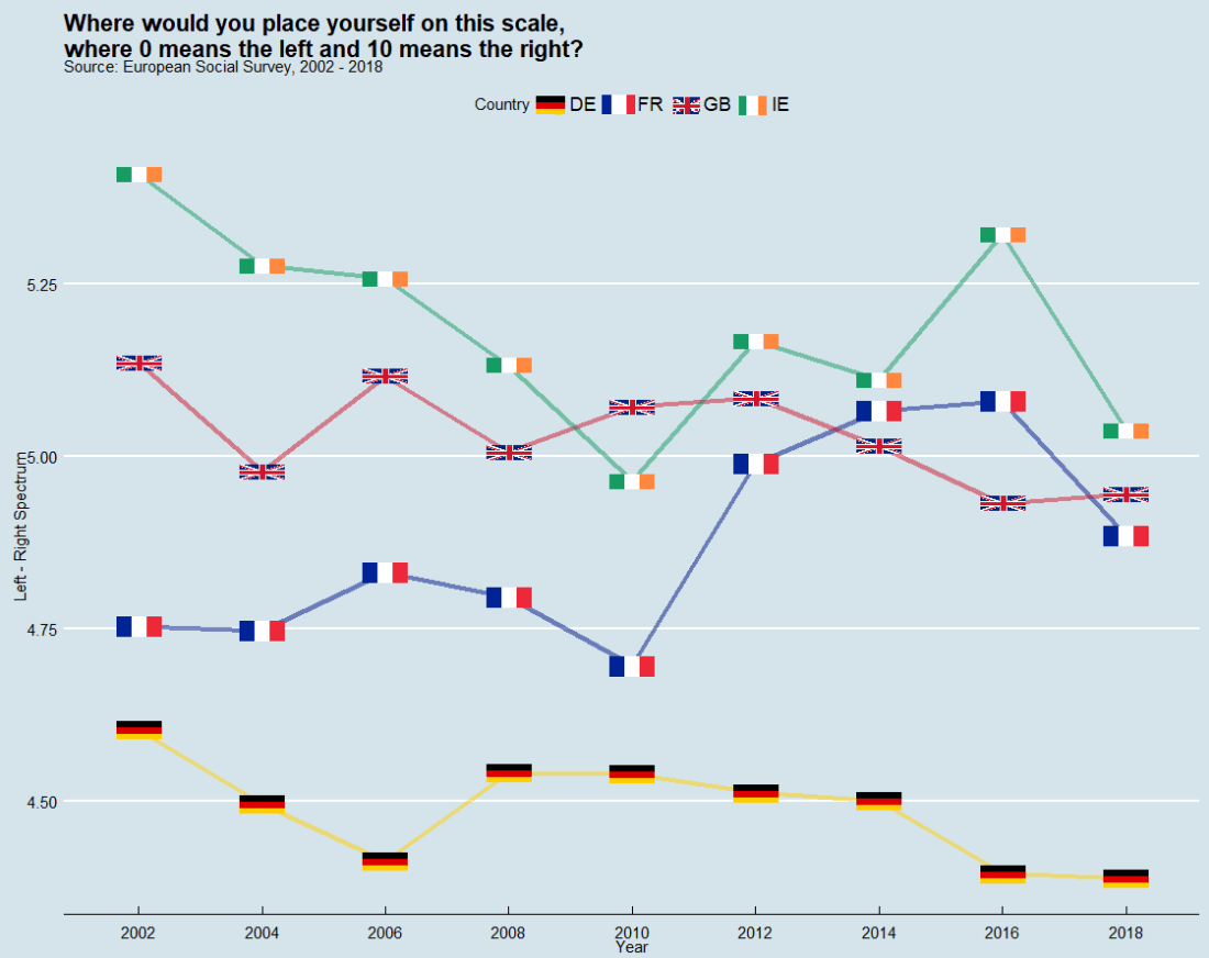
In this post, we can compare countries on the left – right political spectrum and graph the trends.
In the European Social Survey, they ask respondents to indicate where they place themselves on the political spectrum with this question: “In politics people sometimes talk of ‘left’ and ‘right’. Where would you place yourself on this scale, where 0 means the left and 10 means the right?”
library(ggthemes, ggimage)

lrscale_graph <- round_df %>%
  dplyr::filter(country == "IE" | country == "GB" | country == "FR" | country == "DE") %>%
  ggplot(aes(x= round, y = mean_lr, group = country)) +
  geom_line(aes(color = factor(country)), size = 1.5, alpha = 0.5) +
  ggimage::geom_flag(aes(image = country), size = 0.04) +
  scale_color_manual(values = my_palette) +
  scale_x_discrete(name = "Year", limits=c("2002","2004","2006","2008","2010","2012","2014","2016","2018")) +
  labs(title = "Where would you place yourself on this scale,\n where 0 means the left and 10 means the right?",
       subtitle = "Source: European Social Survey, 2002 - 2018",
       fill="Country",
       x = "Year",
       y = "Left - Right Spectrum")

lrscale_graph + guides(color=guide_legend(title="Country")) + theme_economist()
The European Social Survey (ESS) measure attitudes in thirty-ish countries (depending on the year) across the European continent. It has been conducted every two years since 2001.
The survey consists of a core module and two or more ‘rotating’ modules, on social and public trust; political interest and participation; socio-political orientations; media use; moral, political and social values; social exclusion, national, ethnic and religious allegiances; well-being, health and security; demographics and socio-economics.
So lots of fun data for political scientists to look at.
install.packages("essurvey")
library(essurvey)
The very first thing you need to do before you can download any of the data is set your email address.
set_email("rforpoliticalscience@gmail.com")
Don’t forget the email address goes in as a string in “quotations marks”.
Show what countries are in the survey with the show_countries() function.
It’s important to know that country names are case sensitive and you can only use the name printed out by show_countries(). For example, you need to write “Russian Federation” to access Russian survey data; if you write “Russia”…
Using these country names, we can download specific rounds or waves (i.e survey years) with import_country. We have the option to choose the two most recent rounds, 8th (from 2016) and 9th round (from 2018).
ire_data <- import_all_cntrounds("Ireland")
The resulting data comes in the form of nine lists, one for each round
These rounds correspond to the following years:
ESS Round 9 – 2018
ESS Round 8 – 2016
ESS Round 7 – 2014
ESS Round 6 – 2012
ESS Round 5 – 2010
ESS Round 4 – 2008
ESS Round 3 – 2006
ESS Round 2 – 2004
ESS Round 1 – 2002
I want to compare the first round and most recent round to see if Irish people’s views have changed since 2002. In 2002, Ireland was in the middle of an economic boom that we called the “Celtic Tiger”. People did mad things like buy panini presses and second house in Bulgaria to resell. Then the 2008 financial crash hit the country very hard.
Irish people during the Celtic Tiger:
Irish people after the Celtic Tiger crash:
Ireland in 2018 was a very different place. So it will be interesting to see if these social changes translated into attitude changes.
First, we use the import_country() function to download data from ESS. Specify the country and rounds you want to download.
The resulting ire object is a list, so we’ll need to extract the two data.frames from the list:
ire_1 <- ire[[1]]

ire_9 <- ire[[2]]
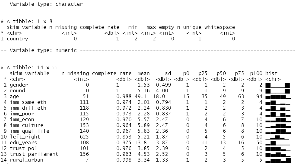
The exact same questions are not asked every year in ESS; there are rotating modules, sometimes questions are added or dropped. So to merge round 1 and round 9, first we find the common columns with the intersect() function.
All the variables in the dataset are a special class called “haven_labelled“. So we must convert them to numeric variables with a quick function. We exclude the first variable because we want to keep country name as a string character variable.
We can look at the distribution of our variables and count how many missing values there are with the skim() function from the skimr package
library(skimr)

skim(att_df)
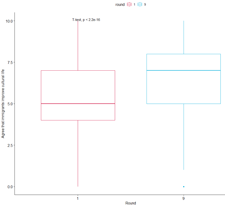
We can run a quick t-test to compare the mean attitudes to immigrants on the statement: “Immigrants make country worse or better place to live” across the two survey rounds.
Lower scores indicate an attitude that immigrants undermine Ireland’ quality of life and higher scores indicate agreement that they enrich it!
t.test(att_df$imm_qual_life ~ att_df$round)
In future blog, I will look at converting the raw output of R into publishable tables.
The results of the independent-sample t-test show that if we compare Ireland in 2002 and Ireland in 2018, there has been a statistically significant increase in positive attitudes towards immigrants and belief that Ireland’s quality of life is more enriched by their presence in the country.
As I am currently an immigrant in a foreign country myself, I am glad to come from a country that sees the benefits of immigrants!
If we load the ggpubr package, we can graphically look at the difference in mean attitude scores.
library(ggpubr)

box1 <- ggpubr::ggboxplot(att_df, x = "round", y = "imm_qual_life", color = "round", palette = c("#d11141", "#00aedb"),
 ylab = "Attitude", xlab = "Round")

box1 + stat_compare_means(method = "t.test")
It’s not the most glamorous graph but it conveys the shift in Ireland to more positive attitudes to immigration!
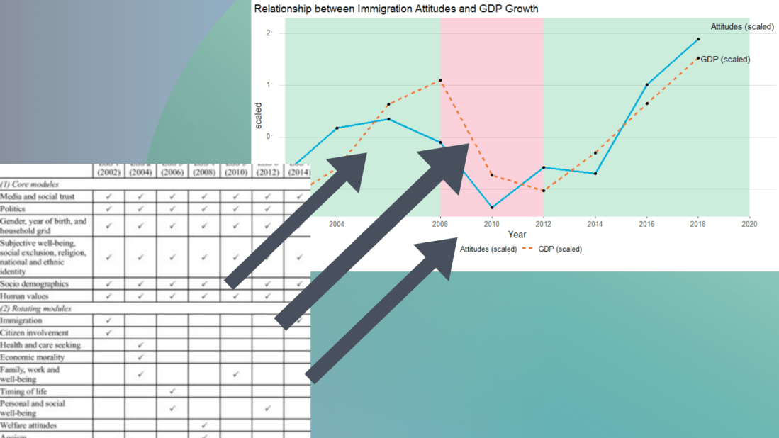
I suspect that a country’s economic growth correlates with attitudes to immigration.
The geom_rect() function graphs the coloured rectangles on the plot. I take colours from this color-hex website; the green rectangle for times of economic growth and red for times of recession. Makes sure the geom-rect() comes before the geom_line().
And we can see that there is a relationship between attitudes to immigrants in Ireland and Irish GDP growth. When GDP is growing, Irish people see that immigrants improve quality of life in Ireland and vice versa. The red section of the graph corresponds to the financial crisis.
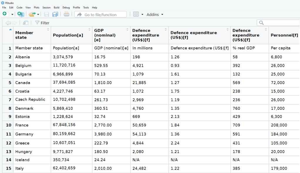
We can all agree that Wikipedia is often our go-to site when we want to get information quick. When we’re doing IR or Poli Sci reesarch, Wikipedia will most likely have the most up-to-date data compared to other databases on the web that can quickly become out of date.
So in R, we can scrape a table from Wikipedia and turn into a database with the rvest package .
First, we copy and paste the Wikipedia page we want to scrape into the read_html() function as a string:
Next we save all the tables on the Wikipedia page as a list. Turn the header = TRUE.
nato_tables <- nato_members %>% html_table(header = TRUE, fill = TRUE)
The table that I want is the third table on the page, so use [[two brackets]] to access the third list.
nato_exp <- nato_tables[[3]]
The dataset is not perfect, but it is handy to have access to data this up-to-date. It comes from the most recent NATO report, published in 2019.
Some problems we will have to fix.
The first row is a messy replication of the header / more information across two cells in Wikipedia.
The headers are long and convoluted.
There are a few values in as N/A in the dataset, which R thinks is a string.
All the numbers have commas, so R thinks all the numeric values are all strings.
There are a few NA values that I would not want to impute because they are probably zero. Iceland has no armed forces and manages only a small coast guard. North Macedonia joined NATO in March 2020, so it doesn’t have all the data completely.
So first, let’s do some quick data cleaning:
Clean the variable names to remove symbols and adds underscores with a function from the janitor package
Next turn all the N/A value strings to NULL. The na_strings object we create can be used with other instances of pesky missing data varieties, other than just N/A string.
Remove all the commas from the number columns and convert the character strings to numeric values with a quick function we apply to all numeric columns in the data.frame.
Next, we can calculate the average NATO score of all the countries (excluding the member_state variable, which is a character string).
We’ll exclude the NATO total column (as it is not a member_state but an aggregate of them all) and the data about Iceland and North Macedonia, which have missing values.
library(WDI)
library(tidyverse)
library(magrittr) # for pipes
library(ggthemes)
library(rnaturalearth)
 # to create maps
library(viridis) # for pretty colors
We will use this package to really quickly access all the indicators from the World Bank website.
Below is a screenshot of the World Bank’s data page where you can search through all the data with nice maps and information about their sources, their available years and the unit of measurement et cetera.
In R when we download the WDI package, we can download the datasets directly into our environment.
With the WDIsearch() function we can look for the World Bank indicator.
For this blog, we want to map out how dependent countries are on oil. We will download the dataset that measures oil rents as a percentage of a country’s GDP.
WDIsearch('oil rent')
The output is:
indicator             name
"NY.GDP.PETR.RT.ZS"   "Oil rents (% of GDP)"
Copy the indicator string and paste it into the WDI() function. The country codes are the iso2 codes, which you can input as many as you want in the c().
If you want all countries that the World Bank has, do not add country argument.
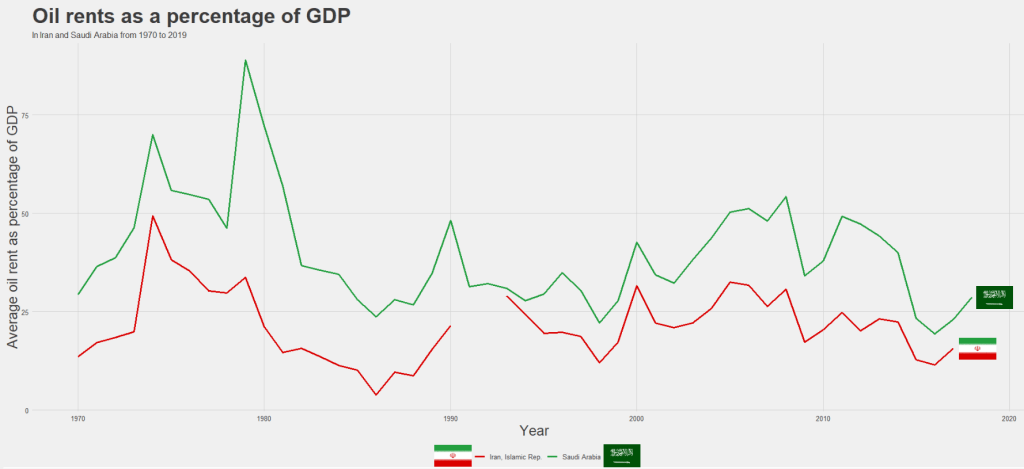
We can compare Iran and Saudi Arabian oil rents from 1970 until the most recent value.
data = WDI(indicator='NY.GDP.PETR.RT.ZS', country=c('IR', 'SA'), start=1970, end=2019)
And graph out the output. All only takes a few steps.
my_palette = c("#DA0000", "#239f40")
 #both the hex colors are from the maps of the countries

oil_graph <- ggplot(oil_data, aes(year, NY.GDP.PETR.RT.ZS, color =  country)) +
  geom_line(size = 1.4) +
  labs(title = "Oil rents as a percentage of GDP",
       subtitle = "In Iran and Saudi Arabia from 1970 to 2019",
       x = "Year",
       y = "Average oil rent as percentage of GDP",
       color = " ") +
  scale_color_manual(values = my_palette)

oil_graph +
ggthemes::theme_fivethirtyeight() +
theme(
plot.title = element_text(size = 30),
      axis.title.y = element_text(size = 20),
      axis.title.x = element_text(size = 20))
For some reason the World Bank does not have data for Iran for most of the early 1990s. But I would imagine that they broadly follow the trends in Saudi Arabia.
I added the flags myself manually after I got frustrated with geom_flag() . It is something I will need to figure out for a future blog post!
It is really something that in the late 1970s, oil accounted for over 80% of all Saudi Arabia’s Gross Domestic Product.
Now we see both countries rely on a far smaller percentage. Due both to the fact that oil prices are volatile, climate change is a new constant threat and resource exhaustion is on the horizon, both countries have adjusted policies in attempts to diversify their sources of income.
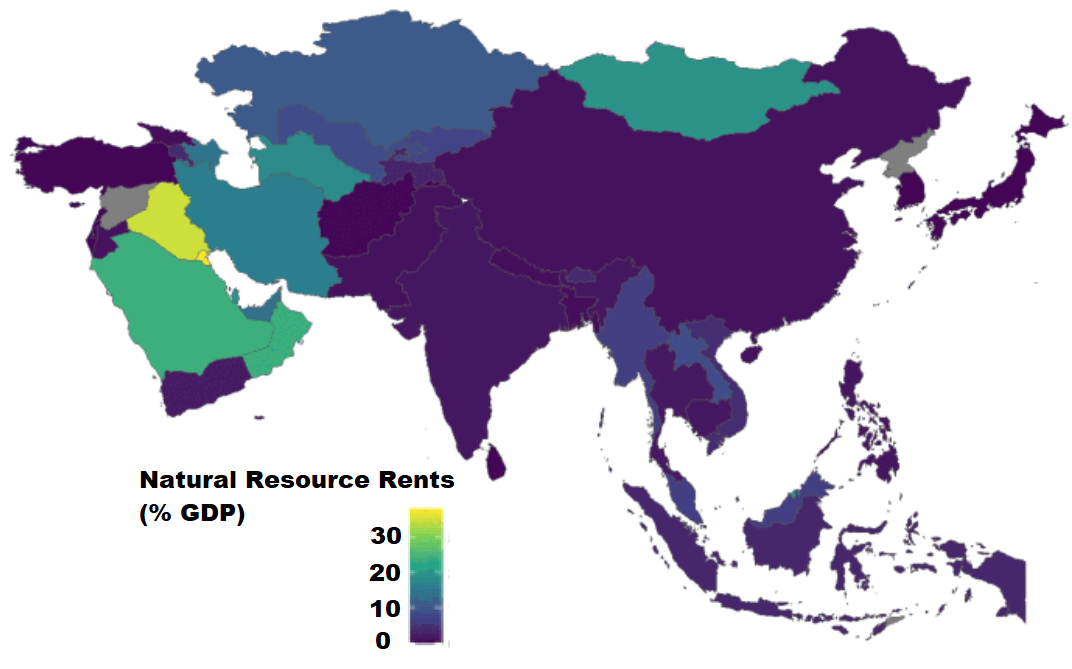
Next we can use the World Bank data to create maps and compare regions on any World Bank scores.
We will compare all Asian and Middle Eastern countries with regard to all natural rents (not just oil) as a percentage of their GDP.
This blog will create dendogram to examine whether Asian countries cluster together when it comes to extent of judicial compliance. I’m examining Asian countries with populations over 1 million and data comes from the year 2019.
Judicial compliance measure how often a government complies with important decisions by courts with which it disagrees.
Higher scores indicate that the government often or always complies, even when they are unhappy with the decision. Lower scores indicate the government rarely or never complies with decisions that it doesn’t like.
It is important to make sure there are no NA values. So I will impute any missing variables.
Next we can scale the dataset. This step is for when you are clustering on more than one variable and the variable units are not necessarily equivalent. The distance value is related to the scale on which the different variables are made.
Therefore, it’s good to scale all to a common unit of analysis before measuring any inter-observation dissimilarities.
asia_scale <- scale(asia_df)
Next we calculate the distance between the countries (i.e. different rows) on the variables of interest and create a dist object.
There are many different methods you can use to calculate the distances. Click here for a description of the main formulae you can use to calculate distances. In the linked article, they provide a helpful table to summarise all the common methods such as “euclidean“, “manhattan” or “canberra” formulae.
I will go with the “euclidean” method. but make sure your method suits the data type (binary, continuous, categorical etc.)
We now have a dist object we can feed into the hclust() function.
With this function, we will need to make another decision regarding the method we will use.
The possible methods we can use are "ward.D", "ward.D2", "single", "complete", "average" (= UPGMA), "mcquitty" (= WPGMA), "median" (= WPGMC) or "centroid" (= UPGMC).
Again I will choose a common "ward.D2" method, which chooses the best clusters based on calculating: at each stage, which two clusters merge that provide the smallest increase in the combined error sum of squares.
When we plot the different clusters, there are many options to change the color, size and dimensions of the dendrogram. To do this we use the set() function.
asia_judicial_dend %>%
set("branches_k_color", k=5) %>%    # five clustered groups of different colors
set("branches_lwd", 2) %>%          # size of the lines (thick or thin)
set("labels_colors", k=5) %>%       # color the country labels, also five groups
plot(horiz = TRUE)                  # plot the dendrogram horizontally
I choose to divide the countries into five clusters by color:
And if I zoom in on the ends of the branches, we can examine the groups.
The top branches appear to be less democratic countries. We can see that North Korea is its own cluster with no other countries sharing similar judicial compliance scores.
The bottom branches appear to be more democratic with more judicial independence. However, when we have our final dendrogram, it is our job now to research and investigate the characteristics that each countries shares regarding the role of the judiciary and its relationship with executive compliance.
Singapore, even though it is not a democratic country in the way that Japan is, shows a highly similar level of respect by the executive for judicial decisions.
Also South Korean executive compliance with the judiciary appears to be more similar to India and Sri Lanka than it does to Japan and Singapore.
So we can see that dendrograms are helpful for exploratory research and show us a starting place to begin grouping different countries together regarding a concept.
A really quick way to complete all steps in one go, is the following code. However, you must use the default methods for the dist and hclust functions. So if you want to fine tune your methods to suit your data, this quicker option may be too brute.
First, we access and store a map object from the rnaturalearth package, with all the spatial information in contains. We specify returnclass = "sf", which will return a dataframe with simple features information.
SF?
Simple features or simple feature access refers to a formal standard (ISO 19125-1:2004) that describes how objects in the real world can be represented in computers, with emphasis on the spatial geometry of these objects. Our map has these attributes stored in the object.
With the ne_countries() function, we get the borders of all countries.
This map object comes with lots of information about 241 countries and territories around the world.
In total, it has 65 columns, mostly with different variants of the names / locations of each country / territory. For example, ISO codes for each country. Further in the dataset, there are a few other variables such as GDP and population estimates for each country. So a handy source of data.
However, I want to use values from a different source; I have a freedom_df dataframe with a freedom of association variable.
The freedom of association index broadly captures to what extent are parties, including opposition parties, allowed to form and to participate in elections, and to what extent are civil society organizations able to form and to operate freely in each country.
So, we can merge them into one dataset.
Before that, I want to only use the scores from the most recent year to map out. So, take out only those values in the year 2019 (don’t forget the comma sandwiched between the round bracket and the square bracket):
We’re all ready to graph the map. We can add the freedom of association variable into the aes() argument of the geom_sf() function. Again, the sf refers to simple features with geospatial information we will map out.
assoc_graph <- ggplot(data = map19) +
  geom_sf(aes(fill = freedom_association_index),
          position = "identity") +
  labs(fill='Freedom of Association Index')  +
  scale_fill_viridis_c(option = "viridis")
The scale_fill_viridis_c(option = "viridis") changes the color spectrum of the main variable.
Other options include:
"viridis"
"magma"
"plasma“
And various others. Click here to learn more about this palette package.
Finally we call the new graph stored in the assoc_graph object.
I use the theme_map() function from the ggtheme package to make the background very clean and to move the legend down to the bottom left of the screen where it takes up the otherwise very empty Pacific ocean / Antarctic expanse.
And there we have it, a map of countries showing the Freedom of Association index across countries.
The index broadly captures to what extent are parties, including opposition parties, allowed to form and to participate in elections, and to what extent are civil society organizations able to form and to operate freely.
Yellow colors indicate more freedom, green colors indicate middle scores and blue colors indicate low levels of freedom.
Some of the countries have missing data, such as Germany and Yemen, for various reasons. A true perfectionist would go and find and fill in the data manually.
Google Trends is a search trends feature. It shows how frequently a given search term is entered into Google’s search engine, relative to the site’s total search volume over a given period of time.
( So note: because the results are all relative to the other search terms in the time period, the dates you provide to the gtrendsR function will change the shape of your graph and the relative percentage frequencies on the y axis of your plot).
To scrape data from Google Trends, we use the gtrends() function from the gtrendsR package and the get_interest() function from the trendyy package (a handy wrapper package for gtrendsR).
If necessary, also load the tidyverse and ggplot packages.
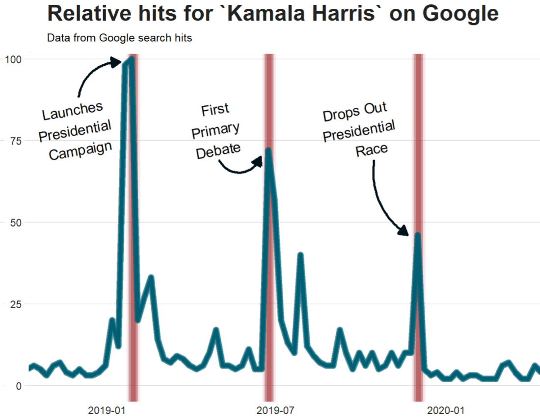
For the next example, here we search for the term “Kamala Harris” during the period from 1st of January 2019 until today.
If you want to check out more specifications, for the package, you can check out the package PDF here. For example, we can change the geographical region (US state or country for example) with the geo specification.
We can also change the parameters of the time argument, we can specify the time span of the query with any one of the following strings:
“now 1-H” (previous hour)
“now 4-H” (previous four hours)
“today+5-y” last five years (default)
“all” (since the beginning of Google Trends (2004))
If don’t supply a string, the default is five year search data.
We call the get_interest() function to save this data from Google Trends into a data.frame version of the kamala object. If we didn’t execute this last step, the data would be in a form that we cannot use with ggplot().
View(kamala)
In this data.frame, there is a date variable for each week and a hits variable that shows the interest during that week. Remember, this hits figure shows how frequently a given search term is entered into Google’s search engine relative to the site’s total search volume over a given period of time.
We will use these two variables to plot the y and x axis.
To look at the search trends in relation to the events during the Kamala Presidential campaign over 2019, we can add vertical lines along the date axis, with a data.frame, we can call kamala_events.
kamala_events = data.frame(date=as.Date(c("2019-01-21", "2019-06-25", "2019-12-03", "2020-08-12")),
event=c("Launch Presidential Campaign", "First Primary Debate", "Drops Out Presidential Race", "Chosen as Biden's VP"))
Note the very specific order the as.Date() function requires.
Next, we can graph the trends, using the above date and hits variables:
Super easy and a quick way to visualise the ups and downs of Kamala Harris’ political career over the past few months, operationalised as the relative frequency with which people Googled her name.
If I had chosen different dates, the relative hits as shown on the y axis would be different! So play around with it and see how the trends change when you increase or decrease the time period.
Without examining interaction effects in your model, sometimes we are incorrect about the real relationship between variables.
This is particularly evident in political science when we consider, for example, the impact of regime type on the relationship between our dependent and independent variables. The nature of the government can really impact our analysis.
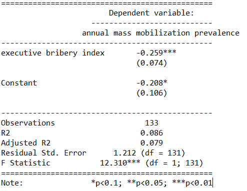
For example, I were to look at the relationship between anti-government protests and executive bribery.
I would expect to see that the higher the bribery score in a country’s government, the higher prevalence of people protesting against this corrupt authority. Basically, people are angry when their government is corrupt. And they make sure they make this very clear to them by protesting on the streets.
First, I will describe the variables I use and their data type.
With the dependent variable democracy_protest being an interval score, based upon the question: In this year, how frequent and large have events of mass mobilization for pro-democratic aims been?
The main independent variable is another interval score on executive_bribery scale and is based upon the question: How clean is the executive (the head of government, and cabinet ministers), and their agents from bribery (granting favors in exchange for bribes, kickbacks, or other material inducements?)
So, let’s run a quick regression to examine this relationship:
summary(protest_model <- lm(democracy_protest ~ executive_bribery, data = data_2010))
Examining the results of the regression model:
We see that there is indeed a negative relationship. The cleaner the government, the less likely people in the country will protest in the year under examination. This confirms our above mentioned hypothesis.
However, examining the R2, we see that less than 1% of the variance in protest prevalence is explained by executive bribery scores.
Not very promising.
Is there an interaction effect with regime type? We can look at a scatterplot and see if the different regime type categories cluster in distinct patterns.
The four regime type categories are
purple: liberal democracy (such as Sweden or Canada)
teal: electoral democracy (such as Turkey or Mongolia)
khaki green: electoral autocracy (such as Georgia or Ethiopia)
red: closed autocracy (such as Cuba or China)
The color clusters indicate regime type categories do cluster.
Liberal democracies (purple) cluster at the top left hand corner. Higher scores in clean executive index and lower prevalence in pro-democracy protesting.
Electoral autocracies (teal) cluster in the middle.
Electoral democracies (khaki green) cluster at the bottom of the graph.
The closed autocracy countries (red) seem to have a upward trend, opposite to the overall best fitted line.
So let’s examine the interaction effect between regime types and executive corruption with mass pro-democracy protests.
Plot the model and add the * interaction effect:
summary(protest_model_2 <-lm(democracy_protest ~ executive_bribery*regime_type, data = data_2010))
Adding the regime type variable, the R2 shoots up to 27%.
The interaction effect appears to only be significant between clean executive scores and liberal democracies. The cleaner the country’s executive, the prevalence of mass mobilization and protests decreases by -0.98 and this is a statistically significant relationship.
The initial relationship we saw in the first model, the simple relationship between clean executive scores and protests, has disappeared. There appears to be no relationship between bribery and protests in the semi-autocratic countries; (those countries that are not quite democratic but not quite fully despotic).
Let’s graph out these interactions.
In the plot_model() function, first type the name of the model we fitted above, protest_model.
Next, choose the type . For different type arguments, scroll to the bottom of this blog post. We use the type = "pred" argument, which plots the marginal effects.
Marginal effects tells us how a dependent variable changes when a specific independent variable changes, if other covariates are held constant. The two terms typed here are the two variables we added to the model with the * interaction term.
install.packages("sjPlot")
library(sjPlot)

plot_model(protest_model, type = "pred", terms = c("executive_bribery", "regime_type"), title = 'Predicted values of Mass Mobilization Index',

 legend.title = "Regime type")
Looking at the graph, we can see that the relationship changes across regime type. For liberal democracies (purple), there is a negative relationship. Low scores on the clean executive index are related to high prevalence of protests. So, we could say that when people in democracies see corrupt actions, they are more likely to protest against them.
However with closed autocracies (red) there is the opposite trend. Very corrupt countries in closed autocracies appear to not have high levels of protests.
This would make sense from a theoretical perspective: even if you want to protest in a very corrupt country, the risk to your safety or livelihood is often too high and you don’t bother. Also the media is probably not free so you may not even be aware of the extent of government corruption.
It seems that when there are no democratic features available to the people (free media, freedom of assembly, active civil societies, or strong civil rights protections, freedom of expression et cetera) the barriers to protesting are too high. However, as the corruption index improves and executives are seen as “cleaner”, these democratic features may be more accessible to them.
If we only looked at the relationship between the two variables and ignore this important interaction effects, we would incorrectly say that as
Of course, panel data would be better to help separate any potential causation from the correlations we can see in the above graphs.
The blue line is almost vertical. This matches with the regression model which found the coefficient in electoral autocracy is 0.001. Virtually non-existent.
Different Plot Types
type = "std" – Plots standardized estimates.
type = "std2" – Plots standardized estimates, however, standardization follows Gelman’s (2008) suggestion, rescaling the estimates by dividing them by two standard deviations instead of just one. Resulting coefficients are then directly comparable for untransformed binary predictors.
type = "pred" – Plots estimated marginal means (or marginal effects). Simply wraps ggpredict.
type = "eff"– Plots estimated marginal means (or marginal effects). Simply wraps ggeffect.
type = "slope" and type = "resid" – Simple diagnostic-plots, where a linear model for each single predictor is plotted against the response variable, or the model’s residuals. Additionally, a loess-smoothed line is added to the plot. The main purpose of these plots is to check whether the relationship between outcome (or residuals) and a predictor is roughly linear or not. Since the plots are based on a simple linear regression with only one model predictor at the moment, the slopes (i.e. coefficients) may differ from the coefficients of the complete model.
type = "diag" – For Stan-models, plots the prior versus posterior samples. For linear (mixed) models, plots for multicollinearity-check (Variance Inflation Factors), QQ-plots, checks for normal distribution of residuals and homoscedasticity (constant variance of residuals) are shown. For generalized linear mixed models, returns the QQ-plot for random effects.
Well this is just delightful! This package was created by Karthik Ram.
install.packages("wesanderson")
library(wesanderson)
library(hrbrthemes) # for plot themes
library(gapminder) # for data
library(ggbump) # for the bump plot
After you install the wesanderson package, you can
create a ggplot2 graph object
choose the Wes Anderson color scheme you want to use and create a palette object
add the graph object and and the palette object and behold your beautiful data
wes_palette(name, n, type = c("discrete", "continuous"))
To generate a vector of colors, the wes_palette() function requires:
name: Name of desired palette
n: Number of colors desired (i.e. how many categories so n = 4).
The names of all the palettes you can enter into the wes_anderson() function
We can use data from the gapminder package. We will look at the scatterplot between life expectancy and GDP per capita.
We feed the wes_palette() function into the scale_color_manual() with the values = wes_palette() argument.
We indicate that the colours would be the different geographic regions.
If we indicate fill in the geom_point() arguments, we would change the last line to scale_fill_manual()
We can log the gapminder variables with the mutate(across(where(is.numeric), log)). Alternatively, we could scale the axes when we are at the ggplot section of the code with the scale_*_continuous(trans='log10')
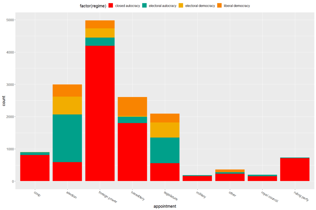
Both the regime variable and the appointment variable are discrete categories so we can use the geom_bar() function. When adding the palette to the barplot object, we can use the scale_fill_manual() function.
eighteenth_century + scale_fill_manual(values = wes_palette("Darjeeling1", n = 4)
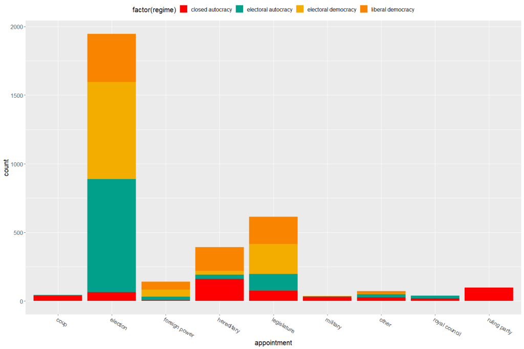
Now to compare the breakdown with countries in the 21st century (2000 to present)
Sometimes the best way to examine the relationship between our variables of interest is to plot it out and give it a good looking over. For me, it’s most helpful to see where different countries are in relation to each other and to see any interesting outliers.
For this, I can use the geom_text() function from the ggplot2 package.
I will look at the relationship between economic globalization and social globalization in OECD countries in the year 2000.
The KOF Globalisation Index, introduced by Dreher (2006) measures globalization along the economic, social and political dimension for most countries in the world
First, as always, we install and load the necessary package. This time, it is the ggplot2 package
install.packages("ggplot2")
library(ggplot2)
Next add the following code:
fin <- ggplot(oecd2000, aes(economic_globalization, social_globalization))
        + ggtitle("Relationship between Globalization Index Scores among OECD countries in 2000")
        + scale_x_continuous("Economic Globalization Index")
        + scale_y_continuous("Social Globalization Index")
        + geom_smooth(method = "lm")
        + geom_point(aes(colour = polity_score), size = 2) + labs(color = "Polity Score")
        + geom_text(hjust = 0, nudge_x = 0.5, size = 4, aes(label = country))

fin
In the aes() function, we enter the two variables we want to plot.
Then I use the next three lines to add titles to axes and graph
I use the geom_smooth() function with the “lm” method to add a best fitting regression line through the points on the plot. Click here to learn more about adding a regression line to a plot.
I add a legend to examine where countries with different democracy scores (taken from the Polity Index) are located on the globalization plane. Click here to learn about adding legends.
The last line is the geom_text() function that I use to specify that I want to label each observation (i.e. each OECD country) with its name, rather than the default dataset number.
Some geom_text() commands to use:
nudge_x (or nudge_y) slightly “nudge” the labels from their corresponding points to help minimise messy overlapping.
hjust and vjust move the text label “left”, “center”, “right”, “bottom”, “middle” or “top” of the point.
Yes, yes! There is a package that uses the color palettes of Wes Anderson movies to make graphs look just beautiful. Click here to use different Wes Anderson aesthetic themed graphs!
zissou_colors <- wes_palette("Zissou1", 100, type = "continuous")

fin + scale_color_gradientn(colours = zissou_colors)
Which outputs:
Interestingly, it seems that at the very bottom left hand corner of the plot (which shows the countries that are both low in economic globalization and low in social globalization), we have two OECD countries that score high on democracy – Japan and South Korea- right next to two countries that score the lowest in the OECD on democracy, Turkey and Mexico.
So it could be interesting to further examine why these countries from opposite ends of the democracy spectrum have similar pattern of low globalization. It puts a spanner in the proverbial works with my working theory that countries higher in democracy are more likely to be more globalized! What is special about these two high democracy countries that gives them such low scores on globalization.
If I want to graphically display the relationship between two variables, the ggplot2 package is a very handy way to produce graphs.
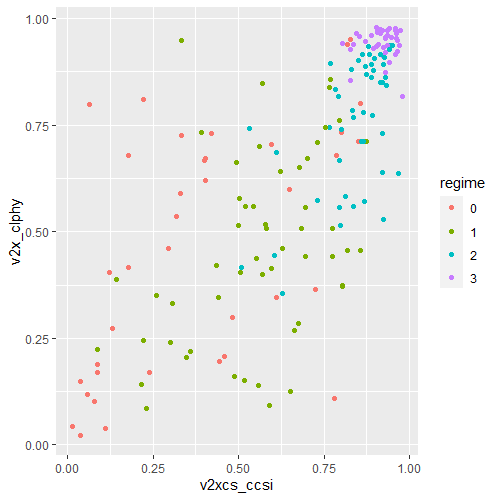
For example, I can use the ggplot2 package to graphically examine the relationship between civil society strength and freedom of citizens from torture. Also I can see whether this relationship is the same across regime types.
aes() indicates how variables are mapped to visual properties or aesthetics. The first variable goes on the x-axis and the second variable goes on the y-axis.
geom_point() creates a scatterplot style graph. Alternatives to this are geom_line(), which creates a line plot and geom_histogram() which creates a histogram plot.
ggplot(data2000, aes(v2xcs_ccsi, v2cltort)) + geom_point() +
xlab("Civil society robustness") +
ylab("Freedom from torture")
Next we can add information on regime types, a categorical variable with four levels.
0 = closed autocracy
1 = electoral autocracy
2 = electoral democracy
3 = liberal democracy
In the aes() function, add colour = regime to differentiate the four categories on the graph
Alternatively we can use the facet_wrap( ~ regime) function to create four separate scatterplots and examine the relationship separately.
ggplot(data2000, aes(v2xcs_ccsi, v2x_clphy, colour = regime)) + geom_point() + facet_wrap(~regime) + xlab("Civil society robustness") + ylab("Freedom from torture")
Lastly, we can add a linear model line (method = "lm") with a grey standard error bar (se = TRUE) in the geom_smooth() function.
ggplot(data2000, aes(v2xcs_ccsi, v2x_clphy, colour = regime)) +
geom_point() +
facet_wrap(~regime) +
geom_smooth(method = "lm", se = TRUE) +
xlab("Civil society robustness") +
ylab("Freedom from torture")
In these graphs, we can see that as civil society robustness score increases, the likelihood of a life free from torture increases! Pretty intuitive result and we could argue that there is a third variable – namely strong democratic institutions – that drives this positive relationship.
The graphs break down this relationship across four different regime types, ranging from the most autocratic in the top left hand side to the most democratic in the bottom right. There is more variety in this relationship with closed autocracies (i.e. the red points), with some points deviating far from the line.
The purple graph – liberal democracies – shows a tiny amount of variance. In liberal democracies, it appears that all countries score highly in both civil society robustness and freedom from torture!