In this post, we will look at easy ways to graph data from the democracyData package.
The two datasets we will look at are the Anckar-Fredriksson dataset of political regimes and Freedom House Scores.
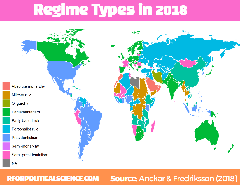
Regarding democracies, Anckar and Fredriksson (2018) distinguish between republics and monarchies. Republics can be presidential, semi-presidential, or parliamentary systems.
Within the category of monarchies, almost all systems are parliamentary, but a few countries are conferred to the category semi-monarchies.
Autocratic countries can be in the following main categories: absolute monarchy, military rule, party-based rule, personalist rule, and oligarchy.
I want to only look at regimes types in the final year in the dataset – which is 2018 – so we filter only one year before we merge with the map data.frame.
The geom_polygon() part is where we indiciate the variable we want to plot. In our case it is the regime category
anckar %>%
 filter(year == max(year)) %>%
  inner_join(world_map, by = c("cown")) %>%
  mutate(regimebroadcat = ifelse(region == "Libya", 'Military rule', regimebroadcat)) %>%
  ggplot(aes(x = long, y = lat, group = group)) +
  geom_polygon(aes(fill = regimebroadcat), color = "white", size = 1)
library(democracyData)
library(tidyverse)
library(magrittr)       # for pipes
library(ggstream)       # proportion plots
library(ggthemes)       # nice ggplot themes
library(forcats)        # reorder factor variables
library(ggflags)        # add flags
library(peacesciencer)  # more great polisci data
library(countrycode)    # add ISO codes to countries
This blog will highlight some quick datasets that we can download with this nifty package.
To install the democracyData package, it is best to do this via the github of Xavier Marquez:
remotes::install_github("xmarquez/democracyData", force = TRUE)
library(democracyData)
We can download the dataset from the Democracy and Dictatorship Revisited paper by Cheibub Gandhi and Vreeland (2010) with the redownload_pacl() function. It’s all very simple!
pacl <- redownload_pacl()
This gives us over 80 variables, with information on things such as regime type, geographical data, the name and age of the leaders, and various democracy variables.
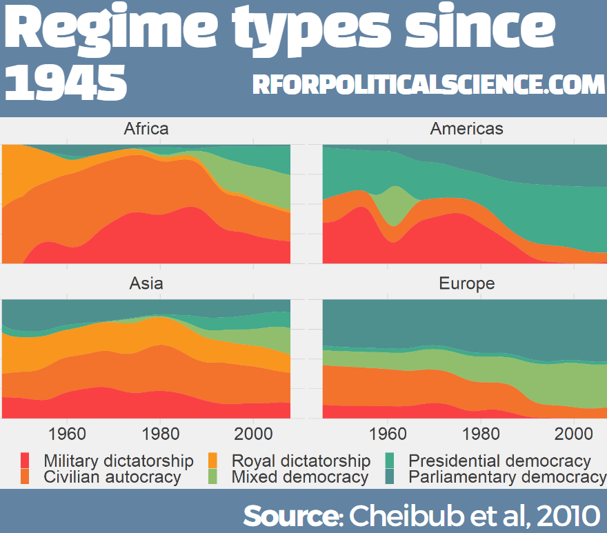
We are going to focus on the different regimes across the years.
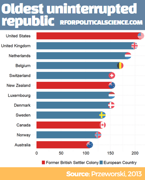
The six-fold regime classification Cheibub et al (2010) present is rooted in the dichotomous classification of regimes as democracy and dictatorship introduced in Przeworski et al. (2000). They classify according to various metrics, primarily by examining the way in which governments are removed from power and what constitutes the “inner sanctum” of power for a given regime. Dictatorships can be distinguished according to the characteristics of these inner sanctums. Monarchs rely on family and kin networks along with consultative councils; military rulers confine key potential rivals from the armed forces within juntas; and, civilian dictators usually create a smaller body within a regime party—a political bureau—to coopt potential rivals. Democracies highlight their category, depending on how the power of a given leadership ends
We can change the regime variable from numbers to a factor variables, describing the type of regime that the codebook indicates:
Before we make the graph, we can give traffic light hex colours to the types of democracy. This goes from green (full democracy) to more oranges / reds (autocracies):
This describes political conditions in every country (including tenures and personal characteristics of world leaders, the types of political institutions and political regimes in effect, election outcomes and election announcements, and irregular events like coups)
Again, to download this dataset with the democracyData package, it is very simple:
reign <- download_reign()
I want to compare North and South Korea since their independence from Japan and see the changes in regimes and democracy scores over the years.
Next, we can easily download Freedom House or Polity 5 scores.
The Freedom House Scores default dataset ranges from 1972 to 2020, covering around 195 countries (depending on the year)
fh <- download_fh()
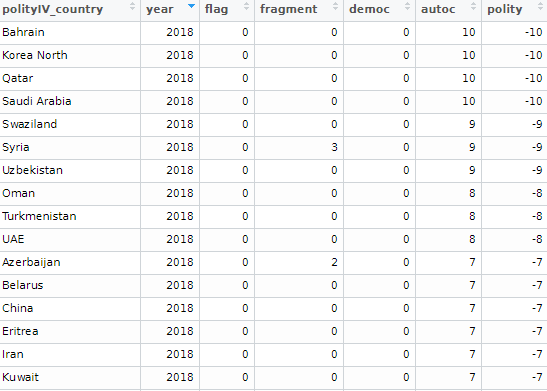
Alternatively, we can look at Polity Scores. This default dataset countains around 190 ish countries (again depending on the year and the number of countries in existance at that time) and covers a far longer range of years; from 1880 to 2018.
polityiv <- redownload_polityIV()
Alternatively, to download democracy scores, we can also use the peacesciencer dataset. Click here to read more about this package:
We may to use specific hex colours for our graphs. I always prefer these deeper colours, rather than the pastel defaults that ggplot uses. I take them from coolors.co website!
While North Korea has been consistently ruled by the Kim dynasty, South Korea has gone through various types of government and varying levels of democracy!
References
Cheibub, J. A., Gandhi, J., & Vreeland, J. R. (2010). . Public choice, 143(1), 67-101.
Przeworski, A., Alvarez, R. M., Alvarez, M. E., Cheibub, J. A., Limongi, F., & Neto, F. P. L. (2000). Democracy and development: Political institutions and well-being in the world, 1950-1990 (No. 3). Cambridge University Press.
If we look at the table, some of the surveys started in Feb but ended in March. We want to extract the final section (i.e. the March section) and use that.
So we use grepl() to find rows that have both Feb AND March, and just extract the March section. If it only has one of those months, we leave it as it is.
Following that, we use the parse_number() function from tidyr package to extract the first number found in the string and create a day_number varible (with integer class now)
We want to take these two variables we created and combine them together with the unite() function from tidyr again! We want to delete the variables after we unite them. But often I want to keep the original variables, so usually I change the argument remove to FALSE.
We indicate we want to have nothing separating the vales with the sep = "" argument
And we convert this new date into Date class with as.Date() function.
Here is a handy cheat sheet to help choose the appropriate % key so the format recognises the dates. I will never memorise these values, so I always need to refer to this site.
We have days as numbers (1, 2, 3) and abbreviated 3 character month (Jan, Feb, Mar), so we choose %d and %b
After than, we need to clean the actual numbers, remove the percentage signs and convert from character to number class. We use the str_extract() and the regex code to extract the number and not keep the percentage sign.
Some of the different polls took place on the same day. So we will take the average poll favourability value for each candidate on each day with the group_by() function
We can create variables to help us filter different groups of candidates. If we want to only look at the largest candidates, we can makes an important variable and then filter
We can lump the candidates that do not have data from every poll (i.e. the smaller candidate) and add them into the “other_undecided” category with the fct_lump_min() function from the forcats package
I want to only look at the main two candidates from the main parties that have been polling in the 40% range – Lee and Yoon – as well as the data for Ahn (who recently dropped out and endorsed Yoon).
Last, with the annotate() functions, we can also add an annotation arrow and text to add some more information about Ahn Cheol-su the candidate dropping out.
  annotate("text", x = as.Date("2022-02-11"), y = 13, label = "Ahn dropped out just as the polling blackout began", size = 10, color = "white") +
  annotate(geom = "curve", x = as.Date("2022-02-25"), y = 13, xend = as.Date("2022-03-01"), yend = 10,
    curvature = -.3, arrow = arrow(length = unit(2, "mm")), size = 1, color = "white")
We will just have to wait until next Wednesday / Thursday to see who is the winner ~
library(tidyverse)      # of course
library(ggridges)       # density plots
library(GGally)         # correlation matrics
library(stargazer)      # tables
library(knitr)          # more tables stuff
library(kableExtra)     # more and more tables
library(ggrepel)        # spread out labels
library(ggstream)       # streamplots
library(bbplot)         # pretty themes
library(ggthemes)       # more pretty themes
library(ggside)         # stack plots side by side
library(forcats)        # reorder factor levels
Before jumping into any inferentional statistical analysis, it is helpful for us to get to know our data.
That always means plotting and visualising the data and looking at the spread, the mean, distribution and outliers in the dataset.
Before we plot anything, a simple package that creates tables in the stargazer package. We can examine descriptive statistics of the variables in one table.
Click here to read this practically exhaustive cheat sheet for the stargazer package by Jake Russ. I refer to it at least once a week. Thank you, Jack.
I want to summarise a few of the stats, so I write into the summary.stat() argument the number of observations, the mean, median and standard deviation.
The kbl() and kable_classic() will change the look of the table in R (or if you want to copy and paste the code into latex with the type = "latex" argument).
In HTML, they do not appear.
To find out more about the knitr kable tables, click here to read the cheatsheet by Hao Zhu.
Choose the variables you want, put them into a data.frame and feed them into the stargazer() function
stargazer(my_df_summary,
          covariate.labels = c("Corruption index",
                               "Civil society strength",
                               'Rule of Law score',
                               "Physical Integerity Score",
                               "GDP growth"),
          summary.stat = c("n", "mean", "median", "sd"),
          type = "html") %>%
  kbl() %>%
  kable_classic(full_width = F, html_font = "Times", font_size = 25)
Statistic
N
Mean
Median
St. Dev.
Corruption index
179
0.477
0.519
0.304
Civil society strength
179
0.670
0.805
0.287
Rule of Law score
173
7.451
7.000
4.745
Physical Integerity Score
179
0.696
0.807
0.284
GDP growth
163
0.019
0.020
0.032
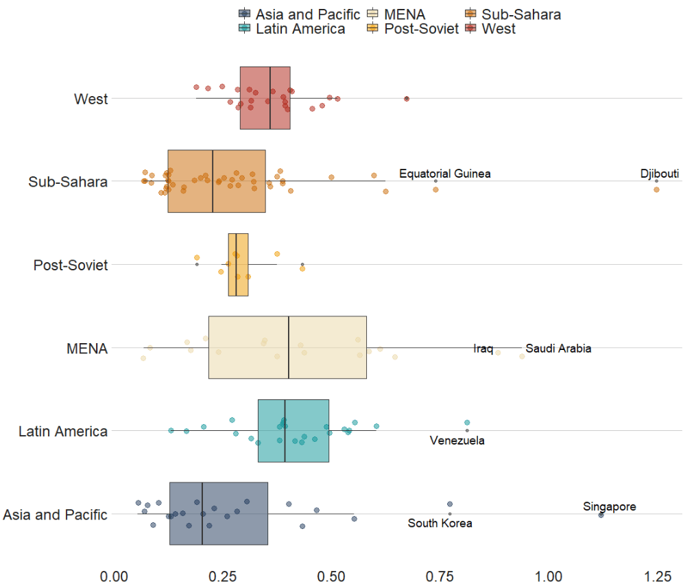
Next, we can create a barchart to look at the different levels of variables across categories. We can look at the different regime types (from complete autocracy to liberal democracy) across the six geographical regions in 2018 with the geom_bar().
my_df %>%
  filter(year == 2018) %>%
  ggplot() +
  geom_bar(aes(as.factor(region),
               fill = as.factor(regime)),
           color = "white", size = 2.5) -> my_barplot
This type of graph also tells us that Sub-Saharan Africa has the highest number of countries and the Middle East and North African (MENA) has the fewest countries.
However, if we want to look at each group and their absolute percentages, we change one line: we add geom_bar(position = "fill"). For example we can see more clearly that over 50% of Post-Soviet countries are democracies ( orange = electoral and blue = liberal democracy) as of 2018.
We can also check out the density plot of democracy levels (as a numeric level) across the six regions in 2018.
With these types of graphs, we can examine characteristics of the variables, such as whether there is a large spread or normal distribution of democracy across each region.
Click here to read more about the GGally package and click here to read their CRAN PDF.
We can use the ggside package to stack graphs together into one plot.
There are a few arguments to add when we choose where we want to place each graph.
For example, geom_xsideboxplot(aes(y = freedom_house), orientation = "y") places a boxplot for the three Freedom House democracy levels on the top of the graph, running across the x axis. If we wanted the boxplot along the y axis we would write geom_ysideboxplot(). We add orientation = "y" to indicate the direction of the boxplots.
Next we indiciate how big we want each graph to be in the panel with theme(ggside.panel.scale = .5) argument. This makes the scatterplot take up half and the boxplot the other half. If we write .3, the scatterplot takes up 70% and the boxplot takes up the remainning 30%. Last we indicade scale_xsidey_discrete() so the graph doesn’t think it is a continuous variable.
We add Darjeeling Limited color palette from the Wes Anderson movie.
Click here to learn about adding Wes Anderson theme colour palettes to graphs and plots.
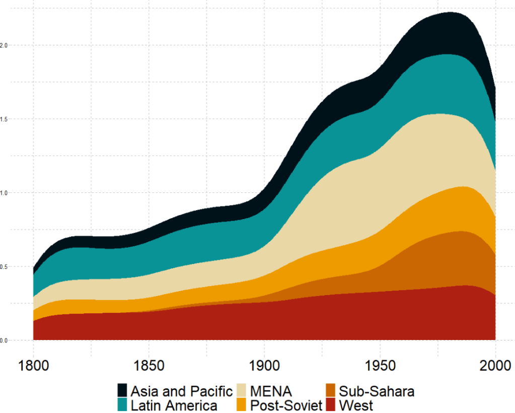
The next plot will look how variables change over time.
We can check out if there are changes in the volume and proportion of a variable across time with the geom_stream(type = "ridge") from the ggstream package.
In this instance, we will compare urban populations across regions from 1800s to today.
Click here to read more about the ggstream package and click here to read their CRAN PDF.
We can also look at interquartile ranges and spread across variables.
We will look at the urbanization rate across the different regions. The variable is calculated as the ratio of urban population to total country population.
Before, we will create a hex color vector so we are not copying and pasting the colours too many times.
If we want to look more closely at one year and print out the country names for the countries that are outliers in the graph, we can run the following function and find the outliers int he dataset for the year 1990:
In the next blog post, we will look at t-tests, ANOVAs (and their non-parametric alternatives) to see if the difference in means / medians is statistically significant and meaningful for the underlying population.
We are going to make bar charts to plot out responses to the question asked to American participaints: Should the US cooperate more or less with some key countries? The countries asked were China, Russia, Germany, France, Japan and the UK.
Before we dive in, we can find some nice hex colors for the bar chart. There are four possible responses that the participants could give: cooperate more, cooperate less, cooperate the same as before and refuse to answer / don’t know.
pal <- c("Cooperate more" = "#0a9396",
         "Same as before" = "#ee9b00",
         "Don't know" = "#005f73",
         "Cooperate less" ="#ae2012")
We first select the questions we want from the full survey and pivot the dataframe to long form with pivot_longer(). This way we have a single column with all the different survey responses. that we can manipulate more easily with dplyr functions.
Then we summarise the data to count all the survey reponses for each of the four countries and then calculate the frequency of each response as a percentage of all answers.
Then we mutate the variables so that we can add flags. The geom_flag() function from the ggflags packages only recognises ISO2 country codes in lower cases.
After that we change the factors level for the four responses so they from positive to negative views of cooperation
We use the position = "stack" to make all the responses “stack” onto each other for each country. We use stat = "identity" because we are not counting each reponses. Rather we are using the freq variable we calculated above.
pew_clean %>%
  ggplot() +
  geom_bar(aes(x = forcats::fct_reorder(country_question, freq), y = freq, fill = response_string), color = "#e5e5e5", size = 3, position = "stack", stat = "identity") +
  geom_flag(aes(x = country_question, y = -0.05 , country = country_question), color = "black", size = 20) -> pew_graph
And last we change the appearance of the plot with the theme function
pew_graph +
coord_flip() +
  scale_fill_manual(values = pal) +
  ggthemes::theme_fivethirtyeight() +
  ggtitle("Should the US cooperate more or less with the following country?") +
  theme(legend.title = element_blank(),
        legend.position = "top",
        legend.key.size = unit(2, "cm"),
        text = element_text(size = 25),
        legend.text = element_text(size = 20),
        axis.text = element_blank())
We will plot out a lollipop plot to compare EU countries on their level of income inequality, measured by the Gini coefficient.
A Gini coefficient of zero expresses perfect equality, where all values are the same (e.g. where everyone has the same income). A Gini coefficient of one (or 100%) expresses maximal inequality among values (e.g. for a large number of people where only one person has all the income or consumption and all others have none, the Gini coefficient will be nearly one).
To start, we will take data on the EU from Wikipedia. With rvest package, scrape the table about the EU countries from this Wikipedia page.
With the gsub() function, we can clean up the different variables with some regex. Namely delete the footnotes / square brackets and change the variable classes.
Next some data cleaning and grouping the year member groups into different decades. This indicates what year each country joined the EU. If we see clustering of colours on any particular end of the Gini scale, this may indicate that there is a relationship between the length of time that a country was part of the EU and their domestic income inequality level. Are the founding members of the EU more equal than the new countries? Or conversely are the newer countries that joined from former Soviet countries in the 2000s more equal. We can visualise this with the following mutations:
To create the lollipop plot, we will use the geom_segment() functions. This requires an x and xend argument as the country names (with the fct_reorder() function to make sure the countries print out in descending order) and a y and yend argument with the gini number.
All the countries in the EU have a gini score between mid 20s to mid 30s, so I will start the y axis at 20.
We can add the flag for each country when we turn the ISO2 character code to lower case and give it to the country argument.
We can see there does not seem to be a clear pattern between the year a country joins the EU and their level of domestic income inequality, according to the Gini score.
Another option for the lolliplot plot comes from the ggpubr package. It does not take the familiar aesthetic arguments like you can do with ggplot2 but it is very quick and the defaults look good!
Some quick data cleaning and then we can look at the variables in the dataset.
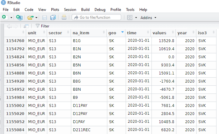
govt$year <- as.numeric(format(govt$time, format = "%Y"))
View(govt)
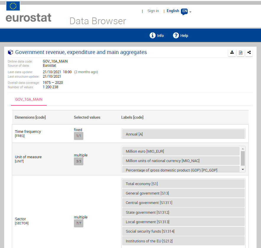
The numbers and letters are a bit incomprehensible. We can go to the Eurostat data browser site. It ascts as a codebook for all the variables we downloaded:
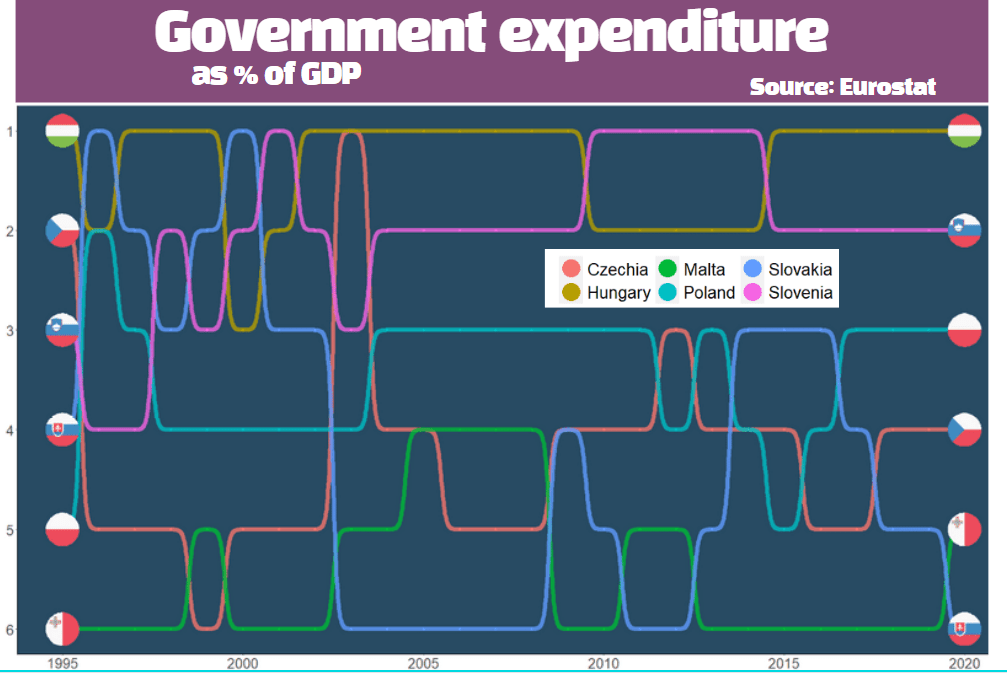
We will look at general government spending of the countries from the 2004 accession.
Also we will choose data is government expenditure as a percentage of GDP.
govt_df %<>%
  filter(sector == "S13") %>%      # General government spending
  filter(accession == 2004) %>%    # For countries that joined 2004
  filter(unit == "PC_GDP") %>%     # Spending as percentage of GDP
  filter(na_item == "TE")          # Total expenditure
A little more data cleaning! To use the ggflags package, the ISO 2 character code needs to be in lower case.
Also we will use some regex to remove the strings in the square brackets from the dataset.
To put the flags at the start of the graph and names of the countries at the end of the lines, create mini dataframes with only information for the last year and first year:
Eurostat is the statistical office of the EU. It publishes statistics and indicators that enable comparisons between countries and regions.
With the eurostat package, we can visualise some data from the EU and compare countries. In this blog, we will create a pyramid graph and a Statista-style bar chart.
First, we use the get_eurostat_toc() function to see what data we can download. We only want to look at datasets.
A simple dataset that we can download looks at populations. We can browse through the available datasets and choose the code id. We feed this into the get_eurostat() dataset.
demo <- get_eurostat(id = "demo_pjan",
                     type = "label")

View(demo)
Some quick data cleaning. First changing the date to a numeric variable. Next, extracting the number from the age variable to create a numeric variable.
I want to compare the populations of the founding EU countries (in 1957) and those that joined in 2004. I’ll take the data from Wikipedia, using the rvest package. Click here to learn how to scrape data from the Internet.
We merge the two datasets, on the same variable. In this case, I will use the ISO3C country codes (from the countrycode package). Using the names of each country is always tricky (I’m looking at you, Czechia / Czech Republic).
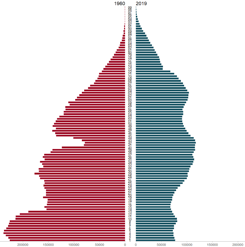
We will use the pyramid_chart() function from the ggcharts package. Click to read more about this function.
The function takes the age group (we go from 1 to 99 years of age), the number of people in that age group and we add year to compare the ages in 1960 versus in 2019.
The first graph looks at the countries that founded the EU in 1957.
Next we will use the Eurostat data on languages in the EU and compare countries in a bar chart.
I want to try and make this graph approximate the style of Statista graphs. It is far from identical but I like the clean layout that the Statista website uses.
Similar to above, we add the code to the get_eurostat() function and claen the data like above.
lang <- get_eurostat(id = "edat_aes_l22",
                     type = "label")

lang$year <- as.numeric(format(lang$time, format = "%Y"))

lang$iso2 <- tolower(countrycode(lang$geo, "country.name", "iso2c"))

lang %>%
  mutate(geo = ifelse(geo == "Germany (until 1990 former territory of the FRG)", "Germany",
                      ifelse(geo == "European Union - 28 countries (2013-2020)", "EU", geo))) %>%
  filter(n_lang == "3 languages or more") %>%
  filter(year == 2016) %>%
  filter(age == "From 25 to 34 years") %>%
  filter(!is.na(iso2)) %>%
  group_by(geo, year) %>%
  mutate(mean_age = mean(values, na.rm = TRUE)) %>%
  arrange(mean_age) -> lang_clean
Next we will create bar chart with the stat = "identity" argument.
We need to make sure our ISO2 country code variable is in lower case so that we can add flags to our graph with the ggflags package. Click here to read more about this package
lang_clean %>%
  ggplot(aes(x = reorder(geo, mean_age), y = mean_age)) +
  geom_bar(stat = "identity", width = 0.7, color = "#0a85e5", fill = "#0a85e5") +
  ggflags::geom_flag(aes(x = geo, y = -1, country = iso2), size = 8) +
  geom_text(aes(label= values), position = position_dodge(width = 0.9), hjust = -0.5, size = 5, color = "#000500") +
  labs(title = "Percentage of people that speak 3 or more languages",
       subtitle = ("(% of overall population)"),
       caption = "         Source: Eurostat ") +
  xlab("") +
  ylab("") -> lang_plot
To try approximate the Statista graphs, we add many arguments to the theme() function for the ggplot graph!
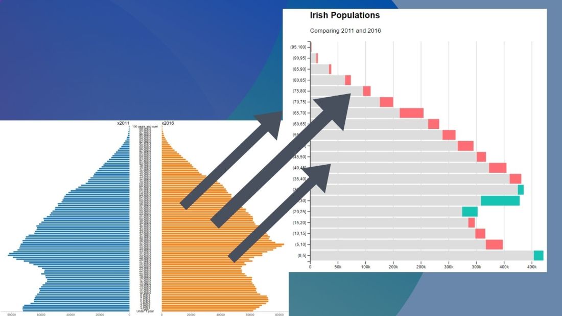
No we can create our pyramid chart with the pyramid_chart() from the ggcharts package. The first argument is the age category for both the 2011 and 2016 data. The second is the actual population counts for each year. Last, enter the group variable that indicates the year.
One problem with the pyramid chart is that it is difficult to discern any differences between the two years without really really examining each year.
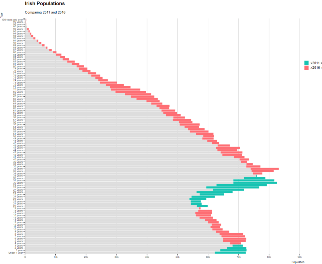
One way to more easily see the differences with the compareBars function
The compareBars package created by David Ranzolin can help to simplify comparative bar charts! It’s a super simple function to use that does a lot of visualisation leg work under the hood!
First we need to pivot the data.frame back to wide format and then input the age, and then the two groups – x2011 and x2016 – in the compareBars() function.
We can add more labels and colors to customise the graph also!
We can see that under the age of four-ish, 2011 had more at the time. And again, there were people in their twenties in 2011 compared to 2016.
However, there are more older people in 2016 than in 2011.
Similar to above it is a bit busy! So we can create groups for every five age years categories and examine the broader trends with fewer horizontal bars.
First we want to remove the word “years” from the age variable and convert it to a numeric class variable. We can easily do this with the parse_number() function from the readr package
Next we can group the age years together into five year categories, zero to 5 years, 6 to 10 years et cetera.
We use the cut() function to divide the numeric age_num variable into equal groups. We use the seq() function and input age 0 to 100, in increments of 5.
Next, we can use group_by() to calculate the sum of each population number in each five year category.
And finally, we use the distinct() function to remove the duplicated rows (i.e. we only want to keep the first row that gives us the five year category’s population count for each category.
Well this is just delightful! This package was created by Karthik Ram.
install.packages("wesanderson")
library(wesanderson)
library(hrbrthemes) # for plot themes
library(gapminder) # for data
library(ggbump) # for the bump plot
After you install the wesanderson package, you can
create a ggplot2 graph object
choose the Wes Anderson color scheme you want to use and create a palette object
add the graph object and and the palette object and behold your beautiful data
wes_palette(name, n, type = c("discrete", "continuous"))
To generate a vector of colors, the wes_palette() function requires:
name: Name of desired palette
n: Number of colors desired (i.e. how many categories so n = 4).
The names of all the palettes you can enter into the wes_anderson() function
We can use data from the gapminder package. We will look at the scatterplot between life expectancy and GDP per capita.
We feed the wes_palette() function into the scale_color_manual() with the values = wes_palette() argument.
We indicate that the colours would be the different geographic regions.
If we indicate fill in the geom_point() arguments, we would change the last line to scale_fill_manual()
We can log the gapminder variables with the mutate(across(where(is.numeric), log)). Alternatively, we could scale the axes when we are at the ggplot section of the code with the scale_*_continuous(trans='log10')
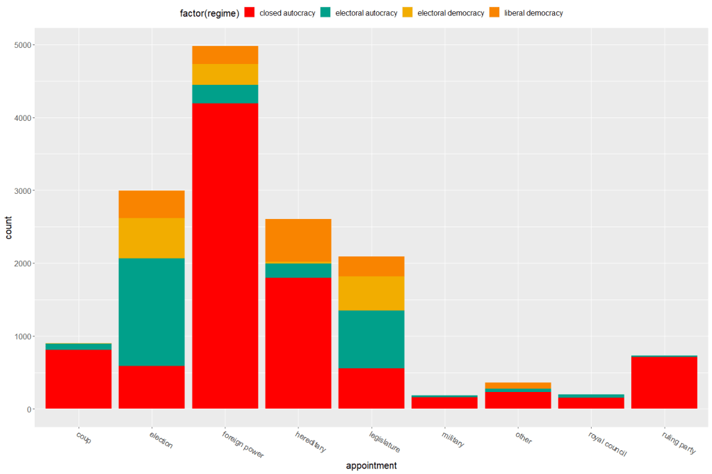
Both the regime variable and the appointment variable are discrete categories so we can use the geom_bar() function. When adding the palette to the barplot object, we can use the scale_fill_manual() function.
eighteenth_century + scale_fill_manual(values = wes_palette("Darjeeling1", n = 4)
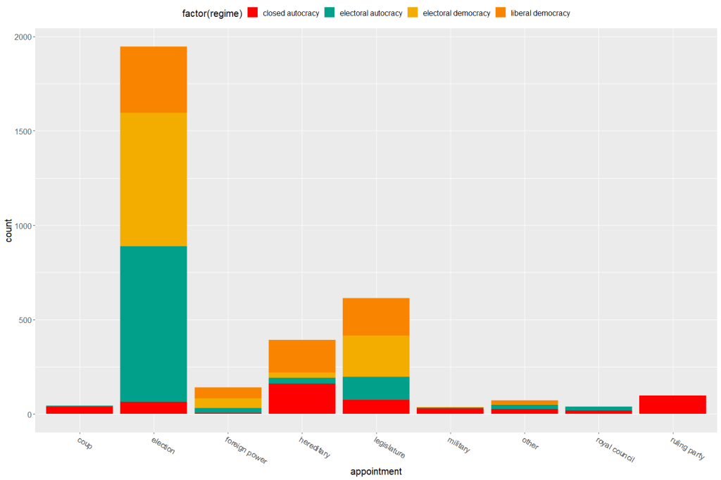
Now to compare the breakdown with countries in the 21st century (2000 to present)
Sometimes the best way to examine the relationship between our variables of interest is to plot it out and give it a good looking over. For me, it’s most helpful to see where different countries are in relation to each other and to see any interesting outliers.
For this, I can use the geom_text() function from the ggplot2 package.
I will look at the relationship between economic globalization and social globalization in OECD countries in the year 2000.
The KOF Globalisation Index, introduced by Dreher (2006) measures globalization along the economic, social and political dimension for most countries in the world
First, as always, we install and load the necessary package. This time, it is the ggplot2 package
install.packages("ggplot2")
library(ggplot2)
Next add the following code:
fin <- ggplot(oecd2000, aes(economic_globalization, social_globalization))
        + ggtitle("Relationship between Globalization Index Scores among OECD countries in 2000")
        + scale_x_continuous("Economic Globalization Index")
        + scale_y_continuous("Social Globalization Index")
        + geom_smooth(method = "lm")
        + geom_point(aes(colour = polity_score), size = 2) + labs(color = "Polity Score")
        + geom_text(hjust = 0, nudge_x = 0.5, size = 4, aes(label = country))

fin
In the aes() function, we enter the two variables we want to plot.
Then I use the next three lines to add titles to axes and graph
I use the geom_smooth() function with the “lm” method to add a best fitting regression line through the points on the plot. Click here to learn more about adding a regression line to a plot.
I add a legend to examine where countries with different democracy scores (taken from the Polity Index) are located on the globalization plane. Click here to learn about adding legends.
The last line is the geom_text() function that I use to specify that I want to label each observation (i.e. each OECD country) with its name, rather than the default dataset number.
Some geom_text() commands to use:
nudge_x (or nudge_y) slightly “nudge” the labels from their corresponding points to help minimise messy overlapping.
hjust and vjust move the text label “left”, “center”, “right”, “bottom”, “middle” or “top” of the point.
Yes, yes! There is a package that uses the color palettes of Wes Anderson movies to make graphs look just beautiful. Click here to use different Wes Anderson aesthetic themed graphs!
zissou_colors <- wes_palette("Zissou1", 100, type = "continuous")

fin + scale_color_gradientn(colours = zissou_colors)
Which outputs:
Interestingly, it seems that at the very bottom left hand corner of the plot (which shows the countries that are both low in economic globalization and low in social globalization), we have two OECD countries that score high on democracy – Japan and South Korea- right next to two countries that score the lowest in the OECD on democracy, Turkey and Mexico.
So it could be interesting to further examine why these countries from opposite ends of the democracy spectrum have similar pattern of low globalization. It puts a spanner in the proverbial works with my working theory that countries higher in democracy are more likely to be more globalized! What is special about these two high democracy countries that gives them such low scores on globalization.
If I want to graphically display the relationship between two variables, the ggplot2 package is a very handy way to produce graphs.
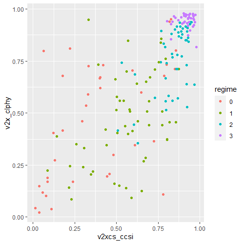
For example, I can use the ggplot2 package to graphically examine the relationship between civil society strength and freedom of citizens from torture. Also I can see whether this relationship is the same across regime types.
aes() indicates how variables are mapped to visual properties or aesthetics. The first variable goes on the x-axis and the second variable goes on the y-axis.
geom_point() creates a scatterplot style graph. Alternatives to this are geom_line(), which creates a line plot and geom_histogram() which creates a histogram plot.
ggplot(data2000, aes(v2xcs_ccsi, v2cltort)) + geom_point() +
xlab("Civil society robustness") +
ylab("Freedom from torture")
Next we can add information on regime types, a categorical variable with four levels.
0 = closed autocracy
1 = electoral autocracy
2 = electoral democracy
3 = liberal democracy
In the aes() function, add colour = regime to differentiate the four categories on the graph
Alternatively we can use the facet_wrap( ~ regime) function to create four separate scatterplots and examine the relationship separately.
ggplot(data2000, aes(v2xcs_ccsi, v2x_clphy, colour = regime)) + geom_point() + facet_wrap(~regime) + xlab("Civil society robustness") + ylab("Freedom from torture")
Lastly, we can add a linear model line (method = "lm") with a grey standard error bar (se = TRUE) in the geom_smooth() function.
ggplot(data2000, aes(v2xcs_ccsi, v2x_clphy, colour = regime)) +
geom_point() +
facet_wrap(~regime) +
geom_smooth(method = "lm", se = TRUE) +
xlab("Civil society robustness") +
ylab("Freedom from torture")
In these graphs, we can see that as civil society robustness score increases, the likelihood of a life free from torture increases! Pretty intuitive result and we could argue that there is a third variable – namely strong democratic institutions – that drives this positive relationship.
The graphs break down this relationship across four different regime types, ranging from the most autocratic in the top left hand side to the most democratic in the bottom right. There is more variety in this relationship with closed autocracies (i.e. the red points), with some points deviating far from the line.
The purple graph – liberal democracies – shows a tiny amount of variance. In liberal democracies, it appears that all countries score highly in both civil society robustness and freedom from torture!


