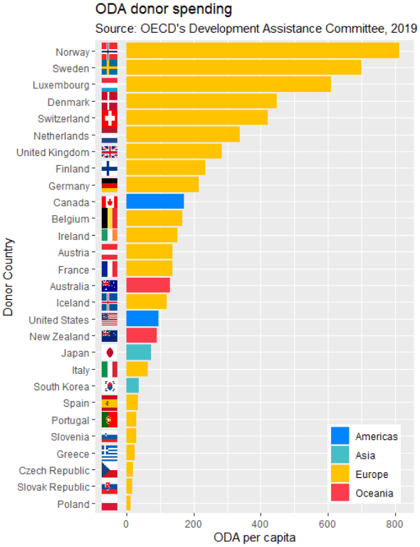
Packages we will need:
library(tidyverse)
library(rvest)
library(ggflags)
library(countrycode)
library(ggpubr)
We will plot out a lollipop plot to compare EU countries on their level of income inequality, measured by the Gini coefficient.
A Gini coefficient of zero expresses perfect equality, where all values are the same (e.g. where everyone has the same income). A Gini coefficient of one (or 100%) expresses maximal inequality among values (e.g. for a large number of people where only one person has all the income or consumption and all others have none, the Gini coefficient will be nearly one).
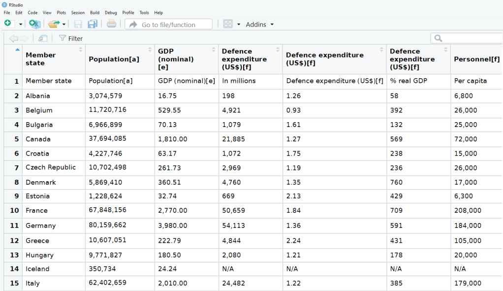
To start, we will take data on the EU from Wikipedia. With rvest package, scrape the table about the EU countries from this Wikipedia page.
Click here to read more about the rvest pacakge
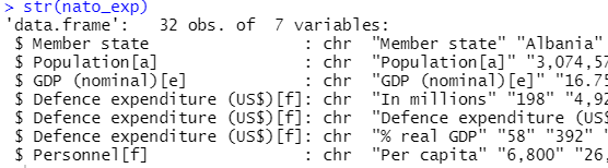
With the gsub() function, we can clean up the different variables with some regex. Namely delete the footnotes / square brackets and change the variable classes.
eu_site <- read_html("https://en.wikipedia.org/wiki/Member_state_of_the_European_Union")

eu_tables <- eu_site %>% html_table(header = TRUE, fill = TRUE)

eu_members <- eu_tables[[3]]

eu_members %<>% janitor::clean_names()  %>%
  filter(!is.na(accession))

eu_members$iso3 <- countrycode::countrycode(eu_members$geo, "country.name", "iso3c")

eu_members$accession <- as.numeric(gsub("([0-9]+).*$", "\\1",eu_members$accession))

eu_members$name_clean <- gsub("\\[.*?\\]", "", eu_members$name)

eu_members$gini_clean <- gsub("\\[.*?\\]", "", eu_members$gini)
Next some data cleaning and grouping the year member groups into different decades. This indicates what year each country joined the EU. If we see clustering of colours on any particular end of the Gini scale, this may indicate that there is a relationship between the length of time that a country was part of the EU and their domestic income inequality level. Are the founding members of the EU more equal than the new countries? Or conversely are the newer countries that joined from former Soviet countries in the 2000s more equal. We can visualise this with the following mutations:
eu_members %>%
  filter(name_clean != "Totals/Averages") %>%
  mutate(gini_numeric = as.numeric(gini_clean)) %>%
  mutate(accession_decades = ifelse(accession < 1960, "1957", ifelse(accession > 1960 & accession < 1990, "1960s-1980s", ifelse(accession == 1995, "1990s", ifelse(accession > 2003, "2000s", accession))))) -> eu_clean
To create the lollipop plot, we will use the geom_segment() functions. This requires an x and xend argument as the country names (with the fct_reorder() function to make sure the countries print out in descending order) and a y and yend argument with the gini number.
All the countries in the EU have a gini score between mid 20s to mid 30s, so I will start the y axis at 20.
We can add the flag for each country when we turn the ISO2 character code to lower case and give it to the country argument.
Click here to read more about the ggflags package
eu_clean %>%
ggplot(aes(x= name_clean, y= gini_numeric, color = accession_decades)) +
  geom_segment(aes(x = forcats::fct_reorder(name_clean, -gini_numeric),
                   xend = name_clean, y = 20, yend = gini_numeric, color = accession_decades), size = 4, alpha = 0.8) +
  geom_point(aes(color = accession_decades), size= 10) +
  geom_flag(aes(y = 20, x = name_clean, country = tolower(iso_3166_1_alpha_2)), size = 10) +
  ggtitle("Gini Coefficients of the EU countries") -> eu_plot
Last we add various theme changes to alter the appearance of the graph
eu_plot +
coord_flip() +
ylim(20, 40) +
  theme(panel.border = element_blank(),
        legend.title = element_blank(),
        axis.title = element_blank(),
        axis.text = element_text(color = "white"),
        text= element_text(size = 35, color = "white"),
        legend.text = element_text(size = 20),
        legend.key = element_rect(colour = "#001219", fill = "#001219"),
        legend.key.width = unit(3, 'cm'),
        legend.position = "bottom",
        panel.grid.major.y = element_line(linetype="dashed"),
        plot.background = element_rect(fill = "#001219"),
        panel.background = element_rect(fill = "#001219"),
        legend.background = element_rect(fill = "#001219") )
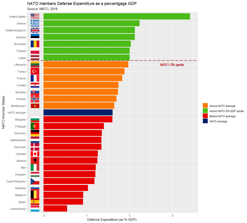
We can see there does not seem to be a clear pattern between the year a country joins the EU and their level of domestic income inequality, according to the Gini score.
Of course, the Gini coefficient is not a perfect measurement, so take it with a grain of salt.
Another option for the lolliplot plot comes from the ggpubr package. It does not take the familiar aesthetic arguments like you can do with ggplot2 but it is very quick and the defaults look good!
eu_clean %>%
  ggdotchart( x = "name_clean", y = "gini_numeric",
              color = "accession_decades",
              sorting = "descending",
              rotate = TRUE,
              dot.size = 10,
              y.text.col = TRUE,
              ggtheme = theme_pubr()) +
  ggtitle("Gini Coefficients of the EU countries") +
  theme(panel.border = element_blank(),
        legend.title = element_blank(),
        axis.title = element_blank(),
        axis.text = element_text(color = "white"),
        text= element_text(size = 35, color = "white"),
        legend.text = element_text(size = 20),
        legend.key = element_rect(colour = "#001219", fill = "#001219"),
        legend.key.width = unit(3, 'cm'),
        legend.position = "bottom",
        panel.grid.major.y = element_line(linetype="dashed"),
        plot.background = element_rect(fill = "#001219"),
        panel.background = element_rect(fill = "#001219"),
        legend.background = element_rect(fill = "#001219") )