Packages we will need
library(HH)
library(tidyverse)
library(bbplot)
library(haven)
In this blog post, we are going to recreate Pew Opinion poll graphs.
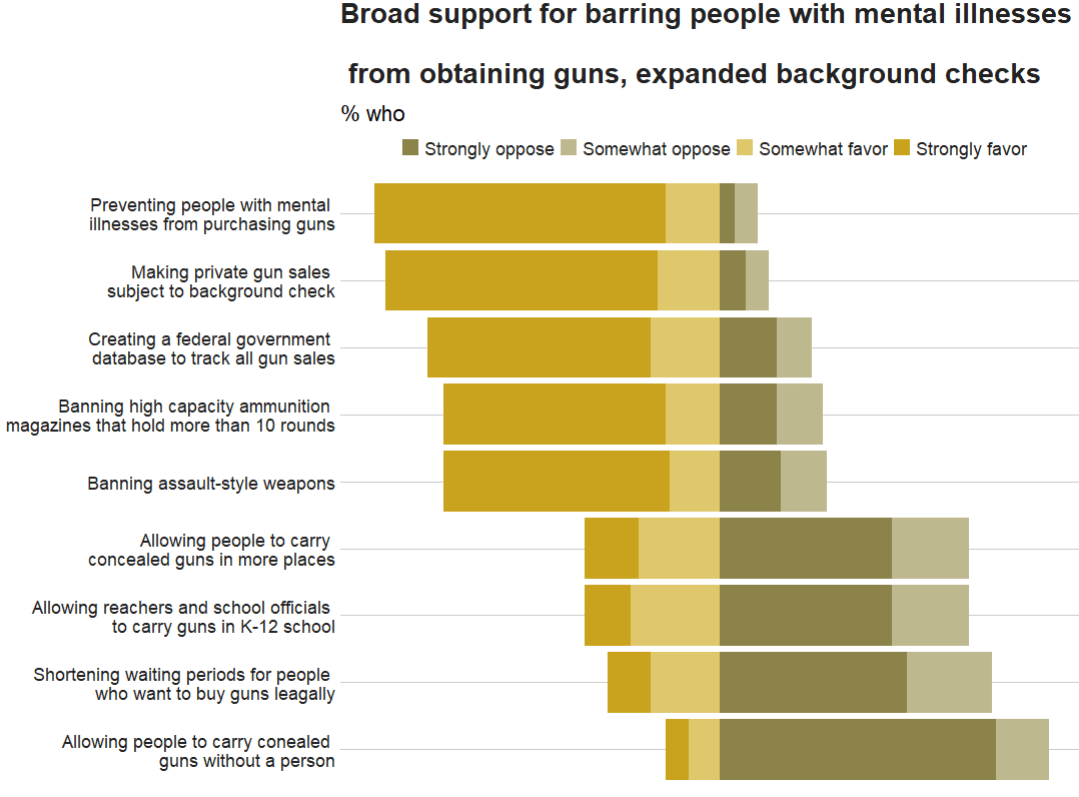
This is the plot we will try to recreate on gun control opinions of Americans:

To do this, we will download the data from the Pew website by following the link below:
atp <- read.csv(file.choose())We then select the variables related to gun control opinions
atp %>%
  select(GUNPRIORITY1_b_W87:GUNPRIORITY2_j_W87) -> gun_df
I want to rename the variables so I don’t forget what they are.
Then, we convert them all to factor variables because haven labelled class variables are sometimes difficult to wrangle…
gun_df %<>%
  select(mental_ill = GUNPRIORITY1_b_W87,
         assault_rifle = GUNPRIORITY1_c_W87,
         gun_database = GUNPRIORITY1_d_W87,
         high_cap_mag = GUNPRIORITY1_e_W87,
         gunshow_bkgd_check = GUNPRIORITY1_f_W87,
         conceal_gun =GUNPRIORITY2_g_W87,
         conceal_gun_no_permit = GUNPRIORITY2_h_W87,
         teacher_gun = GUNPRIORITY2_i_W87,
         shorter_waiting = GUNPRIORITY2_j_W87) %>%
  mutate(across(everything()), haven::as_factor(.))
Also we can convert the “Refused” to answer variables to NA if we want, so it’s easier to filter out.
gun_df %<>%
  mutate(across(where(is.factor), ~na_if(., "Refused")))
Next we will pivot the variables to long format. The new names variable will be survey_question and the responses (Strongly agree, Somewhat agree etc) will go to the new response variable!
gun_df %>%
  pivot_longer(everything(), names_to = "survey_question", values_to = "response") -> gun_long
And next we calculate counts and frequencies for each variable
gun_long %<>%
  group_by(survey_question, response) %>%
  summarise(n = n()) %>%
  mutate(freq = n / sum(n)) %>%
  ungroup()
Then we want to reorder the levels of the factors so that they are in the same order as the original Pew graph.
gun_long %>%
  mutate(survey_question = as.factor(survey_question))   %>%
   mutate(survey_question_reorder = factor(survey_question,
          levels =  c(
           "conceal_gun_no_permit",
           "shorter_waiting",
           "teacher_gun",
           "conceal_gun",
           "assault_rifle",
           "high_cap_mag",
           "gun_database",
           "gunshow_bkgd_check",
           "mental_ill"
           ))) -> gun_reordered
And we use the hex colours from the original graph … very brown… I used this hex color picker website to find the right hex numbers: https://imagecolorpicker.com/en
brown_palette <- c("Strongly oppose" = "#8c834b",
                   "Somewhat oppose" = "#beb88f",
                   "Somewhat favor" = "#dfc86c",
                   "Strongly favor" = "#caa31e")
And last, we use the geom_bar() – with position = "stack" and stat = "identity" arguments – to create the bar chart.
To add the numbers, write geom_text() function with label = frequency within aes() and then position = position_stack() with hjust and vjust to make sure you’re happy with where the numbers are
gun_reordered %>%
  filter(!is.na(response)) %>%
  mutate(frequency = round(freq * 100), 0) %>%
  ggplot(aes(x = survey_question_reorder,
             y = frequency, fill = response)) +
  geom_bar(position = "stack",
           stat = "identity") +
  coord_flip() +
  scale_fill_manual(values = brown_palette) +
  geom_text(aes(label = frequency), size = 10,
            color = "black",
            position = position_stack(vjust = 0.5)) +
  bbplot::bbc_style() +
  labs(title = "Broad support for barring people with mental illnesses
       \n from obtaining guns, expanded background checks",
       subtitle = "% who",
       caption = "Note: No answer resposes not shown.\n Source: Survey of U.S. adults conducted April 5-11 2021.") +
  scale_x_discrete(labels = c(
    "Allowing people to carry conealed \n guns without a person",
    "Shortening waiting periods for people \n who want to buy guns leagally",
    "Allowing reachers and school officials \n to carry guns in K-12 school",
    "Allowing people to carry \n concealed guns in more places",
    "Banning assault-style weapons",
    "Banning high capacity ammunition \n magazines that hold more than 10 rounds",
    "Creating a federal government \n database to track all gun sales",
    "Making private gun sales \n subject to background check",
    "Preventing people with mental \n illnesses from purchasing guns"
    ))


Unfortunately this does not have diverving stacks from the middle of the graph
We can make a diverging stacked bar chart using function likert() from the HH package.
For this we want to turn the dataset back to wider with a column for each of the responses (strongly agree, somewhat agree etc) and find the frequency of each response for each of the questions on different gun control measures.
Then with the likert() function, we take the survey question variable and with the ~tilda~ make it the product of each response. Because they are the every other variable in the dataset we can use the shorthand of the period / fullstop.
We use positive.order = TRUE because we want them in a nice descending order to response, not in alphabetical order or something like that
gun_reordered %<>%
    filter(!is.na(response)) %>%
  select(survey_question, response, freq) %>%
  pivot_wider(names_from = response, values_from = freq ) %>%
  ungroup() %>%
  HH::likert(survey_question ~., positive.order = TRUE,
            main =  "Broad support for barring people with mental illnesses
            \n from obtaining guns, expanded background checks")
With this function, it is difficult to customise … but it is very quick to make a diverging stacked bar chart.

If we return to ggplot2, which is more easy to customise … I found a solution on Stack Overflow! Thanks to this answer! The solution is to put two categories on one side of the centre point and two categories on the other!
gun_reordered %>%
filter(!is.na(response)) %>%
  mutate(frequency = round(freq * 100), 0) -> gun_final
And graph out
ggplot(data = gun_final, aes(x = survey_question_reorder,
            fill = response)) +
  geom_bar(data = subset(gun_final, response %in% c("Strongly favor",
           "Somewhat favor")),
           aes(y = -frequency), position="stack", stat="identity") +
  geom_bar(data = subset(gun_final, !response %in% c("Strongly favor",
            "Somewhat favor")),
           aes(y = frequency), position="stack", stat="identity") +
  coord_flip() +
  scale_fill_manual(values = brown_palette) +
  geom_text(data = gun_final, aes(y = frequency, label = frequency), size = 10, color = "black", position = position_stack(vjust = 0.5)) +
  bbplot::bbc_style() +
  labs(title = "Broad support for barring people with mental illnesses
       \n from obtaining guns, expanded background checks",
       subtitle = "% who",
       caption = "Note: No answer resposes not shown.\n Source: Survey of U.S. adults conducted April 5-11 2021.") +
  scale_x_discrete(labels = c(
    "Allowing people to carry conealed \n guns without a person",
    "Shortening waiting periods for people \n who want to buy guns leagally",
    "Allowing reachers and school officials \n to carry guns in K-12 school",
    "Allowing people to carry \n concealed guns in more places",
    "Banning assault-style weapons",
    "Banning high capacity ammunition \n magazines that hold more than 10 rounds",
    "Creating a federal government \n database to track all gun sales",
    "Making private gun sales \n subject to background check",
    "Preventing people with mental \n illnesses from purchasing guns"
  ))

Next to complete in PART 2 of this graph, I need to figure out how to add lines to graphs and add the frequency in the correct place


