In this blog post, we are going to run boosted decision trees with xgboost in tidymodels.
Boosted decision trees are a type of ensemble learning technique.
Ensemble learning methods combine the predictions from multiple models to create a final prediction that is often more accurate than any single model’s prediction.
The ensemble consists of a series of decision trees added sequentially, where each tree attempts to correct the errors of the preceding ones.
Similar to the previous blog, we will use Varieties of Democracy data and we will examine the relationship between judicial corruption and public sector theft.
mode specifies the type of predictive modeling that we are running.
Common modes are:
"regression" for predicting numeric outcomes,
"classification" for predicting categorical outcomes,
"censored" for time-to-event (survival) models.
The mode we choose is regression.
Next we add the number of trees to include in the ensemble.
More trees can improve model accuracy but also increase computational cost and risk of overfitting. The choice of how many trees to use depends on the complexity of the dataset and the diminishing returns of adding more trees.
We will choose 1000 trees.
tree_depth indicates the maximum depth of each tree. The depth of a tree is the length of the longest path from a root to a leaf, and it controls the complexity of the model.
Deeper trees can model more complex relationships but also increase the risk of overfitting. A smaller tree depth helps keep the model simpler and more generalizable.
Our model is quite simple, so we can choose 3.
When your model is very simple, for instance, having only one independent variable, the need for deep trees diminishes. This is because there are fewer interactions between variables to consider (in fact, no interactions in the case of a single variable), and the complexity that a model can or should capture is naturally limited.
For a model with a single predictor, starting with a lower max_depth value (e.g., 3 to 5) is sensible. This setting can provide a balance between model simplicity and the ability to capture non-linear relationships in the data.
The best way to determine the optimal max_depth is with cross-validation. This involves training models with different values of max_depth and evaluating their performance on a validation set. The value that results in the best cross-validated metric (e.g., RMSE for regression, accuracy for classification) is the best choice.
We will look at RMSE at the end of the blog.
Next we look at the min_n, which is the minimum number of data points allowed in a node to attempt a new split. This parameter controls overfitting by preventing the model from learning too much from the noise in the training data. Higher values result in simpler models.
We choose min_n of 10.
loss_reduction is the minimum loss reduction required to make a further partition on a leaf node of the tree. It’s a way to control the complexity of the model; larger values result in simpler models by making the algorithm more conservative about making additional splits.
We input a loss_reduction of 0.01.
A low value (like 0.01) means that the model will be more inclined to make splits as long as they provide even a slight improvement in loss reduction.
This can be advantageous in capturing subtle nuances in the data but might not be as critical in a simple model where the potential for overfitting is already lower due to the limited number of predictors.
sample_size determines the fraction of data to sample for each tree. This parameter is used for stochastic boosting, where each tree is trained on a random subset of the full dataset. It introduces more variation among the trees, can reduce overfitting, and can improve model robustness.
Our sample_size is 0.5.
While setting sample_size to 0.5 is a common practice in boosting to help with overfitting and improve model generalization, its optimality for a model with a single independent variable may not be suitable.
We can test different values through cross-validation and monitoring the impact on both training and validation metrics
mtry indicates the number of variables randomly sampled as candidates at each split. For regression problems, the default is to use all variables, while for classification, a commonly used default is the square root of the number of variables. Adjusting this parameter can help in controlling model complexity and overfitting.
For this regression, our mtry will equal 2 variables at each split
learn_rate is also known as the learning rate or shrinkage. This parameter scales the contribution of each tree.
We will use a learn_rate = 0.01.
A smaller learning rate requires more trees to model all the relationships but can lead to a more robust model by reducing overfitting.
Finally, engine specifies the computational engine to use for training the model. In this case, "xgboost" package is used, which stands for eXtreme Gradient Boosting.
When to use each argument:
Mode: Always specify this based on the type of prediction task at hand (e.g., regression, classification).
Trees, tree_depth, min_n, and loss_reduction: Adjust these to manage model complexity and prevent overfitting. Start with default or moderate values and use cross-validation to find the best settings.
Sample_size and mtry: Use these to introduce randomness into the model training process, which can help improve model robustness and prevent overfitting. They are especially useful in datasets with a large number of observations or features.
Learn_rate: Start with a low to moderate value (e.g., 0.01 to 0.1) and adjust based on model performance. Smaller values generally require more trees but can lead to more accurate models if tuned properly.
Engine: Choose based on the specific requirements of the dataset, computational efficiency, and available features of the engine.
The tidymodels framework in R is a collection of packages for modeling.
Within tidymodels, the parsnip package is primarily responsible for specifying models in a way that is independent of the underlying modeling engines. The set_engine() function in parsnip allows users to specify which computational engine to use for modeling, enabling the same model specification to be used across different packages and implementations.
In this blog series, we will look at some commonly used models and engines within the tidymodels package
Linear Regression (lm): The classic linear regression model, with the default engine being stats, referring to the base R stats package.
Logistic Regression (logistic_reg): Used for binary classification problems, with engines like stats for the base R implementation and glmnet for regularized regression.
Random Forest (rand_forest): A popular ensemble method for classification and regression tasks, with engines like ranger and randomForest.
Boosted Trees (boost_tree): Used for boosting tasks, with engines such as xgboost, lightgbm, and catboost.
Decision Trees (decision_tree): A base model for classification and regression, with engines like rpart and C5.0.
K-Nearest Neighbors (nearest_neighbor): A simple yet effective non-parametric method, with engines like kknn and caret.
Principal Component Analysis (pca): For dimensionality reduction, with the stats engine.
Lasso and Ridge Regression (linear_reg): For regression with regularization, specifying the penalty parameter and using engines like glmnet.
library(tidyverse)
library(haven) # import SPSS data
library(rnaturalearth) # download map data
library(countrycode) # add country codes for merging
library(gt) # create HTML tables
library(gtExtras) # customise HTML tables
In this blog, we will look at calculating a variation of the Herfindahl-Hirschman Index (HHI) for languages. This will give us a figure that tells us how diverse / how concentrated the languages are in a given country.
We will continue using the Afrobarometer survey in the post!
Click here to read more about downloading the Afrobarometer survey data in part one of the series.
You can use the file.choose() to import the Afrobarometer survey round you downloaded. It is an SPSS file, so we need to use the read_sav() function from have package
ab <- read_sav(file.choose())
First, we can quickly add the country names to the data.frame with the case_when() function
ab %>%
  mutate(country_name = case_when(
    COUNTRY == 2 ~ "Angola",
    COUNTRY == 3 ~ "Benin",
    COUNTRY == 4 ~ "Botswana",
    COUNTRY == 5 ~ "Burkina Faso",
    COUNTRY == 6 ~ "Cabo Verde",
    COUNTRY == 7 ~ "Cameroon",
    COUNTRY == 8 ~ "Côte d'Ivoire",
    COUNTRY == 9 ~ "Eswatini",
    COUNTRY == 10 ~ "Ethiopia",
    COUNTRY == 11 ~ "Gabon",
    COUNTRY == 12 ~ "Gambia",
    COUNTRY == 13 ~ "Ghana",
    COUNTRY == 14 ~ "Guinea",
    COUNTRY == 15 ~ "Kenya",
    COUNTRY == 16 ~ "Lesotho",
    COUNTRY == 17 ~ "Liberia",
    COUNTRY == 19 ~ "Malawi",
    COUNTRY == 20 ~ "Mali",
    COUNTRY == 21 ~ "Mauritius",
    COUNTRY == 22 ~ "Morocco",
    COUNTRY == 23 ~ "Mozambique",
    COUNTRY == 24 ~ "Namibia",
    COUNTRY == 25 ~ "Niger",
    COUNTRY == 26 ~ "Nigeria",
    COUNTRY == 28 ~ "Senegal",
    COUNTRY == 29 ~ "Sierra Leone",
    COUNTRY == 30 ~ "South Africa",
    COUNTRY == 31 ~ "Sudan",
    COUNTRY == 32 ~ "Tanzania",
    COUNTRY == 33 ~ "Togo",
    COUNTRY == 34 ~ "Tunisia",
    COUNTRY == 35 ~ "Uganda",
    COUNTRY == 36 ~ "Zambia",
    COUNTRY == 37 ~ "Zimbabwe")) -> ab
If we consult the Afrobarometer codebook (check out the previous blog post to access), Q2 asks the survey respondents what is their primary langugage. We will count the responses to see a preview of the languages we will be working with
Most people use Portuguese. This is because Portugese-speaking Angola had twice the number of surveys administered than most other countries. We will try remedy this oversampling later on.
We can start off my mapping the languages of the survey respondents.
We download a map dataset with the geometry data we will need to print out a map
We use right_join() to merge the map to the ab_number_languages dataset
ab_number_languages %>%
  mutate(cown = countrycode::countrycode(country_name, "country.name", "cown")) %>%
  right_join(map , by = "cown") %>%
  ggplot() +
  geom_sf(aes(geometry = geometry, fill = n),
          position = "identity", color = "grey", linewidth = 0.5) +
  scale_fill_gradient2(midpoint = 20, low = "#457b9d", mid = "white",
                       high = "#780000", space = "Lab") +
  theme_minimal() + labs(title = "Total number of languages of respondents")
ab %>% group_by(country_name) %>% count() %>%
  arrange(n)
There is an uneven number of respondents across the 34 countries. Angola has the most with 2400 and Mozambique has the fewest with 1110.
One way we can deal with that is to sample the data and run the analyse multiple times. We can the graph out the distribution of Herfindahl Index results.
The Herfindahl-Hirschman Index (HHI) is a measure of market concentration often used in economics and competition analysis. The formula for the HHI is as follows:
HHI = (s1^2 + s2^2 + s3^2 + … + sn^2)
Where:
“s1,” “s2,” “s3,” and so on represent the market shares (expressed as percentages) of individual firms or entities within a given market.
“n” represents the total number of firms or entities in that market.
Each firm’s market share is squared and then summed to calculate the Herfindahl-Hirschman Index. The result is a number that quantifies the concentration of market share within a specific industry or market. A higher HHI indicates greater market concentration, while a lower HHI suggests more competition.
And we see that the linguistic Herfindahl index is 16.4%
lang_hhi
     <dbl>
1    0.164
The Herfindahl Index ranges from 0% (perfect diversity) to 100% (perfect concentration).
16% indicates a moderate level of diversity or variation within the sample of 500 survey respondents. It’s not extremely concentrated (e.g., one dominant category) and highlight tht even in a small sample of 500 people, there are many languages spoken in Nigeria.
We can repeat this sampling a number of times and see a distribution of sample index scores.
We can also compare the Herfindahl score between all countries in the survey.
First step, we will create a function to calculate lang_hhi for a single sample, according to the HHI above.
combined_results %>%
  ggplot(aes(x = lang_hhi)) +
  geom_histogram(binwidth = 0.01,
                 fill = "#3498db",
                 alpha = 0.6, color = "#708090") +
  facet_wrap(~factor(country_name), scales = "free_y") +
  labs(title = "Distribution of Linguistic HHI", x = "HHI") +
  theme_minimal()
From the graphs, we can see that the average HHI score in the samples is pretty narrow in countries such as Sudan, Tunisia (we often see that most respondents speak the same language so there is more linguistic concentration) and in countries such as Liberia and Uganda (we often see that the diversity in languages is high and it is rare that we have a sample of 500 survey respondents that speak the same language). Countries such as Zimbabwe and Gabon are in the middle in terms of linguistic diversity and there is relatively more variation (sometimes more of the random survey respondents speak the same langage, sometimes fewer!)
The loess method in ggplot2 fits a smoothing line to our data.
We can do this with the method = "loess" in the geom_smooth() layer.
LOESS stands “Locally Weighted Scatterplot Smoothing.” (I am not sure why it is not called LOWESS … ?)
The loess line can help show non-linear relationships in the scatterplot data, while taking care of stopping the over-influence of outliers.
Loess gives more weight to nearby data points and less weight to distant ones. This means that nearby points have a greater influence on the squiggly-ness of the line.
The degree of smoothing is controlled by the span parameter in the geom_smooth() layer.
When we set the span, we can choose how many nearby data points are considered when estimating the local regression line.
A smaller span (e.g. span = 0.5) results in more local (flexible) smoothing, while a larger span (e.g. span = 1.5) produces more global (smooth) smoothing.
We will take the variables from the Varieties of Democracy dataset and plot the relationship between oil produciton and media freedoms across different regions.
df %>%
  ggplot(aes(x = log_avg_oil,
             y = avg_media)) +
  geom_point(size = 6, alpha = 0.5) +
  geom_smooth(aes(color = region),
              method = "loess",
              span = 2,
              se = FALSE,
              size = 3,
              alpha = 0.6) +
  facet_wrap(~region) +
  labs(title = "Oil and Media Corruption", subtitle = "VDEM",
       x = "Average Oil logged",
       y = "Average Media Freedom") +
  scale_color_manual(values = my_pal) +
  my_theme()
If we change the span to 0.5, we get the following graph:
span = 0.5
When examining the connection between oil production and media freedoms across various regions, there are many ways to draw the line.
If we think the relationship is linear, it is no problem to add method = "lm" to the graph.
However, if outliers might overly distort the linear relationship, method = "rlm" (robust linear model” can help to take away the power from these outliers.
Linear and robust linear models (lm and rlm) can also accommodate parametric non-linear relationships, such as quadratic or cubic, when used with a proper formula specification.
For example, “geom_smooth(method=’lm’, formula = y ~ x + I(x^2))” can be used for estimating a quadratic relationship using lm.
If the outcome variable is binary (such as “is democracy” versus “is not democracy” or “is oil producing” versus “is not oil producing”) we can use method = “glm” (which is generalised linear model). It models the log odds of a oil producing as a linear function of a predictor variable, like age.
If the relationship between age and log odds is non-linear, the gam method is preferred over glm. Both glm and gam can handle outcome variables with more than two categories, count variables, and other complexities.
The Economic Community of West African States (ECOWAS) has been in the news recently. The regional bloc is openly discussing military options in response to the coup unfolding in the capital of Niger.
This made me realise that I know VERY VERYLITTLE about the regional economic communities (REC) in Africa.
Ernest Aniche (2015: 41) argues, “the ghost of [the 1884] Berlin Conference” led to a quasi-balkanisation of African economies into spheres of colonial influence. He argues that this ghost “continues to haunt Africa […] via “neo-colonial ties” today.
To combat this balkanisation and forge a new pan-Africanist approach to the continent’s development, the African Union (AU) has focused on regional integration.
This integration was more concretely codified with 1991’s Abuja Treaty.
One core pillar on this agreement highlights a need for increasing flows of intra-African trade and decreasing the reliance on commodity exports to foreign markets (Songwe, 2019: 97)
Broadly they aim mirror the integration steps of the EU. That translates into a roadmap towards the development of:
Free Trade Areas:
AU : The African Continental Free Trade Area (AfCFTA) aims to create a single market for goods and services across the African continent, with the goal of boosting intra-African trade.
EU : The European Free Trade Association (EFTA) is a free trade area consisting of four European countries (Iceland, Liechtenstein, Norway, and Switzerland) that have agreed to remove barriers to trade among themselves.
Customs Union:
AU: The East African Community (EAC) is an REC a customs union where member states (Burundi, Kenya, Rwanda, South Sudan, Tanzania, and Uganda) have eliminated customs duties and adopted a common external tariff for trade with non-member countries.
EU: The EU’s Single Market is a customs union where goods can move freely without customs duties or other barriers across member states.
Common Market:
AU: Many RECs such the Southern African Development Community (SADC) is working towards establishing a common market that allows for the free movement of goods, services, capital, and labor among its member states.
EU: The EU is a prime example of a common market, where not only goods and services, but also people and capital, can move freely across member countries.
Economic Union:
AU: The West African Economic and Monetary Union (WAEMU) is moving towards an economic union with shared economic policies, a common currency (West African CFA franc), and coordination of monetary and fiscal policies.
EU: Has coordinated economic policies and a single currency (Euro) used by several member states.
The achievement of a political union on the continent is seen as the ultimate objective in many African countries (Hartzenberg, 2011: 2), such as the EU with its EU Parliament, Council, Commission and common foreign policy.
According to a 2012 UNCTAD report, “progress towards regional integration has, to date, been uneven, with some countries integrating better at the regional and/or subregional level and others less so”.
So over this blog, series, we will look at the RECs and see how they are contributing to African integration.
We can use the rvest package to scrape the countries and information from each Wiki page. Click here to read more about the rvest package and web scraping:
First we will look at the Arab Maghreb Union (AMU). We feed the AMU wikipedia page into the read_html() function.
With `[[`(3) we can choose the third table on the Wikipedia page.
With the janitor package, we can can clean the names (such as remove capital letters and awkward spaces) and ensure more uniform variable names.
We pull() the country variable and it becomes a vector, then turn it into a data frame with as.data.frame() . Alternatively we can just select this variable with the select() function.
We create some more variables for each REC group when we merge them all together later.
We will use the str_detect() function from the stringr package to filter out the total AMU column row as it is non-country.
We can see in the table on the Wikipedia page, that it contains a row for all the Arab Maghreb Union countries at the end. But we do not want this.
We use the str_detect() function to check if the “country” variable contains the string pattern we feed in. The ignore_case = TRUE makes the pattern matching case-insensitive.
The ! before str_detect() means that we remove this row that matches our string pattern.
We can use the fixed() function to make sure that we match a string as a literal pattern rather than a regular expression pattern / special regex symbols. This is not necessary in this situation, but it is always good to know.
For this example, I will paste the code to make a map of the countries with country flags.
To add the flags on the map, we need longitude and latitude coordinates to feed into the x and y arguments in the geom_flag(). We can scrape these from the web too.
We add iso2 character codes in all lower case (very important for the geom_flag() step)) with the countrycode() function.
And we can create the map of AMU countries with the following code:
amu_map %>%
  ggplot() +
  geom_sf(aes(geometry = geometry,
              fill = as.factor(amu_map),
              alpha = 0.9),
          position = "identity",
          color = "black") +
  ggflags::geom_flag(data = . %>% filter(rec_abbrev == "AMU"),
                     aes(x = longitude,
                         y = latitude + 0.5,
                         country = iso_a2),
                     size = 6) +
  scale_fill_manual(values = c("#FFFFFF", "#b766b4"))
Next we will look at the Common Market for Eastern and Southern Africa.
If we don’t want to scrape the data from the Wikipedia article, we can feed in the vector of countries – separated by commas – into a data.frame() function.
Then we can separate the vector of countries into rows, and a cell for each country.
In the next blog post, we will complete the dataset (most importantly, clean up the country duplicates and make data visualisations / some data analysis with political and economic data!
Hartzenberg, T. (2011). Regional integration in Africa. World Trade Organization Publications: Economic Research and Statistics Division Staff Working Paper (ERSD-2011-14). PDF available
UNCTAD (United Nations Conference on Trade and Development) (2021). Economic Development in Africa Report 2021: Reaping the Potential Benefits of the African Continental Free Trade Area for Inclusive Growth. PDF available
Songwe, V. (2019). Intra-African trade: A path to economic diversification and inclusion. Coulibaly, Brahima S, Foresight Africa: Top Priorities for the Continent in, 97-116. PDF available
The World Development Indicators (WDI) package by Vincent Arel-Bundock provides access to a database of hundreds of economic development indicators from the World Bank.
Examples of variables include population, GDP, education, health, and poverty, school attendance rates.
Reference: Arel-Bundock, V. (2017). WDI: World Development Indicators (R Package Version 2.7.1).
This package by Steve Miller helps you download data related to peace and conflict studies, including the Correlates of War project.
Examples of variables include Alliance Treaty Obligations and Provisions (ATOP), Thompson and Dreyer’s (2012) strategic rivalry data, fractionalization/polarization estimates from the Composition of Religious and Ethnic Groups (CREG) Project, and Uppsala Conflict Data Program (UCDP) data on civil and inter-state conflicts.
Data can come in either country-year, event-level or dyadic-level.
eurostat provides access to a wide range of statistics and data on the European Union and its member states, covering topics such as population, economics, society, and the environment.
Examples of variables include employment, inflation, education, crime, and air pollution. The package was authored by Leo Lahti.
The Varieties of Democracy package by Staffan I. Lindberg et al. provides data on a range of indicators related to democracy and governance in countries around the world, including measures of electoral democracy, civil liberties, and human rights.
Examples of variables include freedom of speech, rule of law, corruption, government transparency, and voter turnout.
Reference: Lindberg, S. I., & Stepanova, N. (2020). vdem: Varieties of Democracy Project (R Package Version 1.6).
5. democracyData
This package by Xavier Marquez: provides data on a range of variables related to democracy, including elections, political parties, and civil liberties.
This package by Frederick Solt provides a simple way to download and import data from the Inter-university Consortium for Political and Social Research (ICPSR) archive into R. This is for easy replication and sharing of data. The package includes datasets from different fields of study, including sociology, political science, and economics.
Reference: Solt, F. (2020). icpsrdata: Reproducible Data Retrieval from the ICPSR Archive (R Package Version 0.5.0).
7. Quandl
This R package by Quandl provides an interface to access financial and economic data from over 20 different sources. Examples of variables include stock prices, futures, options, and macroeconomic indicators. The package includes functions to easily download data directly into R and perform tasks such as plotting, transforming, and aggregating data. Additional functions for managing and exploring data, such as search tools and data caching features, are also available.
Here are five examples of variables in the Quandl package:
The essurvey package is an R package that provides access to data from the European Social Survey (ESS), which is a large-scale survey that collects data on attitudes, values, and behavior across Europe. The package includes functions to easily download, read, and analyze data from the ESS, and also includes documentation and sample code to help users get started.
Examples of variables in the ESS dataset include political interest, trust in political institutions, social class, education level, and income. The package was authored by David Winter and includes a variety of useful functions for working with ESS data.
Reference: Winter, D. (2021). essurvey: Download Data from the European Social Survey on the Fly. R package version 3.4.4. Retrieved from https://cran.r-project.org/package=essurvey.
manifestoR is an R package that provides access to data from the Comparative Manifesto Project (CMP), which is a cross-national research project that analyzes political party manifestos. The package allows users to easily download and analyze data from the CMP, including party positions on various policy issues and the salience of those issues across time and space.
Examples of variables in the CMP dataset include party positions on taxation, immigration, the environment, healthcare, and education. The package was authored by Jörg Matthes, Marcelo Jenny, and Carsten Schwemmer.
Reference: Matthes, J., Jenny, M., & Schwemmer, C. (2018). manifestoR: Access and Process Data and Documents of the Manifesto Project. R package version 1.2.1. Retrieved from https://cran.r-project.org/package=manifestoR.
The unvotes data package provides historical voting data of the United Nations General Assembly, including votes for each country in each roll call, as well as descriptions and topic classifications for each vote.
The classifications included in the dataset cover a wide range of issues, including human rights, disarmament, decolonization, and Middle East-related issues.
The gravity package in R, created by Anna-Lena Woelwer, provides a set of functions for estimating gravity models, which are used to analyze bilateral trade flows between countries. The package includes the gravity_data dataset, which contains information on trade flows between pairs of countries.
Examples of variables that may affect trade in the dataset are GDP, distance, and the presence of regional trade agreements, contiguity, common official language, and common currency.
iso_o: ISO-Code of country of origin iso_d: ISO-Code of country of destination distw: weighted distance gdp_o: GDP of country of origin gdp_d: GDP of country of destination rta: regional trade agreement flow: trade flow contig: contiguity comlang_off: common official language comcur: common currency
Next we count the number of counties that have given Ireland a Taoiseach with the group_by() and count() functions.
One Taoiseach, Eamon DeValera, was born in New York City, so he will not be counted in the graph.
Sorry Dev.
We can join the Taoisech dataset to the county_geom dataframe by the county variable. The geometric data has the counties in capital letters, so we convert tolower() letters.
Add the geometry variable in the main ggplot() function.
We can play around with the themes arguments and add the theme_map() from the ggthemes package to get the look you want.
I added a few hex colors to indicate the different number of countries.
If you want a transparent background, we save it with the ggsave() function and set the bg argument to “transparent”
Number of years each party held the office of Taoiseach
Source: Wikipedia
Fianna Fail has held the office over twice as long as Fine Fail and much more than the one term of W Cosgrove (the only CnG Taoiseach)
Last we can create an icon waffle plots. We can use little man icons to create a waffle plot of all the men (only men) in the office, colored by political party.
I got the code and tutorial for making these waffle plots from the following website:
It was very helpful in walking step by step through how to download the FontAwesome icons into the correct font folder on the PC. I had a heap of issues with the wrong versions of the htmltools.
Next we will find out the number of Taoisigh from each party:
And we fill a vector of values into the waffle() function. We can play around with the number of rows. Three seems like a nice fit for the number of icons (glyphs).
Also, we choose the type of glyph image we want with the the use_glyph() argument.
The options are the glyphs that come with the Font Awesome package we downloaded with extrafonts.
Check out part 1 of this blog where you can follow along how to scrape the data that we will use in this blog. It will create a dataset of the current MPs in the Irish Dail.
In this blog, we will use the ggparliament package, created by Zoe Meers.
With this dataset of the 33rd Dail, we will reduce it down to get the number of seats that each party holds.
If we don’t want to graph every party, we can lump most of the smaller parties into an “other” category. We can do this with the fct_lump_n() function from the forcats package. I want the top five biggest parties only in the graph. The rest will be colored as “Other”.
  <fct>        <int>
1 Fianna Fail     38
2 Sinn Fein       37
3 Fine Gael       35
4 Independent     19
5 Other           19
6 Green Party     12
Before we graph, I found the hex colors that represent each of the biggest Irish political party. We can create a new party color variables with the case_when() function and add each color.
If we view the dail_33_coord data.frame we can see that the parliament_data() function calculated new x and y coordinate variables for the semi-circle graph.
I don’t know what the theta variables is for… But there it is also … maybe to make circular shapes?
We feed the x and y coordinates into the ggplot() function and then add the geom_parliament_seat() layer to produce our graph!
Click here to check out the PDF for the ggparliament package
dail_33_coord %>%
  ggplot(aes(x = x,
             y = y,
             colour = party_groups)) +
  geom_parliament_seats(size = 20) -> dail_33_plot
And we can make it look more pretty with bbc_style() plot and colors.
This blogpost will walk through how to scrape and clean up data for all the members of parliament in Ireland.
Or we call them in Irish, TDs (or Teachtaí Dála) of the Dáil.
We will start by scraping the Wikipedia pages with all the tables. These tables have information about the name, party and constituency of each TD.
On Wikipedia, these datasets are on different webpages.
This is a pain.
However, we can get around this by creating a list of strings for each number in ordinal form – from1st to 33rd. (because there have been 33 Dáil sessions as of January 2023)
We don’t need to write them all out manually: “1st”, “2nd”, “3rd” … etc.
Instead, we can do this with the toOrdinal() function from the package of the same name.
dail_sessions <- sapply(1:33,toOrdinal)
Next we can feed this vector of strings with the beginning of the HTML web address for Wikipedia as a string.
We paste the HTML string and the ordinal number strings together with the stri_paste() function from the stringi package.
This iterates over the length of the dail_sessions vector (in this case a length of 33) and creates a vector of each Wikipedia page URL.
With the first_name variable, we can use the new pacakge by Kalimu. This guesses the gender of the name. Later, we can track the number of women have been voted into the Dail over the years.
Of course, this will not be CLOSE to 100% correct … so later we will have to check each person manually and make sure they are accurate.
In the next blog, we will graph out the various images to explore these data in more depth. For example, we can make a circle plot with the composition of the current Dail with the ggparliament package.
We can go into more depth with it in the next blog… Stay tuned.
When you come across data from the World Bank, often it is messy.
So this blog will go through how to make it more tidy and more manageable in R
For this blog, we will look at World Bank data on financial aid. Specifically, we will be using values for net ODA received as percentage of each country’s GNI. These figures come from the Development Assistance Committee of the Organisation for Economic Co-operation and Development (DAC OECD).
The year values are character strings, not numbers. So we will convert with parse_number(). This parses the first number it finds, dropping any non-numeric characters before the first number and all characters after the first number.
oda %>%
     mutate(year = parse_number(year)) -> oda
Next we will move from the year variable to ODA variable. There are many ODA values that are empty. We can see that there are 145 instances of empty character strings.
oda %>%
  count(oda_gni) %>%
  arrange(oda_gni)
So we can replace the empty character strings with NA values using the na_if() function. Then we can use the parse_number() function to turn the character into a string.
oda %>%
  mutate(oda_gni = na_if(oda_gni, "")) %>%
  mutate(oda_gni = parse_number(oda_gni)) -> oda
Now we need to delete the year variables that have no values.
oda %<>%
  filter(!is.na(year))
Also we need to delete non-countries.
The dataset has lots of values for regions that are not actual countries. If you only want to look at politically sovereign countries, we can filter out countries that do not have a Correlates of War value.
oda %<>%
  mutate(cow = countrycode(oda$country_name, "country.name", 'cown')) %>%
  filter(!is.na(cow))
We can also make a variable for each decade (1990s, 2000s etc).
Next we will pivot the variables to long format. The new names variable will be survey_question and the responses (Strongly agree, Somewhat agree etc) will go to the new response variable!
And we use the hex colours from the original graph … very brown… I used this hex color picker website to find the right hex numbers: https://imagecolorpicker.com/en
And last, we use the geom_bar() – with position = "stack" and stat = "identity" arguments – to create the bar chart.
To add the numbers, write geom_text() function with label = frequency within aes() and then position = position_stack() with hjust and vjust to make sure you’re happy with where the numbers are
gun_reordered %>%
  filter(!is.na(response)) %>%
  mutate(frequency = round(freq * 100), 0) %>%
  ggplot(aes(x = survey_question_reorder,
             y = frequency, fill = response)) +
  geom_bar(position = "stack",
           stat = "identity") +
  coord_flip() +
  scale_fill_manual(values = brown_palette) +
  geom_text(aes(label = frequency), size = 10,
            color = "black",
            position = position_stack(vjust = 0.5)) +
  bbplot::bbc_style() +
  labs(title = "Broad support for barring people with mental illnesses
       \n from obtaining guns, expanded background checks",
       subtitle = "% who",
       caption = "Note: No answer resposes not shown.\n Source: Survey of U.S. adults conducted April 5-11 2021.") +
  scale_x_discrete(labels = c(
    "Allowing people to carry conealed \n guns without a person",
    "Shortening waiting periods for people \n who want to buy guns leagally",
    "Allowing reachers and school officials \n to carry guns in K-12 school",
    "Allowing people to carry \n concealed guns in more places",
    "Banning assault-style weapons",
    "Banning high capacity ammunition \n magazines that hold more than 10 rounds",
    "Creating a federal government \n database to track all gun sales",
    "Making private gun sales \n subject to background check",
    "Preventing people with mental \n illnesses from purchasing guns"
    ))
Unfortunately this does not have diverving stacks from the middle of the graph
We can make a diverging stacked bar chart using function likert() from the HH package.
For this we want to turn the dataset back to wider with a column for each of the responses (strongly agree, somewhat agree etc) and find the frequency of each response for each of the questions on different gun control measures.
Then with the likert() function, we take the survey question variable and with the ~tilda~ make it the product of each response. Because they are the every other variable in the dataset we can use the shorthand of the period / fullstop.
We use positive.order = TRUE because we want them in a nice descending order to response, not in alphabetical order or something like that
gun_reordered %<>%
    filter(!is.na(response)) %>%
  select(survey_question, response, freq) %>%
  pivot_wider(names_from = response, values_from = freq ) %>%
  ungroup() %>%
  HH::likert(survey_question ~., positive.order = TRUE,
            main =  "Broad support for barring people with mental illnesses
            \n from obtaining guns, expanded background checks")
With this function, it is difficult to customise … but it is very quick to make a diverging stacked bar chart.
If we return to ggplot2, which is more easy to customise … I found a solution on Stack Overflow! Thanks to this answer! The solution is to put two categories on one side of the centre point and two categories on the other!
ggplot(data = gun_final, aes(x = survey_question_reorder,
            fill = response)) +
  geom_bar(data = subset(gun_final, response %in% c("Strongly favor",
           "Somewhat favor")),
           aes(y = -frequency), position="stack", stat="identity") +
  geom_bar(data = subset(gun_final, !response %in% c("Strongly favor",
            "Somewhat favor")),
           aes(y = frequency), position="stack", stat="identity") +
  coord_flip() +
  scale_fill_manual(values = brown_palette) +
  geom_text(data = gun_final, aes(y = frequency, label = frequency), size = 10, color = "black", position = position_stack(vjust = 0.5)) +
  bbplot::bbc_style() +
  labs(title = "Broad support for barring people with mental illnesses
       \n from obtaining guns, expanded background checks",
       subtitle = "% who",
       caption = "Note: No answer resposes not shown.\n Source: Survey of U.S. adults conducted April 5-11 2021.") +
  scale_x_discrete(labels = c(
    "Allowing people to carry conealed \n guns without a person",
    "Shortening waiting periods for people \n who want to buy guns leagally",
    "Allowing reachers and school officials \n to carry guns in K-12 school",
    "Allowing people to carry \n concealed guns in more places",
    "Banning assault-style weapons",
    "Banning high capacity ammunition \n magazines that hold more than 10 rounds",
    "Creating a federal government \n database to track all gun sales",
    "Making private gun sales \n subject to background check",
    "Preventing people with mental \n illnesses from purchasing guns"
  ))
Next to complete in PART 2 of this graph, I need to figure out how to add lines to graphs and add the frequency in the correct place
Last September 17th 2021 marked the 30th anniversary of the entry of North Korea and South Korea into full membership in the United Nations. Prior to this, they were only afforded observer status.
Join them all together and filter out any country that does not have the word “Korea” in its name.
un_votes %>%
  inner_join(un_votes_issues, by = "rcid") %>%
  inner_join(country_votes, by = "rcid") %>%
  mutate(year = format(date, format = "%Y")) %>%
  filter(grepl("Korea", country)) -> korea_un
First we can make a wordcloud of all the different votes for which they voted YES. Is there a discernable difference in the types of votes that each country supported?
First, download the stop words that we can remove (such as the, and, if)
data("stop_words")
Then I will make a North Korean dataframe of all the votes for which this country voted YES. I remove some of the messy formatting with the gsub argument and count the occurence of each word. I get rid of a few of the procedural words that are more related to the technical wording of the resolutions, rather than related to the tpoic of the vote.
Next we can look more in detail at the votes that they countries abstained from voting in.
We can use the tidytext function that reorders the geom_bar in each country. You can read the blog of Julie Silge to learn more about the functions, it is a bit tricky but it fixes the problem of randomly ordered bars across facets.
South Korea was far more likely to abstain from votes that North Korea on all issues
Next we can simply plot out the Human Rights votes that each country voted to support. Even though South Korea has far higher human rights scores, North Korea votes in support of more votes on this topic.
The 1980s were a prolific time for the UNGA with voting, with arms control being the largest share of votes. And it has stablised in the decades since.
According to Urquhart (1995) in his article, “Selecting the World’s CEO”,
From the outset, the U.N. secretary general has been an important part of the institution, not only as its chief executive, but as both symbol and guardian of the original vision of the organization. There, however, specific agreement has ended. The United Nations, like any important organization, needs strong and independent leadership, but it is an inter- governmental organization, and govern ments have no intention of giving up control of it. While the secretary-general can be extraordinarily useful in times of crisis, the office inevitably embodies something more than international coop eration, sometimes even an unwelcome hint of supranationalism. Thus, the atti- tude of governments toward the United Nations’ chief and only elected official is and has been necessarily ambivalent.
(Urquhart, 1995: 21)
So who are these World CEOs? We’ll examine more in this dataset.
The table we scrape is a bit of a hot mess in this state …. but we can fix it
We can first use the clean_names() function from the janitor package
A quick way to clean up the table and keep only the rows with the names of the Secretaries-General is to use the distinct() function. Last we filter out the rows and select out the columns we don’t want.
Already we can see a much cleaner table. However, the next problem is that the names and their years of birth / death are in one cell.
Also the dates in office are combined together.
So we can use the separate() function from tidyr to make new variables for each piece of information.
First we will separate the name of the Secretary-General from their date of birth and death.
We supply the two new variable names to the into = argument.
We then use the regex code pattern [()] to indicate where we want to separate the character string into two separate columns. In this instance the regex pattern is for what is after the round brackets (
I want to remove the original cluttered varaible so remove = TRUE
sg_clean %<>%
  separate(
    col = secretary_general_born_died,
    into = c("sec_gen", "born_died"),
    sep = '[()]',
    remove = TRUE)
We can repeat this step to create a separate born and died variable. This time the separator symbol is a hyphen And so we do not need regex pattern; we can just indicate a hyphen.
sg_clean %<>%
  separate(
    col = born_died,
    into = c("born", "died"),
    sep = '–',
    remove = TRUE)
And I want to ignore the “present” variable, so I extract the numbers with the parse_number() function, converting things from characters to numbers
sg_clean %<>%
  mutate(born = parse_number(born))
Last, we repeat with the dates in office. This is also easily seperated by indicating the hyphen.
sg_clean %<>%
  separate(
    col = dates_in_office,
    into = c("start_office", "end_office"),
    sep = '–',
    remove = TRUE)
We convert the word “present” to the actual present date
For this blog post, we will look at UN peacekeeping missions and compare across regions.
Despite the criticisms about some operations, the empirical record for UN peacekeeping records has been robust in the academic literature
“In short, peacekeeping intervenes in the most difficult cases, dramatically increases the chances that peace will last, and does so by altering the incentives of the peacekept, by alleviating their fear and mistrust of each other, by preventing and controlling accidents and misbehavior by hard-line factions, and by encouraging political inclusion” (Goldstone, 2008: 178).
The data on the current and previous PKOs (peacekeeping operations) will come from the Wikipedia page. But the variables do not really lend themselves to analysis as they are.
Once we have the url, we scrape all the tables on the Wikipedia page in a few lines
We then bind the completed and current mission data.frames
rbind(pko_complete, pko_current) -> pko
Then we clean the variable names with the function from the janitor package.
pko_df <-  pko %>%
  janitor::clean_names()
Next we’ll want to create some new variables.
We can make a new row for each country that is receiving a peacekeeping mission. We can paste all the countries together and then use the separate function from the tidyr package to create new variables.
pko_countries %>%
  ggplot(mapping = aes(x = decade,
                       y = duration,
                       fill = decade)) +
  geom_boxplot(alpha = 0.4) +
  geom_jitter(aes(color = decade),
              size = 6, alpha = 0.8, width = 0.15) +
   coord_flip() +
  geom_curve(aes(x = "1950s", y = 60, xend = "1940s", yend = 72),
  arrow = arrow(length = unit(0.1, "inch")), size = 0.8, color = "black",
   curvature = -0.4) +
  annotate("text", label = "First Mission to Kashmir",
           x = "1950s", y = 49, size = 8, color = "black") +
  geom_curve(aes(x = "1990s", y = 46, xend = "1990s", yend = 32),
             arrow = arrow(length = unit(0.1, "inch")), size = 0.8, color = "black",curvature = 0.3) +
  annotate("text", label = "Most Missions after the Cold War",
           x = "1990s", y = 60, size = 8, color = "black") +

  bbplot::bbc_style() + ggtitle("Duration of Peacekeeping Missions")
Years
Following the end of the Cold War, there were renewed calls for the UN to become the agency for achieving world peace, and the agency’s peacekeeping dramatically increased, authorizing more missions between 1991 and 1994 than in the previous 45 years combined.
We can use a waffle plot to see which decade had the most operation missions. Waffle plots are often seen as more clear than pie charts.
To get the data ready for a waffle chart, we just need to count the number of peacekeeping missions (i.e. the number of rows) in each decade. Then we fill the groups (i.e. decade) and enter the n variable we created as the value.
In this post, we are going to scrape NATO accession data from Wikipedia and turn it into panel data. This means turning a list of every NATO country and their accession date into a time-series, cross-sectional dataset with information about whether or not a country is a member of NATO in any given year.
This is helpful for political science analysis because simply a dummy variable indicating whether or not a country is in NATO would lose information about the date they joined. The UK joined NATO in 1948 but North Macedonia only joined in 2020. A simple binary variable would not tell us this if we added it to our panel data.
We will first scrape a table from the Wikipedia page on NATO member states with a few functions form the rvest pacakage.
Our dataset now has 60 observations. We see Albania joined in 2009 and is still a member in 2020, for example.
Next we will use the complete() function from the tidyr package to fill all the dates in between 1948 until 2020 in the dataset. This will increase our dataset to 2,160 observations and a row for each country each year.
Nect we will group the dataset by country and fill the nato_member status variable down until the most recent year.
epr_indo <- read_csv('/mnt/data/epr_indo.csv')

# Expand the data to have a row for each year for each group
epr_indo_expanded <- epr_indo %>%
  rowwise() %>%
  mutate(year = list(seq(from, to))) %>%
  unnest(year) %>%
  select(-from, -to)

# Pivot the data to wide format with separate ethnicity, share, and broad_cat columns
epr_indo_wide <- epr_indo_expanded %>%
  group_by(statename, year) %>%
  mutate(index = row_number()) %>%
  ungroup() %>%
  pivot_wider(
    id_cols = c(statename, year),
    names_from = index,
    values_from = c(group, size, broad_cat),
    names_sep = "_"
  ) %>%
  # Renaming the columns for ethnicity, share, and broad category
  rename_with(~ str_replace(., "group_", "ethnicity_"), starts_with("group_")) %>%
  rename_with(~ str_replace(., "size_", "share_"), starts_with("size_")) %>%
  rename_with(~ str_replace(., "broad_cat_", "broad_cat_"), starts_with("broad_cat_"))
For this blog, we are going to look at the titles of all countries’ heads of state, such as Kings, Presidents, Emirs, Chairman … understandably, there are many many many ways to title the leader of a country.
First, we will download the PACL dataset from the democracyData package.
Click here to read more about this super handy package:
We are going to look at the npost variable; this captures the political title of the nominal head of stage. This can be King, President, Sultan et cetera!
pacl %>%
  count(npost) %>%
  arrange(desc(n))
If we count the occurence of each title, we can see there are many ways to be called the head of a country!
"president"                         3693
"prime minister"                    2914
"king"                               470
"Chairman of Council of Ministers"   229
"premier"                            169
"chancellor"                         123
"emir"                               117
"chair of Council of Ministers"      111
"head of state"                       90
"sultan"                              67
"chief of government"                 63
"president of the confederation"      63
""                                    44
"chairman of Council of Ministers"    44
"shah"                                33

# ... with 145 more rows
155 groups is a bit difficult to meaningfully compare.
So we can collapse some of the groups together and lump all the titles that occur relatively seldomly – sometimes only once or twice – into an “other” category.
First, we use grepl() function to take the word president and chair (chairman, chairwoman, chairperson et cetera) and add them into broader categories.
Also, we use the tolower() function to make all lower case words and there is no confusion over the random capitalisation.
Now, instead of 155 types of leader titles, we have 10 types and the rest are all bundled into the Other Leader Type category
President            4370
Prime Minister       2945
Chairperson           520
King                  470
Other Leader Type     225
Premier               169
Chancellor            123
Emir                  117
Head Of State          90
Sultan                 67
Chief Of Government    63
The forcast package has three other ways to lump the variables together.
First, we can quickly look at fct_lump_min().
We can set the min argument to 100 and look at how it condenses the groups together:
President       4370
Prime Minister  2945
Chairperson      520
King             470
Other Type       445
Premier          169
Chancellor       123
Emir             117
We can see that if the post appears fewer than 100 times, it is now in the Other Type category. In the previous example, Head Of State only appeared 90 times so it didn’t make it.
Next we look at fct_lump_lowfreq().
This function lumps together the least frequent levels. This one makes sure that “other” category remains as the smallest group. We don’t add another numeric argument.
President       4370
Prime Minister  2945
Other Type      1844
This one only has three categories and all but president and prime minister are chucked into the Other type category.
Last, we can look at the fct_lump_n() to make sure we have a certain number of groups. We add n = 5 and we create five groups and the rest go to the Other type category.
President       4370
Prime Minister  2945
Other Type       685
Chairperson      520
King             470
Premier          169
Next we can make a simple graph counting the different leader titles in free, partly free and not free Freedom House countries. We will use the download_fh() from DemocracyData package again
fh <- download_fh()
We will use the reorder_within() function from tidytext package.
Click here to read the full blog post explaining the function from Julia Silge’s blog.
First we add Freedom House data with the inner_join() function
Then we use the fct_lump_n() and choose the top five categories (plus the Other Type category we make)
Using reorder_within(), we order the titles from most to fewest occurences WITHIN each status group:
pacl %<>%
  mutate(npost = reorder_within(npost, n, status))
To plot the columns, we use geom_col() and separate them into each Freedom House group, using facet_wrap(). We add scales = "free y" so that we don’t add every title to each group. Without this we would have empty spaces in the Free group for Emir and King. So this step removes a lot of clutter.
Last, I manually added the colors to each group (which now have longer names to reorder them) so that they are consistent across each group. I am sure there is an easier and less messy way to do this but sometimes finding the easier way takes more effort!
We add the scale_x_reordered() function to clean up the names and remove everything from the underscore in the title label.
In this post, we will look at easy ways to graph data from the democracyData package.
The two datasets we will look at are the Anckar-Fredriksson dataset of political regimes and Freedom House Scores.
Regarding democracies, Anckar and Fredriksson (2018) distinguish between republics and monarchies. Republics can be presidential, semi-presidential, or parliamentary systems.
Within the category of monarchies, almost all systems are parliamentary, but a few countries are conferred to the category semi-monarchies.
Autocratic countries can be in the following main categories: absolute monarchy, military rule, party-based rule, personalist rule, and oligarchy.
I want to only look at regimes types in the final year in the dataset – which is 2018 – so we filter only one year before we merge with the map data.frame.
The geom_polygon() part is where we indiciate the variable we want to plot. In our case it is the regime category
anckar %>%
 filter(year == max(year)) %>%
  inner_join(world_map, by = c("cown")) %>%
  mutate(regimebroadcat = ifelse(region == "Libya", 'Military rule', regimebroadcat)) %>%
  ggplot(aes(x = long, y = lat, group = group)) +
  geom_polygon(aes(fill = regimebroadcat), color = "white", size = 1)
library(democracyData)
library(tidyverse)
library(magrittr)       # for pipes
library(ggstream)       # proportion plots
library(ggthemes)       # nice ggplot themes
library(forcats)        # reorder factor variables
library(ggflags)        # add flags
library(peacesciencer)  # more great polisci data
library(countrycode)    # add ISO codes to countries
This blog will highlight some quick datasets that we can download with this nifty package.
To install the democracyData package, it is best to do this via the github of Xavier Marquez:
remotes::install_github("xmarquez/democracyData", force = TRUE)
library(democracyData)
We can download the dataset from the Democracy and Dictatorship Revisited paper by Cheibub Gandhi and Vreeland (2010) with the redownload_pacl() function. It’s all very simple!
pacl <- redownload_pacl()
This gives us over 80 variables, with information on things such as regime type, geographical data, the name and age of the leaders, and various democracy variables.
We are going to focus on the different regimes across the years.
The six-fold regime classification Cheibub et al (2010) present is rooted in the dichotomous classification of regimes as democracy and dictatorship introduced in Przeworski et al. (2000). They classify according to various metrics, primarily by examining the way in which governments are removed from power and what constitutes the “inner sanctum” of power for a given regime. Dictatorships can be distinguished according to the characteristics of these inner sanctums. Monarchs rely on family and kin networks along with consultative councils; military rulers confine key potential rivals from the armed forces within juntas; and, civilian dictators usually create a smaller body within a regime party—a political bureau—to coopt potential rivals. Democracies highlight their category, depending on how the power of a given leadership ends
We can change the regime variable from numbers to a factor variables, describing the type of regime that the codebook indicates:
Before we make the graph, we can give traffic light hex colours to the types of democracy. This goes from green (full democracy) to more oranges / reds (autocracies):
This describes political conditions in every country (including tenures and personal characteristics of world leaders, the types of political institutions and political regimes in effect, election outcomes and election announcements, and irregular events like coups)
Again, to download this dataset with the democracyData package, it is very simple:
reign <- download_reign()
I want to compare North and South Korea since their independence from Japan and see the changes in regimes and democracy scores over the years.
Next, we can easily download Freedom House or Polity 5 scores.
The Freedom House Scores default dataset ranges from 1972 to 2020, covering around 195 countries (depending on the year)
fh <- download_fh()
Alternatively, we can look at Polity Scores. This default dataset countains around 190 ish countries (again depending on the year and the number of countries in existance at that time) and covers a far longer range of years; from 1880 to 2018.
polityiv <- redownload_polityIV()
Alternatively, to download democracy scores, we can also use the peacesciencer dataset. Click here to read more about this package:
We may to use specific hex colours for our graphs. I always prefer these deeper colours, rather than the pastel defaults that ggplot uses. I take them from coolors.co website!
While North Korea has been consistently ruled by the Kim dynasty, South Korea has gone through various types of government and varying levels of democracy!
References
Cheibub, J. A., Gandhi, J., & Vreeland, J. R. (2010). . Public choice, 143(1), 67-101.
Przeworski, A., Alvarez, R. M., Alvarez, M. E., Cheibub, J. A., Limongi, F., & Neto, F. P. L. (2000). Democracy and development: Political institutions and well-being in the world, 1950-1990 (No. 3). Cambridge University Press.
If we look at the table, some of the surveys started in Feb but ended in March. We want to extract the final section (i.e. the March section) and use that.
So we use grepl() to find rows that have both Feb AND March, and just extract the March section. If it only has one of those months, we leave it as it is.
Following that, we use the parse_number() function from tidyr package to extract the first number found in the string and create a day_number varible (with integer class now)
We want to take these two variables we created and combine them together with the unite() function from tidyr again! We want to delete the variables after we unite them. But often I want to keep the original variables, so usually I change the argument remove to FALSE.
We indicate we want to have nothing separating the vales with the sep = "" argument
And we convert this new date into Date class with as.Date() function.
Here is a handy cheat sheet to help choose the appropriate % key so the format recognises the dates. I will never memorise these values, so I always need to refer to this site.
We have days as numbers (1, 2, 3) and abbreviated 3 character month (Jan, Feb, Mar), so we choose %d and %b
After than, we need to clean the actual numbers, remove the percentage signs and convert from character to number class. We use the str_extract() and the regex code to extract the number and not keep the percentage sign.
Some of the different polls took place on the same day. So we will take the average poll favourability value for each candidate on each day with the group_by() function
We can create variables to help us filter different groups of candidates. If we want to only look at the largest candidates, we can makes an important variable and then filter
We can lump the candidates that do not have data from every poll (i.e. the smaller candidate) and add them into the “other_undecided” category with the fct_lump_min() function from the forcats package
I want to only look at the main two candidates from the main parties that have been polling in the 40% range – Lee and Yoon – as well as the data for Ahn (who recently dropped out and endorsed Yoon).
Last, with the annotate() functions, we can also add an annotation arrow and text to add some more information about Ahn Cheol-su the candidate dropping out.
annotate("text", x = as.Date("2022-02-11"), y = 13, label = "Ahn dropped out just as the polling blackout began", size = 10, color = "white") +
annotate(geom = "curve", x = as.Date("2022-02-25"), y = 13, xend = as.Date("2022-03-01"), yend = 10,
curvature = -.3, arrow = arrow(length = unit(2, "mm")), size = 1, color = "white")
We will just have to wait until next Wednesday / Thursday to see who is the winner ~
library(tidyverse) # of course
library(ggridges) # density plots
library(GGally) # correlation matrics
library(stargazer) # tables
library(knitr) # more tables stuff
library(kableExtra) # more and more tables
library(ggrepel) # spread out labels
library(ggstream) # streamplots
library(bbplot) # pretty themes
library(ggthemes) # more pretty themes
library(ggside) # stack plots side by side
library(forcats) # reorder factor levels
Before jumping into any inferentional statistical analysis, it is helpful for us to get to know our data.
That always means plotting and visualising the data and looking at the spread, the mean, distribution and outliers in the dataset.
Before we plot anything, a simple package that creates tables in the stargazer package. We can examine descriptive statistics of the variables in one table.
Click here to read this practically exhaustive cheat sheet for the stargazer package by Jake Russ. I refer to it at least once a week. Thank you, Jack.
I want to summarise a few of the stats, so I write into the summary.stat() argument the number of observations, the mean, median and standard deviation.
The kbl() and kable_classic() will change the look of the table in R (or if you want to copy and paste the code into latex with the type = "latex" argument).
In HTML, they do not appear.
To find out more about the knitr kable tables, click here to read the cheatsheet by Hao Zhu.
Choose the variables you want, put them into a data.frame and feed them into the stargazer() function
stargazer(my_df_summary,
covariate.labels = c("Corruption index",
"Civil society strength",
'Rule of Law score',
"Physical Integerity Score",
"GDP growth"),
summary.stat = c("n", "mean", "median", "sd"),
type = "html") %>%
kbl() %>%
kable_classic(full_width = F, html_font = "Times", font_size = 25)
Statistic
N
Mean
Median
St. Dev.
Corruption index
179
0.477
0.519
0.304
Civil society strength
179
0.670
0.805
0.287
Rule of Law score
173
7.451
7.000
4.745
Physical Integerity Score
179
0.696
0.807
0.284
GDP growth
163
0.019
0.020
0.032
Next, we can create a barchart to look at the different levels of variables across categories. We can look at the different regime types (from complete autocracy to liberal democracy) across the six geographical regions in 2018 with the geom_bar().
my_df %>%
filter(year == 2018) %>%
ggplot() +
geom_bar(aes(as.factor(region),
fill = as.factor(regime)),
color = "white", size = 2.5) -> my_barplot
This type of graph also tells us that Sub-Saharan Africa has the highest number of countries and the Middle East and North African (MENA) has the fewest countries.
However, if we want to look at each group and their absolute percentages, we change one line: we add geom_bar(position = "fill"). For example we can see more clearly that over 50% of Post-Soviet countries are democracies ( orange = electoral and blue = liberal democracy) as of 2018.
We can also check out the density plot of democracy levels (as a numeric level) across the six regions in 2018.
With these types of graphs, we can examine characteristics of the variables, such as whether there is a large spread or normal distribution of democracy across each region.
Click here to read more about the GGally package and click here to read their CRAN PDF.
We can use the ggside package to stack graphs together into one plot.
There are a few arguments to add when we choose where we want to place each graph.
For example, geom_xsideboxplot(aes(y = freedom_house), orientation = "y") places a boxplot for the three Freedom House democracy levels on the top of the graph, running across the x axis. If we wanted the boxplot along the y axis we would write geom_ysideboxplot(). We add orientation = "y" to indicate the direction of the boxplots.
Next we indiciate how big we want each graph to be in the panel with theme(ggside.panel.scale = .5) argument. This makes the scatterplot take up half and the boxplot the other half. If we write .3, the scatterplot takes up 70% and the boxplot takes up the remainning 30%. Last we indicade scale_xsidey_discrete() so the graph doesn’t think it is a continuous variable.
We add Darjeeling Limited color palette from the Wes Anderson movie.
Click here to learn about adding Wes Anderson theme colour palettes to graphs and plots.
The next plot will look how variables change over time.
We can check out if there are changes in the volume and proportion of a variable across time with the geom_stream(type = "ridge") from the ggstream package.
In this instance, we will compare urban populations across regions from 1800s to today.
Click here to read more about the ggstream package and click here to read their CRAN PDF.
We can also look at interquartile ranges and spread across variables.
We will look at the urbanization rate across the different regions. The variable is calculated as the ratio of urban population to total country population.
Before, we will create a hex color vector so we are not copying and pasting the colours too many times.
If we want to look more closely at one year and print out the country names for the countries that are outliers in the graph, we can run the following function and find the outliers int he dataset for the year 1990:
In the next blog post, we will look at t-tests, ANOVAs (and their non-parametric alternatives) to see if the difference in means / medians is statistically significant and meaningful for the underlying population.
Before we graph the energy sources, we can tidy up the variable names with the janitor package. We next select column 2 to 12 which looks at the sources for electricity generation. Other rows are aggregates and not the energy-related categories we want to look at.
Next we pivot the dataset longer to make it more suitable for graphing.
We can extract the last two digits from the month dataset to add the year variable.
First we can use the geom_stream from the ggstream package. There are three types of plots: mirror, ridge and proportion.
First we will plot the proportion graph.
Select the different types of energy we want to compare, we can take the annual values, rather than monthly with the tried and trusted group_by() and summarise().
Optionally, we can add the bbc_style() theme for the plot and different hex colors with scale_fill_manual() and feed a vector of hex values into the values argument.
library(tidyverse)
library(magrittr) # for pipes
library(ggrepel) # to stop overlapping labels
library(ggflags)
library(countrycode) # if you want create the ISO2C variable
Her graph compares Dr. Who actors and their average audience rating across their run as the Doctor on the show. So I have very liberally copied her code for my plot on OECD countries.
That is the beauty of TidyTuesday and the ability to be inspired and taught by other people’s code.
I originally was going to write a blog about how to download data from the OECD R package. However, my attempts to download the data leads to an unpleasant looking error and ends the donwload request.
I will try to work again on that blog in the future when the package is more established.
So, instead, I went to the OECD data website and just directly downloaded data on level of trust that citizens in each of the OECD countries feel about their governments.
Then I cleaned up the data in excel and used countrycode() to add ISO2 and country name data.
Click here to read more about the countrycode() package.
First I will only look at EU countries. I tried with all the countries from the OECD but it was quite crowded and hard to read.
I add region data from another dataset I have. This step is not necessary but I like to colour my graphs according to categories. This time I am choosing geographic regions.
When we plot the graph, we need a few geom arguments.
Along the x axis we have all the countries, and reorder them from most trusting of their goverments to least trusting.
We will color the points with one of the four geographic regions.
We use geom_jitter() rather than geom_point() for the different yearly trust values to make the graph a little more interesting.
I also make the sizes scaled to the year in the aes() argument. Again, I did this more to look interesting, rather than to convey too much information about the different values for trust across each country. But smaller circles are earlier years and grow larger for each susequent year.
The geom_hline() plots a vertical line to indicate the average trust level for all countries.
We then use the geom_segment() to horizontally connect the country’s individual average (the yend argument) to the total average (the y arguement). We can then easily see which countries are above or below the total average. The x and xend argument, we supply the country_name variable twice.
Next we use the geom_flag(), which comes from the ggflags package. In order to use this package, we need the ISO 2 character code for each country in lower case!
Click here to read more about the ggflags package.
We can see that countries in southern Europe are less trusting of their governments than in other regions. Western countries seem to occupy the higher parts of the graph, with France being the least trusting of their government in the West.
There is a large variation in Northern countries. However, if we look at the countries, we can see that the Scandinavian countries are more trusting and the Baltic countries are among the least trusting. This shows they are more similar in their trust levels to other Post-Soviet countries.
Next we can look into see if there is a relationship between democracy scores and level of trust in the goverment with a geom_point() scatterplot
The geom_smooth() argument plots a linear regression OLS line, with a standard error bar around.
We want the labels for the country to not overlap so we use the geom_label_repel() from the ggrepel package. We don’t want an a in the legend, so we add show.legend = FALSE to the arguments
We will plot out a lollipop plot to compare EU countries on their level of income inequality, measured by the Gini coefficient.
A Gini coefficient of zero expresses perfect equality, where all values are the same (e.g. where everyone has the same income). A Gini coefficient of one (or 100%) expresses maximal inequality among values (e.g. for a large number of people where only one person has all the income or consumption and all others have none, the Gini coefficient will be nearly one).
To start, we will take data on the EU from Wikipedia. With rvest package, scrape the table about the EU countries from this Wikipedia page.
With the gsub() function, we can clean up the different variables with some regex. Namely delete the footnotes / square brackets and change the variable classes.
Next some data cleaning and grouping the year member groups into different decades. This indicates what year each country joined the EU. If we see clustering of colours on any particular end of the Gini scale, this may indicate that there is a relationship between the length of time that a country was part of the EU and their domestic income inequality level. Are the founding members of the EU more equal than the new countries? Or conversely are the newer countries that joined from former Soviet countries in the 2000s more equal. We can visualise this with the following mutations:
To create the lollipop plot, we will use the geom_segment() functions. This requires an x and xend argument as the country names (with the fct_reorder() function to make sure the countries print out in descending order) and a y and yend argument with the gini number.
All the countries in the EU have a gini score between mid 20s to mid 30s, so I will start the y axis at 20.
We can add the flag for each country when we turn the ISO2 character code to lower case and give it to the country argument.
We can see there does not seem to be a clear pattern between the year a country joins the EU and their level of domestic income inequality, according to the Gini score.
Another option for the lolliplot plot comes from the ggpubr package. It does not take the familiar aesthetic arguments like you can do with ggplot2 but it is very quick and the defaults look good!
In this blog, we will try to replicate this graph from Eurostat!
It compares all European countries on their Digitical Intensity Index scores in 2020. This measures the use of different digital technologies by enterprises.
The higher the score, the higher the digital intensity of the enterprise, ranging from very low to very high.
First, we will download the digital index from Eurostat with the get_eurostat() function.
Click here to learn more about downloading data on EU from the Eurostat package.
Next some data cleaning. To copy the graph, we will aggregate the different levels into very low, low, high and very high categories with the grepl() function in some ifelse() statements.
The variable names look a bit odd with lots of blank space because I wanted to space out the legend in the graph to replicate the Eurostat graph above.
Next I fliter out the year I want and aggregate all industry groups (from the sizen_r2 variable) in each country to calculate a single DII score for each country.
Some quick data cleaning and then we can look at the variables in the dataset.
govt$year <- as.numeric(format(govt$time, format = "%Y"))
View(govt)
The numbers and letters are a bit incomprehensible. We can go to the Eurostat data browser site. It ascts as a codebook for all the variables we downloaded:
We will look at general government spending of the countries from the 2004 accession.
Also we will choose data is government expenditure as a percentage of GDP.
govt_df %<>%
filter(sector == "S13") %>% # General government spending
filter(accession == 2004) %>% # For countries that joined 2004
filter(unit == "PC_GDP") %>% # Spending as percentage of GDP
filter(na_item == "TE") # Total expenditure
A little more data cleaning! To use the ggflags package, the ISO 2 character code needs to be in lower case.
Also we will use some regex to remove the strings in the square brackets from the dataset.
To put the flags at the start of the graph and names of the countries at the end of the lines, create mini dataframes with only information for the last year and first year:
Eurostat is the statistical office of the EU. It publishes statistics and indicators that enable comparisons between countries and regions.
With the eurostat package, we can visualise some data from the EU and compare countries. In this blog, we will create a pyramid graph and a Statista-style bar chart.
First, we use the get_eurostat_toc() function to see what data we can download. We only want to look at datasets.
A simple dataset that we can download looks at populations. We can browse through the available datasets and choose the code id. We feed this into the get_eurostat() dataset.
demo <- get_eurostat(id = "demo_pjan",
type = "label")
View(demo)
Some quick data cleaning. First changing the date to a numeric variable. Next, extracting the number from the age variable to create a numeric variable.
I want to compare the populations of the founding EU countries (in 1957) and those that joined in 2004. I’ll take the data from Wikipedia, using the rvest package. Click here to learn how to scrape data from the Internet.
We merge the two datasets, on the same variable. In this case, I will use the ISO3C country codes (from the countrycode package). Using the names of each country is always tricky (I’m looking at you, Czechia / Czech Republic).
We will use the pyramid_chart() function from the ggcharts package. Click to read more about this function.
The function takes the age group (we go from 1 to 99 years of age), the number of people in that age group and we add year to compare the ages in 1960 versus in 2019.
The first graph looks at the countries that founded the EU in 1957.
Next we will use the Eurostat data on languages in the EU and compare countries in a bar chart.
I want to try and make this graph approximate the style of Statista graphs. It is far from identical but I like the clean layout that the Statista website uses.
Similar to above, we add the code to the get_eurostat() function and claen the data like above.
lang <- get_eurostat(id = "edat_aes_l22",
type = "label")
lang$year <- as.numeric(format(lang$time, format = "%Y"))
lang$iso2 <- tolower(countrycode(lang$geo, "country.name", "iso2c"))
lang %>%
mutate(geo = ifelse(geo == "Germany (until 1990 former territory of the FRG)", "Germany",
ifelse(geo == "European Union - 28 countries (2013-2020)", "EU", geo))) %>%
filter(n_lang == "3 languages or more") %>%
filter(year == 2016) %>%
filter(age == "From 25 to 34 years") %>%
filter(!is.na(iso2)) %>%
group_by(geo, year) %>%
mutate(mean_age = mean(values, na.rm = TRUE)) %>%
arrange(mean_age) -> lang_clean
Next we will create bar chart with the stat = "identity" argument.
We need to make sure our ISO2 country code variable is in lower case so that we can add flags to our graph with the ggflags package. Click here to read more about this package
lang_clean %>%
ggplot(aes(x = reorder(geo, mean_age), y = mean_age)) +
geom_bar(stat = "identity", width = 0.7, color = "#0a85e5", fill = "#0a85e5") +
ggflags::geom_flag(aes(x = geo, y = -1, country = iso2), size = 8) +
geom_text(aes(label= values), position = position_dodge(width = 0.9), hjust = -0.5, size = 5, color = "#000500") +
labs(title = "Percentage of people that speak 3 or more languages",
subtitle = ("(% of overall population)"),
caption = " Source: Eurostat ") +
xlab("") +
ylab("") -> lang_plot
To try approximate the Statista graphs, we add many arguments to the theme() function for the ggplot graph!
If we want to convey nuance in the data, sometimes that information is lost if we display many groups in a pie chart.
According to Bernard Marr, our brains are used to equal slices when we think of fractions of a whole. When the slices aren’t equal, as often is the case with real-world data, it’s difficult to envision the parts of a whole pie chart accurately.
Below are some slight alternatives that we can turn to and visualise different values across groups.
I’m going to compare regions around the world on their total energy consumption levels since the 1900s.
First, we can download the region data with information about the geography and income levels for each group, using the ne_countries() function from the rnaturalearth package.
Next, we will download national military capabilities (NMC) dataset. These variables – which attempt to operationalize a country’s power – are military expenditure, military personnel, energy consumption, iron and steel production, urban population, and total population. It serves as the basis for the most widely used indicator of national capability, CINC (Composite Indicator of National Capability) and covers the period 1816-2016.
To download them in one line of code, we use the create_stateyears() function from the peacesciencer package.
states <- create_stateyears(mry = FALSE) %>% add_nmc()
Click here to read more about downloading Correlates of War and other IR variables from the peacesciencer package
Next we add a UN location code so we can easily merge both datasets we downloaded!
First, we will create one high income group. The map dataset has a separate column for OECD and non-OECD countries. But it will be easier to group them together into one category. We do with with the ifelse() function within mutate().
Next we filter out any country that is NA in the dataset, just to keep it cleaner.
We then group the dataset according to income group and sum all the primary energy consumption in each region since 1900.
When we get to the ggplotting, we want order the income groups from biggest to smallest. To do this, we use the reorder() function with income_grp as the second argument.
To create the coxcomb chart, we need the geom_bar() and coord_polar() lines.
With the coord_polar() function, it takes the following arguments :
theta – the variable we map the angle to (either x or y)
start – indicates the starting point from 12 o’clock in radians
direction – whether we plot the data clockwise (1) or anticlockwise (-1)
We feed in a theta of “x” (this is important!), then a starting point of 0 and direction of -1.
Next we add nicer colours with hex values and label the legend in the scale_fill_manual() function.
I like using the fonts and size stylings in the bbc_style() theme.
Last we can delete some of the ticks and text from the plot to make it cleaner.
Last we add our title and source!
states_df %>%
mutate(income_grp = ifelse(income_grp == "1. High income: OECD", "1. High income", ifelse(income_grp == "2. High income: nonOECD", "1. High income", income_grp))) %>%
filter(!is.na(income_grp)) %>%
filter(year > 1899) %>%
group_by(income_grp) %>%
summarise(sum_pec = sum(pec, na.rm = TRUE)) %>%
ggplot(aes(x = reorder(sum_pec, income_grp), y = sum_pec, fill = as.factor(income_grp))) +
geom_bar(stat = "identity") +
coord_polar("x", start = 0, direction = -1) +
ggthemes::theme_pander() +
scale_fill_manual(
values = c("#f94144", "#f9c74f","#43aa8b","#277da1"),
labels = c("High Income", "Upper Middle Income", "Lower Middle Income", "Low Income"), name = "Income Level") +
bbplot::bbc_style() +
theme(axis.text = element_blank(),
axis.title.x = element_blank(),
axis.title.y = element_blank(),
axis.ticks = element_blank(),
panel.grid = element_blank()) +
ggtitle(label = "Primary Energy Consumption across income levels since 1900", subtitle = "Source: Correlates of War CINC")
We can compare to the number of countries in each region :
states_df %>%
mutate(income_grp = ifelse(income_grp == "1. High income: OECD", "1. High income",
ifelse(income_grp == "2. High income: nonOECD", "1. High income", income_grp))) %>%
filter(!is.na(income_grp)) %>%
filter(year == 2016) %>%
count(income_grp) %>%
ggplot(aes(reorder(n, income_grp), n, fill = as.factor(income_grp))) +
geom_bar(stat = "identity") +
coord_polar("x", start = 0, direction = - 1) +
ggthemes::theme_pander() +
scale_fill_manual(
values = c("#f94144", "#f9c74f","#43aa8b","#277da1"),
labels = c("High Income", "Upper Middle Income", "Lower Middle Income", "Low Income"),
name = "Income Level") +
bbplot::bbc_style() +
theme(axis.text = element_blank(),
axis.title.x = element_blank(),
axis.title.y = element_blank(),
axis.ticks = element_blank(),
panel.grid = element_blank()) +
ggtitle(label = "Number of countries per region")
Another variation is the waffle plot!
It is important we do not install the CRAN version, but rather the version in development. I made the mistake of installing the non-github version and nothing worked.
When you want to create a dataset for large-n political science analysis from scratch, it can get muddled fast. Some tips I have found helpful to create clean data ready for panel data analysis.
The partial argument indicates how we want to deal with states that is independent for only part of the year. We can indicate “any”, “exact”, “first” or “last”.
For this example, I want to create a dataset starting in 1990 and ending in 2020. I put useGW = FALSE because I want to use the COW list of states.
We can see that the early 1990s saw the creation of many states after the end of the Soviet Union. Since 2011, the dataset levels out at 195 (after the creation of South Sudan)
Next, we can add the country name with the countrycode() function from the countrycode package. We feed in the cowcode variable and add the full country names. Click here to read more about the function in more detail and see other options to add country ISO code, for example.
I’ll first add some basic variables, such as population, GDP per capita and infant mortality. We can do this with the WDI() function. The indicator code for population is SP.POP.TOTL so we add that to the indicator argument. (If we wanted only a few countries, we can add a vector of ISO2 code strings to the country argument).
POP <- WDI(country = "all",
indicator = 'SP.POP.TOTL',
start = 1990,
end = 2020)
The default variable name for population is the long string, so I’ll quickly change that
When we download World Bank data, it comes with aggregated data for regions and economic groups. If we only want in our dataset the variables for countries, we have to delete the extra rows that we don’t want. We have two options for this.
The first option is to add the cow codes and then filter out all the rows that do not have a cow code (i.e. all non-countries)
Then we re-organise the variables a bit more nicely in the dataset with select() and keep only the countries with filter() and the !is.na argument that will remove any row with NA values in the cow_code column.
Alternatively, we can merge the World Bank variables with our states df and it can filter out any row that is not a sovereign, independent state.
In the merge() function, we use by to indicate the columns by which we want to merge the datasets. The all argument indicates which dataset we want to keep and NOT delete rows that do not match. If we typed all = TRUE, it would not delete any rows that do not match.
You can see that df_v2 has 85 more rows that df_v3. So it is up to you which way you want to use, and which countries you want to include each year. The df_v3 contains states that are more likely to be recognised as sovereign. df_v2 contains more territories.
Let’s look at the prevalence of NA values across our dataset.
We can use the plot_missing() function from the states package.
plot_missing(df_v3, ccode = "cowcode")
It is good to see a lot of green!
Let’s add some constant variables, such as geographical information. The rnaturalearth package is great for plotting maps. Click here to see how to plot maps with the package.
For this dataset, we just want the various geography group variables to add to our dataset:
This regions_sf is not in a data.frame object, it is a simple features dataset. So we delete the variables that make it an sf object and explicitly coerce it to data.frame
Warning message:
In countrycode(regions_df$admin, "country.name", "cown") :
Some values were not matched unambiguously: Antarctica, Kashmir, Republic of Serbia, Somaliland, Western Sahara
Sometimes we cannot avoid hand-coding some of our variables. In this case, we don’t want to drop Serbia because the countrycode function couldn’t add the right code.
So we can check what its COW code is and add it to the dataset directly with the mutate function and an ifelse condition:
If we look at the countries, we can spot a problem. For Cyprus, it was counted twice – due to the control by both Turkish and Greek authorities. We can delete one of the versions because all the other World Bank variables look at Cyprus as one entity so they will be the same across both variables.
regions_df <- regions_df %>% slice(-c(38))
Next we merge the new geography variables to our dataset. Note that we only merge by one variable – the COW code – and indicate that we want to merge for every row in the x dataset (i.e. the first dataset in the function). So it will apply to each year row for each country!
We with the aggr() function from the VIM package to look at the prevalence of NA values. It’s always good to keep an eye on this and catch badly merged or badly specified datasets!
Click here for PART 2, where we add some Correlates of War data and interesting variables with the peacesciencer package .


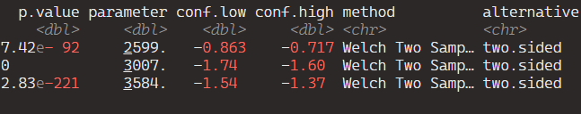


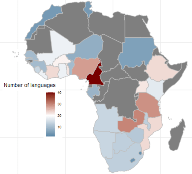


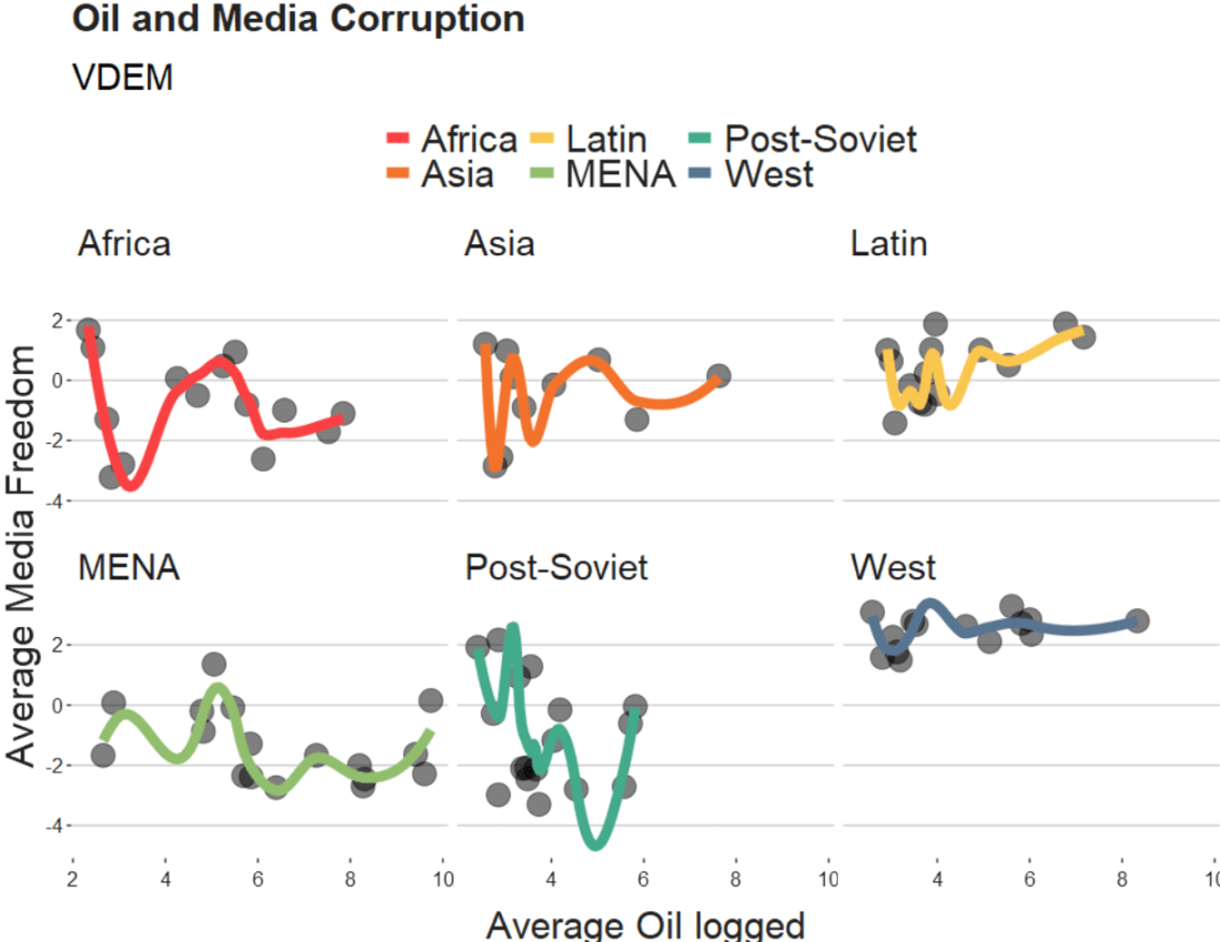


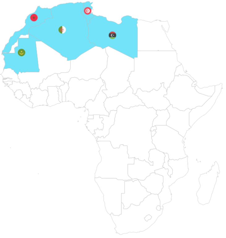
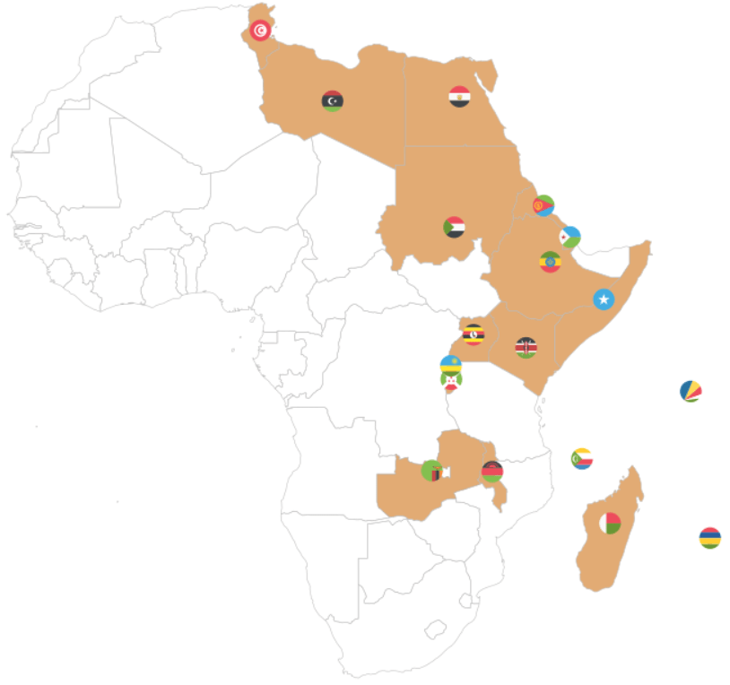


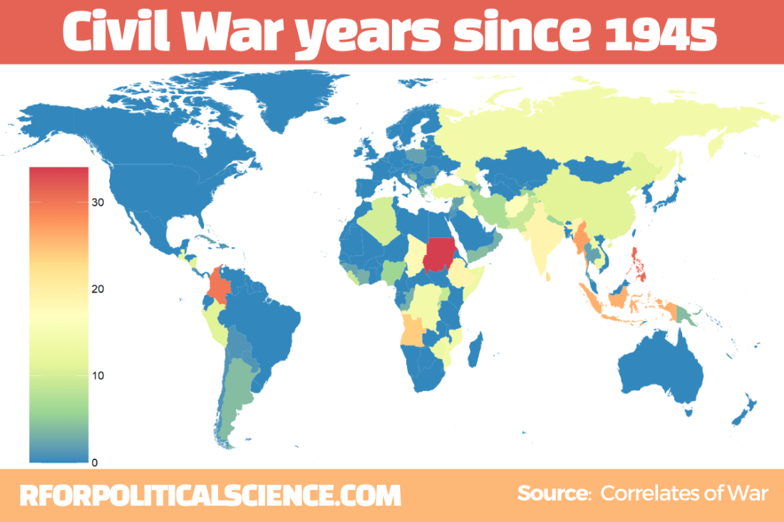


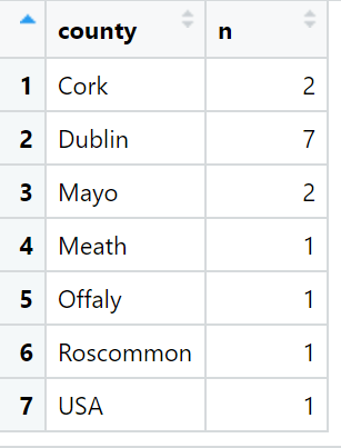
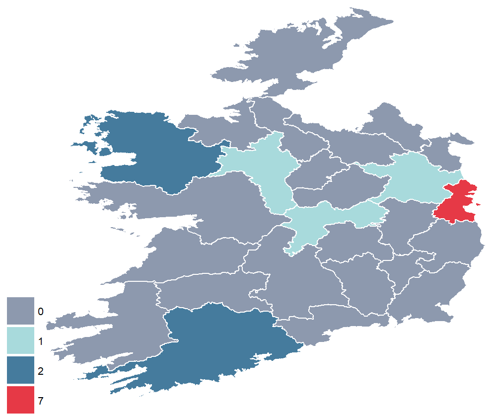
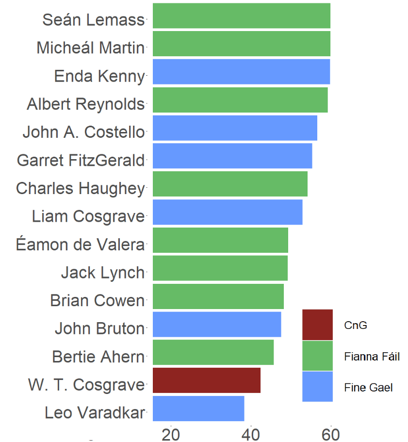
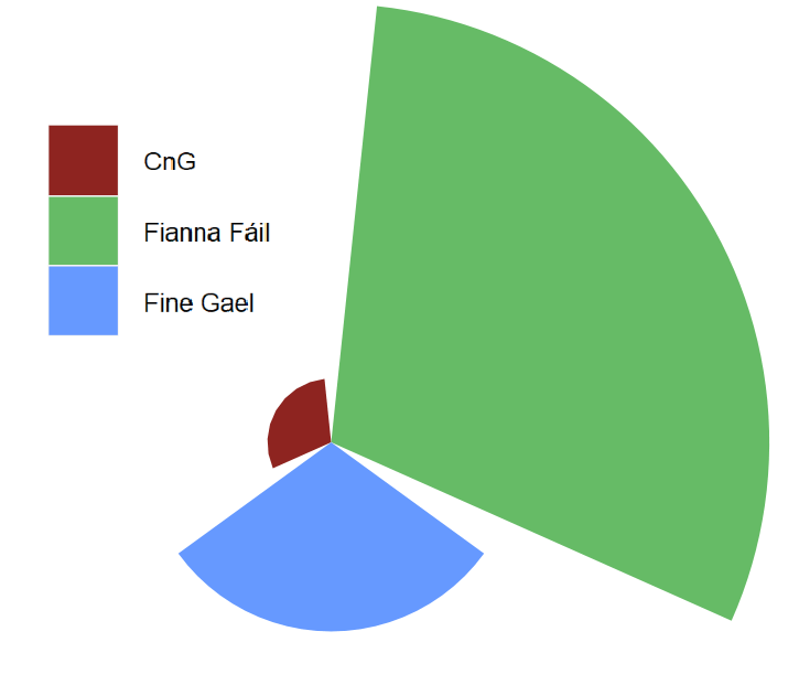
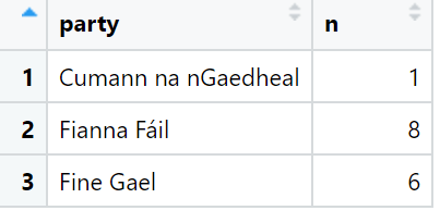
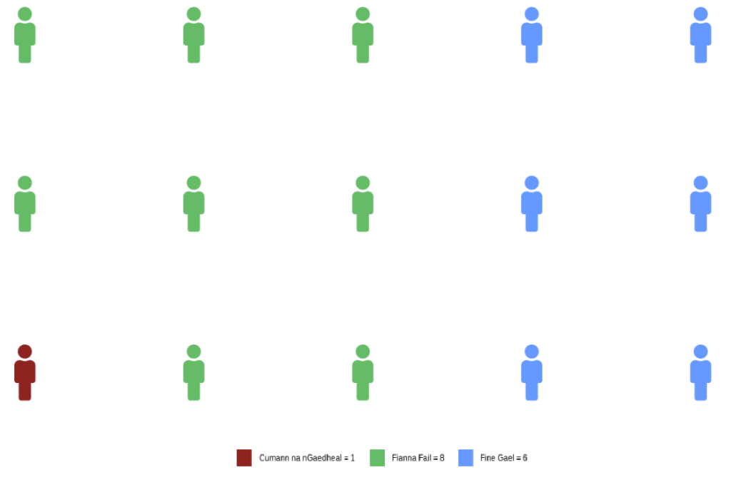


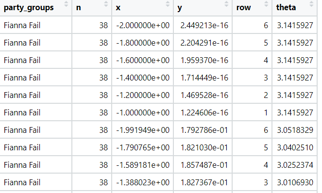
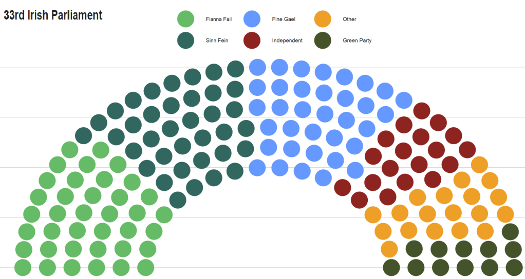


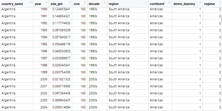
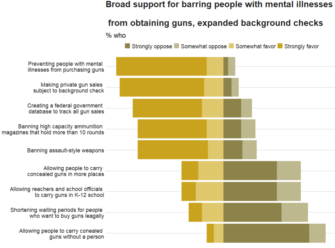


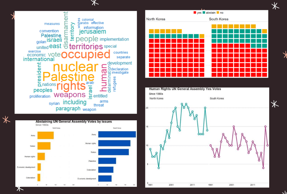


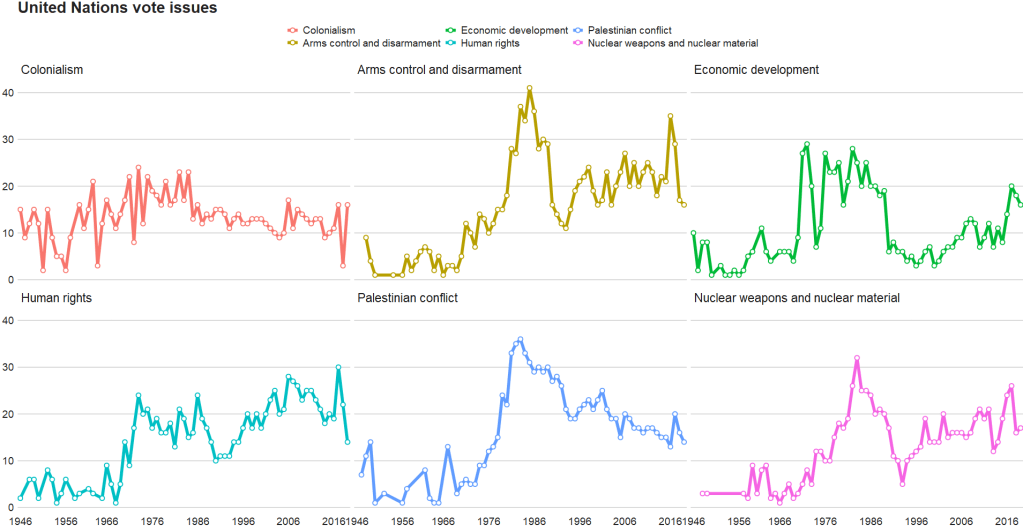


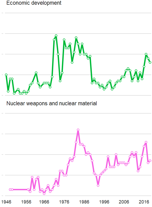
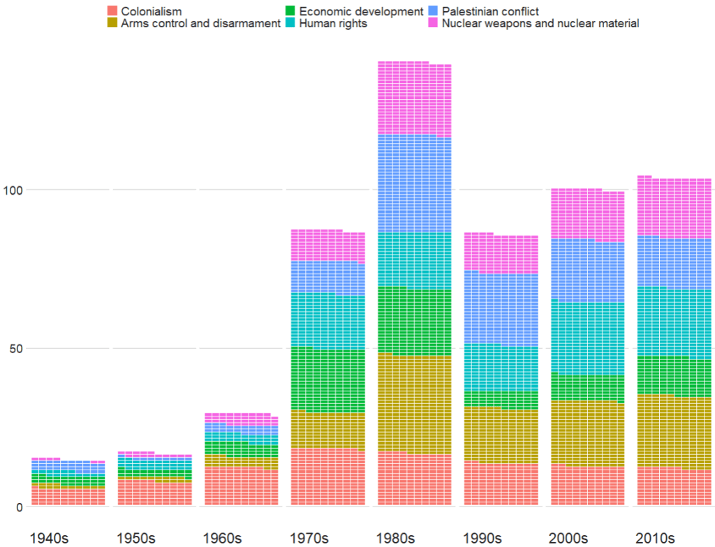


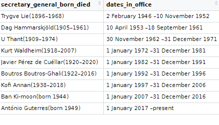
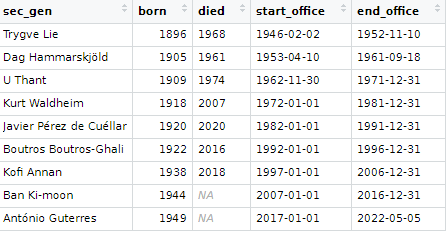

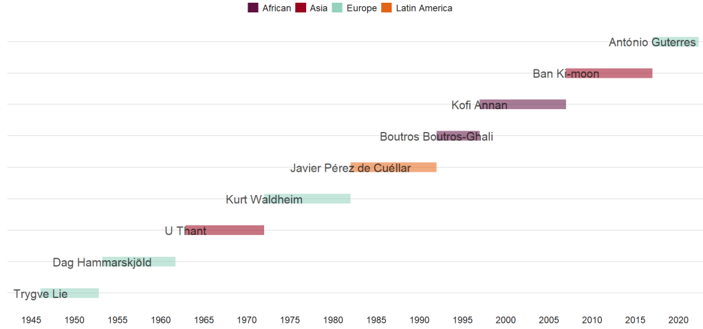


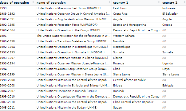


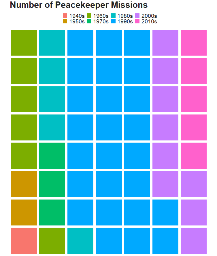


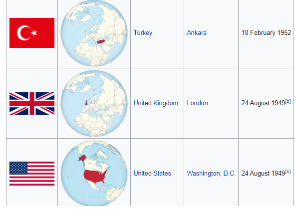

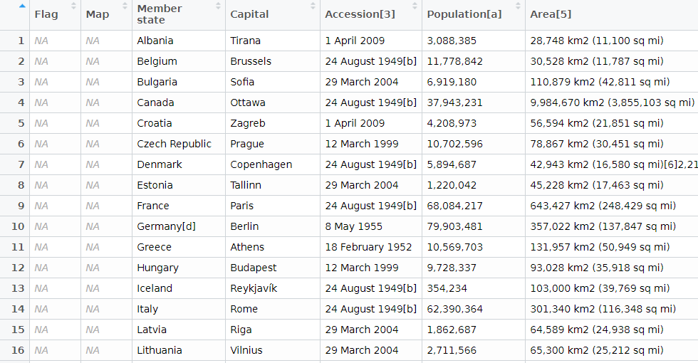


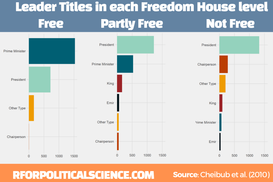


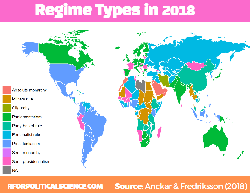


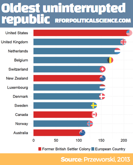

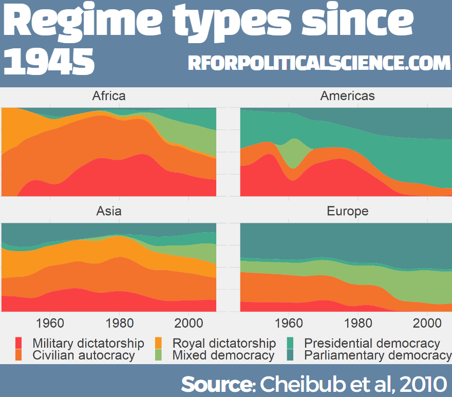


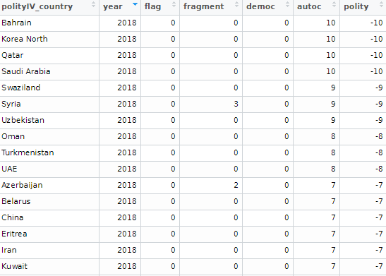


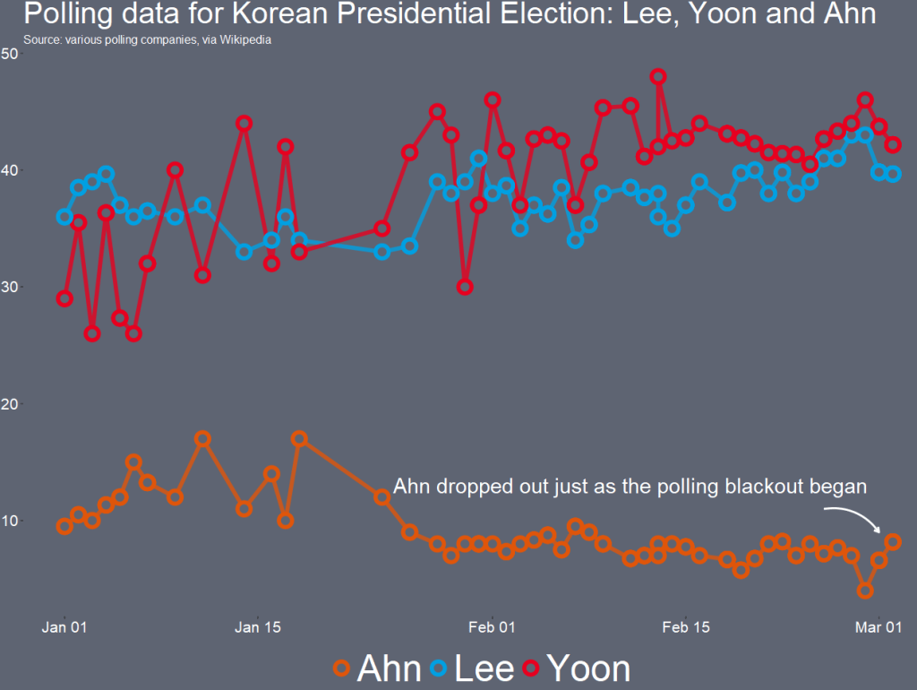


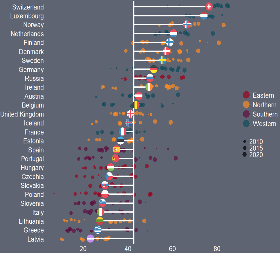

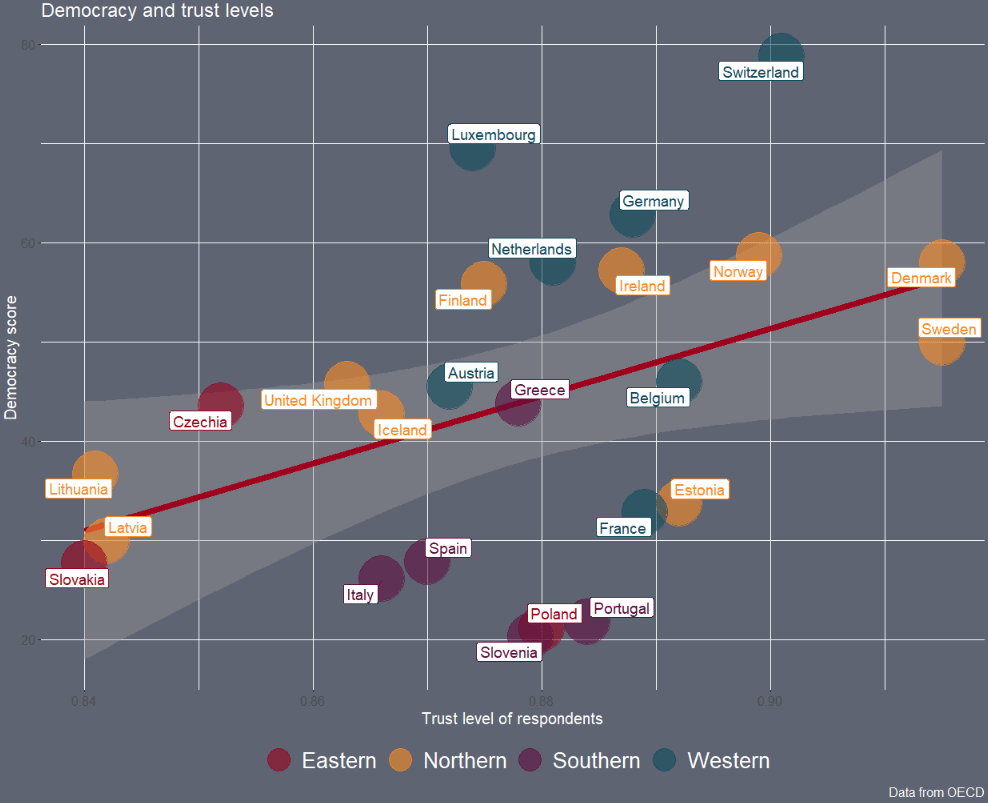


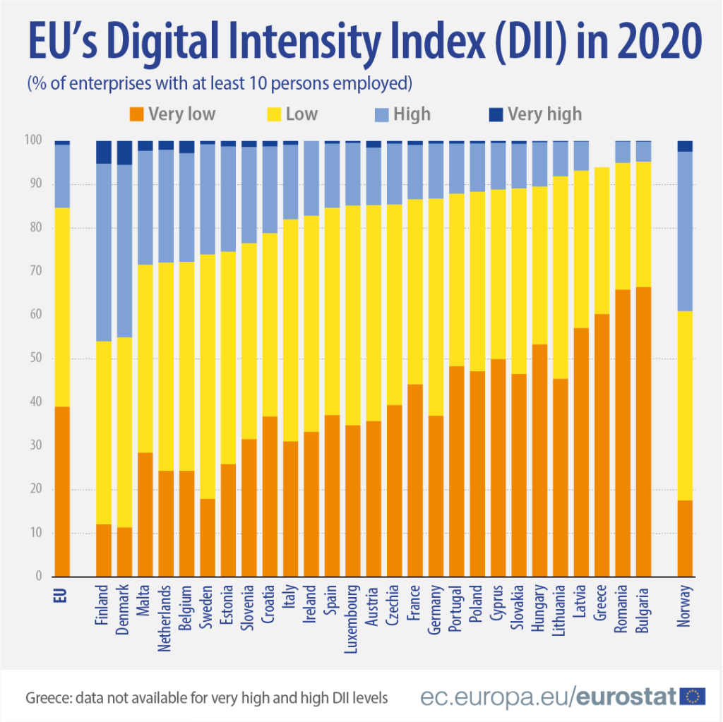
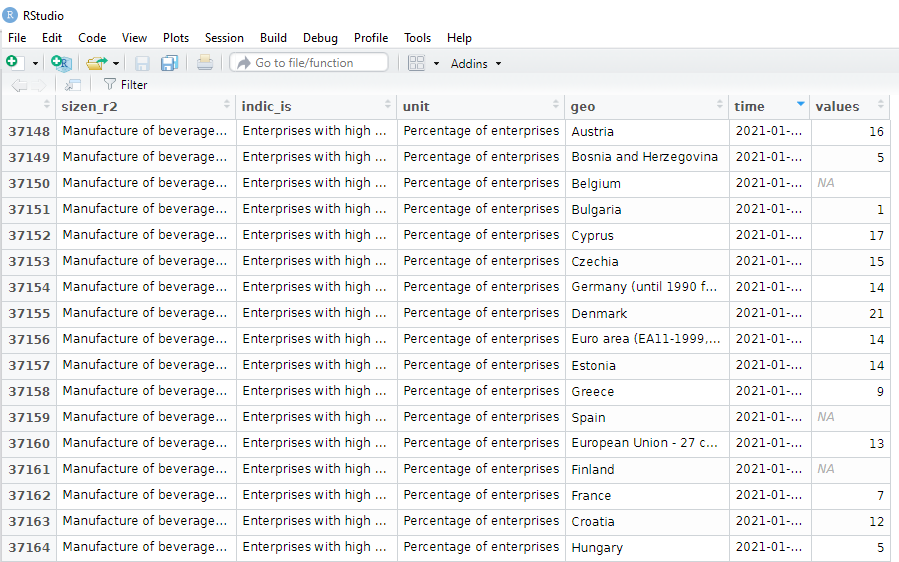


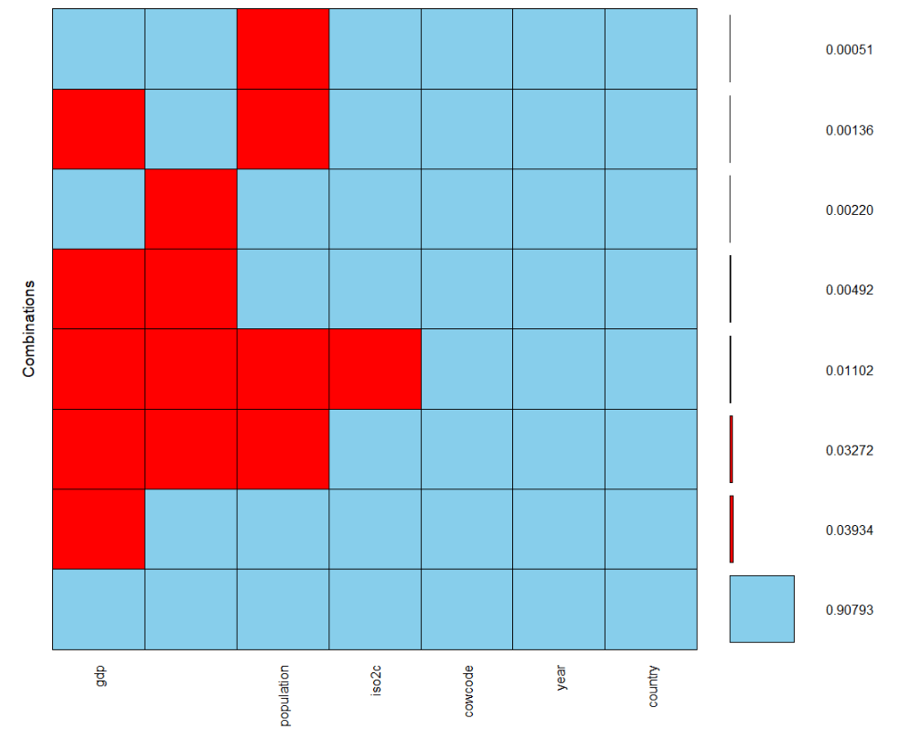


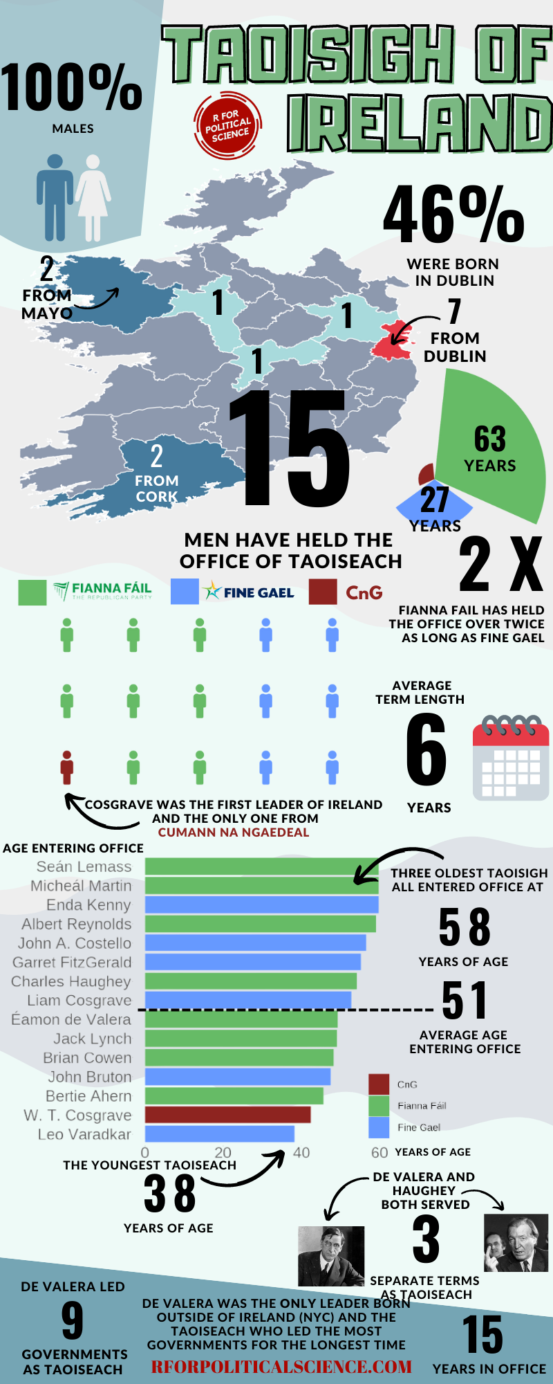
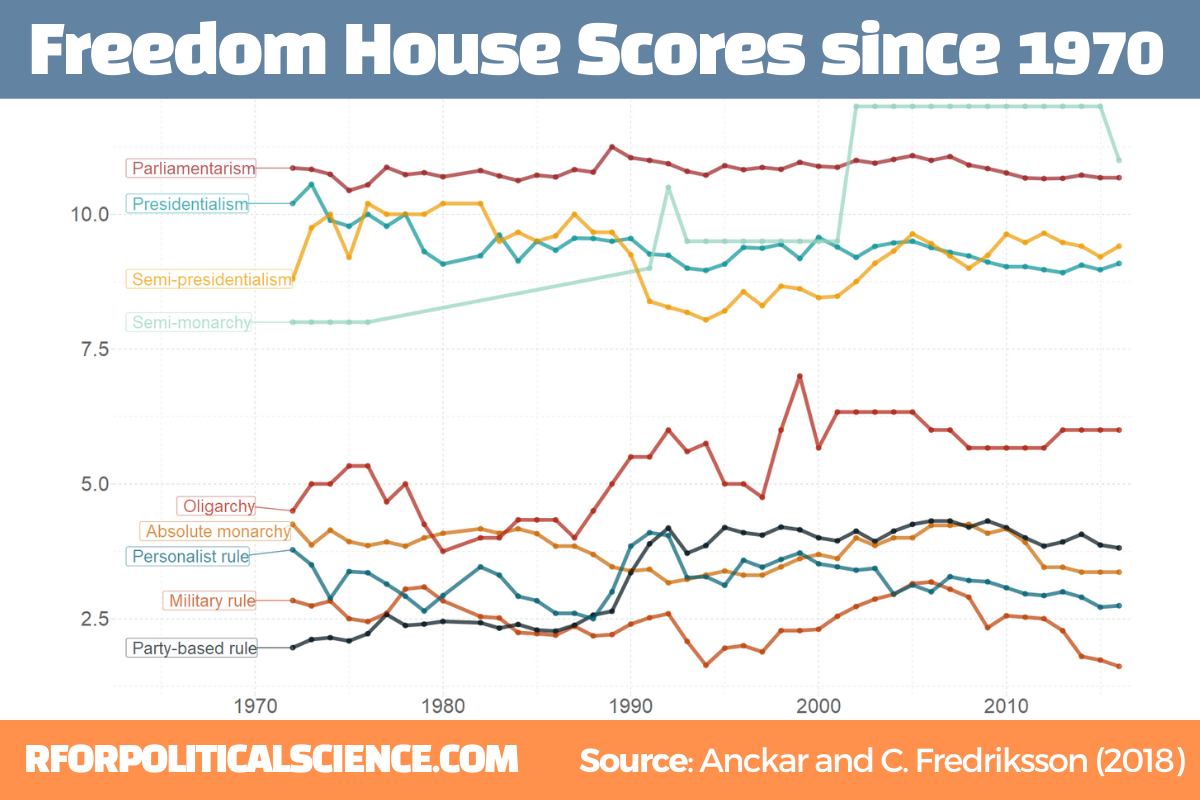